ColorPicker
故事背景
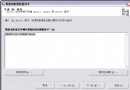
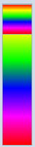
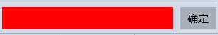
項目裡面需要一個像Winfrom裡面那樣的顏色選擇器,如下圖所示:
在網上看了一下。沒有現成的東東可以拿來使用。大概查看了一下關於顏色的一些知識,想著沒人種樹,那就由我自己來種樹,大家來乘涼好了。
設計過程
由於要考慮到手機上的效果,所以說這種向右展開的方式,不是太合適手機,所以最外層我考慮使用Pivot來存放基本顏色和自定義顏色這2頁。
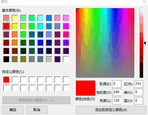
第一頁是基本顏色,第二頁是自定義的顏色,如下圖。
ColorPicker這個控件,主要是由一個Button以及FlyoutBase.AttachedFlyout中的Flyout來組成的。
由Button的點擊來控制Flyout的打開或者是關閉。

<Button x:Name="ToggleButton" Padding="{TemplateBinding Padding}" BorderBrush="{TemplateBinding BorderBrush}" Background="{TemplateBinding Background}" BorderThickness="{TemplateBinding BorderThickness}">
<Grid Padding="{TemplateBinding Padding}" Background="#01010101">
<Grid.ColumnDefinitions>
<ColumnDefinition Width="*"/>
<ColumnDefinition Width="auto"/>
</Grid.ColumnDefinitions>
<Rectangle HorizontalAlignment="Stretch" VerticalAlignment="Stretch">
<Rectangle.Fill>
<!--failed to use TemplateBinding-->
<SolidColorBrush Color="{Binding SelectedColor,RelativeSource={RelativeSource TemplatedParent}}"/>
</Rectangle.Fill>
</Rectangle>
<TextBlock x:Name="ArrowPolygon" Foreground="{TemplateBinding Foreground}" Visibility="{TemplateBinding ArrowVisibility}" Grid.Column="1" Text="" FontSize="{TemplateBinding FontSize}" FontFamily="Segoe UI Symbol" FontWeight="Normal" VerticalAlignment="Center" HorizontalAlignment="Center" Margin="5,0,5,0"/>
</Grid>
<FlyoutBase.AttachedFlyout>
<Flyout x:Name="Flyout">
<Flyout.FlyoutPresenterStyle>
<Style TargetType="FlyoutPresenter">
<Setter Property="ScrollViewer.VerticalScrollMode" Value="Disabled"/>
<Setter Property="ScrollViewer.HorizontalScrollMode" Value="Disabled"/>
<Setter Property="ScrollViewer.VerticalScrollBarVisibility" Value="Disabled"/>
<Setter Property="ScrollViewer.HorizontalScrollBarVisibility" Value="Disabled"/>
<!--<Setter Property="MaxHeight" Value="NaN"/>
<Setter Property="MaxWidth" Value="NaN"/>-->
<Setter Property="MinHeight" Value="0"/>
<Setter Property="MinWidth" Value="0"/>
<Setter Property="Padding" Value="0,0,0,0"/>
<Setter Property="Margin" Value="0,0,0,0"/>
<Setter Property="BorderThickness" Value="0"/>
<Setter Property="Background" Value="White"/>
<!--<Setter Property="BorderBrush" Value="#A4AFBA"/>-->
<Setter Property="MaxWidth" Value="NaN"/>
<Setter Property="MaxHeight" Value="NaN"/>
<Setter Property="Background" Value="Transparent"/>
<Setter Property="VerticalContentAlignment" Value="Center"/>
<Setter Property="HorizontalContentAlignment" Value="Center"/>
</Style>
</Flyout.FlyoutPresenterStyle>
<Grid Background="#FFD1DCE8" RequestedTheme="Light" BorderBrush="#A4AFBA" BorderThickness="1" Width="{TemplateBinding FlyoutWidth}" Height="{TemplateBinding FlyoutHeight}">
<Pivot x:Name="Pivot" >
<Pivot.Resources>
<!--<Style TargetType="TextBlock">
<Setter Property="Foreground" Value="Black"/>
</Style>-->
<Style TargetType="PivotHeaderItem" BasedOn="{StaticResource ColorPickerPivotHeaderItem}"/>
<Style TargetType="PivotItem">
<Setter Property="HorizontalContentAlignment" Value="Stretch"/>
<Setter Property="Margin" Value="0"/>
<Setter Property="Padding" Value="0"/>
<Setter Property="MinWidth" Value="0"/>
</Style>
</Pivot.Resources>
<PivotItem>
<PivotItem.Header>
<Grid HorizontalAlignment="Stretch" VerticalAlignment="Stretch" Padding="5">
<Grid.ColumnDefinitions>
<ColumnDefinition Width="17"/>
<ColumnDefinition/>
</Grid.ColumnDefinitions>
<Border Width="13" Height="13" Background="#FF97AEBF">
<Grid>
<Rectangle Height="10" HorizontalAlignment="Left" VerticalAlignment="Top" Width="3" Fill="#FFFF0000" Margin="1 1 0 0"/>
<Rectangle Height="5" HorizontalAlignment="Left" VerticalAlignment="Top" Width="3" Fill="#FFFFC000" Margin="5 1 0 0"/>
<Rectangle Height="5" HorizontalAlignment="Left" VerticalAlignment="Top" Width="3" Fill="#FFFFFF00" Margin="9 1 0 0"/>
<Rectangle Height="5" HorizontalAlignment="Left" VerticalAlignment="Top" Width="3" Fill="#FF92D050" Margin="1 5 0 0"/>
<Rectangle Height="5" HorizontalAlignment="Left" VerticalAlignment="Top" Width="3" Fill="#FF00B050" Margin="5 5 0 0"/>
<Rectangle Height="5" HorizontalAlignment="Left" VerticalAlignment="Top" Width="3" Fill="#FF0C8242" Margin="9 5 0 0"/>
<Rectangle Height="5" HorizontalAlignment="Left" VerticalAlignment="Top" Width="3" Fill="#FF0070C0" Margin="1 9 0 0"/>
<Rectangle Height="5" HorizontalAlignment="Left" VerticalAlignment="Top" Width="3" Fill="#FF002060" Margin="5 9 0 0"/>
<Rectangle Height="5" HorizontalAlignment="Left" VerticalAlignment="Top" Width="3" Fill="#FF7030A0" Margin="9 9 0 0"/>
</Grid>
</Border>
<TextBlock HorizontalAlignment="Left" VerticalAlignment="Center" Text="基本顏色" TextWrapping="Wrap" Grid.Column="1">
</TextBlock>
</Grid>
</PivotItem.Header>
<StackPanel Orientation="Vertical">
<Border Margin="0,5,0,0" HorizontalAlignment="Stretch" BorderBrush="#A4AFBA" BorderThickness="0,0,0,1" Height="30">
<TextBlock Margin="5,0" VerticalAlignment="Center">
<Run Text="{Binding Title,RelativeSource={RelativeSource TemplatedParent}}"/>
<Run Text=" - "/>
<Run Text="基本顏色"/>
</TextBlock>
</Border>
<local:ColorPickerItemsControl x:Name="BasicColorItems" MinHeight="43"/>
<Border Margin="0,5,0,0" BorderBrush="#A4AFBA" BorderThickness="0,0,0,1" HorizontalAlignment="Stretch" Height="30">
<TextBlock Margin="5,0" Text="最近使用顏色" VerticalAlignment="Center"/>
</Border>
<local:ColorPickerItemsControl x:Name="RecentColorItems" MinHeight="43"/>
</StackPanel>
</PivotItem>
<PivotItem>
<PivotItem.Header>
<Grid HorizontalAlignment="Stretch" VerticalAlignment="Stretch" Padding="5">
<Grid.ColumnDefinitions>
<ColumnDefinition Width="17"/>
<ColumnDefinition/>
</Grid.ColumnDefinitions>
<Ellipse Height="14" Margin="0.5,-1,3,-1" Fill="#FFFFFFFF" Width="14"/>
<Ellipse Width="14" Height="14" Margin="0.5,-1,3,-1">
<Ellipse.Fill>
<LinearGradientBrush EndPoint="0.5,1" StartPoint="0.5,0">
<GradientStop Color="#FFFF0000" Offset="0.1"/>
<GradientStop Color="#00FF0000" Offset="0.5"/>
</LinearGradientBrush>
</Ellipse.Fill>
</Ellipse>
<Ellipse Height="14" HorizontalAlignment="Stretch" Margin="0.5,-1,3,-1" VerticalAlignment="Stretch" Width="14">
<Ellipse.Fill>
<LinearGradientBrush EndPoint="0.982999980449677,0.179000005125999" StartPoint="0.0879999995231628,0.753000020980835">
<GradientStop Color="#FF079BF0" Offset="0.1"/>
<GradientStop Color="#00079BF0" Offset="0.5"/>
</LinearGradientBrush>
</Ellipse.Fill>
</Ellipse>
<Ellipse Height="14" HorizontalAlignment="Stretch" Margin="0.5,-1,3,-1" VerticalAlignment="Stretch" Width="14">
<Ellipse.Fill>
<LinearGradientBrush EndPoint="0.136000007390976,0.174999997019768" StartPoint="0.843999981880188,0.822000026702881">
<GradientStop Color="#FFF2F413" Offset="0.1"/>
<GradientStop Color="#00F2F413" Offset="0.5"/>
</LinearGradientBrush>
</Ellipse.Fill>
</Ellipse>
<Ellipse Height="14" HorizontalAlignment="Stretch" Margin="0.5,-1,3,-1" VerticalAlignment="Stretch" Width="14" Visibility="Visible">
<Ellipse.Fill>
<LinearGradientBrush>
<GradientStop Color="#00000000" Offset="0.772"/>
<GradientStop Color="#4C000000" Offset="1"/>
</LinearGradientBrush>
</Ellipse.Fill>
</Ellipse>
<Ellipse Height="15" HorizontalAlignment="Stretch" Margin="-0.5,-1.5,2.5,-1.5" VerticalAlignment="Stretch" Width="15" Stroke="#FF8AA3B5"/>
<TextBlock HorizontalAlignment="Left" VerticalAlignment="Center" Text="自定義顏色" TextWrapping="Wrap" Grid.Column="1">
</TextBlock>
</Grid>
</PivotItem.Header>
<Grid HorizontalAlignment="Stretch" VerticalAlignment="Stretch">
<Grid.RowDefinitions>
<RowDefinition Height="auto"/>
<RowDefinition Height="*"/>
<RowDefinition Height="auto"/>
<RowDefinition Height="auto"/>
</Grid.RowDefinitions>
<Grid.Resources>
<Style TargetType="local:NumericTextBox">
<Setter Property="InputScope" Value="Number"/>
<Setter Property="ValueFormat" Value="F0"/>
<Setter Property="Minimum" Value="0"/>
<Setter Property="Maximum" Value="255"/>
<Setter Property="MinWidth" Value="0"/>
<Setter Property="Margin" Value="5,0,0,0"/>
<Setter Property="HorizontalContentAlignment" Value="Center"/>
</Style>
</Grid.Resources>
<Border Margin="0,5,0,0" HorizontalAlignment="Stretch" BorderBrush="#A4AFBA" BorderThickness="0,0,0,1" Height="30">
<TextBlock Margin="5,0" VerticalAlignment="Center">
<Run Text="{Binding Title,RelativeSource={RelativeSource TemplatedParent}}"/>
<Run Text=" - "/>
<Run Text="自定義顏色"/>
</TextBlock>
</Border>
<Grid HorizontalAlignment="Stretch" VerticalAlignment="Stretch" Grid.Row="1" BorderBrush="#A4AFBA" BorderThickness="0,0,0,1">
<Grid.ColumnDefinitions>
<ColumnDefinition Width="*"/>
<ColumnDefinition Width="auto"/>
<ColumnDefinition Width="auto"/>
</Grid.ColumnDefinitions>
<ContentControl x:Name="ChoiceGridParent" Grid.Column="0" HorizontalContentAlignment="Stretch" VerticalContentAlignment="Stretch">
<Grid x:Name="ChoiceGrid" HorizontalAlignment="Stretch" Margin="5,5,0,5" VerticalAlignment="Stretch" >
<!--<Grid.Background>
<LinearGradientBrush StartPoint="0,0" EndPoint="1,0">
<LinearGradientBrush.GradientStops>
<GradientStop Offset="0.0" Color="White"/>
<GradientStop Offset="1" Color="#00FFFFFF"/>
</LinearGradientBrush.GradientStops>
</LinearGradientBrush>
</Grid.Background>-->
<Rectangle HorizontalAlignment="Stretch" VerticalAlignment="Stretch">
<Rectangle.Fill>
<LinearGradientBrush StartPoint="0,0" EndPoint="1,0">
<LinearGradientBrush.GradientStops>
<GradientStop Offset="0.0" Color="White"/>
<GradientStop Offset="1" Color="#00FFFFFF"/>
</LinearGradientBrush.GradientStops>
</LinearGradientBrush>
</Rectangle.Fill>
</Rectangle>
<Rectangle HorizontalAlignment="Stretch" VerticalAlignment="Stretch">
<Rectangle.Fill>
<LinearGradientBrush StartPoint="0,0" EndPoint="0,1">
<LinearGradientBrush.GradientStops>
<GradientStop Offset="0.0" Color="#00000000"/>
<GradientStop Offset="1" Color="Black"/>
</LinearGradientBrush.GradientStops>
</LinearGradientBrush>
</Rectangle.Fill>
</Rectangle>
<Canvas x:Name="PadCanvas">
<Canvas x:Name="Indicator">
<Ellipse Height="6" Width="6" Fill="Transparent" Stroke="#FFFFFFFF" StrokeThickness="1" Margin="-3 -3 0 0" />
<Ellipse Height="12" Width="12" Fill="Transparent" Stroke="#FF737373" Margin="-6 -6 0 0" />
</Canvas>
</Canvas>
</Grid>
</ContentControl>
<Slider x:Name="Hue" Margin="5,5,0,5" Grid.Column="1">
<Slider.Background>
<LinearGradientBrush StartPoint="0,0" EndPoint="0,1">
<GradientStop Offset="0.0" Color="#FFFF0000"/>
<GradientStop Offset="0.2" Color="#FFFFFF00"/>
<GradientStop Offset="0.4" Color="#FF00FF00"/>
<GradientStop Offset="0.6" Color="#FF0000FF"/>
<GradientStop Offset="0.8" Color="#FFFF00FF"/>
<GradientStop Offset="1.0" Color="#FFFF0000"/>
</LinearGradientBrush>
</Slider.Background>
</Slider>
<Slider x:Name="Alpha" Margin="5" Grid.Column="2">
<Slider.Background>
<LinearGradientBrush StartPoint="0,0" EndPoint="0,1">
<GradientStop Color="Black" Offset="0"/>
<GradientStop Color="Transparent" Offset="1"/>
</LinearGradientBrush>
</Slider.Background>
</Slider>
</Grid>
<Grid Margin="0,0,5,0" Padding="0,0,0,5" HorizontalAlignment="Stretch" VerticalAlignment="Stretch" Grid.Row="2" BorderBrush="#A4AFBA" BorderThickness="0,0,0,1">
<Grid.ColumnDefinitions>
<ColumnDefinition Width="*"/>
<ColumnDefinition Width="*"/>
<ColumnDefinition Width="*"/>
<ColumnDefinition Width="*"/>
</Grid.ColumnDefinitions>
<local:NumericTextBox x:Name="AColor" Grid.Column="0">
<local:NumericTextBox.Header>
<TextBlock Text="透明度(A)" HorizontalAlignment="Center"/>
</local:NumericTextBox.Header>
</local:NumericTextBox>
<local:NumericTextBox x:Name="RColor" Grid.Column="1" >
<local:NumericTextBox.Header>
<TextBlock Text="紅(R)" HorizontalAlignment="Center"/>
</local:NumericTextBox.Header>
</local:NumericTextBox>
<local:NumericTextBox x:Name="GColor" Grid.Column="2" >
<local:NumericTextBox.Header>
<TextBlock Text="綠(G)" HorizontalAlignment="Center"/>
</local:NumericTextBox.Header>
</local:NumericTextBox>
<local:NumericTextBox x:Name="BColor" Grid.Column="3" >
<local:NumericTextBox.Header>
<TextBlock Text="藍(B)" HorizontalAlignment="Center"/>
</local:NumericTextBox.Header>
</local:NumericTextBox>
</Grid>
<Grid Grid.Row="3" Margin="5">
<Grid.ColumnDefinitions>
<ColumnDefinition Width="*"/>
<ColumnDefinition Width="auto"/>
</Grid.ColumnDefinitions>
<Grid HorizontalAlignment="Stretch" Margin="0,0,10,0">
<local:TransparentBackground/>
<Rectangle x:Name="CustomColorRectangle" HorizontalAlignment="Stretch" VerticalAlignment="Stretch">
<Rectangle.Fill>
<SolidColorBrush Color="{Binding CurrentCustomColor,RelativeSource={RelativeSource TemplatedParent}}"/>
</Rectangle.Fill>
<ToolTipService.ToolTip>
<ToolTip>
<Binding Converter="{StaticResource ColorToStringConverter}" Path="CurrentCustomColor" RelativeSource="{RelativeSource TemplatedParent}"/>
</ToolTip>
</ToolTipService.ToolTip>
</Rectangle>
</Grid>
<Button x:Name="CustomColorOkButton" Grid.Column="1" Content="確定" VerticalAlignment="Center" HorizontalAlignment="Right"/>
</Grid>
</Grid>
</PivotItem>
</Pivot>
<Button x:Name="CloseButton" Content="關閉" HorizontalAlignment="Right" VerticalAlignment="Bottom" Margin="5"/>
</Grid>
</Flyout>
</FlyoutBase.AttachedFlyout>
<ToolTipService.ToolTip>
<ToolTip>
<Binding Path="SelectedColor" RelativeSource="{RelativeSource TemplatedParent}" Converter="{StaticResource ColorToStringConverter}"/>
</ToolTip>
</ToolTipService.ToolTip>
</Button>
View Code
通過重寫Pivot的模板我們可以輕松得到PiovtHeaderItem 在下面的效果(修改Header和PivotItemPresenter的行號)
Pivot部分模板代碼如下,注意藍色部分:
                 <Grid x:Name="PivotLayoutElement">
                                        <Grid.RowDefinitions>
                                            <RowDefinition Height="*" />
                                            <RowDefinition Height="Auto" />
                                        </Grid.RowDefinitions>
                                        <Grid.ColumnDefinitions>
                                            <ColumnDefinition Width="Auto" />
                                            <ColumnDefinition Width="*" />
                                            <ColumnDefinition Width="Auto" />
                                        </Grid.ColumnDefinitions>
                                        <Grid.RenderTransform>
                                            <CompositeTransform x:Name="PivotLayoutElementTranslateTransform" />
                                        </Grid.RenderTransform>
                                        <ContentPresenter Grid.Row="1"
                  x:Name="LeftHeaderPresenter"
                  Content="{TemplateBinding LeftHeader}"
                  ContentTemplate="{TemplateBinding LeftHeaderTemplate}"
                  HorizontalAlignment="Stretch"
                  VerticalAlignment="Stretch" />
                                        <ContentControl Grid.Row="1"
                  x:Name="HeaderClipper"
                  Grid.Column="1"
                  UseSystemFocusVisuals="False"
                  HorizontalContentAlignment="Stretch">
                                            <ContentControl.Clip>
                                                <RectangleGeometry x:Name="HeaderClipperGeometry" />
                                            </ContentControl.Clip>
                                            <Grid Background="Transparent" BorderBrush="#A4AFBA" BorderThickness="0,1,0,0">
                                                <PivotHeaderPanel x:Name="StaticHeader" Visibility="Collapsed" />
                                                <PivotHeaderPanel x:Name="Header">
                                                    <PivotHeaderPanel.RenderTransform>
                                                        <TransformGroup>
                                                            <CompositeTransform x:Name="HeaderTranslateTransform" />
                                                            <CompositeTransform x:Name="HeaderOffsetTranslateTransform" />
                                                        </TransformGroup>
                                                    </PivotHeaderPanel.RenderTransform>
                                                </PivotHeaderPanel>
                                            </Grid>
                                        </ContentControl>
                                        <Button Grid.Row="1"
                    x:Name="PreviousButton"
                    Grid.Column="1"
                    Template="{StaticResource PreviousTemplate}"
                    Width="20"
                    Height="36"
                    UseSystemFocusVisuals="False"
                    Margin="{ThemeResource PivotNavButtonMargin}"
                    IsTabStop="False"
                    IsEnabled="False"
                    HorizontalAlignment="Left"
                    VerticalAlignment="Top"
                    Opacity="0"
                    Background="Transparent" />
                                        <Button Grid.Row="1"
                    x:Name="NextButton"
                    Grid.Column="1"
                    Template="{StaticResource NextTemplate}"
                    Width="20"
                    Height="36"
                    UseSystemFocusVisuals="False"
                    Margin="{ThemeResource PivotNavButtonMargin}"
                    IsTabStop="False"
                    IsEnabled="False"
                    HorizontalAlignment="Right"
                    VerticalAlignment="Top"
                    Opacity="0"
                    Background="Transparent" />
                                        <ContentPresenter Grid.Row="1"
                    x:Name="RightHeaderPresenter"
                    Grid.Column="2"
                    Content="{TemplateBinding RightHeader}"
                    ContentTemplate="{TemplateBinding RightHeaderTemplate}"
                    HorizontalAlignment="Stretch"
                    VerticalAlignment="Stretch" />
                                        <ItemsPresenter x:Name="PivotItemPresenter" Grid.Row="0" Grid.ColumnSpan="3">
                                            <ItemsPresenter.RenderTransform>
                                                <TransformGroup>
                                                    <TranslateTransform x:Name="ItemsPresenterTranslateTransform" />
                                                    <CompositeTransform x:Name="ItemsPresenterCompositeTransform" />
                                                </TransformGroup>
                                            </ItemsPresenter.RenderTransform>
                                        </ItemsPresenter>
                                    </Grid>
這個色塊就比較簡單了,通過Just Color Picker 把Winform 裡面的顏色都給搞出來,通過ItemsControl把他們都布局在一塊。
最近使用顏色,這個就是記錄最近你點擊修改的顏色,我這裡用了一個幫助類來進行管理。
internal static class ColorPickerColorHelper
    {
        const string ColorPickerRecentColorsKey = "ColorPickerRecentColors.json";
        private static ObservableCollection<Color> RecentColors;
        //private static List<Color> systemColors;
        //private static List<Color> basicColors;
        private static bool hasLoadedRecentColors;

        //public static List<Color> BasicColors
        //{
        //    get
        //    {
        //        return basicColors;
        //    }
        //}

        static ColorPickerColorHelper()
        {
            //basicColors = new List<Color>();
            RecentColors = new ObservableCollection<Color>();
            //systemColors = new List<Color>();
            //foreach (var color in typeof(Colors).GetRuntimeProperties())
            //{
            //    basicColors.Add((Color)color.GetValue(null));
            //}

        }

        public static async Task<ObservableCollection<Color>> GetRecentColorsAsync()
        {
            if (!hasLoadedRecentColors)
            {
                hasLoadedRecentColors = true;
                RecentColors = await GetRecentColorsAsyncInternal();
                var temp = await GetRecentColorsAsyncInternal();
                if (temp != null)
                {
                    RecentColors = temp;
                }
            }
            return RecentColors;
        }

        public async static Task SetRecentColorsAsync(Color color)
        {
            if (RecentColors != null)
            {
                if (RecentColors.LastOrDefault() == color)
                {
                    return;
                }
                RecentColors.Add(color);
                if (RecentColors.Count > 8)
                {
                    RecentColors.RemoveAt(0);
                }
                await SaveRecentColorsAsync();
            }
        }

        private static async Task<ObservableCollection<Color>> GetRecentColorsAsyncInternal()
        {
            var jsonText = await StorageHelper.ReadFileAsync(ColorPickerRecentColorsKey);
            return JsonConvert.DeserializeObject<ObservableCollection<Color>>(jsonText);
        }

        private static async Task SaveRecentColorsAsync()
        {
            string jsonText = "";

            if (RecentColors.Count > 0)
            {
                jsonText = JsonConvert.SerializeObject(RecentColors);
            }
            await StorageHelper.WriteFileAsync(ColorPickerRecentColorsKey, jsonText);
        }
    }
}
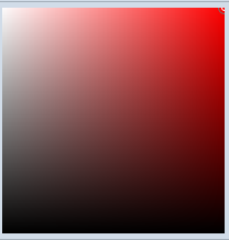
第二頁是自定義的色盤
這裡用到HSL 色彩模式,之前不了解的小伙伴可以先去看一下,RGB→HSL 和 HSL→RGB轉換的算法也有。
 HSL通道
HSL通道 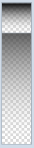 透明度通道 這個2個我用到了Slider控件,當然模板我重新寫了一下
 你可以通過拖拽、點擊、鍵盤上下左右來微調顏色數值,這個屬於比較簡單的拖拽實現,Ellipse通過計算得出它的位置。
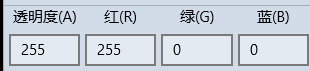 當然你可以通過直接設置ARGB來設置顏色。這個輸入框,我設計成了NumericTextBox繼承於TextBox控件,支持Format
public class NumericTextBox : TextBox
    {

        private bool _isChangingTextWithCode;
        private bool _isChangingValueWithCode;
        private const double Epsilon = .00001;

        public event EventHandler ValueChanged;
        public double Value
        {
            get { return (double)GetValue(ValueProperty); }
            set { SetValue(ValueProperty, value); }
        }

        // Using a DependencyProperty as the backing store for Value.  This enables animation, styling, binding, etc...
        public static readonly DependencyProperty ValueProperty =
            DependencyProperty.Register("Value", typeof(double), typeof(NumericTextBox), new PropertyMetadata(0.0, new PropertyChangedCallback(OnValueChanged)));

        private static void OnValueChanged(DependencyObject d, DependencyPropertyChangedEventArgs e)
        {
            (d as NumericTextBox).UpdateValueText();
            (d as NumericTextBox).OnValueChanged();
        }

        public string ValueFormat
        {
            get { return (string)GetValue(ValueFormatProperty); }
            set { SetValue(ValueFormatProperty, value); }
        }

        // Using a DependencyProperty as the backing store for ValueFormat.  This enables animation, styling, binding, etc...
        public static readonly DependencyProperty ValueFormatProperty =
            DependencyProperty.Register("ValueFormat", typeof(string), typeof(NumericTextBox), new PropertyMetadata("F0"));


        public double Minimum
        {
            get { return (double)GetValue(MinimumProperty); }
            set { SetValue(MinimumProperty, value); }
        }

        // Using a DependencyProperty as the backing store for Minimum.  This enables animation, styling, binding, etc...
        public static readonly DependencyProperty MinimumProperty =
            DependencyProperty.Register("Minimum", typeof(double), typeof(NumericTextBox), new PropertyMetadata(double.MinValue));

        public double Maximum
        {
            get { return (double)GetValue(MaximumProperty); }
            set { SetValue(MaximumProperty, value); }
        }

        // Using a DependencyProperty as the backing store for Maximum.  This enables animation, styling, binding, etc...
        public static readonly DependencyProperty MaximumProperty =
            DependencyProperty.Register("Maximum", typeof(double), typeof(NumericTextBox), new PropertyMetadata(double.MaxValue));


        public NumericTextBox()
        {
            Text = this.Value.ToString(CultureInfo.CurrentCulture);
            TextChanged += this.OnValueTextBoxTextChanged;
            KeyDown += this.OnValueTextBoxKeyDown;
            PointerExited += this.OnValueTextBoxPointerExited;
        }

        private void OnValueTextBoxPointerExited(object sender, PointerRoutedEventArgs e)
        {

        }

        private void OnValueTextBoxKeyDown(object sender, KeyRoutedEventArgs e)
        {

        }

        private void OnValueTextBoxTextChanged(object sender, TextChangedEventArgs e)
        {
            this.UpdateValueFromText();
        }

        protected override void OnGotFocus(RoutedEventArgs e)
        {
            base.OnGotFocus(e);
        }

        protected override void OnLostFocus(RoutedEventArgs e)
        {
            this.UpdateValueFromText();
            base.OnLostFocus(e);
        }


        private void UpdateValueText()
        {
            _isChangingTextWithCode = true;
            this.Text = this.Value.ToString(this.ValueFormat);
            this.SelectionStart = this.Text.Length;
            _isChangingTextWithCode = false;
        }

        private void OnValueChanged()
        {
            if (ValueChanged != null)
            {
                ValueChanged(null, null);
            }
        }

        private bool UpdateValueFromText()
        {
            if (_isChangingTextWithCode)
            {
                return false;
            }

            double val;

            if (double.TryParse(this.Text, NumberStyles.Any, CultureInfo.CurrentUICulture, out val) ||
                Calculator.TryCalculate(this.Text, out val))
            {
                _isChangingValueWithCode = true;
                if (val < Minimum)
                {
                    val = Minimum;
                }
                if (val > Maximum)
                {
                    val = Maximum;
                }

                this.Value = val;

                UpdateValueText();

                _isChangingValueWithCode = false;

                return true;
            }
            else
            {
                if (this.Text == "")
                {
                    this.Value = Minimum;
                }
                UpdateValueText();

            }

            return false;
        }


        private bool SetValueAndUpdateValidDirections(double value)
        {
            // Range coercion is handled by base class.
            var oldValue = this.Value;
            if (value < Minimum)
            {
                value = Minimum;
            }
            if (value > Maximum)
            {
                value = Maximum;
            }
            this.Value = value;
            if (value < Minimum || value > Maximum)
            {
                UpdateValueText();
            }
            //this.SetValidIncrementDirection();

            return Math.Abs(this.Value - oldValue) > Epsilon;
        }
    }
View Code
 最後這個色塊就是顯示的最終的顏色,點擊確認會生產自定義的顏色。這裡說一下透明色的效果是怎麼做成的。
在我們VS裡面當把顏色設置為Transparent的時候,效果是如下圖
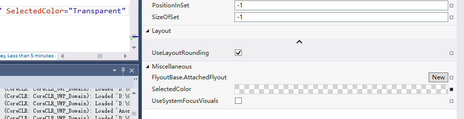
其實就是添加了些灰色的Rect,知道效果,怎麼做就簡單了,代碼如下
     public class TransparentBackground : Grid
    {

        public double SquareWidth
        {
            get { return (double)GetValue(SquareWidthProperty); }
            set { SetValue(SquareWidthProperty, value); }
        }

        // Using a DependencyProperty as the backing store for SquareWidth.  This enables animation, styling, binding, etc...
        public static readonly DependencyProperty SquareWidthProperty =
            DependencyProperty.Register("SquareWidth", typeof(double), typeof(TransparentBackground), new PropertyMetadata(4.0, new PropertyChangedCallback(OnUpdateSquares)));

        private static void OnUpdateSquares(DependencyObject d, DependencyPropertyChangedEventArgs e)
        {
            (d as TransparentBackground).UpdateSquares();
        }

        public Brush SquareBrush
        {
            get { return (Brush)GetValue(SquareBrushProperty); }
            set { SetValue(SquareBrushProperty, value); }
        }

        // Using a DependencyProperty as the backing store for SquareBrush.  This enables animation, styling, binding, etc...
        public static readonly DependencyProperty SquareBrushProperty =
            DependencyProperty.Register("SquareBrush", typeof(Brush), typeof(TransparentBackground), new PropertyMetadata(new SolidColorBrush(Color.FromArgb(0xFF, 0xd7, 0xd7, 0xd7)), new PropertyChangedCallback(OnUpdateSquares)));


        public Brush AlternatingSquareBrush
        {
            get { return (Brush)GetValue(AlternatingSquareBrushProperty); }
            set { SetValue(AlternatingSquareBrushProperty, value); }
        }

        // Using a DependencyProperty as the backing store for AlternatingSquareBrush.  This enables animation, styling, binding, etc...
        public static readonly DependencyProperty AlternatingSquareBrushProperty =
            DependencyProperty.Register("AlternatingSquareBrush", typeof(Brush), typeof(TransparentBackground), new PropertyMetadata(new SolidColorBrush(Colors.White), new PropertyChangedCallback(OnUpdateSquares)));

        public TransparentBackground()
        {
            HorizontalAlignment = HorizontalAlignment.Stretch;
            VerticalAlignment = VerticalAlignment.Stretch;
            //this.SizeChanged += (s, e) =>
            //{

            //    if (e.NewSize != e.PreviousSize)
            //    {
            //        UpdateSquares();
            //    }
            //};
        }

        Size pre = Size.Empty;
        protected override Size ArrangeOverride(Size finalSize)
        {
            if (pre != finalSize)
            {
                UpdateSquares(finalSize);
                pre = finalSize;
            }

            return base.ArrangeOverride(finalSize);
        }

        private void UpdateSquares(Size? finalSize = null)
        {

            Size size = finalSize == null ? new Size(this.ActualWidth, this.ActualHeight) : finalSize.Value;
            //size = new Size(this.ActualWidth, this.ActualHeight);
            this.Children.Clear();
            for (int x = 0; x < size.Width / SquareWidth; x++)
            {
                for (int y = 0; y < size.Height / SquareWidth; y++)
                {
                    var rectangle = new Rectangle();
                    rectangle.Fill = ((x % 2 == 0 && y % 2 == 0) || (x % 2 == 1 && y % 2 == 1)) ? SquareBrush : AlternatingSquareBrush;
                    rectangle.Width = Math.Max(0, Math.Min(SquareWidth, size.Width - x * SquareWidth));
                    rectangle.Height = Math.Max(0, Math.Min(SquareWidth, size.Height - y * SquareWidth));

                    rectangle.Margin = new Thickness(x * SquareWidth, y * SquareWidth, 0, 0);
                    rectangle.HorizontalAlignment = HorizontalAlignment.Left;
                    rectangle.VerticalAlignment = VerticalAlignment.Top;
                    this.Children.Add(rectangle);
                }
            }

        }
    }
這樣子我們整個控件就差不多了。
擴展
由於項目裡面,一個頁面上需要有很多個這樣的控件,感覺如果有10個需要選擇顏色的地方,就要有10個實例的話,比較傻,固做以下的擴展。
添加了
Owner 屬性-作為ColorPicker 顏色改變的接受源
PlacementTarget 屬性- 作為ColorPicker 彈出的Target
Show 方法- 能夠使用代碼顯示ColorPicker
用法如下:
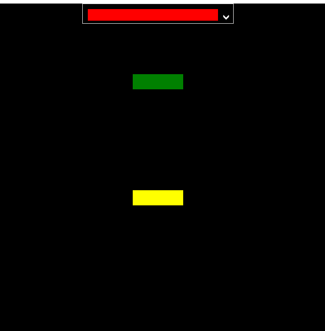
前台Xaml
<control:ColorPicker x:Name="colorPicker" Width="300" Height="40" Opacity="0" Closed="colorPicker_Closed" SelectedColorChanged="colorPicker_SelectedColorChanged" Placement="BottomCenter" HorizontalAlignment="Center" VerticalAlignment="Top" SelectedColor="Transparent" ArrowVisibility="Visible"/>
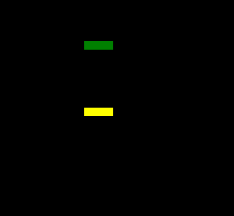
<Rectangle x:Name="rectangle1" Width="100" Height="30" Margin="100" Fill="Green" Tapped="Rectangle_Tapped"/>
<Rectangle x:Name="rectangle2" Width="100" Height="30" Margin="100" Fill="Yellow" Tapped="Rectangle_Tapped"/>
後台cs
         private void Rectangle_Tapped(object sender, TappedRoutedEventArgs e)
        {
            colorPicker.Placement = AdvancedFlyoutPlacementMode.RightCenter;
            colorPicker.PlacementTarget = (sender as FrameworkElement);
            colorPicker.Owner = sender;
            colorPicker.Show();

        }

        private void colorPicker_SelectedColorChanged(object sender, EventArgs e)
        {
            if (colorPicker.Owner!=null)
            {
                (colorPicker.Owner as Rectangle).Fill = new SolidColorBrush(colorPicker.SelectedColor);
                colorPicker.Owner = null;
            }
        }

        private void colorPicker_Closed(object sender, object e)
        {
            colorPicker.PlacementTarget = null;
        }
總結
其實ColorPicker這個控件總體來說還是比較簡單的,搞清楚UI 和HSL算法就ok。對了Colorpicker是固定了主題Light和大小的,黑色主題太丑了,而且會使色塊看著及其不爽,所以背景和主題以及大小我都是寫死了的。
AdvancedFlyout
背景
做這個東西,是被微軟逼的。
10586 和 14393上面Flyout這個控件 行為上有很大區別。
主要問題是在10586上面,不能支持同時2個Flyout打開,就是說打開一個。再打開下一個的時候會關閉上一個。
沒辦法,只有自己搞一個。
AdvancedFlyoutBase/AdvancedFlyout
把微軟的FlyoutBase/Floyout 屬性方法都搞過來,我們自己用Popup來實現。
    /// <summary>
    /// to solve issue that can't open two flyouts in 10586.
    /// </summary>
    [ContentProperty(Name = nameof(Content))]
    public class AdvancedFlyout : AdvancedFlyoutBase
    {
        public UIElement Content { get; set; }
        /// <summary>
        /// FlyoutPresenter Style
        /// </summary>
        public Style FlyoutPresenterStyle { get; set; }

        protected override Control CreatePresenter()
        {
            var fp = base.CreatePresenter() as FlyoutPresenter;
            if (FlyoutPresenterStyle != null)
            {
                fp.Style = FlyoutPresenterStyle;
            }
            fp.Content = Content;
            return fp;
        }
    }
主要的實現在於控制Popup的位置。
AdvancedFlyoutBase 裡面我添加了
FlyoutBase 沒有的三個屬性:
IsLightDismissEnabled
VerticalOffset
HorizontalOffset
這3個屬性都是Popup的。主要是在Placement的基准上再給於用戶微調的權利。PlacementMode是一個枚舉,比微軟的分的更細。
    public enum AdvancedFlyoutPlacementMode
    {
        TopLeft = 0,
        TopCenter,
        TopRight,

        BottomLeft,
        BottomCenter,
        BottomRight,

        LeftTop,
        LeftCenter,
        LeftBottom,

        RightTop,
        RightCenter,
        RightBottom,

        FullScreen,
        CenterScreen,
    }
我們在ShowAt方法中來實現計算Popup的具體位置
        public void ShowAt(FrameworkElement placementTarget)
        {
            if (Opening != null)
            {
                Opening(this, null);
            }

            if (_popup == null)
            {
                _popup = new Popup();
                _popup.ChildTransitions = new TransitionCollection() { new PopupThemeTransition() };
                _popup.Opened += _popup_Opened;
                _popup.Closed += _popup_Closed;
                _popup.Child = CreatePresenter();
            }
            reCalculatePopupPosition = !CalculatePopupPosition(placementTarget);
            _popup.IsLightDismissEnabled = IsLightDismissEnabled;
            this.placementTarget = placementTarget;
            if (reCalculatePopupPosition || FlyoutPresenter.Style == null)
            {
                _popup.Opacity = 0;
            }

            _popup.HorizontalOffset += HorizontalOffset;
            _popup.VerticalOffset += VerticalOffset;

            _popup.IsOpen = true;
        }
其中CalculatePopupPosition 是我們的重中之重。
我們計算Popup的位置需要參考下面幾樣:
1.PlacementTarget在頁面上的位置
其實就是控件相對於Window的位置,由以下代碼獲得
var placementTargetRect = placementTarget.TransformToVisual(Window.Current.Content as FrameworkElement).TransformBounds(new Rect(0, 0, placementTarget.ActualWidth, placementTarget.ActualHeight));
2.彈出頁面的大小
FlyoutPresenter的實際大小,由以下代碼獲得
                var fp = FlyoutPresenter;
                fp.Width = double.NaN;
                fp.Height = double.NaN;
                if (fp.DesiredSize == fpSize)
                {
                    fp.Measure(new Size(double.PositiveInfinity, double.PositiveInfinity));
                }

                fpSize = fp.DesiredSize;
3.Window 的大小
var windowSize = new Size(Window.Current.Bounds.Width, Window.Current.Bounds.Height);
有了之上3個參考數據,那麼我們就很容易來計算出Popup顯示的位置,
下面以Top為例:
        private bool TryHandlePlacementTop(Rect placementTargetRect, Size fpSize, Size windowSize)
        {
            if (placementTargetRect.Y - fpSize.Height < 0)
            {
                return false;
            }

            double x = 0;

            _popup.VerticalOffset = placementTargetRect.Y - fpSize.Height;

            if (fpSize.Width > windowSize.Width)
            {
                _popup.HorizontalOffset = 0;
                return true;
            }

            switch (Placement)
            {
                case AdvancedFlyoutPlacementMode.TopLeft:
                    x = placementTargetRect.X;
                    break;
                case AdvancedFlyoutPlacementMode.TopCenter:
                    x = placementTargetRect.X + placementTargetRect.Width / 2 - fpSize.Width / 2;
                    if (x < 0)
                    {
                        x = 0;
                    }
                    break;
                case AdvancedFlyoutPlacementMode.TopRight:
                    x = placementTargetRect.X + placementTargetRect.Width - fpSize.Width;
                    if (x < 0)
                    {
                        x = 0;
                    }
                    break;
                default:
                    goto case AdvancedFlyoutPlacementMode.TopCenter;
            }


            if (x + fpSize.Width > windowSize.Width)
            {
                x = windowSize.Width - fpSize.Width;
            }


            _popup.HorizontalOffset = x;
            return true;
        }
如果target控件上面的空間不夠,那麼肯定我們不能把Popup放上面,故return false,再嘗試把Popup放在其他方位上。
如果可以放的話,我們再按照是Left,Center,Right的參考位置來計算,注意我們要考慮到Window的大小,不能超出Window。
最終Top的代碼如下圖
                        case AdvancedFlyoutPlacementMode.TopLeft:
                        case AdvancedFlyoutPlacementMode.TopCenter:
                        case AdvancedFlyoutPlacementMode.TopRight:
                            if (!TryHandlePlacementTop(placementTargetRect, fpSize, windowSize))
                            {
                                if (!TryHandlePlacementBottom(placementTargetRect, fpSize, windowSize))
                                {
                                    if (!TryHandlePlacementLeft(placementTargetRect, fpSize, windowSize))
                                    {
                                        if (!TryHandlePlacementRight(placementTargetRect, fpSize, windowSize))
                                        {
                                            TryHandlePlacementCenterScreen(fpSize, windowSize);
                                        }
                                    }
                                }
                            }

                            break;
在開發過程中發現
如果在Popup Open之前計算FlyoutPresenter的大小,
可能導致Size不正確,如果沒有給FlyoutPresenter 賦Style,這個時候還不會使用默認FlyoutPresenter 的樣式,Pading,Margin這些參數還沒得到賦值。
或者拋異常,比如FlyoutPresenter內部是Pivot的時候會拋異常。
所以我增加了容錯。
在計算出錯或者FlyoutPresenter的Style 為Null的時候,講Popup的Opacity設置為0,
並且在Popup Open之後 重寫計算位置,然後把Popup Opacity設置1.
            if (reCalculatePopupPosition || FlyoutPresenter.Style == null)
            {
                _popup.Opacity = 0;
            }


         private void _popup_Opened(object sender, object e)
        {
            //DesiredSize was not right when style was null before opened
            //we should re-calcuatePopupPosition after FlyoutPresenter get default values from default style or app resource style
            if (FlyoutPresenter.Style == null || reCalculatePopupPosition)
            {
                CalculatePopupPosition(placementTarget);
                _popup.HorizontalOffset += HorizontalOffset;
                _popup.VerticalOffset += VerticalOffset;
                _popup.Opacity = 1;
            }

            if (Opened != null)
            {
                Opened(this, e);
            }

        }
這樣就解決位置不對的問題。。其實我在使用Flyout的時候也遇到過顯示的位置從左上角 跳到正確位置的情況,估計跟我這個原因一樣。。估計微軟也做了容錯。不過沒把Opacity設置一下。
總結
其實在開發中,有時間去抱怨微軟版本控件有問題,不如靜下心來想想其他辦法,也需會比微軟更好的版本,也更容易方便我們自定義。
開源有益,源碼GitHub地址。
最後放上2個控件在項目裡面的合體照。
