 <style>
body{ margin:0; padding:0; font-size:30px; font-weight:bold}
.header{height: 100px;background: #777;}
.content{height:700px;background: #000;}
.left{ width:240px; height:600px; background:#ccc; position:absolute; left:0; top:100}
.main{ height:600px; margin:0 240px; background:#9CF}
.right{ height:600px; width:240px; position:absolute; top:100; right:0; background:#FCC;}
</style>
</head>

<body>
    <div class="header"></div>
        <div class="content">
            <div class="left">left</div>
            <div class="main">main</div>
            <div class="right">right</div>
        </div>
</body>
很簡單的三列布局,為什麼給右邊欄會浮動到下面去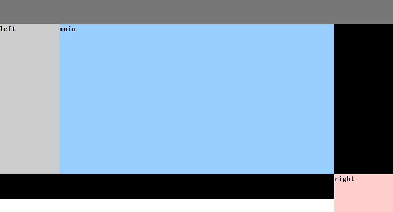
left和right的css添加top:100px,要不沒設置top時,緊跟上一個容器的位置進行定位


