# !pip install brewer2mpl
import numpy as np
import pandas as pd
import matplotlib as mpl
import matplotlib.pyplot as plt
import seaborn as sns
import warnings; warnings.filterwarnings(action='once')
large = 22; med = 16; small = 12
params = {'axes.titlesize': large,
          'legend.fontsize': med,
          'figure.figsize': (16, 10),
          'axes.labelsize': med,
          'axes.titlesize': med,
          'xtick.labelsize': med,
          'ytick.labelsize': med,
          'figure.titlesize': large}
plt.rcParams.update(params)
plt.style.use('seaborn-whitegrid')
sns.set_style("white")
%matplotlib inline
# Version
print(mpl.__version__)  #> 3.0.0
print(sns.__version__) #> 0.9.01. 散點圖
Scatteplot是用於研究兩個變量之間關系的經典和基本圖。如果數據中有多個組,則可能需要以不同顏色可視化每個組。在Matplotlib,你可以方便地使用。
# Import dataset
midwest = pd.read_csv("https://raw.githubusercontent.com/selva86/datasets/master/midwest_filter.csv")
# Prepare Data
# Create as many colors as there are unique midwest['category']
categories = np.unique(midwest['category'])
colors = [plt.cm.tab10(i/float(len(categories)-1)) for i in range(len(categories))]
# Draw Plot for Each Category
plt.figure(figsize=(16, 10), dpi= 80, facecolor='w', edgecolor='k')
for i, category in enumerate(categories):
    plt.scatter('area', 'poptotal',
                data=midwest.loc[midwest.category==category, :],
                s=20, c=colors[i], label=str(category))
# Decorations
plt.gca().set(xlim=(0.0, 0.1), ylim=(0, 90000),
              xlabel='Area', ylabel='Population')
plt.xticks(fontsize=12); plt.yticks(fontsize=12)
plt.title("Scatterplot of Midwest Area vs Population", fontsize=22)
plt.legend(fontsize=12)
plt.show() 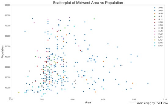
2. 帶邊界的氣泡圖
有時,您希望在邊界內顯示一組點以強調其重要性。在此示例中,您將從應該被環繞的數據幀中獲取記錄,並將其傳遞給下面的代碼中描述的記錄。encircle()
from matplotlib import patches
from scipy.spatial import ConvexHull
import warnings; warnings.simplefilter('ignore')
sns.set_style("white")
# Step 1: Prepare Data
midwest = pd.read_csv("https://raw.githubusercontent.com/selva86/datasets/master/midwest_filter.csv")
# As many colors as there are unique midwest['category']
categories = np.unique(midwest['category'])
colors = [plt.cm.tab10(i/float(len(categories)-1)) for i in range(len(categories))]
# Step 2: Draw Scatterplot with unique color for each category
fig = plt.figure(figsize=(16, 10), dpi= 80, facecolor='w', edgecolor='k')
for i, category in enumerate(categories):
    plt.scatter('area', 'poptotal', data=midwest.loc[midwest.category==category, :], s='dot_size', c=colors[i], label=str(category), edgecolors='black', linewidths=.5)
# Step 3: Encircling
# https://stackoverflow.com/questions/44575681/how-do-i-encircle-different-data-sets-in-scatter-plot
def encircle(x,y, ax=None, **kw):
    if not ax: ax=plt.gca()
    p = np.c_[x,y]
    hull = ConvexHull(p)
    poly = plt.Polygon(p[hull.vertices,:], **kw)
    ax.add_patch(poly)
# Select data to be encircled
midwest_encircle_data = midwest.loc[midwest.state=='IN', :]
# Draw polygon surrounding vertices
encircle(midwest_encircle_data.area, midwest_encircle_data.poptotal, ec="k", fc="gold", alpha=0.1)
encircle(midwest_encircle_data.area, midwest_encircle_data.poptotal, ec="firebrick", fc="none", linewidth=1.5)
# Step 4: Decorations
plt.gca().set(xlim=(0.0, 0.1), ylim=(0, 90000),
              xlabel='Area', ylabel='Population')
plt.xticks(fontsize=12); plt.yticks(fontsize=12)
plt.title("Bubble Plot with Encircling", fontsize=22)
plt.legend(fontsize=12)
plt.show() 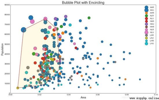
3. 帶線性回歸最佳擬合線的散點圖
如果你想了解兩個變量如何相互改變,那麼最合適的線就是要走的路。下圖顯示了數據中各組之間最佳擬合線的差異。要禁用分組並僅為整個數據集繪制一條最佳擬合線,請從下面的調用中刪除該參數。
# Import Data
df = pd.read_csv("https://raw.githubusercontent.com/selva86/datasets/master/mpg_ggplot2.csv")
df_select = df.loc[df.cyl.isin([4,8]), :]
# Plot
sns.set_style("white")
gridobj = sns.lmplot(x="displ", y="hwy", hue="cyl", data=df_select,
                     height=7, aspect=1.6, robust=True, palette='tab10',
                     scatter_kws=dict(s=60, linewidths=.7, edgecolors='black'))
# Decorations
gridobj.set(xlim=(0.5, 7.5), ylim=(0, 50))
plt.title("Scatterplot with line of best fit grouped by number of cylinders", fontsize=20)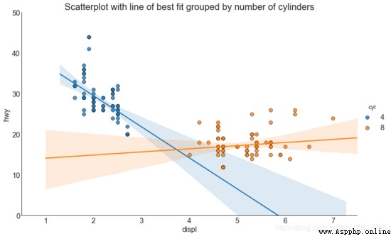
每個回歸線都在自己的列中
或者,您可以在其自己的列中顯示每個組的最佳擬合線。你可以通過在裡面設置參數來實現這一點。
# Import Data
df = pd.read_csv("https://raw.githubusercontent.com/selva86/datasets/master/mpg_ggplot2.csv")
df_select = df.loc[df.cyl.isin([4,8]), :]
# Each line in its own column
sns.set_style("white")
gridobj = sns.lmplot(x="displ", y="hwy",
                     data=df_select,
                     height=7,
                     robust=True,
                     palette='Set1',
                     col="cyl",
                     scatter_kws=dict(s=60, linewidths=.7, edgecolors='black'))
# Decorations
gridobj.set(xlim=(0.5, 7.5), ylim=(0, 50))
plt.show()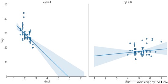
4. 抖動圖
通常,多個數據點具有完全相同的X和Y值。結果,多個點相互繪制並隱藏。為避免這種情況,請稍微抖動點,以便您可以直觀地看到它們。這很方便使用
# Import Data
df = pd.read_csv("https://raw.githubusercontent.com/selva86/datasets/master/mpg_ggplot2.csv")
# Draw Stripplot
fig, ax = plt.subplots(figsize=(16,10), dpi= 80)
sns.stripplot(df.cty, df.hwy, jitter=0.25, size=8, ax=ax, linewidth=.5)
# Decorations
plt.title('Use jittered plots to avoid overlapping of points', fontsize=22)
plt.show()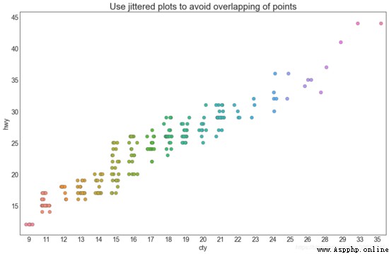
5. 計數圖
避免點重 疊問題的另一個選擇是增加點的大小,這取決於該點中有多少點。因此,點的大小越大,周圍的點的集中度就越大。
# Import Data
df = pd.read_csv("https://raw.githubusercontent.com/selva86/datasets/master/mpg_ggplot2.csv")
df_counts = df.groupby(['hwy', 'cty']).size().reset_index(name='counts')
# Draw Stripplot
fig, ax = plt.subplots(figsize=(16,10), dpi= 80)
sns.stripplot(df_counts.cty, df_counts.hwy, size=df_counts.counts*2, ax=ax)
# Decorations
plt.title('Counts Plot - Size of circle is bigger as more points overlap', fontsize=22)
plt.show()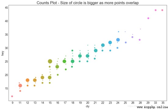
6. 邊緣直方圖
邊緣直方圖具有沿X和Y軸變量的直方圖。這用於可視化X和Y之間的關系以及單獨的X和Y的單變量分布。該圖如果經常用於探索性數據分析(EDA)。
# Import Data
df = pd.read_csv("https://raw.githubusercontent.com/selva86/datasets/master/mpg_ggplot2.csv")
# Create Fig and gridspec
fig = plt.figure(figsize=(16, 10), dpi= 80)
grid = plt.GridSpec(4, 4, hspace=0.5, wspace=0.2)
# Define the axes
ax_main = fig.add_subplot(grid[:-1, :-1])
ax_right = fig.add_subplot(grid[:-1, -1], xticklabels=[], yticklabels=[])
ax_bottom = fig.add_subplot(grid[-1, 0:-1], xticklabels=[], yticklabels=[])
# Scatterplot on main ax
ax_main.scatter('displ', 'hwy', s=df.cty*4, c=df.manufacturer.astype('category').cat.codes, alpha=.9, data=df, cmap="tab10", edgecolors='gray', linewidths=.5)
# histogram on the right
ax_bottom.hist(df.displ, 40, histtype='stepfilled', orientation='vertical', color='deeppink')
ax_bottom.invert_yaxis()
# histogram in the bottom
ax_right.hist(df.hwy, 40, histtype='stepfilled', orientation='horizontal', color='deeppink')
# Decorations
ax_main.set(title='Scatterplot with Histograms   displ vs hwy', xlabel='displ', ylabel='hwy')
ax_main.title.set_fontsize(20)
for item in ([ax_main.xaxis.label, ax_main.yaxis.label] + ax_main.get_xticklabels() + ax_main.get_yticklabels()):
    item.set_fontsize(14)
xlabels = ax_main.get_xticks().tolist()
ax_main.set_xticklabels(xlabels)
plt.show()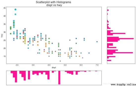
7.邊緣箱形圖
邊緣箱圖與邊緣直方圖具有相似的用途。然而,箱線圖有助於精確定位X和Y的中位數,第25和第75百分位數。
# Import Data
df = pd.read_csv("https://raw.githubusercontent.com/selva86/datasets/master/mpg_ggplot2.csv")
# Create Fig and gridspec
fig = plt.figure(figsize=(16, 10), dpi= 80)
grid = plt.GridSpec(4, 4, hspace=0.5, wspace=0.2)
# Define the axes
ax_main = fig.add_subplot(grid[:-1, :-1])
ax_right = fig.add_subplot(grid[:-1, -1], xticklabels=[], yticklabels=[])
ax_bottom = fig.add_subplot(grid[-1, 0:-1], xticklabels=[], yticklabels=[])
# Scatterplot on main ax
ax_main.scatter('displ', 'hwy', s=df.cty*5, c=df.manufacturer.astype('category').cat.codes, alpha=.9, data=df, cmap="Set1", edgecolors='black', linewidths=.5)
# Add a graph in each part
sns.boxplot(df.hwy, ax=ax_right, orient="v")
sns.boxplot(df.displ, ax=ax_bottom, orient="h")
# Decorations ------------------
# Remove x axis name for the boxplot
ax_bottom.set(xlabel='')
ax_right.set(ylabel='')
# Main Title, Xlabel and YLabel
ax_main.set(title='Scatterplot with Histograms   displ vs hwy', xlabel='displ', ylabel='hwy')
# Set font size of different components
ax_main.title.set_fontsize(20)
for item in ([ax_main.xaxis.label, ax_main.yaxis.label] + ax_main.get_xticklabels() + ax_main.get_yticklabels()):
    item.set_fontsize(14)
plt.show()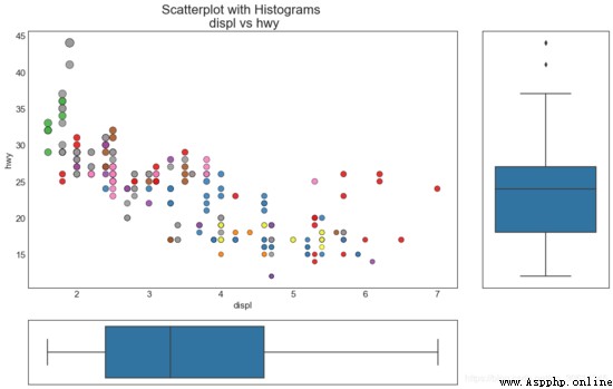
8. 相關圖
Correlogram用於直觀地查看給定數據幀(或2D數組)中所有可能的數值變量對之間的相關度量。
# Import Dataset
df = pd.read_csv("https://github.com/selva86/datasets/raw/master/mtcars.csv")
# Plot
plt.figure(figsize=(12,10), dpi= 80)
sns.heatmap(df.corr(), xticklabels=df.corr().columns, yticklabels=df.corr().columns, cmap='RdYlGn', center=0, annot=True)
# Decorations
plt.title('Correlogram of mtcars', fontsize=22)
plt.xticks(fontsize=12)
plt.yticks(fontsize=12)
plt.show()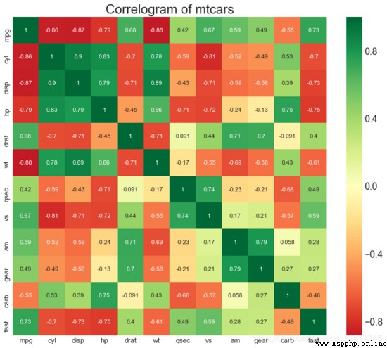
9. 矩陣圖
成對圖是探索性分析中的最愛,以理解所有可能的數字變量對之間的關系。它是雙變量分析的必備工具。
# Load Dataset
df = sns.load_dataset('iris')
# Plot
plt.figure(figsize=(10,8), dpi= 80)
sns.pairplot(df, kind="scatter", hue="species", plot_kws=dict(s=80, edgecolor="white", linewidth=2.5))
plt.show()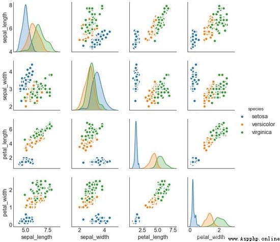
# Load Dataset
df = sns.load_dataset('iris')
# Plot
plt.figure(figsize=(10,8), dpi= 80)
sns.pairplot(df, kind="reg", hue="species")
plt.show()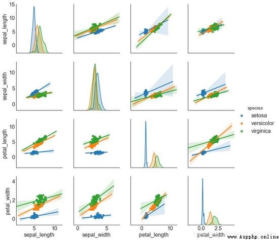
偏差
10. 發散型條形圖
如果您想根據單個指標查看項目的變化情況,並可視化此差異的順序和數量,那麼發散條是一個很好的工具。它有助於快速區分數據中組的性能,並且非常直觀,並且可以立即傳達這一點。
# Prepare Data
df = pd.read_csv("https://github.com/selva86/datasets/raw/master/mtcars.csv")
x = df.loc[:, ['mpg']]
df['mpg_z'] = (x - x.mean())/x.std()
df['colors'] = ['red' if x < 0 else 'green' for x in df['mpg_z']]
df.sort_values('mpg_z', inplace=True)
df.reset_index(inplace=True)
# Draw plot
plt.figure(figsize=(14,10), dpi= 80)
plt.hlines(y=df.index, xmin=0, xmax=df.mpg_z, color=df.colors, alpha=0.4, linewidth=5)
# Decorations
plt.gca().set(ylabel='$Model$', xlabel='$Mileage$')
plt.yticks(df.index, df.cars, fontsize=12)
plt.title('Diverging Bars of Car Mileage', fontdict={'size':20})
plt.grid(linestyle='--', alpha=0.5)
plt.show()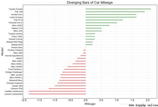
11. 發散型文本
分散的文本類似於發散條,如果你想以一種漂亮和可呈現的方式顯示圖表中每個項目的價值,它更喜歡。
# Prepare Data
df = pd.read_csv("https://github.com/selva86/datasets/raw/master/mtcars.csv")
x = df.loc[:, ['mpg']]
df['mpg_z'] = (x - x.mean())/x.std()
df['colors'] = ['red' if x < 0 else 'green' for x in df['mpg_z']]
df.sort_values('mpg_z', inplace=True)
df.reset_index(inplace=True)
# Draw plot
plt.figure(figsize=(14,14), dpi= 80)
plt.hlines(y=df.index, xmin=0, xmax=df.mpg_z)
for x, y, tex in zip(df.mpg_z, df.index, df.mpg_z):
    t = plt.text(x, y, round(tex, 2), horizontalalignment='right' if x < 0 else 'left',
                 verticalalignment='center', fontdict={'color':'red' if x < 0 else 'green', 'size':14})
# Decorations
plt.yticks(df.index, df.cars, fontsize=12)
plt.title('Diverging Text Bars of Car Mileage', fontdict={'size':20})
plt.grid(linestyle='--', alpha=0.5)
plt.xlim(-2.5, 2.5)
plt.show()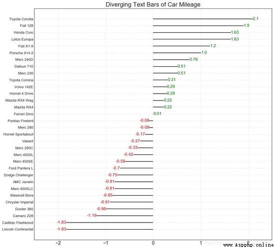
25個Matplotlib圖騰訊文檔-在線文檔 https://docs.qq.com/doc/DT21QdURUY3Z6TEdM