簡書地址:https://www.jianshu.com/u/40ac87350697
簡單幾步,通過Python對B站番劇排行數據進行爬取,並進行可視化分析
源碼文件可以參考Github上傳的項目:https://github.com/Lemon-Sheep/Py/tree/master
下面,我們開始吧!
PS: 作為Python爬蟲初學者,如有不正確的地方,望各路大神不吝賜教[抱拳]
本項目將會對B站番劇排行的數據進行網頁信息爬取以及數據可視化分析
requests、pandas、BeautifulSoup、matplotlib等
因為這是第三方庫,所以我們需要額外下載
下載有兩種方法(以requests為例,其余庫的安裝方法類似):
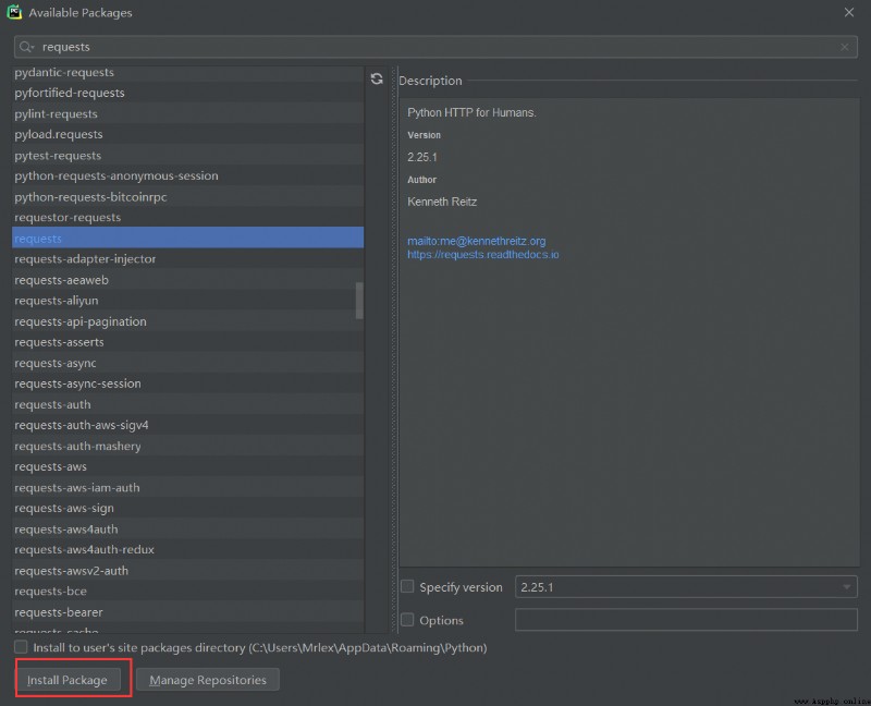
前提:裝了pip( Python 包管理工具,提供了對Python 包的查找、下載、安裝、卸載的功能。 )
pip install requests
第一步:編譯器左上角File–>Settings…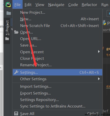
第二步:找到Project Interpreter 點擊右上角加號按鈕,彈出界面上方搜索庫名:requests,點擊左下角Install ,當提示successfully時,即安裝完成。
def get_html(url):
try:
r = requests.get(url) # 使用get來獲取網頁數據
r.raise_for_status() # 如果返回參數不為200,拋出異常
r.encoding = r.apparent_encoding # 獲取網頁編碼方式
return r.text # 返回獲取的內容
except:
return '錯誤'
我們來看爬取情況,是否有我們想要的內容:
def main():
url = 'https://www.bilibili.com/v/popular/rank/bangumi' # 網址
html = get_html(url) # 獲取返回值
print(html) # 打印
if __name__ == '__main__': #入口
main()
爬取結果如下圖所示: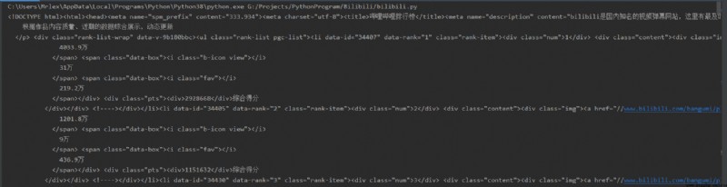
成功!
第一步,先構建BeautifulSoup實例
soup = BeautifulSoup(html, 'html.parser') # 指定BeautifulSoup的解析器
第二步,初始化要存入信息的容器
# 定義好相關列表准備存儲相關信息
TScore = [] # 綜合評分
name = [] # 動漫名字
play= [] # 播放量
review = [] # 評論數
favorite= [] # 收藏數
第三步,開始信息整理
我們先獲取番劇的名字,並將它們先存進列表中
# ******************************************** 動漫名字存儲
for tag in soup.find_all('div', class_='info'):
# print(tag)
bf = tag.a.string
name.append(str(bf))
print(name)
此處我們用到了beautifulsoup的find_all()來進行解析。在這裡,find_all()的第一個參數是標簽名,第二個是標簽中的class值(注意下劃線哦(class_=‘info’))。
我們在網頁界面按下F12,就能看到網頁代碼,找到相應位置,就能清晰地看見相關信息: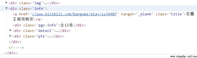
接著,我們用幾乎相同的方法來對綜合評分、播放量,評論數和收藏數來進行提取
# ******************************************** 播放量存儲
for tag in soup.find_all('div', class_='detail'):
# print(tag)
bf = tag.find('span', class_='data-box').get_text()
# 統一單位為‘萬’
if '億' in bf:
num = float(re.search(r'd(.d)?', bf).group()) * 10000
# print(num)
bf = num
else:
bf = re.search(r'd*(.)?d', bf).group()
play.append(float(bf))
print(play)
# ******************************************** 評論數存儲
for tag in soup.find_all('div', class_='detail'):
# pl = tag.span.next_sibling.next_sibling
pl = tag.find('span', class_='data-box').next_sibling.next_sibling.get_text()
# *********統一單位
if '萬' not in pl:
pl = '%.1f' % (float(pl) / 10000)
# print(123, pl)
else:
pl = re.search(r'd*(.)?d', pl).group()
review.append(float(pl))
print(review)
# ******************************************** 收藏數
for tag in soup.find_all('div', class_='detail'):
sc = tag.find('span', class_='data-box').next_sibling.next_sibling.next_sibling.next_sibling.get_text()
sc = re.search(r'd*(.)?d', sc).group()
favorite.append(float(sc))
print(favorite)
# ******************************************** 綜合評分
for tag in soup.find_all('div', class_='pts'):
zh = tag.find('div').get_text()
TScore.append(int(zh))
print('綜合評分', TScore)
其中有個.next_sibling是用於提取同級別的相同標簽信息,如若沒有這個方法,當它找到第一個’span’標簽之後,就不會繼續找下去了(根據具體情況來疊加使用此方法);
還用到了正則表達式來提取信息(需要導入庫‘re’)
最後我們將提取的信息,存進excel表格之中,並返回結果集
# 存儲至excel表格中
info = {'動漫名': name, '播放量(萬)': play, '評論數(萬)': review,'收藏數(萬)': favorite, '綜合評分': TScore}
dm_file = pandas.DataFrame(info)
dm_file.to_excel('Dongman.xlsx', sheet_name="動漫數據分析")
# 將所有列表返回
return name, play, review, favorite, TScore
我們可以打開文件看一看存儲的信息格式(雙擊打開)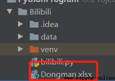
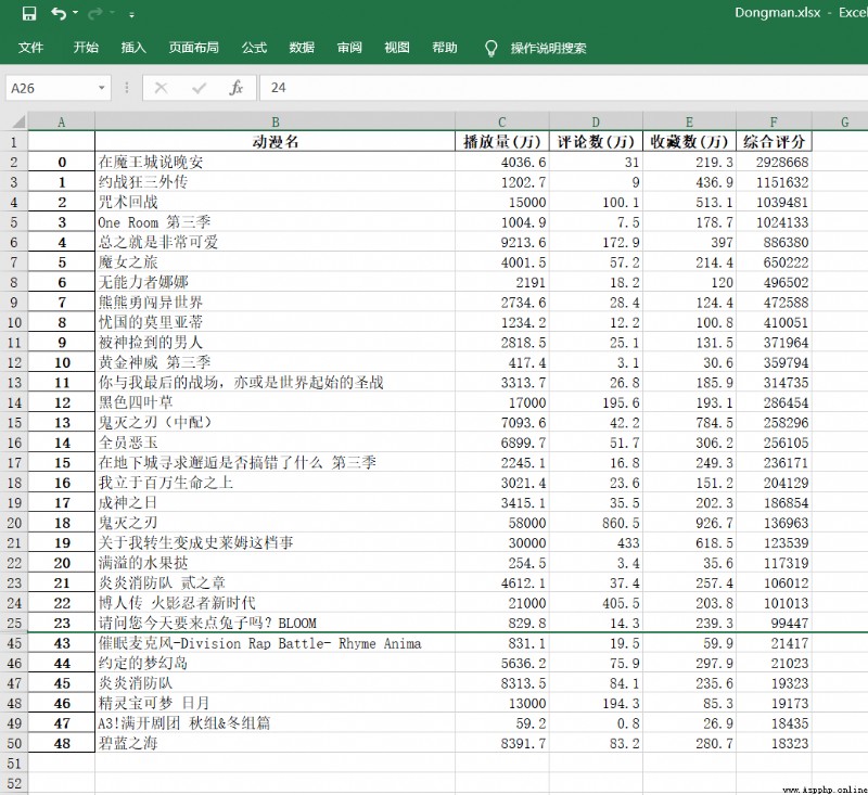
成功!
我們先做一些基礎設置
要先准備一個文件: STHeiti Medium.ttc [注意存放在項目中的位置]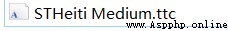
my_font = font_manager.FontProperties(fname='./data/STHeiti Medium.ttc') # 設置中文字體(圖表中能顯示中文)
# 為了坐標軸上能顯示中文
plt.rcParams['font.sans-serif'] = ['SimHei']
plt.rcParams['axes.unicode_minus'] = False
dm_name = info[0] # 番劇名
dm_play = info[1] # 番劇播放量
dm_review = info[2] # 番劇評論數
dm_favorite = info[3] # 番劇收藏數
dm_com_score = info[4] # 番劇綜合評分
# print(dm_com_score)
然後,開始使用matplot來繪制圖形,實現數據可視化分析
文中有詳細注釋,這裡就不再贅述了,聰明的你一定一看就懂了~
# **********************************************************************綜合評分和播放量對比
# *******綜合評分條形圖
fig, ax1 = plt.subplots()
plt.bar(dm_name, dm_com_score, color='red') #設置柱狀圖
plt.title('綜合評分和播放量數據分析', fontproperties=my_font) # 表標題
ax1.tick_params(labelsize=6)
plt.xlabel('番劇名') # 橫軸名
plt.ylabel('綜合評分') # 縱軸名
plt.xticks(rotation=90, color='green') # 設置橫坐標變量名旋轉度數和顏色
# *******播放量折線圖
ax2 = ax1.twinx() # 組合圖必須加這個
ax2.plot(dm_play, color='cyan') # 設置線粗細,節點樣式
plt.ylabel('播放量') # y軸
plt.plot(1, label='綜合評分', color="red", linewidth=5.0) # 圖例
plt.plot(1, label='播放量', color="cyan", linewidth=1.0, line) # 圖例
plt.legend()
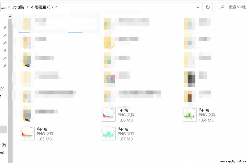
plt.savefig(r'E:1.png', dpi=1000, bbox_inches='tight') #保存至本地
plt.show()
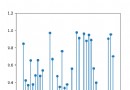
來看看效果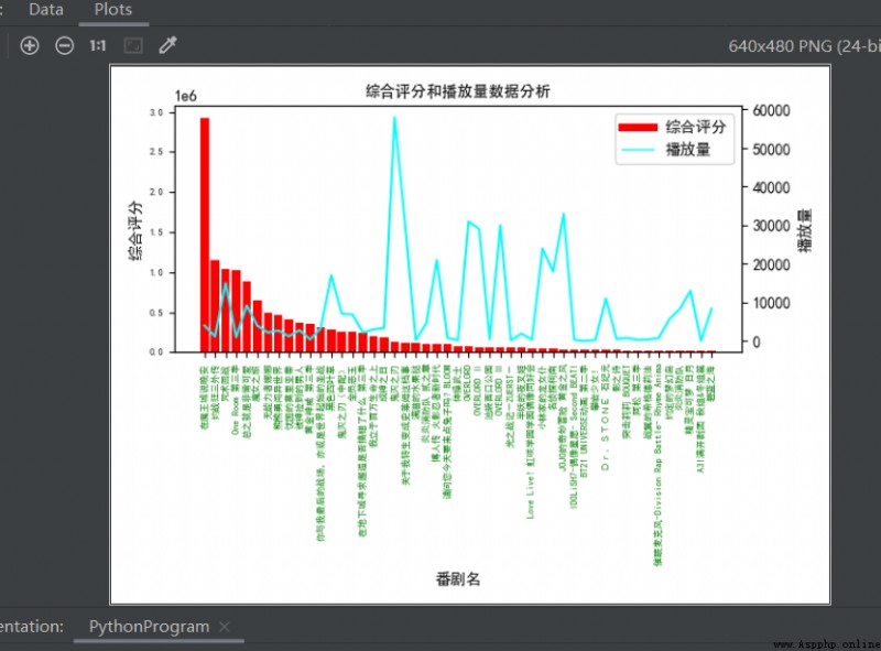
有沒有瞬間就感覺高大上~~了(嘿嘿~)
然後我們用相同的方法來多繪制幾個對比圖:
# **********************************************************************評論數和收藏數對比
# ********評論數條形圖
fig, ax3 = plt.subplots()
plt.bar(dm_name, dm_review, color='green')
plt.title('番劇評論數和收藏數分析')
plt.ylabel('評論數(萬)')
ax3.tick_params(labelsize=6)
plt.xticks(rotation=90, color='green')
# *******收藏數折線圖
ax4 = ax3.twinx() # 組合圖必須加這個
ax4.plot(dm_favorite, color='yellow') # 設置線粗細,節點樣式
plt.ylabel('收藏數(萬)')
plt.plot(1, label='評論數', color="green", linewidth=5.0)
plt.plot(1, label='收藏數', color="yellow", linewidth=1.0, line)
plt.legend()
plt.savefig(r'E:2.png', dpi=1000, bbox_inches='tight')
# **********************************************************************綜合評分和收藏數對比
# *******綜合評分條形圖
fig, ax5 = plt.subplots()
plt.bar(dm_name, dm_com_score, color='red')
plt.title('綜合評分和收藏數量數據分析')
plt.ylabel('綜合評分')
ax5.tick_params(labelsize=6)
plt.xticks(rotation=90, color='green')
# *******收藏折線圖
ax6 = ax5.twinx() # 組合圖必須加這個
ax6.plot(dm_favorite, color='yellow') # 設置線粗細,節點樣式
plt.ylabel('收藏數(萬)')
plt.plot(1, label='綜合評分', color="red", linewidth=5.0)
plt.plot(1, label='收藏數', color="yellow", linewidth=1.0, line)
plt.legend()
plt.savefig(r'E:3.png', dpi=1000, bbox_inches='tight')
# **********************************************************************播放量和評論數對比
# *******播放量條形圖
fig, ax7 = plt.subplots()
plt.bar(dm_name, dm_play, color='cyan')
plt.title('播放量和評論數 數據分析')
plt.ylabel('播放量(萬)')
ax7.tick_params(labelsize=6)
plt.xticks(rotation=90, color='green')
# *******評論數折線圖
ax8 = ax7.twinx() # 組合圖必須加這個
ax8.plot(dm_review, color='green') # 設置線粗細,節點樣式
plt.ylabel('評論數(萬)')
plt.plot(1, label='播放量', color="cyan", linewidth=5.0)
plt.plot(1, label='評論數', color="green", linewidth=1.0, line)
plt.legend()
plt.savefig(r'E:4.png', dpi=1000, bbox_inches='tight')
plt.show()
我們來看看最終效果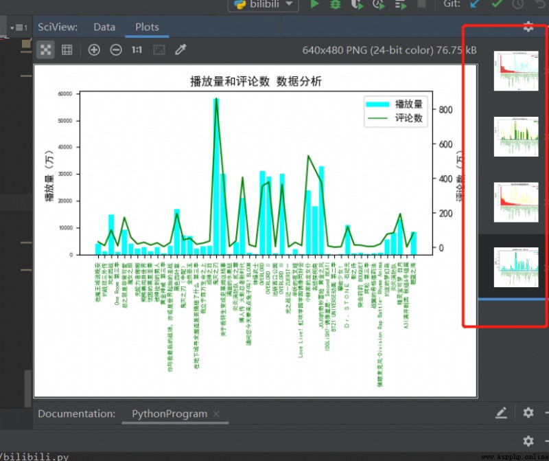
Nice!很完美~ 大家可以根據自己的想法按照相同的方法進行數據組合分析。
最後,附上全部代碼
import re
import pandas
import requests
from bs4 import BeautifulSoup
import matplotlib.pyplot as plt
from matplotlib import font_manager
def get_html(url):
try:
r = requests.get(url) # 使用get來獲取網頁數據
r.raise_for_status() # 如果返回參數不為200,拋出異常
r.encoding = r.apparent_encoding # 獲取網頁編碼方式
return r.text # 返回獲取的內容
except:
return '錯誤'
def save(html):
# 解析網頁
soup = BeautifulSoup(html, 'html.parser') # 指定Beautiful的解析器為“html.parser”
with open('./data/B_data.txt', 'r+', encoding='UTF-8') as f:
f.write(soup.text)
# 定義好相關列表准備存儲相關信息
TScore = [] # 綜合評分
name = [] # 動漫名字
bfl = [] # 播放量
pls = [] # 評論數
scs = [] # 收藏數
# ******************************************** 動漫名字存儲
for tag in soup.find_all('div', class_='info'):
# print(tag)
bf = tag.a.string
name.append(str(bf))
print(name)
# ******************************************** 播放量存儲
for tag in soup.find_all('div', class_='detail'):
# print(tag)
bf = tag.find('span', class_='data-box').get_text()
# 統一單位為‘萬’
if '億' in bf:
num = float(re.search(r'd(.d)?', bf).group()) * 10000
# print(num)
bf = num
else:
bf = re.search(r'd*(.)?d', bf).group()
bfl.append(float(bf))
print(bfl)
# ******************************************** 評論數存儲
for tag in soup.find_all('div', class_='detail'):
# pl = tag.span.next_sibling.next_sibling
pl = tag.find('span', class_='data-box').next_sibling.next_sibling.get_text()
# *********統一單位
if '萬' not in pl:
pl = '%.1f' % (float(pl) / 10000)
# print(123, pl)
else:
pl = re.search(r'd*(.)?d', pl).group()
pls.append(float(pl))
print(pls)
# ******************************************** 收藏數
for tag in soup.find_all('div', class_='detail'):
sc = tag.find('span', class_='data-box').next_sibling.next_sibling.next_sibling.next_sibling.get_text()
sc = re.search(r'd*(.)?d', sc).group()
scs.append(float(sc))
print(scs)
# ******************************************** 綜合評分
for tag in soup.find_all('div', class_='pts'):
zh = tag.find('div').get_text()
TScore.append(int(zh))
print('綜合評分', TScore)
# 存儲至excel表格中
info = {'動漫名': name, '播放量(萬)': bfl, '評論數(萬)': pls, '收藏數(萬)': scs, '綜合評分': TScore}
dm_file = pandas.DataFrame(info)
dm_file.to_excel('Dongman.xlsx', sheet_name="動漫數據分析")
# 將所有列表返回
return name, bfl, pls, scs, TScore
def view(info):
my_font = font_manager.FontProperties(fname='./data/STHeiti Medium.ttc') # 設置中文字體(圖標中能顯示中文)
dm_name = info[0] # 番劇名
dm_play = info[1] # 番劇播放量
dm_review = info[2] # 番劇評論數
dm_favorite = info[3] # 番劇收藏數
dm_com_score = info[4] # 番劇綜合評分
# print(dm_com_score)
# 為了坐標軸上能顯示中文
plt.rcParams['font.sans-serif'] = ['SimHei']
plt.rcParams['axes.unicode_minus'] = False
# **********************************************************************綜合評分和播放量對比
# *******綜合評分條形圖
fig, ax1 = plt.subplots()
plt.bar(dm_name, dm_com_score, color='red') #設置柱狀圖
plt.title('綜合評分和播放量數據分析', fontproperties=my_font) # 表標題
ax1.tick_params(labelsize=6)
plt.xlabel('番劇名') # 橫軸名
plt.ylabel('綜合評分') # 縱軸名
plt.xticks(rotation=90, color='green') # 設置橫坐標變量名旋轉度數和顏色
# *******播放量折線圖
ax2 = ax1.twinx() # 組合圖必須加這個
ax2.plot(dm_play, color='cyan') # 設置線粗細,節點樣式
plt.ylabel('播放量') # y軸
plt.plot(1, label='綜合評分', color="red", linewidth=5.0) # 圖例
plt.plot(1, label='播放量', color="cyan", linewidth=1.0, line) # 圖例
plt.legend()
plt.savefig(r'E:1.png', dpi=1000, bbox_inches='tight') #保存至本地
# plt.show()
# **********************************************************************評論數和收藏數對比
# ********評論數條形圖
fig, ax3 = plt.subplots()
plt.bar(dm_name, dm_review, color='green')
plt.title('番劇評論數和收藏數分析')
plt.ylabel('評論數(萬)')
ax3.tick_params(labelsize=6)
plt.xticks(rotation=90, color='green')
# *******收藏數折線圖
ax4 = ax3.twinx() # 組合圖必須加這個
ax4.plot(dm_favorite, color='yellow') # 設置線粗細,節點樣式
plt.ylabel('收藏數(萬)')
plt.plot(1, label='評論數', color="green", linewidth=5.0)
plt.plot(1, label='收藏數', color="yellow", linewidth=1.0, line)
plt.legend()
plt.savefig(r'E:2.png', dpi=1000, bbox_inches='tight')
# **********************************************************************綜合評分和收藏數對比
# *******綜合評分條形圖
fig, ax5 = plt.subplots()
plt.bar(dm_name, dm_com_score, color='red')
plt.title('綜合評分和收藏數量數據分析')
plt.ylabel('綜合評分')
ax5.tick_params(labelsize=6)
plt.xticks(rotation=90, color='green')
# *******收藏折線圖
ax6 = ax5.twinx() # 組合圖必須加這個
ax6.plot(dm_favorite, color='yellow') # 設置線粗細,節點樣式
plt.ylabel('收藏數(萬)')
plt.plot(1, label='綜合評分', color="red", linewidth=5.0)
plt.plot(1, label='收藏數', color="yellow", linewidth=1.0, line)
plt.legend()
plt.savefig(r'E:3.png', dpi=1000, bbox_inches='tight')
# **********************************************************************播放量和評論數對比
# *******播放量條形圖
fig, ax7 = plt.subplots()
plt.bar(dm_name, dm_play, color='cyan')
plt.title('播放量和評論數 數據分析')
plt.ylabel('播放量(萬)')
ax7.tick_params(labelsize=6)
plt.xticks(rotation=90, color='green')
# *******評論數折線圖
ax8 = ax7.twinx() # 組合圖必須加這個
ax8.plot(dm_review, color='green') # 設置線粗細,節點樣式
plt.ylabel('評論數(萬)')
plt.plot(1, label='播放量', color="cyan", linewidth=5.0)
plt.plot(1, label='評論數', color="green", linewidth=1.0, line)
plt.legend()
plt.savefig(r'E:4.png', dpi=1000, bbox_inches='tight')
plt.show()
def main():
url = 'https://www.bilibili.com/v/popular/rank/bangumi' # 網址
html = get_html(url) # 獲取返回值
# print(html)
info = save(html)
view(info)
if __name__ == '__main__':
main()
關於圖表的分析和得出的結論,這裡就不描述了,一千個讀者就有一千個哈姆雷特,每個人有每個人的分析描述方法,相信你們能有更加透徹的見解分析。
以上就是關於爬蟲以及數據可視化分析的內容,希望能幫到你們!
伙伴們可以到github上查看源碼文件:https://github.com/Lemon-Sheep/Py/tree/master
喜歡記得點個贊哦~