最近工作需要,在做用戶路徑的分析,特此寫下該篇文章記錄一下
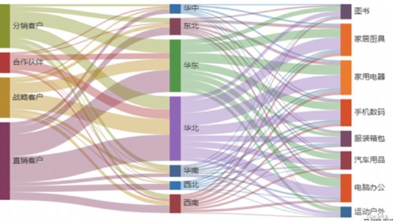
網上主流的桑葚圖大概就是如下圖所示,我們本篇文章也是還原如下效果
實現桑葚圖,我借用了python的pyecharts組件
pyecharts實際上就是Echarts 與 python 的對接
pip3 install pyecharts
pip3 install openpyxl
附上官方文檔:https://gallery.pyecharts.org/#/README
import pandas as pd from pyecharts.charts import Sankey from pyecharts import options as opts import os from pyecharts.charts import Pie,Bar,Map,Page,Funnel def get_data(df): nodes =[] for i in range(2): vales=df.iloc[:,i].unique() for value in vales: dic={
}
dic['name']=value nodes.append(dic) nodes1 = [] for id in nodes: if id not in nodes1: nodes1.append(id) # print(nodes1) links=[] for i in df.values: dic={
}
dic['source']=i[0]
dic['target']=i[1]
dic['value']=i[2]
links.append(dic)
return nodes1,links
# print(links)
def get_tu(tablename,df):
nodes1,links = get_data(df)
sankey = (
Sankey(init_opts=opts.InitOpts(width="2000px", height="800px"))
.add(
tablename,
nodes1,
links,
pos_top="10%",
node_width = 30, #每個桑基圖矩形的寬度
node_gap= 12, #桑基圖中每一列任意兩個矩形節點之間的間隔。
is_draggable = True,
layout_iterations = 5,
# focus_node_adjacency=True,
itemstyle_opts=opts.ItemStyleOpts(border_width=2, border_color="#aaa"),
linestyle_opt=opts.LineStyleOpts(opacity=0.8, curve=0.5, color='source'),
label_opts=opts.LabelOpts(position='right'),
)
.set_global_opts(title_opts=opts.TitleOpts(title="用戶路徑分析"))
)
return sankey
file ='/Users/superyue/Desktop/tu/user2.xlsx'
df_0826 = pd.read_excel(file,sheet_name='result')
sk1 = get_tu('tets',df_0826)
sk1.render("/Users/superyue/Desktop/tu/test.html")
效果如下: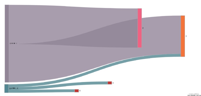
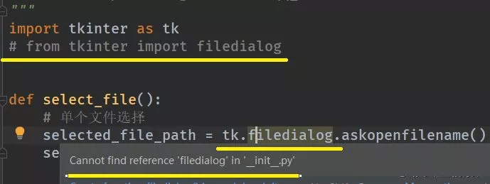
如果出現數據丟進去了,程序也運行成功了,但是效果圖出不來
那麼一定是source和target對應的excel列重復了
以及source或者target列盡量不要出現INT類型的數據(當然也可以通過代碼修改)