導入模塊並加載圖片
提取顏色並整合成表格
繪制圖表
實戰環節
今天小編來為大家分享一個有趣的可視化技巧,如何從圖片中提取顏色然後繪制成可視化圖表,如下圖所示
在示例照片當中有著各種各樣的顏色,我們將通過Python中的可視化模塊以及opencv模塊來識別出圖片當中所有的顏色要素,並且將其添加到可視化圖表的配色當中
那麼按照慣例,第一步一般都是導入模塊,可視化用到的模塊是matplotlib模塊,我們將圖片中的顏色抽取出來之後會保存在顏色映射表中,所以要使用到colormap模塊,同樣也需要導入進來
import numpy as npimport pandas as pdimport matplotlib.pyplot as pltimport matplotlib.patches as patchesimport matplotlib.image as mpimgfrom PIL import Imagefrom matplotlib.offsetbox import OffsetImage, AnnotationBboximport cv2import extcolorsfrom colormap import rgb2hex然後我們先來加載一下圖片,代碼如下
input_name = 'test_1.png'img = plt.imread(input_name)plt.imshow(img)plt.axis('off')plt.show()output

我們調用的是extcolors模塊來從圖片中提取顏色,輸出的結果是RGB形式呈現出來的顏色,代碼如下
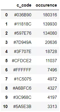
colors_x = extcolors.extract_from_path(img_url, tolerance=12, limit = 12)colors_xoutput
([((3, 107, 144), 180316),
((17, 129, 140), 139930),
((89, 126, 118), 134080),
((125, 148, 154), 20636),
((63, 112, 126), 18728),
((207, 220, 226), 11037),
((255, 255, 255), 7496),
((28, 80, 117), 4972),
((166, 191, 198), 4327),
((60, 150, 140), 4197),
((90, 94, 59), 3313),
((56, 66, 39), 1669)],
538200)
我們將上述的結果整合成一個DataFrame數據集,代碼如下
def color_to_df(input_color): colors_pre_list = str(input_color).replace('([(', '').split(', (')[0:-1] df_rgb = [i.split('), ')[0] + ')' for i in colors_pre_list] df_percent = [i.split('), ')[1].replace(')', '') for i in colors_pre_list] # 將RGB轉換成十六進制的顏色 df_color_up = [rgb2hex(int(i.split(", ")[0].replace("(", "")), int(i.split(", ")[1]), int(i.split(", ")[2].replace(")", ""))) for i in df_rgb] df = pd.DataFrame(zip(df_color_up, df_percent), columns=['c_code', 'occurence']) return df我們嘗試調用上面我們自定義的函數,輸出的結果至DataFrame數據集當中
df_color = color_to_df(colors_x)df_coloroutput
接下來便是繪制圖表的階段了,用到的是matplotlib模塊,代碼如下
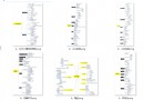
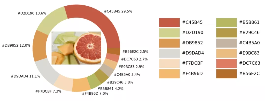
fig, ax = plt.subplots(figsize=(90,90),dpi=10)wedges, text = ax.pie(list_precent, labels= text_c, labeldistance= 1.05, colors = list_color, textprops={'fontsize': 120, 'color':'black'} )plt.setp(wedges, width=0.3)ax.set_aspect("equal")fig.set_facecolor('white')plt.show()output
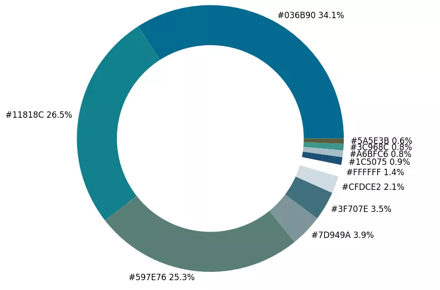
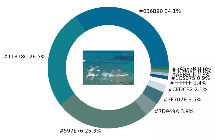
從出來的餅圖中顯示了每種不同顏色的占比,我們更進一步將原圖放置在圓環當中,
imagebox = OffsetImage(img, zoom=2.3)ab = AnnotationBbox(imagebox, (0, 0))ax1.add_artist(ab)output
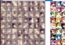
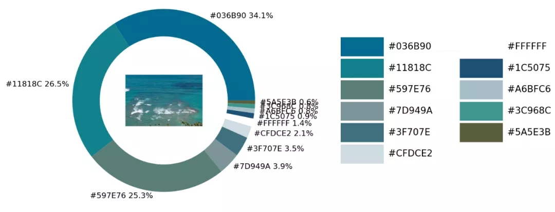
最後制作一張調色盤,將原圖中的各種不同顏色都羅列開來,代碼如下
## 調色盤x_posi, y_posi, y_posi2 = 160, -170, -170for c in list_color: if list_color.index(c) <= 5: y_posi += 180 rect = patches.Rectangle((x_posi, y_posi), 360, 160, facecolor = c) ax2.add_patch(rect) ax2.text(x = x_posi+400, y = y_posi+100, s = c, fontdict={'fontsize': 190}) else: y_posi2 += 180 rect = patches.Rectangle((x_posi + 1000, y_posi2), 360, 160, facecolor = c) ax2.add_artist(rect) ax2.text(x = x_posi+1400, y = y_posi2+100, s = c, fontdict={'fontsize': 190})ax2.axis('off')fig.set_facecolor('white')plt.imshow(bg) plt.tight_layout()output
這一塊兒是實戰環節,我們將上述所有的代碼封裝成一個完整的函數
def exact_color(input_image, resize, tolerance, zoom): output_width = resize img = Image.open(input_image) if img.size[0] >= resize: wpercent = (output_width/float(img.size[0])) hsize = int((float(img.size[1])*float(wpercent))) img = img.resize((output_width,hsize), Image.ANTIALIAS) resize_name = 'resize_'+ input_image img.save(resize_name) else: resize_name = input_image fig.set_facecolor('white') ax2.axis('off') bg = plt.imread('bg.png') plt.imshow(bg) plt.tight_layout() return plt.show()exact_color('test_2.png', 900, 12, 2.5)output
以上就是Python實現提取圖片中顏色並繪制成可視化圖表的詳細內容,更多關於Python提取圖片顏色的資料請關注軟件開發網其它相關文章!