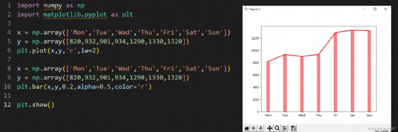
import numpy as np
import matplotlib.pyplot as plt
# Line chart
x = np.array(['Mon','Tue','Wed','Thu','Fri','Sat','Sun'])
y = np.array([820,932,901,934,1290,1330,1320])
plt.plot(x,y,'r',lw=2)
# Histogram aspect
x = np.array(['Mon','Tue','Wed','Thu','Fri','Sat','Sun'])
y = np.array([820,932,901,934,1290,1330,1320])
plt.bar(x,y,0.2,alpha=0.5,color='r')
plt.show()
 After learning Python, I dont want to be a programmer, I only take part-time jobs, hey, its just for fun
現在這個時代,人人開始追求做斜槓青年,多方面開展副業,賺取幾