Signature:
plt.bar(
x,
height,
width=0.8,
bottom=None,
*,
align='center',
data=None,
**kwargs,
)
Docstring:
Make a bar plot.
The bars are positioned at *x* with the given *align*\ment. Their
dimensions are given by *height* and *width*. The vertical baseline
is *bottom* (default 0).
Parameters
----------
x : float or array-like
The x coordinates of the bars. See also *align* for the
alignment of the bars to the coordinates.
height : float or array-like
The height(s) of the bars.
width : float or array-like, default: 0.8
The width(s) of the bars.
bottom : float or array-like, default: 0
The y coordinate(s) of the bars bases.
align : {'center', 'edge'}, default: 'center'
Alignment of the bars to the *x* coordinates:
- 'center': Center the base on the *x* positions.
- 'edge': Align the left edges of the bars with the *x* positions.
To align the bars on the right edge pass a negative *width* and
``align='edge'``.
import matplotlib.pyplot as plt
import numpy as np
# Enter Statistics
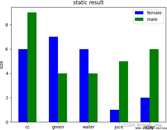
waters = ('cc', 'green', 'water', 'juce', 'other')
buy_number_male = [6, 7, 6, 1, 2]
buy_number_female = [9, 4, 4, 5, 6]
bar_width = 0.3 # Strip width
index_male = np.arange(len(waters)) # Abscissa of the bar chart for boys
index_female = index_male + bar_width # Abscissa of the bar chart for girls
# Use twice bar Function to draw two sets of bar graphs
plt.bar(index_male, height=buy_number_male, width=bar_width, color='b', label='female')
plt.bar(index_female, height=buy_number_female, width=bar_width, color='g', label='male')
plt.xticks(index_male + bar_width/2, waters) # Let the abscissa axis scale display waters Drinking water in , index_male + bar_width/2 The position of the scale for the abscissa
plt.ylabel('size') # Ordinate axis title
plt.title('static result') # Graphic title
plt.legend() # Show Legend
plt.show()
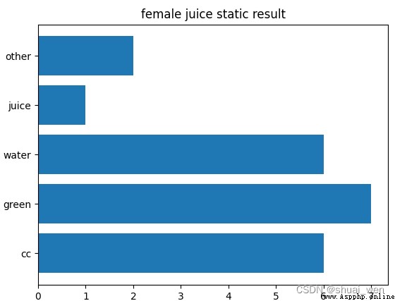
import matplotlib.pyplot as plt
waters = ('cc', 'green', 'water', 'juice', 'other')
buy_number = [6, 7, 6, 1, 2]
plt.barh(waters, buy_number) # Horizontal bar graph function barh
plt.title('female juice static result')
plt.show()
import numpy as np
import matplotlib.pyplot as plt
size = 5
x = np.arange(size)
a = np.random.random(size)
b = np.random.random(size)
plt.bar(x, a, label='a')
plt.bar(x, b, bottom=a, label='b')
plt.legend()
plt.show()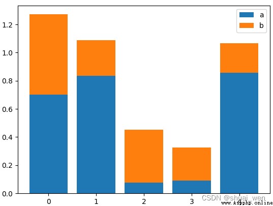
matplotlib mapping —— Histogram - You know
python Draw a bar chart ( Histogram )_ Attitude and work habits determine the height of life blog -CSDN Blog _python Bar chart