菜單收縮有很多種方法具體如何實現還是看個人想法:
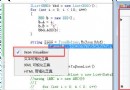
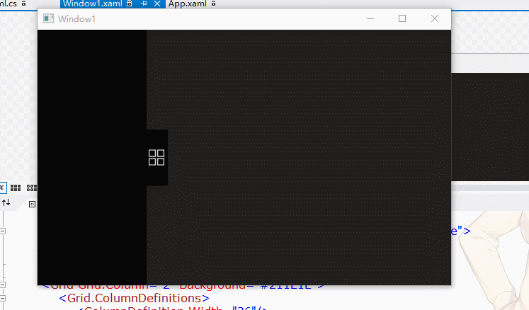
第一種通過後台控制收起與展開:
效果圖:
代碼 :

<Grid>
        <Grid.ColumnDefinitions>
            <ColumnDefinition x:Name="cd" Width="154"/>
            <ColumnDefinition />
        </Grid.ColumnDefinitions>
        <Grid>
            <Grid x:Name="ListMenu" Background="#070607" Focusable="False">

            </Grid>
        </Grid>
        <Grid Grid.Column="2" Background="#211E1E">
            <Grid.ColumnDefinitions>
                <ColumnDefinition Width="36"/>
                <ColumnDefinition Width="*"/>
            </Grid.ColumnDefinitions>
            <Grid  Background="#211E1E">
                <Border Height="80" Width="30" Margin="-6,0,0,0" Background="#070607"
                        MouseLeftButtonDown="No_MouseLeftButtonDown" ToolTip="展開">
                    <Border Height="22" Width="22"  Margin="-2,0,0,0">
                        <Border.Background>
                            <ImageBrush ImageSource="/Image/Open.png"/>
                        </Border.Background>
                    </Border>
                </Border>
            </Grid>
            <Grid Grid.Column="1">

            </Grid>
        </Grid>
    </Grid>
View Code
後台定義:
 private DoubleAnimation c_daListAnimation;
        public bool c_bState = true;//記錄菜單欄狀態 false隱藏 true顯示
View Code
主窗體Loaded和border的MouseLeftButtonDown事件
 void Window1_Loaded(object sender, RoutedEventArgs e)
        {
            c_daListAnimation = new DoubleAnimation();

        }


 private void No_MouseLeftButtonDown(object sender, MouseButtonEventArgs e)
        {
            if (c_bState)
            {

                c_bState = false;
                c_daListAnimation.From = 0;
                c_daListAnimation.To = -154;
                cd.Width = new GridLength(0);
            }
            else
            {
                c_bState = true;
                c_daListAnimation.From = -154;
                c_daListAnimation.To = 0;
                cd.Width = new GridLength(154);
            }

        }
View Code
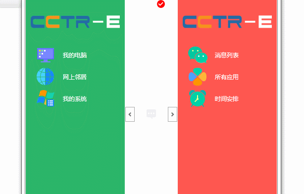
第二種實現方法是通過Expander修改模板實現(效果圖如下)
效果圖:
修改後台模板代碼:
<SolidColorBrush x:Key="Expander.MouseOver.Circle.Stroke" Color="#FF3C7FB1"/>
        <SolidColorBrush x:Key="Expander.MouseOver.Circle.Fill" Color="Transparent"/>
        <SolidColorBrush x:Key="Expander.MouseOver.Arrow.Stroke" Color="#222"/>
        <SolidColorBrush x:Key="Expander.Pressed.Circle.Stroke" Color="#FF526C7B"/>
        <SolidColorBrush x:Key="Expander.Pressed.Circle.Fill" Color="Transparent"/>
        <SolidColorBrush x:Key="Expander.Pressed.Arrow.Stroke" Color="#FF003366"/>
        <SolidColorBrush x:Key="Expander.Disabled.Circle.Stroke" Color="DarkGray"/>
        <SolidColorBrush x:Key="Expander.Disabled.Circle.Fill" Color="Transparent"/>
        <SolidColorBrush x:Key="Expander.Disabled.Arrow.Stroke" Color="#666"/>
        <SolidColorBrush x:Key="Expander.Static.Circle.Fill" Color="Transparent"/>
        <SolidColorBrush x:Key="Expander.Static.Circle.Stroke" Color="DarkGray"/>
        <SolidColorBrush x:Key="Expander.Static.Arrow.Stroke" Color="#666"/>
        <Style x:Key="ExpanderRightHeaderStyle" TargetType="{x:Type ToggleButton}">
            <Setter Property="Template">
                <Setter.Value>
                    <ControlTemplate TargetType="{x:Type ToggleButton}">
                        <Border Padding="{TemplateBinding Padding}">
                            <Grid Background="Transparent" SnapsToDevicePixels="False">

                                <Grid>
                                    <Grid.LayoutTransform>
                                        <TransformGroup>
                                            <TransformGroup.Children>
                                                <TransformCollection>
                                                    <RotateTransform Angle="90"/>
                                                </TransformCollection>
                                            </TransformGroup.Children>
                                        </TransformGroup>
                                    </Grid.LayoutTransform>
                                    <Rectangle x:Name="circle" Fill="{StaticResource Expander.Static.Circle.Fill}" HorizontalAlignment="Center" Height="19" Stroke="{StaticResource Expander.Static.Circle.Stroke}" VerticalAlignment="Center" Width="30"/>
                                    <Path x:Name="arrow" Data="M 1,1.5 L 4.5,5 L 8,1.5" HorizontalAlignment="Center" SnapsToDevicePixels="false" Stroke="{StaticResource Expander.Static.Arrow.Stroke}" StrokeThickness="2" VerticalAlignment="Center"/>
                                </Grid>
                                <ContentPresenter HorizontalAlignment="Center" Margin="0,4,0,0" Grid.Row="1" RecognizesAccessKey="True" SnapsToDevicePixels="True" VerticalAlignment="Top"/>

                            </Grid>
                        </Border>
                        <ControlTemplate.Triggers>
                            <Trigger Property="IsChecked" Value="true">
                                <Setter Property="Data" TargetName="arrow" Value="M 1,4.5  L 4.5,1  L 8,4.5"/>
                            </Trigger>
                            <Trigger Property="IsMouseOver" Value="true">
                                <Setter Property="Stroke" TargetName="circle" Value="{StaticResource Expander.MouseOver.Circle.Stroke}"/>
                                <Setter Property="Fill" TargetName="circle" Value="{StaticResource Expander.MouseOver.Circle.Fill}"/>
                                <Setter Property="Stroke" TargetName="arrow" Value="{StaticResource Expander.MouseOver.Arrow.Stroke}"/>
                            </Trigger>
                            <Trigger Property="IsPressed" Value="true">
                                <Setter Property="StrokeThickness" TargetName="arrow" Value="1.5"/>
                            </Trigger>
                            <Trigger Property="IsEnabled" Value="false">
                                <Setter Property="Stroke" TargetName="circle" Value="{StaticResource Expander.Disabled.Circle.Stroke}"/>
                                <Setter Property="Fill" TargetName="circle" Value="{StaticResource Expander.Disabled.Circle.Fill}"/>
                                <Setter Property="Stroke" TargetName="arrow" Value="{StaticResource Expander.Disabled.Arrow.Stroke}"/>
                            </Trigger>
                        </ControlTemplate.Triggers>
                    </ControlTemplate>
                </Setter.Value>
            </Setter>
        </Style>

        <Style x:Key="ExpanderLeftHeaderStyle" TargetType="{x:Type ToggleButton}">
            <Setter Property="Template">
                <Setter.Value>
                    <ControlTemplate TargetType="{x:Type ToggleButton}">
                        <Border Padding="{TemplateBinding Padding}">
                            <Grid Background="Transparent" SnapsToDevicePixels="False">

                                <Grid>
                                    <Grid.LayoutTransform>
                                        <TransformGroup>
                                            <TransformGroup.Children>
                                                <TransformCollection>
                                                    <RotateTransform Angle="90"/>
                                                </TransformCollection>
                                            </TransformGroup.Children>
                                        </TransformGroup>
                                    </Grid.LayoutTransform>
                                    <Rectangle x:Name="circle" Fill="{StaticResource Expander.Static.Circle.Fill}" HorizontalAlignment="Center" Height="19" Stroke="{StaticResource Expander.Static.Circle.Stroke}" VerticalAlignment="Center" Width="30"/>
                                    <Path x:Name="arrow" Data="M 1,4.5  L 4.5,1  L 8,4.5" HorizontalAlignment="Center" SnapsToDevicePixels="false" Stroke="{StaticResource Expander.Static.Arrow.Stroke}" StrokeThickness="2" VerticalAlignment="Center"/>
                                </Grid>
                                <ContentPresenter HorizontalAlignment="Center" Margin="0,4,0,0" Grid.Row="1" RecognizesAccessKey="True" SnapsToDevicePixels="True" VerticalAlignment="Top"/>

                            </Grid>
                        </Border>
                        <ControlTemplate.Triggers>
                            <Trigger Property="IsChecked" Value="true">
                                <Setter Property="Data" TargetName="arrow" Value="M 1,1.5 L 4.5,5 L 8,1.5"/>
                            </Trigger>
                            <Trigger Property="IsMouseOver" Value="true">
                                <Setter Property="Stroke" TargetName="circle" Value="{StaticResource Expander.MouseOver.Circle.Stroke}"/>
                                <Setter Property="Fill" TargetName="circle" Value="{StaticResource Expander.MouseOver.Circle.Fill}"/>
                                <Setter Property="Stroke" TargetName="arrow" Value="{StaticResource Expander.MouseOver.Arrow.Stroke}"/>
                            </Trigger>
                            <Trigger Property="IsPressed" Value="true">
                                <Setter Property="StrokeThickness" TargetName="arrow" Value="1.5"/>

                            </Trigger>
                            <Trigger Property="IsEnabled" Value="false">
                                <Setter Property="Stroke" TargetName="circle" Value="{StaticResource Expander.Disabled.Circle.Stroke}"/>
                                <Setter Property="Fill" TargetName="circle" Value="{StaticResource Expander.Disabled.Circle.Fill}"/>
                                <Setter Property="Stroke" TargetName="arrow" Value="{StaticResource Expander.Disabled.Arrow.Stroke}"/>
                            </Trigger>
                        </ControlTemplate.Triggers>
                    </ControlTemplate>
                </Setter.Value>
            </Setter>
        </Style>
        <Style x:Key="ExpanderHeaderFocusVisual">
            <Setter Property="Control.Template">
                <Setter.Value>
                    <ControlTemplate>
                        <Border>
                            <Rectangle Margin="0" SnapsToDevicePixels="true" Stroke="Black" StrokeThickness="1" StrokeDashArray="1 2"/>
                        </Border>
                    </ControlTemplate>
                </Setter.Value>
            </Setter>
        </Style>

        <Style x:Key="ExpanderStyle1" TargetType="{x:Type Expander}">
            <Setter Property="Foreground" Value="{DynamicResource {x:Static SystemColors.ControlTextBrushKey}}"/>
            <Setter Property="Background" Value="Transparent"/>
            <Setter Property="HorizontalContentAlignment" Value="Stretch"/>
            <Setter Property="VerticalContentAlignment" Value="Stretch"/>
            <Setter Property="BorderBrush" Value="Transparent"/>
            <Setter Property="BorderThickness" Value="1"/>
            <Setter Property="Template">
                <Setter.Value>
                    <ControlTemplate TargetType="{x:Type Expander}">
                        <Border BorderBrush="{TemplateBinding BorderBrush}" BorderThickness="{TemplateBinding BorderThickness}" Background="{TemplateBinding Background}" CornerRadius="3" SnapsToDevicePixels="true">
                            <DockPanel>
                                <ToggleButton x:Name="HeaderSite"
                                    ContentTemplate="{TemplateBinding HeaderTemplate}"
                                    ContentTemplateSelector="{TemplateBinding HeaderTemplateSelector}"
                                    Content="{TemplateBinding Header}" DockPanel.Dock="Top"
                                    Foreground="{TemplateBinding Foreground}" FontWeight="{TemplateBinding FontWeight}"
                                    FocusVisual Font
                                    FontStretch="{TemplateBinding FontStretch}" FontSize="{TemplateBinding FontSize}"
                                    FontFamily="{TemplateBinding FontFamily}"
                                    HorizontalContentAlignment="{TemplateBinding HorizontalContentAlignment}"
                                    IsChecked="{Binding IsExpanded, Mode=TwoWay, RelativeSource={RelativeSource TemplatedParent}}"
                                    Margin="1" MinWidth="0" MinHeight="0" Padding="{TemplateBinding Padding}"

                                    VerticalContentAlignment="{TemplateBinding VerticalContentAlignment}"/>
                                <ContentPresenter x:Name="ExpandSite" DockPanel.Dock="Bottom" Focusable="false" HorizontalAlignment="{TemplateBinding HorizontalContentAlignment}" Margin="{TemplateBinding Padding}" Visibility="Collapsed" VerticalAlignment="{TemplateBinding VerticalContentAlignment}"/>
                            </DockPanel>
                        </Border>
                        <ControlTemplate.Triggers>
                            <Trigger Property="IsExpanded" Value="true">
                                <Setter Property="Visibility" TargetName="ExpandSite" Value="Visible"/>
                            </Trigger>
                            <Trigger Property="ExpandDirection" Value="Right">
                                <Setter Property="DockPanel.Dock" TargetName="ExpandSite" Value="Right"/>
                                <Setter Property="DockPanel.Dock" TargetName="HeaderSite" Value="Left"/>
                                <Setter Property="Style" TargetName="HeaderSite" Value="{StaticResource ExpanderRightHeaderStyle}"/>
                            </Trigger>
                            <Trigger Property="IsEnabled" Value="false">
                                <Setter Property="Foreground" Value="{DynamicResource {x:Static SystemColors.GrayTextBrushKey}}"/>
                            </Trigger>
                        </ControlTemplate.Triggers>
                    </ControlTemplate>
                </Setter.Value>
            </Setter>
        </Style>
View Code
expander(button樣式自己寫吧)
<Expander  ExpandDirection="Right" Grid.Column="2"  IsExpanded="True">
            <DockPanel Background="#FF5750">
                <Image DockPanel.Dock="Top" Source="Images/AboutLogo.png" Height="50" Width="180" Margin="10,20"/>
                <Button DockPanel.Dock="Top" Foreground="White" Template="{StaticResource IconButtonTemplate}" Margin="0,2">
                    <Button.Content>

                        <StackPanel Orientation="Horizontal" Margin="20,0">
                            <Image Source="Images/WechatBackup.png" Height="40" Width="40"/>
                            <TextBlock Margin="15,0" VerticalAlignment="Center" Text="消息列表"/>
                        </StackPanel>
                    </Button.Content>
                </Button>
                <Button DockPanel.Dock="Top" Foreground="White" Template="{StaticResource IconButtonTemplate}" Margin="0,2">
                    <Button.Content>
                        <StackPanel Orientation="Horizontal" Margin="20,0">
                            <Image Source="Images/QQPCSoftMgr.png" Height="40" Width="40"/>
                            <TextBlock Margin="15,0" VerticalAlignment="Center" Text="所有應用"/>
                        </StackPanel>
                    </Button.Content>
                </Button>
                <Button DockPanel.Dock="Top" Foreground="White" Template="{StaticResource IconButtonTemplate}" Margin="0,2">
                <Button.Content>
                        <StackPanel Orientation="Horizontal" Margin="20,0">
                            <Image Source="Images/QMHealthAssist.png" Height="40" Width="40"/>
                            <TextBlock Margin="15,0" VerticalAlignment="Center" Text="時間安排"/>
                        </StackPanel>
                    </Button.Content>
                </Button>
                <Label/>
            </DockPanel>
        </Expander>
View Code
轉載請注明地址http://www.cnblogs.com/yanjinhua/
