一. 摘要
這篇文章主要是對WPF布局系統做一個較簡單的介紹,大家都知道:UI是做好一個軟件很重要的因素,如果沒有一個漂亮的UI,再怎麼強大的功能也會顯得這個軟件很脆弱且沒有投資價值。本文以總分總的形式展開介紹:首先對WPF Panel做一個總體認識、然後講解各Panel基本用法(分別用XAML和C#兩種方式實現同一個功能,便於大家學習)、布局綜合應用、自定義布局控件以及最後的總結,希望對大家有所幫助。
二. 本文提綱
· 1.摘要
· 2.本文提綱
· 3.總體介紹
· 4.Canvas
· 5.StackPanel
· 6.WrapPanel
· 7.DockPanel
· 8.Grid
· 9.UniformGrid
· 10.ViewBox
· 11.Border
· 12.ScrollViewer
· 13.布局綜合應用
· 14.自定義布局控件
· 15.本文總結
· 16.系列進度
· 17.相關代碼
三. 總體介紹
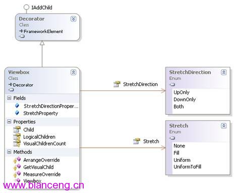
WPF的布局控件都在System.Windows.Controls.Panel這個基類下面,使用 Panel 元素在WPF應用程序中放置和排列子對象。它具體包括哪些布局控件以及如何使用這些布局控件(分別用XAML和C#兩種方式實現同一個功能)、如何開發自定義的布局控件,也就是本文所要討論的范疇:
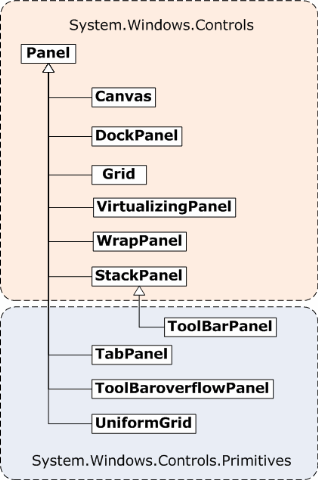
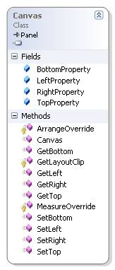
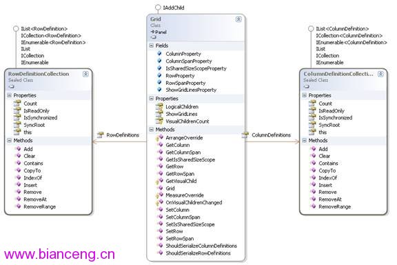
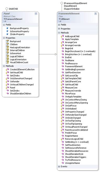
Panel具體繼承關系詳見下面類圖:
如上圖,公共屬性太多了,就簡單介紹幾個常見的屬性:Margin是元素與其他元素的外邊距;Padding是指在本元素內部的元素內容與邊緣的距離;前面這兩個元素基本和ASP.NE中的Margin和Padding類似,只是定義大小的設置不同而已; FlowDirection屬性標示元素的內容顯示方向;Panel.ZIndex是相對於顯示屏的Z軸坐標,用於調整層疊元素的顯示先後;RenderTransform和LayoutTransform用來將縮放和旋轉的變換應用到某個元素上。
一個Panel 的呈現是測量和排列Children子元素、然後在屏幕上繪制它們的過程。所以在布局的過程中會經過一系列的計算,那麼Children 越多,執行的計算次數就越多。如果不需要較為復雜的 Panel(如 Grid和自定義復雜的Panel),則可以使用構造相對簡單的布局(如 Canvas、UniformGrid等),這種布局可帶來更好的性能。 如果有可能,我們應盡量避免不必要地調用 UpdateLayout方法。
每當Panel內的子元素改變其位置時,布局系統就可能觸發一個新的處理過程。對此,了解哪些事件會調用布局系統就很重要,因為不必要的調用可能導致應用程序性能變差。
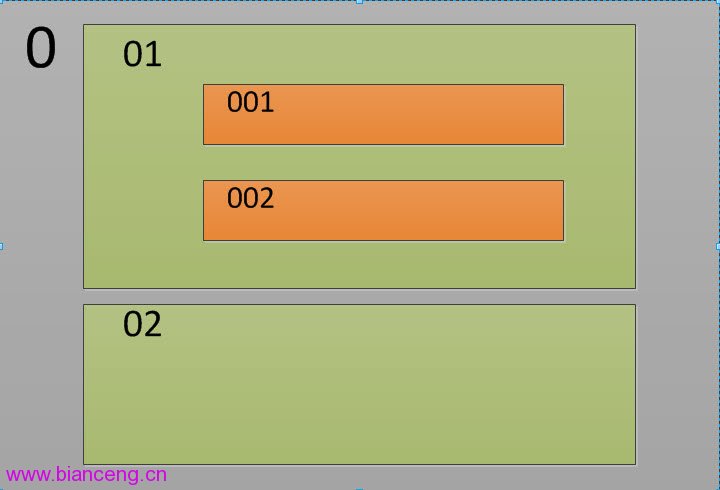
換句話說,布局是一個遞歸系統,實現在屏幕上對元素進行大小調整、定位和繪制,然後進行呈現。具體如下圖,要實現控件0的布局,那麼先要實現0的子控件 01,02...的布局,要實現01的布局,那麼得實現01的子控件001,002...的布局,如此循環直到子控件的布局完成後,再完成父控件的布局, 最後遞歸回去直到遞歸結束,這樣整個布局過程就完成了.
布局系統為 Children 集合的每個成員完成兩個處理過程:測量處理過程(Measure)和排列處理過程(Arrange)。每個子 Panel 均提供自己的 MeasureOverride 和 ArrangeOverride 方法,以實現自己特定的布局行為。
四. Canvas
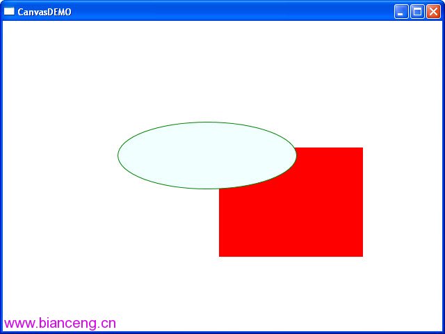
Canvas比較簡單,只是一個存儲元素的容器,它不會自動調整內部元素的排列及大小。不指定元素位置,元素將默認顯示在畫布的左上方。 Canvas的主要用途是用來畫圖。Canvas默認不會自動裁減超過自身范圍的內容,即溢出的內容會顯示在Canvas外面,這是因為默認 ClipToBounds="False";我們可以通過設置ClipToBounds="True來裁剪多出的內容。

要實現的效果如下圖(用XAML和C#實現同一效果):
XAML代碼實現:
<Window

   xmlns="http://schemas.microsoft.com/winfx/2006/xaml/presentation"

   xmlns:x="http://schemas.microsoft.com/winfx/2006/xaml"

   x:Class="WPFLayoutDemo.CanvasDEMO"

   x:Name="Window"

   Title="CanvasDEMO"

   WindowStartupLocation="CenterScreen"

   Width="640" Height="480">

     <Canvas Margin="0,0,0,0" Background="White">

       <Rectangle Fill="Red"

         Stroke="Azure"

         Width="209"

         Height="159"

         Canvas.Left="310" Canvas.Top="181"/>

       <Ellipse Fill="Azure"

         Stroke="Green"

         Width="258" Height="97"

         Panel.ZIndex="1"

         Canvas.Left="165" Canvas.Top="145"/>

     </Canvas>

</Window>
C#代碼實現:
namespace WPFLayoutDemo

{

   public partial class CanvasDEMOCodeBehind

   {

     public CanvasDEMOCodeBehind()

     {

       this.InitializeComponent();

       Canvas canv = new Canvas();

       //把canv添加為窗體的子控件

        this.Content = canv;

       canv.Margin = new Thickness(0, 0, 0, 0);

       canv.Background = new SolidColorBrush(Colors.White);

       //Rectangle

       Rectangle r = new Rectangle();

       r.Fill = new SolidColorBrush(Colors.Red);

       r.Stroke = new SolidColorBrush(Colors.Red);

       r.Width = 145;

       r.Height = 126;

       r.SetValue(Canvas.LeftProperty, (double)124);

       r.SetValue(Canvas.TopProperty, (double)122);

       canv.Children.Add(r);

       //Ellipse

       Ellipse el = new Ellipse();

       el.Fill = new SolidColorBrush(Colors.Azure);

       el.Stroke = new SolidColorBrush(Colors.Azure);

       el.Width = 121;

       el.Height = 100;

       el.SetValue(Canvas.ZIndexProperty, 1);

       el.SetValue(Canvas.LeftProperty, (double)195);

       el.SetValue(Canvas.TopProperty, (double)191);

       canv.Children.Add(el);

     }

   }

}
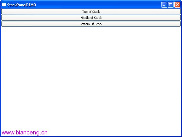
五. StackPanel
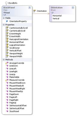
StackPanel就是將子元素按照堆棧的形式一一排列,通過設置面板的Orientation屬性設置了兩種排列方式:橫排(Horizontal默認的)和豎排(Vertical)。縱向的StackPanel默認每個元素寬度與面板一樣寬,反之橫向亦然。如果包含的元素超過了面板空間,它只會截斷多出的內容。 元素的Margin屬性用於使元素之間產生一定得間隔,當元素空間大於其內容的空間時,剩余空間將由HorizontalAlignment和 VerticalAlignment屬性來決定如何分配。其他屬性,大家可以看看如下類圖:
要實現的效果如下圖(用XAML和C#實現同一效果):
XAML代碼實現:
<Window

   xmlns="http://schemas.microsoft.com/winfx/2006/xaml/presentation"

   xmlns:x="http://schemas.microsoft.com/winfx/2006/xaml"

   x:Class="WPFLayoutDemo.StackPanelDEMO"

   x:Name="Window"

   Title="StackPanelDEMO"

   WindowStartupLocation="CenterScreen"

   Width="640" Height="480">

   <StackPanel Margin="0,0,0,0" Background="White" Orientation="Vertical">

     <Button Content="Top of Stack"/>

     <Button Content="Middle of Stack"/>

     <Button Content="Bottom Of Stack"/>

   </StackPanel>

</Window>
C#代碼實現:
namespace WPFLayoutDemo

{

   public partial class StackPanelDEMOCodeBehind

   {

     public StackPanelDEMOCodeBehind()

     {

       this.InitializeComponent();

       StackPanel sp = new StackPanel();

       //把sp添加為窗體的子控件

       this.Content = sp;

       sp.Margin = new Thickness(0, 0, 0, 0);

       sp.Background = new SolidColorBrush(Colors.White);

       sp.Orientation = Orientation.Vertical;

       //Button1

       Button b1 = new Button();

       b1.Content = "Top of Stack";

       sp.Children.Add(b1);

       //Button2

       Button b2 = new Button();

       b2.Content = "Middle of Stack";

       sp.Children.Add(b2);

       //Button3

       Button b3 = new Button();

       b3.Content = "Bottom of Stack";

       sp.Children.Add(b3);

     }

   }

}
六. WrapPanel
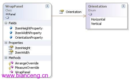
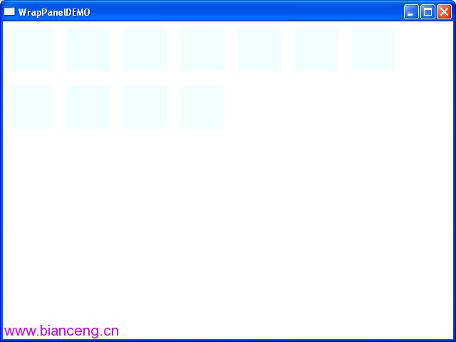
WrapPanel是一個非常簡單的面板,從左至右按順序位置定位子元素,如果排滿斷開至下一行。後續排序按照從上至下或從右至左的順序進行。 WrapPanel面板也提供了 Orientation屬性設置排列方式,這跟上面的StackPanel基本相似。不同的是WrapPanel會根據內容自動換行。
要實現的效果如下圖(用XAML和C#實現同一效果):
XAML代碼實現:
<Window

   xmlns="http://schemas.microsoft.com/winfx/2006/xaml/presentation"

   xmlns:x="http://schemas.microsoft.com/winfx/2006/xaml"

   x:Class="WPFLayoutDemo.WrapPanelDEMO"

   x:Name="Window"

   Title="WrapPanelDEMO"

   WindowStartupLocation="CenterScreen"

   Width="640" Height="480">

     <WrapPanel Margin="0,0,0,0" Background="White">

       <Rectangle Margin="10,10,10,10" Fill ="Azure" Width="60" Height="60"/>

       <Rectangle Margin="10,10,10,10" Fill ="Azure" Width="60" Height="60"/>

       <Rectangle Margin="10,10,10,10" Fill ="Azure" Width="60" Height="60"/>

       <Rectangle Margin="10,10,10,10" Fill ="Azure" Width="60" Height="60"/>

       <Rectangle Margin="10,10,10,10" Fill ="Azure" Width="60" Height="60"/>

       <Rectangle Margin="10,10,10,10" Fill ="Azure" Width="60" Height="60"/>

       <Rectangle Margin="10,10,10,10" Fill ="Azure" Width="60" Height="60"/>

       <Rectangle Margin="10,10,10,10" Fill ="Azure" Width="60" Height="60"/>

       <Rectangle Margin="10,10,10,10" Fill ="Azure" Width="60" Height="60"/>

       <Rectangle Margin="10,10,10,10" Fill ="Azure" Width="60" Height="60"/>

       <Rectangle Margin="10,10,10,10" Fill ="Azure" Width="60" Height="60"/>

   </WrapPanel>

</Window>
C#代碼實現:
namespace WPFLayoutDemo

{

   public partial class WrapPanelDEMOCodeBehind

   {

     public WrapPanelDEMOCodeBehind()

     {

       this.InitializeComponent();

       WrapPanel wp = new WrapPanel();

       //把wp添加為窗體的子控件

       this.Content = wp;

       wp.Margin = new Thickness(0, 0, 0, 0);

       wp.Background = new SolidColorBrush(Colors.White);

       //遍歷增加Rectangles

       Rectangle r;

       for (int i = 0; i <= 10; i++)

       {

         r = new Rectangle();

         r.Fill = new SolidColorBrush(Colors.Azure);

         r.Margin = new Thickness(10, 10, 10, 10);

         r.Width = 60;

         r.Height = 60;

         wp.Children.Add(r);

       }

     }

   }

}
七. DockPanel
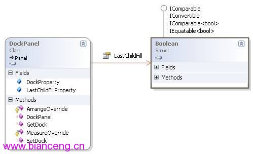
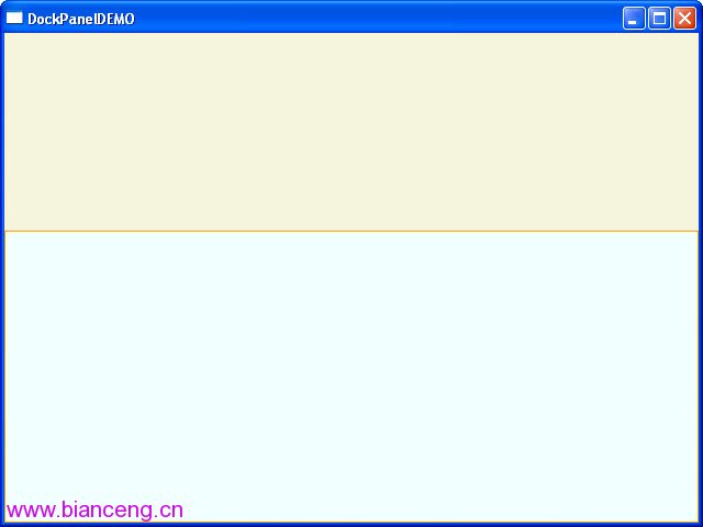
DockPanel定義一個區域,在此區域中,您可以使子元素通過描點的形式排列。停靠面板其實就是在WinForm類似於Dock屬性的元素。DockPanel會對每個子元素進行排序,並停靠在面板的一側,多個停靠在同側的元素則按順序排序,最後一個元素填充這個Panel(這個需要設置 LastChildFill屬性為 True)。對於在DockPanel中的元素的停靠屬性可以通過Panel.Dock的附加屬性來設置.
要實現的效果如下圖(用XAML和C#實現同一效果):
XAML代碼實現:
<Window

   xmlns="http://schemas.microsoft.com/winfx/2006/xaml/presentation"

   xmlns:x="http://schemas.microsoft.com/winfx/2006/xaml"

   x:Class="WPFLayoutDemo.DockPanelDEMO"

   x:Name="Window"

   Title="DockPanelDEMO"

   WindowStartupLocation="CenterScreen"

   Width="640" Height="480">

   <DockPanel Width="Auto" Height="Auto" LastChildFill="True">

     <Rectangle Fill="Beige" Stroke="BlanchedAlmond" Height="180" DockPanel.Dock="Top"/>

     <Rectangle Fill="Azure" Stroke="Orange" />

   </DockPanel>

</Window>
C#代碼實現:
namespace WPFLayoutDemo

{

   public partial class DockPanelDEMOCodeBehind

   {

     public DockPanelDEMOCodeBehind()

     {

       this.InitializeComponent();

       DockPanel dp = new DockPanel();

       dp.LastChildFill = true;

       dp.Width = Double.NaN;  //這個就相當於在XAML中設置Width="Auto"

       dp.Height = Double.NaN;  //這個就相當於在XAML中設置Height="Auto"

       //把dp添加為窗體的子控件

       this.Content = dp;

       //添加Rectangles

       Rectangle rTop = new Rectangle();

       rTop.Fill = new SolidColorBrush(Colors.BlanchedAlmond);

       rTop.Stroke = new SolidColorBrush(Colors.BlanchedAlmond);

       rTop.Height = 180;

       dp.Children.Add(rTop);

       rTop.SetValue(DockPanel.DockProperty,Dock.Top);

       Rectangle rFill = new Rectangle();

       rFill.Fill = new SolidColorBrush(Colors.Azure);

       rFill.Stroke = new SolidColorBrush(Colors.Azure);

       dp.Children.Add(rFill);

     }

   }

}
八. Grid
Grid和其他各個Panel比較起來,功能最多也最為復雜,它由<Grid.ColumnDefinitions>列元素集和<Grid.RowDefinitions>行元素集合兩種元素組成。而放置在Grid面板中的控件元素都必須顯示采用附加屬性語法定義其放置所在的行和列,否則元素均默認放置在第0行第0列。由於Grid的組成並非簡單的添加屬性標記來區分行列,這也使得用戶在實際應用中可以具體到某一單元格中,所以布局起來就很精細了。
Grid的列寬與行高可采用固定、自動、按比列三種方式定義
<Grid>

   <Grid.RowDefinitions>

     <RowDefinition Height="Auto" />

     <RowDefinition Height="Auto" />

     <RowDefinition Height="*" />

     <RowDefinition Height="40" />

   </Grid.RowDefinitions>

   <Grid.ColumnDefinitions>

     <ColumnDefinition Width="Auto" />

     <ColumnDefinition Width="300" />

   </Grid.ColumnDefinitions>

</Grid>
第一種,固定長度——寬度不夠,會裁剪,不好用。單位pixel。
第二種,自動長度——自動匹配列中最長元素的寬度。
第三種,比例長度——*表示占用剩余的全部寬度;兩行都是*,將平分剩余寬度;像上面的一個2*,一個*,表示前者2/3寬度。
跨越多行和多列
<Rectangle Fill="Silver" Grid.Column="1" Grid.ColumnSpan="3"/>
使用Grid.ColumnSpan和Grid.RowSpan附加屬性可以讓相互間隔的行列合並,所以元素也可以跨越多個單元格。
使用GridSplit分割
<GridSplitter Height="6" VerticalAlignment="Stretch" HorizontalAlignment="Stretch"

         Grid.Row="2" Grid.Column="2"></GridSplitter>
使用GridSplit控件結合Grid控件實現類似於WinForm中SplitContainer的功能,這個大家在WinForm當中經常用到,我們也不多做介紹。
要實現的效果如下圖(用XAML和C#實現同一效果):
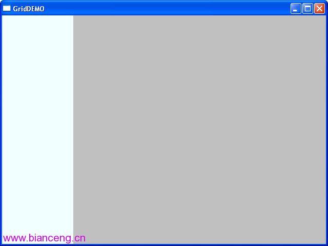
XAML代碼實現:
<Window

   xmlns="http://schemas.microsoft.com/winfx/2006/xaml/presentation"

   xmlns:x="http://schemas.microsoft.com/winfx/2006/xaml"

   x:Class="WPFLayoutDemo.GridDEMO"

   x:Name="Window"

   Title="GridDEMO"

   WindowStartupLocation="CenterScreen"

   Width="640" Height="480">

   <Grid Width="Auto" Height="Auto" >

     <Grid.ColumnDefinitions>

       <ColumnDefinition Width="139"/>

       <ColumnDefinition Width="184*"/>

       <ColumnDefinition Width="45*" />

       <ColumnDefinition Width="250*"/>

     </Grid.ColumnDefinitions>

     <Rectangle Fill="Azure" Grid.ColumnSpan="2" Margin="0,0,21,0" />

     <Rectangle Fill="Silver" Grid.Column="1" Grid.ColumnSpan="3"/>

   </Grid>

</Window>
C#代碼實現:
namespace WPFLayoutDemo

{

   public partial class GridDEMOCodeBehind

   {

     public GridDEMOCodeBehind()

     {

       this.InitializeComponent();

       Grid grid = new Grid();

       grid.Width = Double.NaN;  //這個就相當於在XAML中設置Width="Auto"

       grid.Height = Double.NaN;  //這個就相當於在XAML中設置Height="Auto"

       //把grid添加為窗體的子控件

       this.Content = grid;

       //列一

       ColumnDefinition cd1 = new ColumnDefinition();

       cd1.Width = new GridLength(139);

       grid.ColumnDefinitions.Add(cd1);

       //列二

       ColumnDefinition cd2 = new ColumnDefinition();

       cd2.Width = new GridLength(1, GridUnitType.Star);

       grid.ColumnDefinitions.Add(cd2);

       //列三

       ColumnDefinition cd3 = new ColumnDefinition();

       cd3.Width = new GridLength(2, GridUnitType.Star);

       grid.ColumnDefinitions.Add(cd3);

       //把單元格添加到grid中

       Rectangle r1c1 = new Rectangle();

       r1c1.Fill = new SolidColorBrush(Colors.Azure);

       r1c1.SetValue(Grid.ColumnProperty, 0);

       r1c1.SetValue(Grid.RowProperty, 0);

       grid.Children.Add(r1c1);

       Rectangle r1c23 = new Rectangle();

       r1c23.Fill = new SolidColorBrush(Colors.Silver);

       r1c23.SetValue(Grid.ColumnProperty, 1);

       r1c23.SetValue(Grid.ColumnSpanProperty, 2);

       grid.Children.Add(r1c23);

     }

   }

}
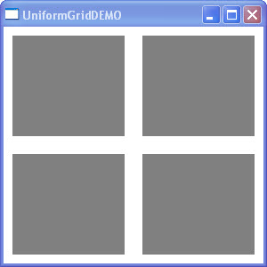
九 UniformGrid
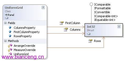
介紹了前面的Grid,接下來的這個UniformGrid 就太簡單了,均布網格的是Grid的簡化版本,每個單元格的大小相同,不用在定義行列集合。均布網格每個單元格只能容納一個元素,將自動按照定義在其內部的元素個數,自動創建行列,並通常保持相同的行列數。
要實現的效果如下圖(用XAML和C#實現同一效果):
XAML代碼實現:
<Window x:Class="WPFLayoutDemo.UniformGridDEMO"

   xmlns="http://schemas.microsoft.com/winfx/2006/xaml/presentation"

   xmlns:x="http://schemas.microsoft.com/winfx/2006/xaml"

   Title="UniformGridDEMO" Height="300" Width="300">

   <UniformGrid Columns="2" Rows="2" Name="uniformGrid1" >

     <Rectangle Margin="10,10,10,10" Fill ="Gray"/>

     <Rectangle Margin="10,10,10,10" Fill ="Gray" />

     <Rectangle Margin="10,10,10,10" Fill ="Gray" />

     <Rectangle Margin="10,10,10,10" Fill ="Gray" />

   </UniformGrid>

</Window>
C#代碼實現:
namespace WPFLayoutDemo

{

   public partial class UniformGridDEMOCodeBehind : Window

   {

     public UniformGridDEMOCodeBehind()

     {

       InitializeComponent();

       UniformGrid wp = new UniformGrid();

       //把wp添加為窗體的子控件

        this.Content = wp;

       wp.Margin = new Thickness(0, 0, 0, 0);

       wp.Background = new SolidColorBrush(Colors.White);

       //遍歷增加Rectangles

       Rectangle r;

       for (int i = 0; i <= 10; i++)

       {

         r = new Rectangle();

         r.Fill = new SolidColorBrush(Colors.Gray);

         r.Margin = new Thickness(10, 10, 10, 10);

         wp.Children.Add(r);

       }

     }

   }

}
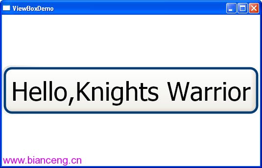
十. ViewBox
ViewBox這個控件通常和其他控件結合起來使用,是WPF中非常有用的控制。定義一個內容容器,該容器可拉伸和縮放單個子元素以填滿可用空間。一個 Viewbox 只能具有一個 Child。如果添加一個附加 Child,會導致一個運行時 ArgumentException錯誤。我們用得最多的首先是Stretch屬性,然後是StrctchDirection屬性,關於這兩個元素,大家可以運行我們的代碼,然後改變設置就可以看到效果。
要實現的效果如下圖(用XAML和C#實現同一效果):
XAML代碼實現:
<Window x:Class="WPFLayoutDemo.ViewBoxDemo"

   xmlns="http://schemas.microsoft.com/winfx/2006/xaml/presentation"

   xmlns:x="http://schemas.microsoft.com/winfx/2006/xaml"

   Title="ViewBoxDemo" Height="342" Width="535">

   <Viewbox Stretch="Uniform">

     <Button Content="Hello,Knights Warrior" />

   </Viewbox>

</Window>
C#代碼實現:
namespace WPFLayoutDemo

{

   public partial class ViewBoxDEMOBehind : Window

   {

     public ViewBoxDEMOBehind()

     {

       this.InitializeComponent();

       Viewbox vb = new Viewbox();

       vb.Stretch = Stretch.Uniform ;

       //把vb添加為窗體的子控件

       this.Content = vb;

       //Button1

       Button b1 = new Button();

       b1.Content = "Hello,Knights Warrior";

       vb.Child=b1;

     }

   }

}
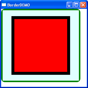
十一. Border
Border 是一個裝飾的控件,此控件繪制邊框及背景,在 Border 中只能有一個子控件(這個子控件又可以包含多個子控件)。Border 的幾個重要屬性:Background:用用一個 Brush 對象來繪制背景 ;BorderBrush:用一個Brush 對象來繪制邊框 ;BorderThickness:此屬性設置 Border 邊框的大小;CornerRadius:此屬性設置 Border 的每一個角圓的半徑;Padding:此r屬性設置 Border 裡的內容與邊框的之間的間隔。
要實現的效果如下圖(用XAML和C#實現同一效果):
XAML代碼實現:
<Window x:Class="WPFLayoutDemo.BorderDEMO"

   xmlns="http://schemas.microsoft.com/winfx/2006/xaml/presentation"

   xmlns:x="http://schemas.microsoft.com/winfx/2006/xaml"

   Title="BorderDEMO" Height="300" Width="300">

   <Border

   BorderThickness="5"

   BorderBrush="Green"

   CornerRadius="10"

   Background="LightGray"

   HorizontalAlignment="Left"

   VerticalAlignment="Top"

   Width="270"

   Height="250">

     <Canvas Background="LightCyan" >

       <Rectangle

       Canvas.Left="30" Canvas.Top="20"

       Height="200" Width="200"

       Stroke="Black" StrokeThickness="10" Fill="Red" />

     </Canvas>

   </Border>

</Window>
C#代碼實現:
namespace WPFLayoutDemo

{

   public partial class BorderDEMOCodeBehind : Window

   {

     public BorderDEMOCodeBehind()

     {

       InitializeComponent();

       Border border = new Border();

       border.Background = new SolidColorBrush(Colors.LightGray);

       border.BorderThickness = new Thickness(5);

       border.BorderBrush = new SolidColorBrush(Colors.Green);

       border.CornerRadius = new CornerRadius(15);

       border.Width = 270;

       border.Height = 250;

       Canvas cnvas = new Canvas();

       Rectangle rect = new Rectangle();

       rect.Width = 200;

       rect.Height = 200;

       rect.Fill = new SolidColorBrush(Colors.Black);

       rect.StrokeThickness = 10d;

       cnvas.Children.Add(rect);

       border.Child = cnvas;

       this.Content = border;

     }

   }

}
十二. ScrollViewer
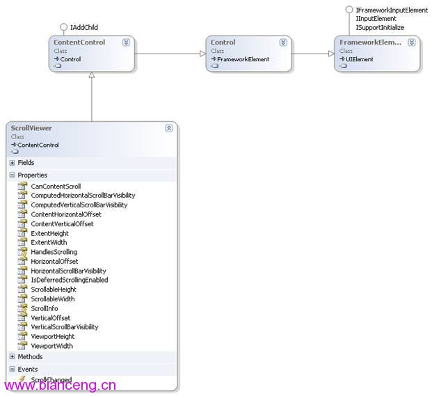
通常用戶界面中的內容比計算機屏幕的顯示區域大,大出的部分就會破壞原有的布局。利用 ScrollViewer 控件可以方便地使應用程序中的內容具備滾動功能。這樣大出的部分就可以正常顯示出來了。常用屬性、事件和繼承關系見下面類圖:
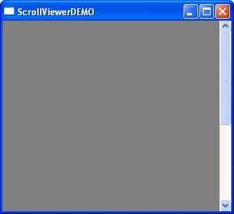
要實現的效果如下圖(用XAML和C#實現同一效果):
XAML代碼實現:
<Window x:Class="WPFLayoutDemo.ScrollViewerDEMO"

   xmlns="http://schemas.microsoft.com/winfx/2006/xaml/presentation"

   xmlns:x="http://schemas.microsoft.com/winfx/2006/xaml"

   Title="ScrollViewerDEMO" Height="300" Width="300">

   <Grid>

     <ScrollViewer>

       <Rectangle Width="500" Height="500" Fill="Gray"></Rectangle>

     </ScrollViewer>

   </Grid>

</Window>
C#代碼實現:
namespace WPFLayoutDemo

{

   public partial class ScrollViewerDEMOCodeBehind : Window

   {

     public ScrollViewerDEMOCodeBehind()

     {

       InitializeComponent();

       ScrollViewer myScrollViewer = new ScrollViewer();

       myScrollViewer.HorizontalScrollBarVisibility = ScrollBarVisibility.Auto;

       Rectangle myRectangle = new Rectangle();

       myRectangle.Fill = Brushes.Gray;

       myRectangle.Width = 500;

       myRectangle.Height = 500;

       myScrollViewer.Content = myRectangle;

       this.Content = myScrollViewer;

     }

   }

}
十三.布局綜合應用
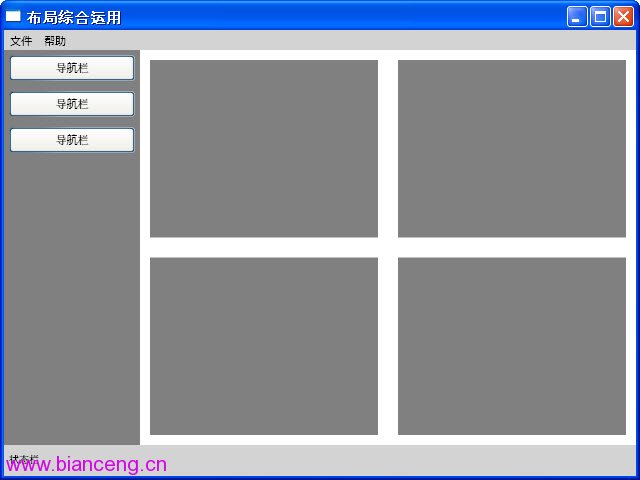
前面通過十多個小節講了一些常用Panel的基本用法,那我們這裡就簡單做一個綜合的小例子,通過這個例子,旨在鞏固前面的內容,也可以當做一個舉一反三的過程。要實現的效果如下圖:
XAML代碼實現:
<Window x:Class="WPFLayoutDemo.PuttingItAllTogether"

   xmlns="http://schemas.microsoft.com/winfx/2006/xaml/presentation"

   xmlns:x="http://schemas.microsoft.com/winfx/2006/xaml"

   WindowStartupLocation="CenterScreen"

   Title="布局綜合運用" Width="640" Height="480" >

   <DockPanel Width="Auto" Height="Auto" LastChildFill="True">

     <!--Top Menu Area-->

     <Menu Width="Auto" Height="20" Background="LightGray" DockPanel.Dock="Top">

       <!-- File Menu -->

       <MenuItem Header="文件">

         <MenuItem Header="保存"/>

         <Separator/>

         <MenuItem Header="退出"/>

       </MenuItem>

       <!-- About Menu -->

       <MenuItem Header="幫助">

         <MenuItem Header="關於本產品"/>

       </MenuItem>

     </Menu>

     <!--State -->

     <StackPanel Width="Auto" Height="31" Background="LightGray" Orientation="Horizontal" DockPanel.Dock="Bottom">

       <Label Width="155" Height="23" Content="狀態欄" FontFamily="Arial" FontSize="10"/>

     </StackPanel>

     <!--Left-->

     <StackPanel Width="136" Height="Auto" Background="Gray">

       <Button Margin="5,5,5,5" Width="Auto" Height="26" Content="導航欄"/>

       <Button Width="126" Height="26" Content="導航欄" Margin="5,5,5,5"/>

       <Button Width="126" Height="26" Content="導航欄" Margin="5,5,5,5"/>

     </StackPanel>


     <!--Right-->

     <Grid Width="Auto" Height="Auto" Background="White">

       <Grid.ColumnDefinitions>

         <ColumnDefinition Width="*"/>

         <ColumnDefinition Width="*"/>

       </Grid.ColumnDefinitions>

       <Grid.RowDefinitions>

         <RowDefinition Height="*"/>

         <RowDefinition Height="*"/>

       </Grid.RowDefinitions>

       <Rectangle Fill="Gray" Margin="10,10,10,10" Grid.Row="0" Grid.Column="0"/>

       <Rectangle Fill="Gray" Margin="10,10,10,10" Grid.Row="0" Grid.Column="1"/>

       <Rectangle Fill="Gray" Margin="10,10,10,10" Grid.Row="1" Grid.Column="0"/>

       <Rectangle Fill="Gray" Margin="10,10,10,10" Grid.Row="1" Grid.Column="1"/>

     </Grid>

   </DockPanel>

</Window>
其實用熟練上面的各個布局控件以後,你會發現布局UI是一件非常容易的事,遇到一個新的UI,你會發現任意一個Panel都可以實現你的需求。當然對於較復雜且對要求很高的UI,我們也會自定義一些Panel,在下面我們就簡單介紹一下自定義布局控件。
十四.自定義布局控件
講到自定義布局控件,我們必須得先談一下在WPF中自定義控件,在WPF自定義控件你可以選擇下圖的一些基類作為繼承對象,你也可以繼承自已有的一些控件,這個就看你的需要了。其實開發WPF自定義控件和開發WinForm、ASP.NET自定義控件基本類似,只是要注意一些特別的地方,比如依賴屬性的處理、路由事件、視覺樹和邏輯樹等等。
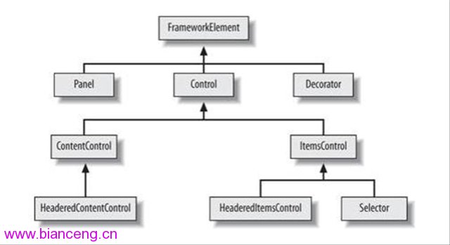
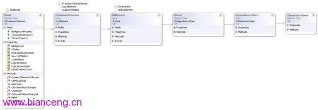
於今天只是講如何開發一個自定義的Panel,所以在清楚了基類的前提下,首先得了解它有哪些屬性和事件,這樣就可以確定哪些是不需要單獨寫、哪些是需要override。下圖就是Panel和基類FrameworkElement 的類圖:
在清楚了上面這張圖以後,我們就可以著手開始寫了,我們知道布局系統的工作原理是先測量後排列,測量就是確定面板需要多大空間,排列則是定義其面板內子元素的排列規則。自定義面板要繼承自Panel類並重寫MeasureOverride和rrangeOverride方法即可,如下便是一個簡單的自定義Panel:
namespace WPFLayoutDemo

{

   public class PlotPanel : Panel

   {

     public PlotPanel()

       : base()

     {

     }

     //重寫默認的Measure方法

     protected override Size MeasureOverride(Size availableSize)

     {

       Size panelDesiredSize = new Size();

       foreach (UIElement child in InternalChildren)

       {

         child.Measure(availableSize);

         panelDesiredSize = child.DesiredSize;

       }

       return panelDesiredSize;

     }

     //重寫默認的Arrange方法

     protected override Size ArrangeOverride(Size finalSize)

     {

       foreach (UIElement child in InternalChildren)

       {

         double x = 50;

         double y = 50;

         child.Arrange(new Rect(new Point(x, y), child.DesiredSize));

       }

       return finalSize;

     }

   }

}
控件的最終大小和位置是由該控件和父控件共同完成的,父控件會先給子控件提供可用空間(availableSize),子控件再反饋給父控件一個自己的期望值(DesiredSize),父控件最後根據自己所擁有的空間大小與子控件的期望值分配一定的空間給子控件並返回自己的大小.那麼這個過程就是通過MeasureOverride 和ArrangeOverride這兩個方法來完成(注意父控件的availableSize是減去Margin、padding等的值)。
本來想自己開發一個較復雜的Panel控件放上來,但一搜網絡,發現已經有很多很好的Panel控件,所以在這裡我也不寫那麼多了,大家可以研究一下這些控件,我也研究了幾個,覺得最好理解且最美觀的當屬“FishEyePanel & FanPanel, Paul Tallett, codeproject ”,大家可以根據鏈接過去看一下,Paul Tallett講解得非常的細致。
TreeMapPanel, Kevin Moore (see bag-o-tricks for code)
AnimatingTilePanel, Kevin Moore (see bag-o-tricks for code)
Disposing Virtualizing Stack Panel, Aaron, WiredPrairie.us
TimeLinePanel, Rob Zelt, robzelt.com (with credit to Robert Ingebretsen and Lauren Lavoie)
Chart and Lens Panel by John Stewien (code available?)
DiagonalPanel
FishEyePanel & FanPanel, Paul Tallett, codeproject
RadiaPanel & ItemsRadialPanel, Rhett log (Henry Hahn posted a Radial panel in 2005, but I'm not sure if it runs or not?)
DisclaimerPanel, Chaz
SpanningStackPanel, Nick Theusen
PlotPanel, Windows SDK Sample
CollapsiblePanel, Thomas Lebrun
CornerStacker, Nick Thuesen
StickyPanel, Unni, Blend PM
ItemSkimmingPanel, Pavan Podila
順便也鏈接兩幅圖:
講到這裡,我們也順便提一下寫WPF自定義控件的幾個步驟,以後在講到這一節的時候會詳細講解:
首先你得清楚你的自定義控件是干什麼用的(能解決什麼問題)?公用到什麼程度(其他項目也可以用、本項目用、項目當中一個模塊用、只有一個地方用)?是繼承已有的控件還是從頭寫?對設計時是否支持?樣式和模板的定義等。
確定好了上面的步驟後,我們就可以建立項目的結構,類和資源文件等該放在什麼位置也就在這一步確定。
選擇要繼承的基類(UIElement、FrameworkElement 、Control 、ContentControl 、HeaderedContentControl 、ItemsControl 、Selector 、RangeBase還是已有的一些控件)。
重寫默認的樣式和新建一些樣式並附默認值。
由於WPF的屬性基本都是依賴屬性,所以我們也要新建一些依賴屬性。
邏輯樹和視覺樹的一些處理以及事件等。
十五.本文總結
今天我們主要講了WPF布局系統,對整個布局系統的原理、各個Panel的基本用法(分別用XAML和C#兩種方式實現同一個功能,便於大家學習)以及自定義布局控件做了一些介紹,由於內容太多,我只是力所能及的做一些相關的介紹和演示,所以只能給大家提供一個參考,如果大家想了解更多,還需要去看專門的教材,同時有些知識也只是個人的一些見解,所以大家只能將就著看了。寫篇文章也是懷著技術交流的心態發布出來,由於是自己對這些技術的使用總結和心得體會,錯誤之處在所難免,所以希望大家能夠多多指點,這樣也能糾正我的錯誤觀點,以便和各位共同提高!
最後如果大家感興趣,可以關注WPF 基礎到企業應用系列索引這個系列文章,我也會不定期的逐漸更新,謝謝各位的關注,也歡迎和各位交流討論。
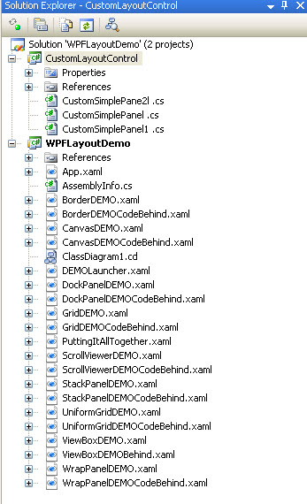
最後也附上代碼結構圖和代碼下載:
出處:http://www.cnblogs.com/KnightsWarrior/
本文配套源碼
