此樣式基於bootstrap-3.3.0,樣式文件裡的源碼行數都是指的這個版本.CSS源文件放到了Content文件夾下的bootstrap.css
WPF樣式和CSS還是不太相同,所以有些內容實現上稍有出入,有些內容用法不太一樣,有些內容並沒有實現
但至少,一些概念,尺寸和取色,還是很好的借鑒
博客說明按Bootstrap官方文檔的順序來寫
App.xaml裡引用Bootstrap.xaml資源
1 <Application.Resources>
2     <ResourceDictionary>
3         <ResourceDictionary.MergedDictionaries>
4             <ResourceDictionary Source="pack://application:,,,/BootstrapWpfStyle;component/Styles/Bootstrap.xaml"/>
5         </ResourceDictionary.MergedDictionaries>
6     </ResourceDictionary>
7 </Application.Resources>
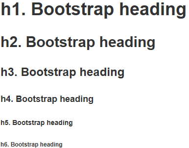
<Label>樣式 h1到h6
效果
代碼
1 <Label Content="h1. Bootstrap heading" ></Label>
2 <Label Content="h2. Bootstrap heading" ></Label>
3 <Label Content="h3. Bootstrap heading" ></Label>
4 <Label Content="h4. Bootstrap heading" ></Label>
5 <Label Content="h5. Bootstrap heading" ></Label>
6 <Label Content="h6. Bootstrap heading" ></Label>
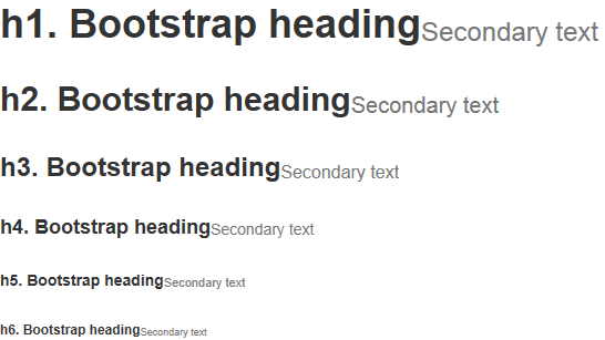
<Label>樣式 h1 small到h6 small.使用時 和標題放到一個<StackPanel>裡 方便對齊
效果
代碼
 1 <StackPanel Orientation="Horizontal">
 2     <Label Content="h1. Bootstrap heading" ></Label>
 3     <Label Content="Secondary text" ></Label>
 4 </StackPanel>
 5 <StackPanel Orientation="Horizontal">
 6     <Label Content="h2. Bootstrap heading" ></Label>
 7     <Label Content="Secondary text" ></Label>
 8 </StackPanel>
 9 <StackPanel Orientation="Horizontal">
10     <Label Content="h3. Bootstrap heading" ></Label>
11     <Label Content="Secondary text" ></Label>
12 </StackPanel>
13 <StackPanel Orientation="Horizontal">
14     <Label Content="h4. Bootstrap heading" ></Label>
15     <Label Content="Secondary text" ></Label>
16 </StackPanel>
17 <StackPanel Orientation="Horizontal">
18     <Label Content="h5. Bootstrap heading" ></Label>
19     <Label Content="Secondary text" ></Label>
20 </StackPanel>
21 <StackPanel Orientation="Horizontal">
22     <Label Content="h6. Bootstrap heading" ></Label>
23     <Label Content="Secondary text" ></Label>
24 </StackPanel>
<Label>樣式 code.使用時 和其他<Label>放到一個<StackPanel>裡
效果

代碼
1 <StackPanel Orientation="Horizontal"> 2 <Label Content="內聯代碼:For example, "></Label> 3 <Label Content="<section>" ></Label> 4 <Label Content=" should be wrapped as inline."></Label> 5 </StackPanel>
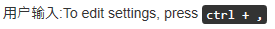
<Label>樣式 kbd.使用時 和其他<Label>放到一個<StackPanel>裡
效果
代碼
1 <StackPanel Orientation="Horizontal">
2     <Label Content="用戶輸入:To edit settings, press "></Label>
3     <Label Content="ctrl + ," ></Label>
4 </StackPanel>
<Label>樣式 pre
效果
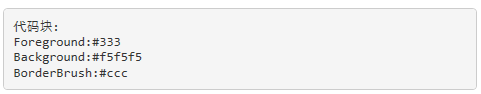
代碼
1 <Label xml:space="preserve" >代碼塊:
2 Foreground:#333
3 Background:#f5f5f5
4 BorderBrush:#ccc</Label>
<Label>樣式 help-block.注:輔助文本在Bootstrap表單樣式裡,原本的解釋:針對表單控件的“塊(block)”級輔助文本.我並沒有建一個表單窗體,所以就寫在了這裡
效果
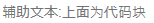
代碼
1 <Label Content="輔助文本:上面為代碼塊" ></Label>
<DataGrid>樣式 默認就這一組樣式,不用引用
效果
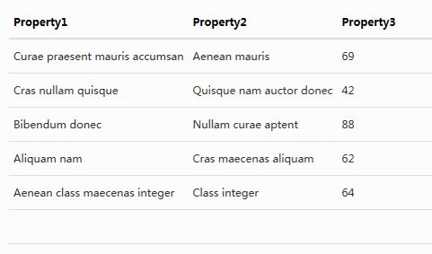
代碼
1 <DataGrid AutoGenerateColumns="False" DataContext="{Binding Source={StaticResource SampleDataSource}}" ItemsSource="{Binding Collection}">
2     <DataGrid.Columns>
3         <DataGridTextColumn Binding="{Binding Property1}" Header="Property1" Element/>
4         <DataGridTextColumn Binding="{Binding Property2}" Header="Property2" Element/>
5         <DataGridTextColumn Binding="{Binding Property3}" Header="Property3" Element/>
6     </DataGrid.Columns>
7 </DataGrid>
WPF沒有表單的概念,所以說明就不按官方文檔的順序了
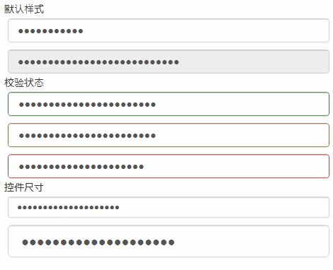
<TextBox>樣式 控件尺寸只支持默認樣式
效果
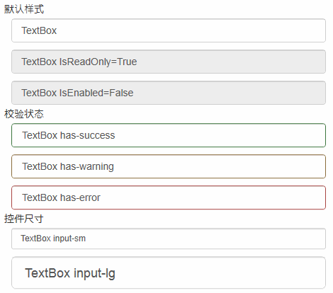
代碼
1 <TextBox Text="TextBox"/>
2 <TextBox Text="TextBox IsReadOnly=True" IsReadOnly="True"/>
3 <TextBox Text="TextBox IsEnabled=False" IsEnabled="False"/>
4 <TextBox Text="TextBox has-success" />
5 <TextBox Text="TextBox has-warning" />
6 <TextBox Text="TextBox has-error" />
7 <TextBox Text="TextBox input-sm" />
8 <TextBox Text="TextBox input-lg" />
<PasswordBox>樣式 控件尺寸只支持默認樣式
效果
代碼
1 <PasswordBox Password="PasswordBox"/>
2 <PasswordBox Password="PasswordBox IsEnabled=False" IsEnabled="False"/>
3 <PasswordBox Password="PasswordBox has-success" />
4 <PasswordBox Password="PasswordBox has-warning" />
5 <PasswordBox Password="PasswordBox has-error" />
6 <PasswordBox Password="PasswordBox input-sm" />
7 <PasswordBox Password="PasswordBox input-lg" />
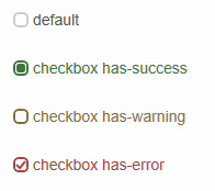
<CheckBox>樣式 checkbox 和Bootstrap有些不同 自己寫的樣式
效果
代碼
1 <CheckBox Content="default"></CheckBox>
2 <CheckBox Content="checkbox has-success"  IsChecked="{x:Null}"></CheckBox>
3 <CheckBox Content="checkbox has-warning"  IsChecked="False"></CheckBox>
4 <CheckBox Content="checkbox has-error"  IsChecked="True"></CheckBox>
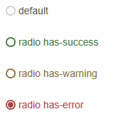
<RadioButton>樣式 radio 和Bootstrap有些不同 自己寫的樣式
效果
代碼
1 <RadioButton Content="default"></RadioButton>
2 <RadioButton Content="radio has-success" ></RadioButton>
3 <RadioButton Content="radio has-warning" ></RadioButton>
4 <RadioButton Content="radio has-error"  IsChecked="True"></RadioButton>
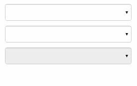
<ComboBox>樣式 默認就這一組樣式,不用引用 gif截圖的原因,看不到下拉
效果
代碼
 1 <ComboBox>
 2     <ComboBoxItem>蘋果</ComboBoxItem>
 3     <ComboBoxItem>橡膠</ComboBoxItem>
 4     <ComboBoxItem>桔子</ComboBoxItem>
 5 </ComboBox>
 6 <ComboBox IsEditable="True">
 7     <ComboBoxItem>蘋果</ComboBoxItem>
 8     <ComboBoxItem>橡膠</ComboBoxItem>
 9     <ComboBoxItem>桔子</ComboBoxItem>
10 </ComboBox>
11 <ComboBox IsEnabled="False">
12     <ComboBoxItem>蘋果</ComboBoxItem>
13     <ComboBoxItem>橡膠</ComboBoxItem>
14     <ComboBoxItem>桔子</ComboBoxItem>
15 </ComboBox>
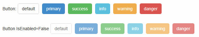
<Button>樣式 btn
效果
代碼
1 <Button Content="default"></Button>
2 <Button Content="primary" ></Button>
3 <Button Content="success" ></Button>
4 <Button Content="info" ></Button>
5 <Button Content="warning" ></Button>
6 <Button Content="danger" ></Button>
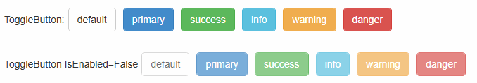
<ToggleButton>樣式 tbtn.Bootstrap中沒有切換按鈕,這裡做成和按鈕一樣,按下去的效果就是按鈕<Button>點擊的效果
效果
代碼
1 <ToggleButton Content="default"></ToggleButton>
2 <ToggleButton Content="primary" ></ToggleButton>
3 <ToggleButton Content="success" ></ToggleButton>
4 <ToggleButton Content="info" ></ToggleButton>
5 <ToggleButton Content="warning" ></ToggleButton>
6 <ToggleButton Content="danger" ></ToggleButton>
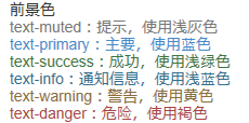
<Label>樣式 text 語境
效果
代碼
1 <Label Content="text-muted:提示,使用淺灰色" ></Label>
2 <Label Content="text-primary:主要,使用藍色" ></Label>
3 <Label Content="text-success:成功,使用淺綠色" ></Label>
4 <Label Content="text-info:通知信息,使用淺藍色" ></Label>
5 <Label Content="text-warning:警告,使用黃色" ></Label>
6 <Label Content="text-danger:危險,使用褐色" ></Label>
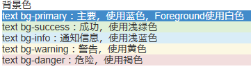
<Label>樣式 text bg 語境
效果
代碼
1 <Label Content="text bg-primary:主要,使用藍色,Foreground使用白色" ></Label>
2 <Label Content="text bg-success:成功,使用淺綠色" ></Label>
3 <Label Content="text bg-info:通知信息,使用淺藍色" ></Label>
4 <Label Content="text bg-warning:警告,使用黃色" ></Label>
5 <Label Content="text bg-danger:危險,使用褐色" ></Label>
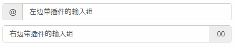
<TextBox>樣式 input-group-addon 輸入框裡帶個<Label>,其實並不是插件,addon這個單詞,使用百度翻譯,翻譯成插件.<Label>裡顯示的內容綁定到Tag屬性
效果
代碼
1 <TextBox Text="左邊帶插件的輸入組" Tag="@" ></TextBox>
2 <TextBox Text="右邊帶插件的輸入組" Tag=".00" ></TextBox>
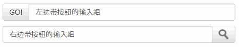
<TextBox>樣式 input-group-btn 輸入框裡帶個<Button>,<Button>裡顯示的內容綁定到Tag屬性
效果
代碼
 1 xmal代碼:
 2 <TextBox Text="左邊帶按鈕的輸入組" Tag="GO!"  Button.Click="InputGroupButton_Click"></TextBox>
 3 <TextBox Text="右邊帶按鈕的輸入組"  Button.Click="InputGroupButton_Click">
 4     <TextBox.Tag>
 5         <Path  Data="{DynamicResource PathDataSearch}"></Path>
 6     </TextBox.Tag>
 7 </TextBox>
 8
 9 後台代碼C#:
10 private void InputGroupButton_Click(object sender, RoutedEventArgs e)
11 {
12     MessageBox.Show(((TextBox)sender).Text);
13 }
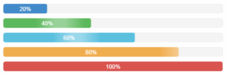
<ProgressBar>樣式 progress-bar
效果
代碼
1 <ProgressBar Value="20" ></ProgressBar>
2 <ProgressBar Value="40" ></ProgressBar>
3 <ProgressBar Value="60" ></ProgressBar>
4 <ProgressBar Value="80" ></ProgressBar>
5 <ProgressBar Value="100" ></ProgressBar>
<ContentControl>樣式 panel
效果

代碼
1 <ContentControl >
2     <ContentControl  Content="內容 Padding=15"/>
3 </ContentControl>
效果
代碼
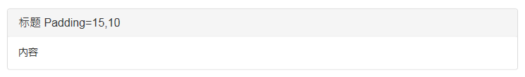
1 <ContentControl >
2     <StackPanel>
3         <ContentControl  Content="標題 Padding=15,10"/>
4         <ContentControl  Content="內容"/>
5     </StackPanel>
6 </ContentControl>
效果
代碼
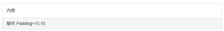
1 <ContentControl >
2     <StackPanel>
3         <ContentControl  Content="內容"/>
4         <ContentControl  Content="腳標 Padding=15,10"/>
5     </StackPanel>
6 </ContentControl>
效果
代碼
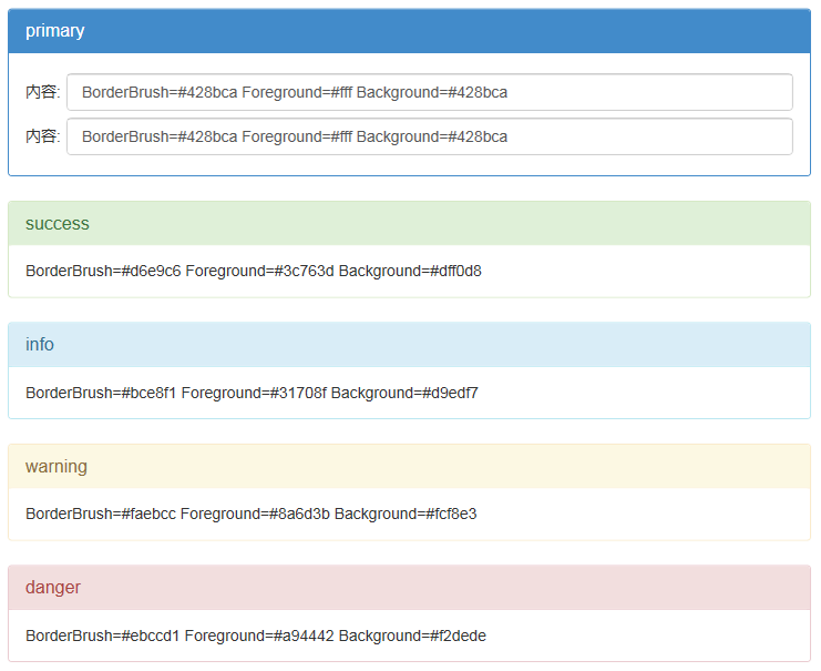
 1 <ContentControl >
 2     <StackPanel>
 3         <ContentControl  Content="primary"/>
 4         <ContentControl >
 5             <ContentControl.Content>
 6                 <Grid>
 7                     <Grid.ColumnDefinitions>
 8                         <ColumnDefinition Width="auto"></ColumnDefinition>
 9                         <ColumnDefinition></ColumnDefinition>
10                     </Grid.ColumnDefinitions>
11                     <Grid.RowDefinitions>
12                         <RowDefinition Height="40"></RowDefinition>
13                         <RowDefinition Height="40"></RowDefinition>
14                     </Grid.RowDefinitions>
15                     <Label Grid.Column="0" Grid.Row="0" Content="內容:" VerticalAlignment="Center"></Label>
16                     <TextBox Grid.Column="1" Grid.Row="0" Margin="5,0,0,0" Text="BorderBrush=#428bca Foreground=#fff Background=#428bca"></TextBox>
17                     <Label Grid.Column="0" Grid.Row="1" Content="內容:" VerticalAlignment="Center"></Label>
18                     <TextBox Grid.Column="1" Grid.Row="1" Margin="5,0,0,0" Text="BorderBrush=#428bca Foreground=#fff Background=#428bca"></TextBox>
19                 </Grid>
20             </ContentControl.Content>
21         </ContentControl>
22     </StackPanel>
23 </ContentControl>
24 <ContentControl >
25     <StackPanel>
26         <ContentControl  Content="success"/>
27         <ContentControl  Content="BorderBrush=#d6e9c6 Foreground=#3c763d Background=#dff0d8"/>
28     </StackPanel>
29 </ContentControl>
30 <ContentControl >
31     <StackPanel>
32         <ContentControl  Content="info"/>
33         <ContentControl  Content="BorderBrush=#bce8f1 Foreground=#31708f Background=#d9edf7"/>
34     </StackPanel>
35 </ContentControl>
36 <ContentControl >
37     <StackPanel>
38         <ContentControl  Content="warning"/>
39         <ContentControl  Content="BorderBrush=#faebcc Foreground=#8a6d3b Background=#fcf8e3"/>
40     </StackPanel>
41 </ContentControl>
42 <ContentControl >
43     <StackPanel>
44         <ContentControl  Content="danger"/>
45         <ContentControl  Content="BorderBrush=#ebccd1 Foreground=#a94442 Background=#f2dede"/>
46     </StackPanel>
47 </ContentControl>
源碼下載:BootstrapWpfStyle.zip