本篇內容主要講解“Python實現數據可視化實例代碼分析”,感興趣的朋友不妨來看看。本文介紹的方法操作簡單快捷,實用性強。下面就讓小編來帶大家學習“Python實現數據可視化實例代碼分析”吧!
對右圖進行修改:
請更換圖形的風格
請將 x 軸的數據改為-10 到 10
請自行構造一個 y 值的函數
將直方圖上的數字,位置改到柱形圖的內部垂直居中的位置
對成績數據 data1402.csv 進行分段統計:每 5 分作為一個分數段,展示出每個分數段的人數直方圖。
自行創建出 10 個學生的 3 個學期排名數據,並通過直方圖進行對比展示。
線圖
把這個圖像做一些調整,要求出現 5 個完整的波峰。
調大 cos 波形的幅度
調大 sin 波形的頻率
用線圖展示北京空氣質量數據
展示 10-15 年 PM 指數月平均數據的變化情況,一幅圖中有 6 條曲線,每年 1 條曲線。
Microsoft Windows 10 版本18363
PyCharm 2020.2.1 (Community Edition)
Python 3.8(Scrapy 2.4.0 + numpy 1.19.4 + pandas 1.1.4 + matplotlib 3.3.3)
對右圖進行修改:
請更換圖形的風格
請將 x 軸的數據改為-10 到 10
請自行構造一個 y 值的函數
將直方圖上的數字,位置改到柱形圖的內部垂直居中的位置
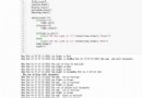
from matplotlib import pyplot as pltimport numpy as npfig, ax = plt.subplots()plt.style.use('classic')plt.title("square numbers")ax.set_xlim(-11, 11)ax.set_ylim(0, 100)x = np.array(range(-10, 11))y = x * xrect1 = plt.bar(x, y)for r in rect1: ax.text(r.get_x(), r.get_height() / 2, r.get_height())plt.show()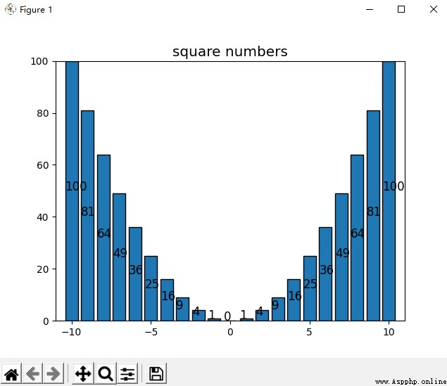
如圖使用 classic 風格,x 軸數據為[-10, 10]的整數,構造的函數為 y=x2,顯示位置並將其將數值改到了柱形圖內部垂直居中的位置。
對成績數據 data1402.csv 進行分段統計:每 5 分作為一個分數段,展示出每個分數段的人數直方圖。
from matplotlib import pyplot as pltimport numpy as npimport pandas as pddf = pd.read_csv("./data1402.csv", encoding='utf-8', dtype=str)df = pd.DataFrame(df, columns=['score'], dtype=np.float)section = np.array(range(0, 105, 5))result = pd.cut(df['score'], section)count = pd.value_counts(result, sort=False)fig, ax = plt.subplots()plt.style.use('classic')ax.set_xlim(0, 100)rect1 = plt.bar(np.arange(2.5, 100, 5), count, width=5)for r in rect1: ax.text(r.get_x(), r.get_height(), r.get_height())plt.show()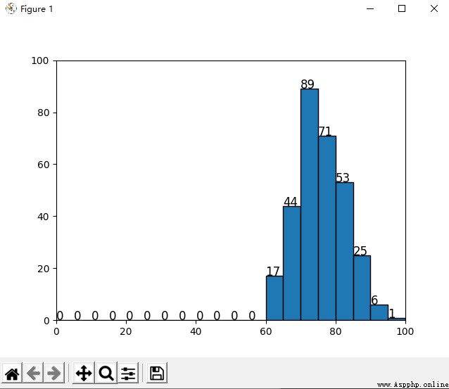
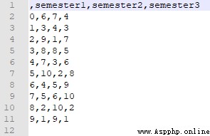
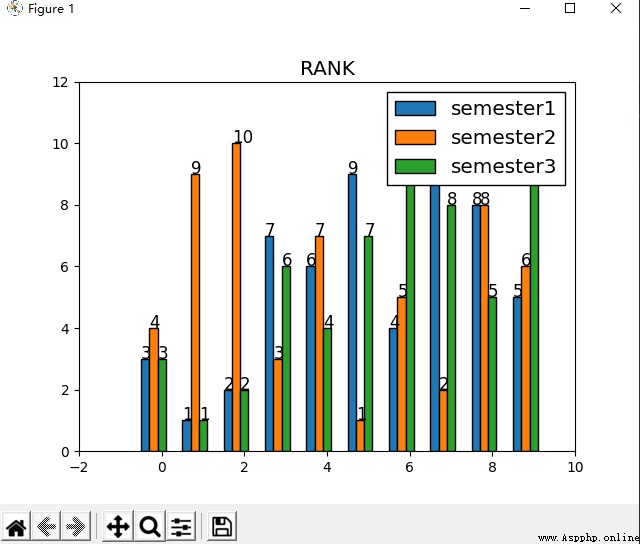
自行創建出 10 個學生的 3 個學期排名數據,並通過直方圖進行對比展示。
import randomsemester1 = np.arange(1, 11)semester2 = np.arange(1, 11)semester3 = np.arange(1, 11)random.shuffle(semester1)random.shuffle(semester2)random.shuffle(semester3)df = pd.DataFrame({'semester1':semester1, 'semester2':semester2, 'semester3':semester3})print(df)df.to_csv("data1403.csv", encoding="utf-8")使用如上代碼創建出隨機的排名數據。
df = pd.read_csv("./data1403.csv", encoding='utf-8', dtype=str)df = pd.DataFrame(df, columns=['semester1', 'semester2', 'semester3'], dtype=np.int)df['total'] = (df['semester1'] + df['semester2'] + df['semester3']) / 3df = df.sort_values('total')fig, ax = plt.subplots()plt.style.use('classic')plt.title('RANK')width = 0.2x = np.array(range(0, 10))rect1 = ax.bar(x-2*width, df['semester1'], width=width, label='semester1')rect2 = ax.bar(x-width, df['semester2'], width=width, label='semester2')rect3 = ax.bar(x, df['semester3'], width=width, label='semester3')for r in rect1: ax.text(r.get_x(), r.get_height(), r.get_height())for r in rect2: ax.text(r.get_x(), r.get_height(), r.get_height())for r in rect3: ax.text(r.get_x(), r.get_height(), r.get_height())plt.legend(ncol=1)plt.show()如上代碼繪圖:
線圖 :
把這個圖像做一些調整,要求出現 5 個完整的波峰。
調大 cos 波形的幅度
調大 sin 波形的頻率
import numpy as npfrom matplotlib import pyplot as pltx = np.linspace(-5 * np.pi, 5 * np.pi, 500)y1 = 3 * np.cos(x)y2 = np.sin(4*x)fig, ax = plt.subplots()plt.style.use('classic')ax.spines["right"].set_visible(False)ax.spines["top"].set_visible(False)ax.spines['bottom'].set_position(('data',0))ax.xaxis.set_ticks_position('bottom')ax.spines['left'].set_position(('data',0))ax.yaxis.set_ticks_position('left')plt.plot(x, y1, color='blue', linestyle='-', label='y=3cosx')plt.plot(x, y2, color='red', linestyle='-', label='y=sin3x')plt.legend()plt.show()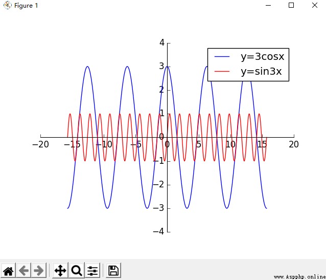
用線圖展示北京空氣質量數據
展示 10-15 年 PM 指數月平均數據的變化情況,一幅圖中有 6 條曲線,每年 1 條曲線。
import numpy as npimport pandas as pdfrom matplotlib import pyplot as pltorig_df = pd.read_csv("./BeijingPM20100101_20151231.csv", encoding='utf-8', dtype=str)orig_df = pd.DataFrame(orig_df, columns=['year', 'month', 'PM_US Post'])df = orig_df.dropna(0, how='any')df['month'] = df['month'].astype(int)df['year'] = df['year'].astype(int)df['PM_US Post'] = df['PM_US Post'].astype(int)df.reset_index(drop=True, inplace=True)num = len(df)section = np.arange(1, 13)record = 0fig, ax = plt.subplots()plt.style.use('classic')plt.title("2010-2015 Beijing average PM2.5(from PM_US Post) per month")for nowyear in range(2010, 2016): i = record result = [0 for i in range(13)] nowsum = 0 cntday = 0 nowmonth = 1 while i < num: if df['month'][i] == nowmonth: cntday = cntday + 1 nowsum = nowsum + df['PM_US Post'][i] else: if df['year'][i] != nowyear: record = i result[nowmonth] = nowsum / cntday break result[nowmonth] = nowsum / cntday cntday = 1 nowsum = df['PM_US Post'][i] nowmonth = df['month'][i] i = i + 1 result = result[1:] # x = np.array(range(1, 13)) plt.plot(x, result, linestyle='-', label=str(nowyear))plt.legend()plt.show()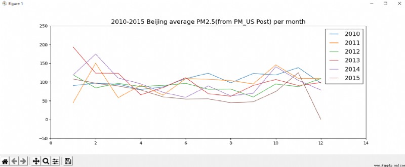
到此,相信大家對“Python實現數據可視化實例代碼分析”有了更深的了解,不妨來實際操作一番吧!這裡是億速雲網站,更多相關內容可以進入相關頻道進行查詢,關注我們,繼續學習!