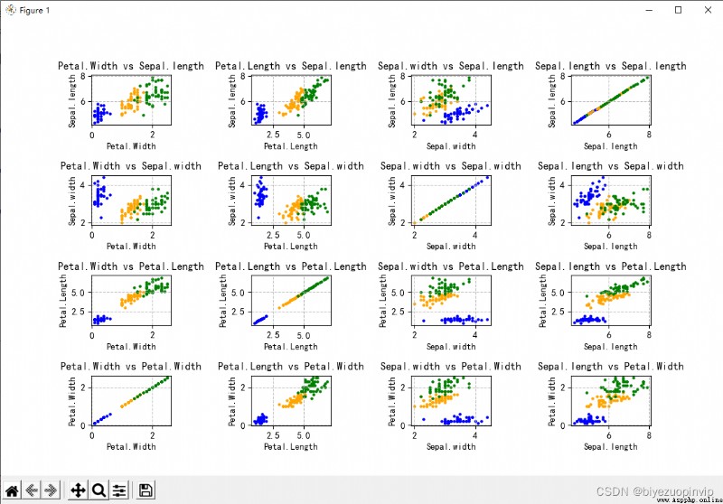
使用 Iris 數據集,在一個 figure 中繪制出右側的 16 個子圖。
分別使用花瓣長度、花瓣寬度、花萼長度和花萼寬度這四種數據,兩兩組合,形成散點。
找一組自己感興趣的真實數據,繪制出餅圖。並看看數據的項數在什麼范圍比較合適在餅圖中展示;
調整數據的順序或角度,使得第一個扇區在 12 點方向開始;
調整字體的大小、標簽的位置等參數。
在中國地圖上展示每個省的高考人數或大學數量。
展示自己家鄉所在城市的溫度變化熱力圖,要求至少有 10 天的數據。
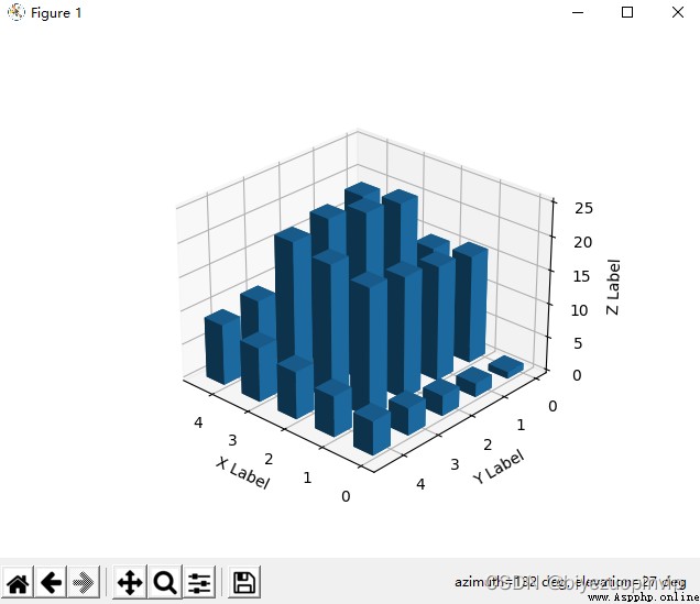
生成一個直方圖,有 25 根直方柱。要求直方柱的最小值是 1,最大值是 25,要求沿著邊緣,從外到內逐步增大
生成一個金字塔的線圖;
生成一上一下兩個金字塔,疊放在一起。
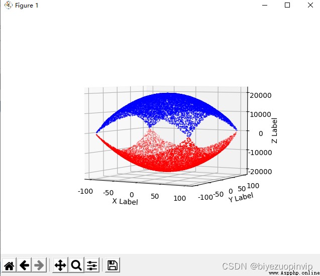
生成一個散點圖,z=x2+y2
Microsoft Windows 10 版本18363
PyCharm 2020.2.1 (Community Edition)
Python 3.8(Scrapy 2.4.0 + numpy 1.19.4 + pandas 1.1.4 + matplotlib 3.3.3)
使用 Iris 數據集,在一個 figure 中繪制出右側的 16 個子圖。
分別使用花瓣長度、花瓣寬度、花萼長度和花萼寬度這四種數據,兩兩組合,形成散點。
from matplotlib import pyplot as plt
import numpy as np
import pandas as pd
from pylab import *
mpl.rcParams['font.sans-serif'] = ['SimHei']
df = pd.read_csv("./iris.csv", encoding='utf-8', dtype=str)
df = pd.DataFrame(df, columns=['Sepal.length', 'Sepal.width', 'Petal.Length', 'Petal.Width', 'Species'], dtype=str)
colors = ['blue', 'orange', 'green']
df['Sepal.length'] = df['Sepal.length'].astype(np.float)
df['Sepal.width'] = df['Sepal.width'].astype(np.float)
df['Petal.Length'] = df['Petal.Length'].astype(np.float)
df['Petal.Width'] = df['Petal.Width'].astype(np.float)
Species = df.Species.unique()
print(Species)
fig, ax = plt.subplots()
labelx = ['Petal.Width', 'Petal.Length', 'Sepal.width', 'Sepal.length']
labely = ['Sepal.length', 'Sepal.width', 'Petal.Length', 'Petal.Width']
for index in range(16):
plt.subplot(4, 4, index + 1)
plt.xlabel(labelx[index % 4])
plt.ylabel(labely[int(index / 4)])
plt.title(labelx[index % 4] + ' vs ' + labely[int(index / 4)])
plt.grid(True, linestyle='--', alpha=0.8)
for i in range(len(Species)):
plt.scatter(df.loc[df.Species == Species[i], labelx[index % 4]], df.loc[df.Species == Species[i], labely[int(index / 4)]], s=5, color=colors[i], label=Species[i])
plt.subplots_adjust(left=None, bottom=None, right=None, top=None,
wspace=1, hspace=1)
plt.show()
找一組自己感興趣的真實數據,繪制出餅圖。並看看數據的項數在什麼范圍比較合適在餅圖中展示;
調整數據的順序或角度,使得第一個扇區在 12 點方向開始;
調整字體的大小、標簽的位置等參數。
選用了之前北京 2010-2015 年 PM 值狀況所對應的的空氣質量等級進行了餅圖展示,調整了字體大小、位置、餅圖大小、每一塊的順序(順逆時針)、初始塊的角度等。
from matplotlib import pyplot as plt
import numpy as np
import pandas as pd
from pylab import *
mpl.rcParams['font.sans-serif'] = ['SimHei']
section = [0, 35, 75, 115, 150, 250, 99999]
section_name = ["優", "良", "輕度污染", "中度污染", "重度污染", "嚴重污染"]
orig_df = pd.read_csv("./BeijingPM20100101_20151231.csv", encoding='utf-8', dtype=str)
orig_df = pd.DataFrame(orig_df, columns=['year', 'month', 'day', 'PM_US Post'])
df = orig_df.dropna(0, how='any')
df['PM_US Post'] = df['PM_US Post'].astype(np.int)
result = pd.DataFrame(pd.cut(df['PM_US Post'], section, labels=section_name, ordered=False))
result_count = result['PM_US Post'].value_counts(sort=False)
plt.pie(result_count, labels=result_count.index, startangle=90, counterclock=False, radius=1.5, textprops={'fontsize':8}, labeldistance=0.5)
plt.show()
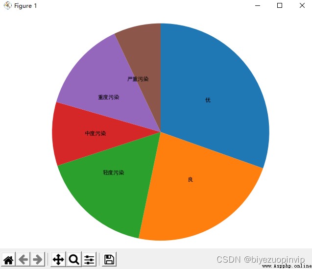
可以發現該餅圖的嚴重污染部分已經發生了錯位,因而餅圖適合於 5~6 塊,即最小塊不要小於 15% 左右會比較好看。
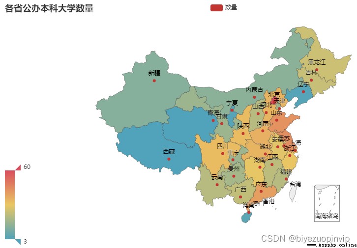
在中國地圖上展示每個省的高考人數或大學數量
選擇展示各省/市的公辦本科大學數量。
 from pyecharts import options as opts
from pyecharts.charts import Map
import numpy as np
import pandas as pd
import random
df = pd.read_csv("./中國大學數量.csv", encoding='utf-8', dtype=np.str)
df = pd.DataFrame(df, columns=['省/市', '公辦本科大學數量'])
df['省/市'] = df['省/市'].astype(np.str)
df['公辦本科大學數量'] = df['公辦本科大學數量'].astype(np.int)
class Data:
@staticmethod
def province() -> list:
res = []
for i in range(len(df)):
res.append(str(df['省/市'][i]))
return res
@staticmethod
def values() -> list:
res = []
for i in range(len(df)):
res.append(int(df['公辦本科大學數量'][i]))
return res
def map2() -> Map:
c = (
Map()
.add("數量", [list(z) for z in zip(Data.province(), Data.values())], "china").set_global_opts(
title_opts=opts.TitleOpts(title="各省公辦本科大學數量"),
visualmap_opts=opts.VisualMapOpts(min_=int(df['公辦本科大學數量'].min()), max_=int(df['公辦本科大學數量'].max())))
.set_series_opts(label_opts=opts.LabelOpts(is_show=True))
)
return c
map2().render("map2.html")
展示自己家鄉所在城市的溫度變化熱力圖,要求至少有 10 天的數據。
選取深圳市作圖,爬取如下網址未來十天深圳市的天氣數據
https://www.tianqi.com/shenzhen/15/](https://www.tianqi.com/shenzhen/15/)
import scrapy
from weather.items import WeatherItem
class TianqiSpider(scrapy.Spider):
name = 'tianqi'
allowed_domains = ['tianqi.com']
start_urls = ['https://www.tianqi.com/shenzhen/15']
def parse(self, response):
item = WeatherItem()
data = response.xpath('//ul[@class="weaul"]/li')
for each in data:
item['date'] = each.xpath('a/div[1]/span[1]/text()').extract()
low = each.xpath('a/div[4]/span[1]/text()').extract()[0]
high = each.xpath('a/div[4]/span[2]/text()').extract()[0]
item['temperature'] = str((int(low) + int(high)) / 2)
yield item
pass
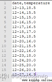
爬蟲代碼及結果如上
from pyecharts import options as opts
from pyecharts.charts import Geo
from pyecharts.globals import ChartType
from pyecharts.render import make_snapshot
from snapshot_phantomjs import snapshot
import pandas as pd
import numpy as np
df = pd.read_csv("./weather.csv", encoding='utf-8', dtype=np.str)
df = pd.DataFrame(df, columns=['temperature'])
df['temperature'] = df['temperature'].astype(np.float)
day = 0
class Data:
guangdong_city = ["深圳市"]
@staticmethod
def values() -> list:
res = []
for i in range(len(df)):
res.append(float(df['temperature'][i]))
return res
def geo_guangdong(title) -> Geo:
c = (
Geo()
.add_schema(maptype="廣東")
.add(
title,
[list(z) for z in zip(Data.guangdong_city, [Data.values()[day]])],
type_=ChartType.HEATMAP,
)
.set_global_opts(
visualmap_opts=opts.VisualMapOpts(min_=0, max_=int(df['temperature'].max())),#is_piecewise=True),
title_opts=opts.TitleOpts(title="廣東省深圳市12月13-27日溫度變化情況"),
)
)
return c
for i in range(10):
day = i
str_date="12月" + str(i+13) + "日"
make_snapshot(snapshot, geo_guangdong(str_date).render(),
str(i+1)+".png", pixel_ratio=1)
生成 10 天熱力圖代碼如上。
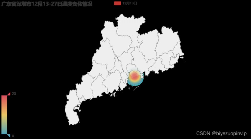
其中一張如上,其余另附。
import numpy as np
import matplotlib.pyplot as plt
import math
from mpl_toolkits.mplot3d import Axes3D
#1.生成fig對象和ax對象
fig = plt.figure()
ax = fig.add_subplot(projection='3d')
ax.set_xlabel('X Label')
ax.set_ylabel('Y Label')
ax.set_zlabel('Z Label')
#2.生成數據
x = []
y = []
z = [i + 1 for i in range(25)]
left = up = -1
down = right = 5
px = py = 0
x.append(px)
y.append(py)
def add(px, py):
x.append(px)
y.append(py)
while True:
if px == 2 and py == 2:
break
while py + 1 < down:
py = py + 1
add(px, py)
left = left + 1
while px + 1 < right:
px = px + 1
add(px, py)
down = down - 1
while py - 1 > up:
py = py - 1
add(px, py)
right = right - 1
while px - 1 > left:
px = px - 1
add(px, py)
up = up + 1
bottom = [0 for _ in range(25)]
width = depth = 0.5
#3.調用bar3d,畫3D直方圖
ax.bar3d(x, y, bottom, width, depth, z, shade=True)
#4.顯示圖形
plt.show()
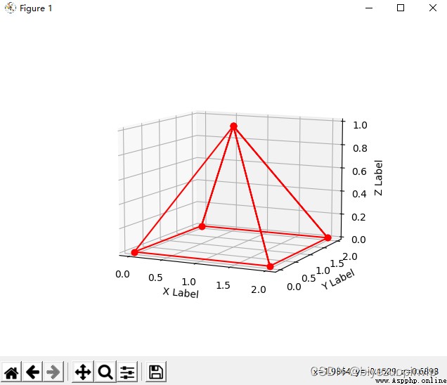
生成一個金字塔的線圖;
生成一上一下兩個金字塔,疊放在一起。
import numpy as np
import matplotlib.pyplot as plt
import math
from mpl_toolkits.mplot3d import Axes3D
#1.生成fig對象和ax對象
fig = plt.figure()
ax = fig.add_subplot(projection='3d')
ax.set_xlabel('X Label')
ax.set_ylabel('Y Label')
ax.set_zlabel('Z Label')
#2.生成數據
x = np.array([1,0,2,1,2,2,1,2,0,1,0,0])
y = np.array([1,0,0,1,0,2,1,2,2,1,2,0])
z = np.array([1,0,0,1,0,0,1,0,0,1,0,0])
z_minus = -1 * z;
#3.調用plot,畫3D的線圖
ax.plot(x,y,z_minus,"b",marker='o')
ax.plot(x,y,z,"r",marker='o')
#4.顯示圖形
plt.show()
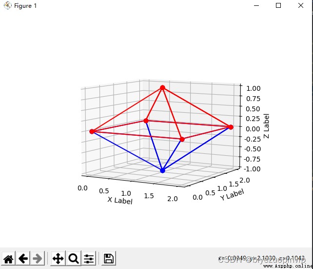
import numpy as np
import matplotlib.pyplot as plt
import random
import math
from mpl_toolkits.mplot3d import Axes3D
#1.生成fig對象和ax對象
fig = plt.figure()
ax = fig.add_subplot(projection='3d')
ax.set_xlabel('X Label')
ax.set_ylabel('Y Label')
ax.set_zlabel('Z Label')
#2.生成數據
x = np.linspace(-100,100,10000)
np.random.shuffle(x)
y = np.linspace(-100,100,10000)
np.random.shuffle(y)
z = x**2 + y**2 - 20000
z_minus = -1 * z
ax.scatter(x, y, z, zdir='z', s=1, c='r', marker='.', depthshade=True)
ax.scatter(x, y, z_minus, zdir='z', s=1, c='b', marker='.', depthshade=True)
#4.顯示圖形
plt.show()