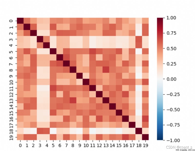
1.heatmap Heat map
Thermograph is often used to show the correlation coefficient matrix of a group of variables in practice , It is also useful for displaying the data distribution of contingency tables , Through the thermodynamic diagram, we can feel the difference of numerical value directly . In this paper seaborn To generate .
2. Data set presentation
The file type read in this article is Excel form , The size is 20*20 Matrix , The details are as follows :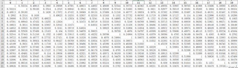
3. Code display
// An highlighted block
import matplotlib.pyplot as plt
import seaborn as sns
import pandas as pd
df = pd.read_excel("C:/Users/coast/Desktop/20_20.xlsx")
#sns.set(font_scale=1.25)# Character size setting
print(df)
hm=sns.heatmap(df,vmin=-1,vmax=1,cmap="RdBu_r")
plt.show()
4. Result display 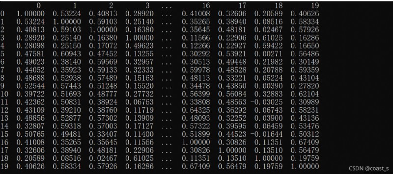
If you are interested in other parameter settings and specific contents of the thermodynamic diagram , You can refer to this article on Zhihu : Heat map reference link