source : Learn quickly Python
The open source project recommended to you is a great visualization Library -- PyG2Plot .
This Python Visualization rookie , stay GitHub It's like this on the Internet :
PyG2Plot yes
@AntV/G2Plotstay Python3 The package on .G2Plot It's a set of simple 、 Easy to use 、 And has the certain expansion ability and the combination ability statistical chart library , Based on the theory of graph grammar .
But research PyG2Plot You have to start with G2 Let's start , It is an open source of ant financial services based on graph Syntax , Statistical chart engine for data analysis . Later, on the basis of it , Encapsulate the statistical chart library commonly used in business ——G2Plot .
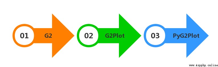
But now, Python It's so hot , Almost every nb Front end visualization Library of , It's going to be used in the end python Develop a set to generate the corresponding html The library of ! It's no exception , It encapsulates Python Visualization Library ——PyG2Plot.
stay GitHub On , An example diagram is also provided , I'm interested in the scatter plot in the lower right corner .
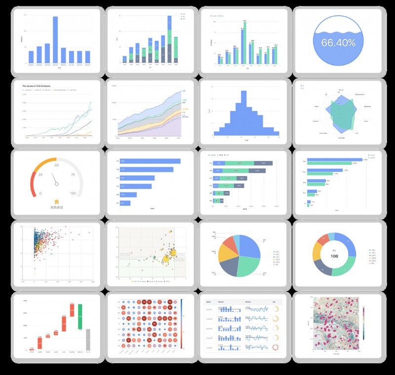
As a result, I went to see the example with great interest , It's a buyer show and a seller show !
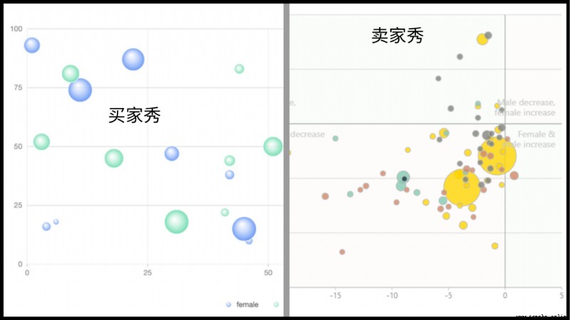
I don't care , I want the one on the right
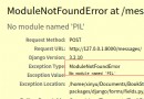
I still need to do it myself , Then install it first PyG2Plot Kuba
pip install pyg2plot At present pyg2plot Just a simple one API, Just list the parameters you need
Plot
Plot(plot_type: str): obtain Plot Corresponding class instance .
plot.set_options(options: object): Set up a G2Plot Configuration of graphics .
plot.render(path, env, **kwargs): Rendering a HTML file , At the same time, you can pass in the path of the file , as well as jinja2 env and kwargs Parameters .
plot.render_notebook(env, **kwargs): Render graphics to jupyter Preview of .
So we can import Plot Method
from pyg2plot import PlotWe're going to draw a scatter plot
scatter = Plot("Scatter") The next step is to get the data and set the parameters plot.set_options(), Get data here and use it directly requset Case analysis json, And parameters let me come back together :
import requests
# Request address
url = "https://gw.alipayobjects.com/os/bmw-prod/0b37279d-1674-42b4-b285-29683747ad9a.json"
# send out get request
a = requests.get(url)
# Get the returned json data , And assign it to data
data = a.json()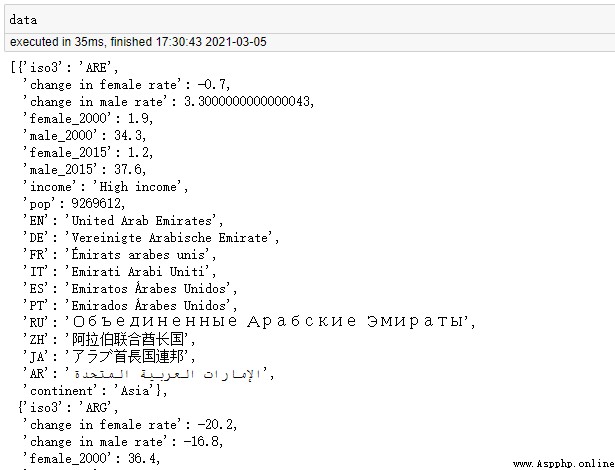
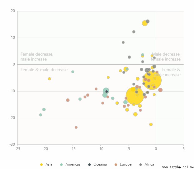
Successfully get the parsed object collection data .
Here are the parameters , A meal operation as fierce as a tiger :
scatter.set_options(
{
'appendPadding': 30,
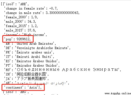
'data': data,
'xField': 'change in female rate',
'yField': 'change in male rate',
'sizeField': 'pop',
'colorField': 'continent',
'color': ['#ffd500', '#82cab2', '#193442', '#d18768','#7e827a'],
'size': [4, 30],
'shape': 'circle',
'pointStyle':{'fillOpacity': 0.8,'stroke': '#bbb'},
'xAxis':{'line':{'style':{'stroke': '#aaa'}},},
'yAxis':{'line':{'style':{'stroke': '#aaa'}},},
'quadrant':{
'xBaseline': 0,
'yBaseline': 0,
'labels': [
{'content': 'Male decrease,\nfemale increase'},
{'content': 'Female decrease,\nmale increase'},
{'content': 'Female & male decrease'},
{'content': 'Female &\n male increase'}, ],},
}) If in Jupyter notebook In the preview , Then execute the following statement
scatter.render_notebook() If you want to render the whole html Words , Then execute the following statement
scatter.render(" Scatter plot .html")Take a look at the results
Dear reader , This may be boring , You can go straight to the end of the article or click collect .
The main thing is to explain in detail just now scatter.set_options() In the parameters of the , It's convenient for you to transform yourself later !
Divide it into several parts and explain it bit by bit :
'appendPadding': 30, #①
'data': data, #②
'xField': 'change in female rate', #③
'yField': 'change in male rate',
① The space between the top right bottom left of the chart , See the figure below for details
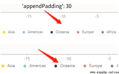
② Set chart data source ( among data It has been assigned before ), The data source here is a collection of objects , for example :[{ time: '1991',value: 20 }, { time: '1992',value: 20 }].
③xField and yField These two parameters are horizontal / The vertical axis corresponds to the field .
'sizeField': 'pop', #④
'colorField': 'continent', #⑤
'color': ['#ffd500', '#82cab2', '#193442', '#d18768','#7e827a'], #⑥
'size': [4, 30], #⑦
'shape': 'circle', #⑧
④ Specifies the field name corresponding to the scatter size , We use pop( Population ) Field .
⑤ Specifies the field name corresponding to the scatter color , We use continent( continent ) Field .
⑥ Set the color of the scatter , Specifies a series of color values .
⑦ Set the size of the scatter , You can specify the size array [minSize, maxSize]
⑧ The shape of the set point , such as cicle、square
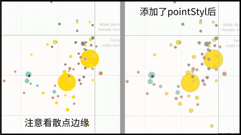
'pointStyle':{'fillOpacity': 0.8,'stroke': '#bbb'}, #⑨
'xAxis':{'line':{'style':{'stroke': '#aaa'}},}, #⑩
'yAxis':{'line':{'style':{'stroke': '#aaa'}},},⑨pointStyle It's a broken line style , But in the scatter plot , It refers to the stroke of scattered points . in addition fillOpacity Set transparency ,stroke Is to set the stroke color .
⑩ This is just setting the color of the axis .
'quadrant':{
    'xBaseline': 0,
    'yBaseline': 0,
    'labels': [
    {'content': 'Male decrease,\nfemale increase'},
    {'content': 'Female decrease,\nmale increase'},
    {'content': 'Female & male decrease'},
    {'content': 'Female &\n male increase'}, ],},
quadrant It's a four quadrant component , The specific subdivision configuration is as follows :
PyG2Plot The introduction document of is not perfect , Many of the above parameters are groping , Just for your reference .

PyG2Plot The principle is actually very simple , It draws lessons from pyecharts The implementation of the , But because ant gold G2Plot Configuration structure based entirely on visual analysis theory , So the package is better than pyecharts Simplicity is very, very much .
-------- End --------