This article only has some code , There are many contents to be analyzed , But there is no necessary explanation
It's my first time to do , I don't know much about stocks , There may be some mistakes .
# Guide pack
import numpy as np
import matplotlib.pyplot as plt
from pandas_datareader import data
from scipy.signal import find_peaks
from scipy.stats import norm
import pandas_datareader.data as web
import pandas_datareader.data as webdata
import datetime
import pandas as pd
import seaborn as sns # pip install seaborn
import matplotlib.patches as mpatches
from pyfinance import TSeries # pip install pyfinance
from empyrical import sharpe_ratio,omega_ratio,alpha_beta,stats # pip install empyrical
import warnings
warnings.filterwarnings('ignore')
tickers = ['F','TSLA','FSR','GM','NEE','SO','BYD','NIO','SOL','JKS']
startDate = '2019-06-01'
endDate = '2022-06-01'
F = webdata.get_data_stooq('F',startDate,endDate) # ford
TSLA = webdata.get_data_stooq('TSLA',startDate,endDate) # tesla
FSR = webdata.get_data_stooq('FSR',startDate,endDate) # Duke energy
GM = webdata.get_data_stooq('GM',startDate,endDate) # general motors
NEE = webdata.get_data_stooq('NEE',startDate,endDate) # NextEra Energy companies
SO = webdata.get_data_stooq('SO',startDate,endDate)# Southern Company
BYD = webdata.get_data_stooq('BYD',startDate,endDate)# BYD
NIO = webdata.get_data_stooq('NIO',startDate,endDate) # Wei to
SOL = webdata.get_data_stooq('SOL',startDate,endDate) # Renewables new energy
JKS = webdata.get_data_stooq('JKS',startDate,endDate) # Faraday's future
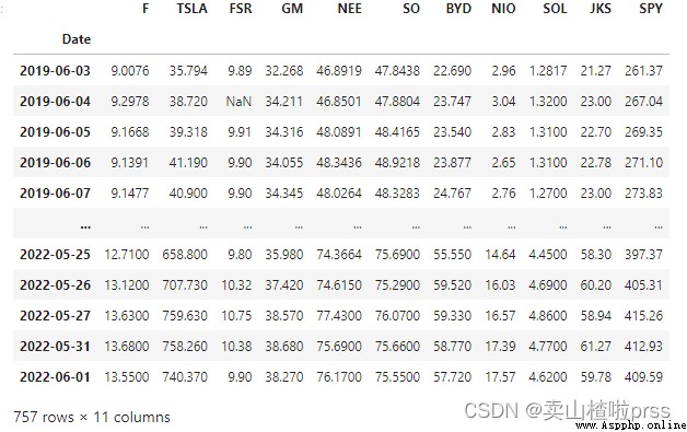
stocks = pd.DataFrame({
"F": F["Close"],
"TSLA": TSLA["Close"],
"FSR": FSR["Close"],
"GM": GM["Close"],
"NEE": NEE["Close"],
"SO": SO["Close"],
"BYD": BYD["Close"],
"NIO": NIO["Close"],
"SOL": SOL["Close"],
"JKS": JKS["Close"],
})
stocks
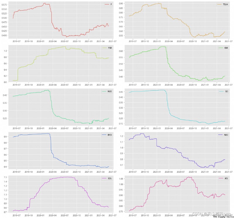
Plot the closing prices of the stocks
# Closing price trend
plt.style.use('ggplot') # style
color_palette=sns.color_palette("hls",10) # Color
plt.rcParams['font.sans-serif']=['Microsoft YaHei']
fig = plt.figure(figsize = (16,12))
for i,j in enumerate(tickers):
plt.subplot(5,2,i+1)
stocks[j].plot(kind='line', style=['-'],color=color_palette[i],label=j)
plt.xlabel('')
plt.ylabel('closing prices')
plt.title('{} - closing prices Plot'.format(j))
plt.legend()
plt.tight_layout()
Percentage change of closing price(day)
# Daily yield trend
# As you can see from the picture above , The overall fluctuation trend is up and down , Individual time points have great volatility .
plt.style.use('ggplot')
color_palette=sns.color_palette("hls",10)
plt.rcParams['font.sans-serif']=['Microsoft YaHei']
fig = plt.figure(figsize = (16,12))
for i,j in enumerate(tickers):
plt.subplot(5,2,i+1)
stocks[j].pct_change().plot(kind='line', style=['-'],color=color_palette[i],label=j)
plt.xlabel('')
plt.ylabel('percentage')
plt.title('{} - Percentage change of closing price'.format(j))
plt.legend()
plt.tight_layout()
Average daily return of closing price
# Average daily earnings
for i in tickers:
r_daily_mean = ((1+stocks[i].pct_change()).prod())**(1/stocks[i].shape[0])-1
#print("%s - Average daily return:%f"%(i,r_daily_mean))
print("%s - Average daily return is:%s"%(i,str(round(r_daily_mean*100,2))+"%"))
F - Average daily return is:0.05%
TSLA - Average daily return is:0.4%
FSR - Average daily return is:0.0%
GM - Average daily return is:0.02%
NEE - Average daily return is:0.06%
SO - Average daily return is:0.06%
BYD - Average daily return is:0.12%
NIO - Average daily return is:0.24%
SOL - Average daily return is:0.17%
JKS - Average daily return is:0.14%
# Probability distribution diagram of daily yield
# Look at the distribution
plt.style.use('ggplot')
plt.rcParams['font.sans-serif']=['Microsoft YaHei']
fig = plt.figure(figsize = (16,12))
for i,j in enumerate(tickers):
plt.subplot(5,2,i+1)
sns.distplot(stocks[j].pct_change(), bins=100, color=color_palette[i])
plt.ylabel('Daily Return')
plt.title('{} - Daily Return distribution'.format(j))
plt.tight_layout();
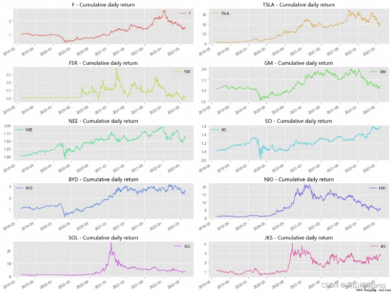
# Cumulative daily yield
# The cumulative daily rate of return helps to determine the value of the investment on a regular basis . The cumulative daily yield can be calculated using the daily percentage change , Just add 1 And calculate the cumulative product .
# The cumulative daily rate of return is calculated relative to the investment . If the cumulative daily yield exceeds 1, Is making a profit , Otherwise, it will be a loss .
plt.style.use('ggplot')
plt.rcParams['font.sans-serif']=['Microsoft YaHei']
fig = plt.figure(figsize = (16,12))
for i,j in enumerate(tickers):
plt.subplot(5,2,i+1)
cc = (1+stocks[j].pct_change()).cumprod()
cc.plot(kind='line', style=['-'],color=color_palette[i],label=j)
plt.xlabel('')
plt.title('{} - Cumulative daily return'.format(j))
plt.legend()
plt.tight_layout()
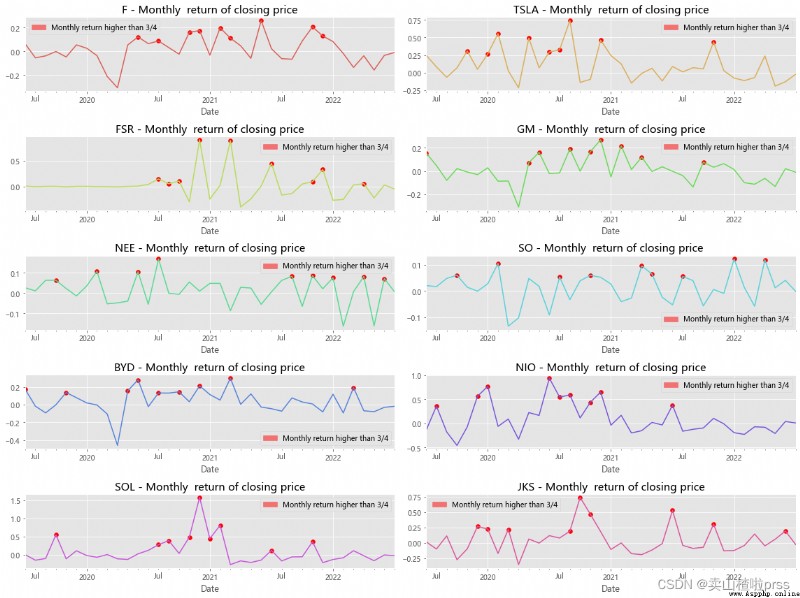
Monthly return of closing price
# Monthly yield
# Visual analysis of monthly yield , Mark the points where the yield is higher than the third quarter .
# The monthly yield fluctuates around the moving average
fig = plt.figure(figsize = (16,12))
for i,j in enumerate(tickers):
plt.subplot(5,2,i+1)
daily_ret = stocks[j].pct_change()
mnthly_ret = daily_ret.resample('M').apply(lambda x : ((1+x).prod()-1))
mnthly_ret.plot(color=color_palette[i]) # Monthly return
start_date=mnthly_ret.index[0]
end_date=mnthly_ret.index[-1]
plt.xticks(pd.date_range(start_date,end_date,freq='Y'),[str(y) for y in range(start_date.year+1,end_date.year+1)])
# Show points with monthly yield greater than 3/4 quantile
dates=mnthly_ret[mnthly_ret>mnthly_ret.quantile(0.75)].index
for i in range(0,len(dates)):
plt.scatter(dates[i], mnthly_ret[dates[i]],color='r')
labs = mpatches.Patch(color='red',alpha=.5, label="Monthly return higher than 3/4")
plt.title('%s - Monthly return of closing price'%j,size=15)
plt.legend(handles=[labs])
plt.tight_layout()
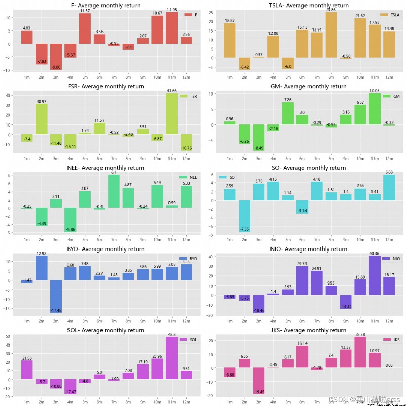
Average monthly return
# Average monthly earnings
plt.style.use('ggplot')
plt.rcParams['font.sans-serif']=['Microsoft YaHei']
fig = plt.figure(figsize = (15,15))
for i,j in enumerate(tickers):
plt.subplot(5,2,i+1)
daily_ret = stocks[j].pct_change()
mnthly_ret = daily_ret.resample('M').apply(lambda x : ((1+x).prod()-1))
mrets=(mnthly_ret.groupby(mnthly_ret.index.month).mean()*100).round(2)
attr=[str(i)+'m' for i in range(1,13)]
v=list(mrets)
plt.bar(attr, v,color=color_palette[i],label=j)
for a, b in enumerate(v):
plt.text(a, b+0.08,b,ha='center',va='bottom')
plt.title('{}- Average monthly return '.format(j))
plt.legend()
plt.tight_layout()
# The graph shows that some months have a positive average yield , And some months have negative average returns ,
Three year compound annual growth rate (CAGR)
Compound annual growth rate (Compound Annual Growth Rate,CAGR) It is the annual growth rate of an investment in a specific period
CAGR=( Existing value / Basic value )^(1/ number of years ) - 1 or (end/start)^(1/# years)-1
It is a constant rate of return over time . In other words , This ratio tells you that at the end of the investment period , What you really get . Its purpose is to describe the expected value obtained by transforming a return on investment into a more stable return on investment .
 # Compound annual growth rate (CAGR)
for i in tickers:
days = (stocks[i].index[0] - stocks[i].index[-1]).days
CAGR_3 = (stocks[i][-1]/ stocks[i][0])** (365.0/days) - 1
print("%s (CAGR):%s"%(i,str(round(CAGR_3*100,2))+"%"))
F (CAGR):-12.74%
TSLA (CAGR):-63.6%
FSR (CAGR):-0.03%
GM (CAGR):-5.53%
NEE (CAGR):-14.94%
SO (CAGR):-14.14%
BYD (CAGR):-26.77%
NIO (CAGR):-44.8%
SOL (CAGR):-34.81%
JKS (CAGR):-29.16%
Annualized rate of return
# Annualized rate of return
# Annualized rate of return , It is an important standard to judge whether a stock has investment value !
# Annualized rate of return , That is, the annual dividend per share divided by the share price
for i in tickers:
r_daily_mean = ((1+stocks[i].pct_change()).prod())**(1/stocks[i].shape[0])-1
annual_rets = (1+r_daily_mean)**252-1
print("%s'annualized rate of return is:%s"%(i,str(round(annual_rets*100,2))+"%"))
F’annualized rate of return is:14.56%
TSLA’annualized rate of return is:174.14%
FSR’annualized rate of return is:0.03%
GM’annualized rate of return is:5.84%
NEE’annualized rate of return is:17.53%
SO’annualized rate of return is:16.43%
BYD’annualized rate of return is:36.45%
NIO’annualized rate of return is:80.92%
SOL’annualized rate of return is:53.24%
JKS’annualized rate of return is:41.06%
maximum drawdowns
Maximum withdrawal rate (Maximum Drawdown), It is used to measure in portfolio value , Before the next peak , The maximum single drop between the highest and lowest points . In other words , This value represents the portfolio risk based on a strategy .
“ The maximum pullback rate refers to pushing back at any historical point in the selected cycle , The maximum value of the rate of return retreat when the net product value reaches the lowest point . Maximum pullback is used to describe the worst possible situation after buying a product . Maximum pullback is an important risk indicator , For hedge funds and quantitative strategy trading , This indicator is more important than volatility .”
The maximum pullback rate exceeds the risk tolerance , It is advisable to choose carefully .
# Maximum withdrawal rate
def getMaxDrawdown(x):
j = np.argmax((np.maximum.accumulate(x) - x) / x)
if j == 0:
return 0
i = np.argmax(x[:j])
d = (x[i] - x[j]) / x[i] * 100
return d
for i in tickers:
MaxDrawdown = getMaxDrawdown(stocks[i])
print("%s maximum drawdowns:%s"%(i,str(round(MaxDrawdown,2))+"%"))
F maximum drawdowns:59.97%
TSLA maximum drawdowns:60.63%
FSR maximum drawdowns:0%
GM maximum drawdowns:57.53%
NEE maximum drawdowns:35.63%
SO maximum drawdowns:38.43%
BYD maximum drawdowns:77.43%
NIO maximum drawdowns:79.77%
SOL maximum drawdowns:88.88%
JKS maximum drawdowns:65.44%
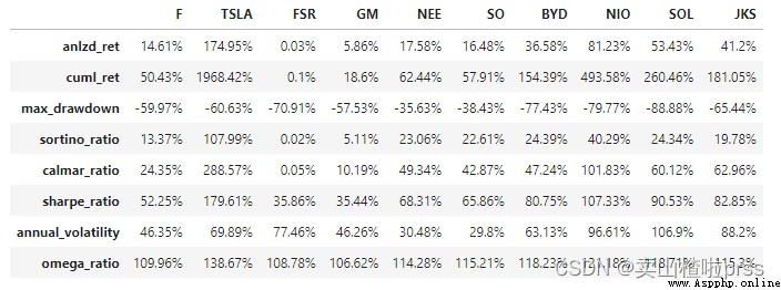
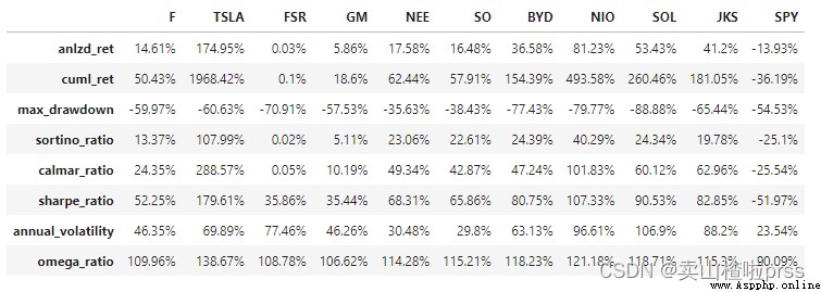
calmer ratios for the top performers
# calmar rate
# Calmar ratio (Calmar Ratio) It describes the relationship between return and maximum pullback . The calculation method is the ratio between the annualized rate of return and the historical maximum pullback .
# Calmar The larger the ratio is , The better the stock performs .
def performance(i):
a = stocks[i].pct_change()
s = a.values
idx = a.index
tss = TSeries(s, index=idx)
dd={
}
dd['anlzd_ret']=str(round(tss.anlzd_ret()*100,2))+"%"
dd['cuml_ret']=str(round(tss.cuml_ret()*100,2))+"%"
dd['max_drawdown']=str(round(tss.max_drawdown()*100,2))+"%"
dd['sortino_ratio']=str(round(tss.sortino_ratio(freq=250),2))+"%"
dd['calmar_ratio']=str(round(tss.calmar_ratio()*100,2))+"%"
dd['sharpe_ratio'] = str(round(sharpe_ratio(tss)*100,2))+"%" # Sharp ratio (Sharpe Ratio): Risk adjusted return . Calculate the total risk per unit of the portfolio , How much excess compensation will be generated .
dd['annual_volatility'] = str(round(stats.annual_volatility(tss)*100,2))+"%" # Volatility
dd['omega_ratio'] = str(round(omega_ratio(tss)*100,2))+"%" # omega_ratio
df=pd.DataFrame(dd.values(),index=dd.keys(),columns = [i])
return df
dff = pd.DataFrame()
for i in tickers:
dd = performance(i)
dff = pd.concat([dff,dd],axis=1)
dff
Volatility
# Annual volatility of daily yield ( rolling )
fig = plt.figure(figsize = (16,15))
for ii,jj in enumerate(tickers):
plt.subplot(5,2,ii+1)
vol = stocks[jj].pct_change()[::-1].rolling(window=252,center=False).std()* np.sqrt(252)
plt.plot(vol,color=color_palette[ii],label=jj)
plt.legend()
plt.tight_layout()
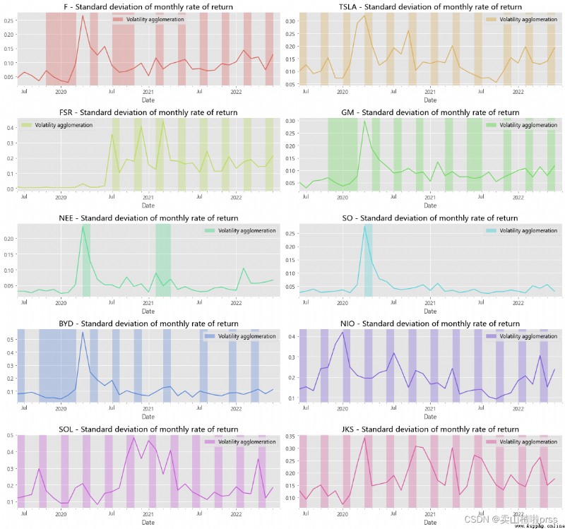
# Annualized standard deviation (volatility) of monthly return
# The annualized standard deviation of the monthly yield ( Volatility )
# Empirical research shows that , Standard deviation of yield ( Volatility ) There is a certain agglomeration phenomenon ,
# That is, high volatility and low volatility tend to gather together , And the periods of high volatility and low volatility are alternating .
# The red department shows , All stocks have certain volatility agglomeration .
fig = plt.figure(figsize = (16,15))
for ii,jj in enumerate(tickers):
plt.subplot(5,2,ii+1)
daily_ret=stocks[jj].pct_change()
mnthly_annu = daily_ret.resample('M').std()* np.sqrt(12)
#plt.rcParams['figure.figsize']=[20,5]
mnthly_annu.plot(color=color_palette[ii],label=jj)
start_date=mnthly_annu.index[0]
end_date=mnthly_annu.index[-1]
plt.xticks(pd.date_range(start_date,end_date,freq='Y'),[str(y) for y in range(start_date.year+1,end_date.year+1)])
dates=mnthly_annu[mnthly_annu>0.07].index
for i in range(0,len(dates)-1,3):
plt.axvspan(dates[i],dates[i+1],color=color_palette[ii],alpha=.3)
plt.title('%s - Standard deviation of monthly rate of return'%jj,size=15)
labs = mpatches.Patch(color=color_palette[ii],alpha=.5, label="Volatility agglomeration")
plt.legend(handles=[labs])
plt.tight_layout()
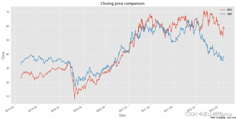
Pairs Trading
# Pairing strategy
# Analysis object:BYD&GM
# Comparison of closing price line chart
ax1 = BYD.plot(y='Close',label='BYD',figsize=(16,8))
GM.plot(ax=ax1,y='Close',label='GM')
plt.title('Closing price comparison')
plt.xlabel('Date')
plt.ylabel('Close')
plt.grid(True)
# Price difference and its mean value
# Closing price spread and its mean value
BYD['diff'] =BYD['Close']-GM['Close']
BYD['diff'].plot(figsize=(16,10))
plt.title('Price difference between BYD and GM')
plt.xlabel('Dtae')
plt.ylabel('Price difference')
plt.axhline(BYD['diff'].mean(),color='blue')
plt.grid(True)
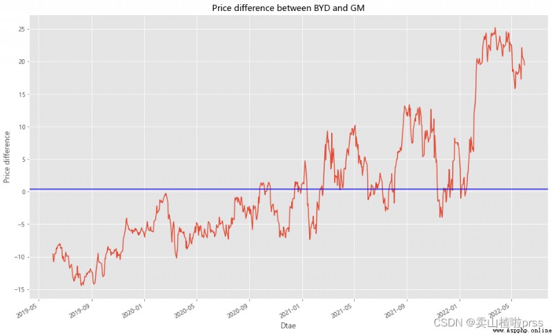
# Maximum deviation point
# Maximum closing spread
BYD['diff'][BYD['diff']==max(BYD['diff'])]
Date
2022-03-25 25.214
Name: diff, dtype: float64
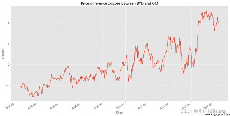
# Measure how far the series deviates from the mean
# measurement BYD and GM The difference between the closing prices of the two stocks The degree of deviation from the average
# Standardize the price difference
BYD['zscore'] =(BYD['diff']-np.mean(BYD['diff']))/np.std(BYD['diff'])
BYD['zscore'].plot(figsize=(16,8))
plt.title('Price difference z-score between BYD and GM')
plt.xlabel('Dtae')
plt.ylabel('z-score')
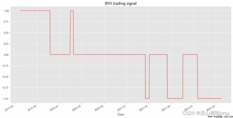
# BYD trading signal
# BYD Stock trading signals
BYD['position1'] = np.where(BYD['zscore']>1,-1,np.nan) # Greater than 1, long
BYD['position1'] = np.where(BYD['zscore']<-1,1,BYD['position1']) # Less than -1, short
BYD['position1'] = np.where(abs(BYD['zscore'])<0.5,0,BYD['position1']) # Close positions within 0.5 range
BYD['position1'] = BYD['position1'].ffill().fillna(0)
BYD['position1'].plot(ylim=[-1.1,1.1],title='BYD trading signal',xlabel='Date',figsize=(16,8))
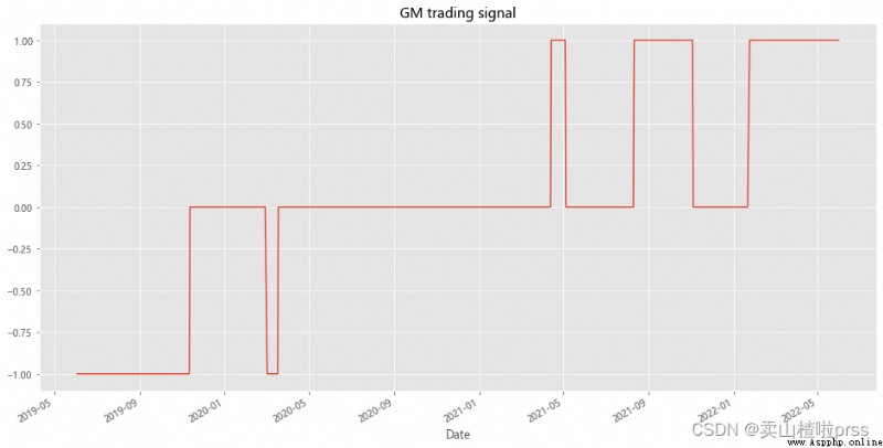
# GM trading signal
# GM Stock trading signals
BYD['position2'] = -np.sign(BYD['position1']) # Opposite to BYD
BYD['position2'].plot(ylim=[-1.1,1.1],title='GM trading signal',xlabel='Date',figsize=(16,8))
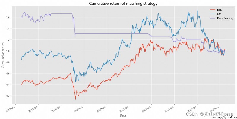
# Cumulative return of strategy
# Cumulative yield of pairing strategy
BYD['BYD']=(np.log(BYD['Close']/BYD['Close'].shift(1))).fillna(0)
BYD['GM']=(np.log(GM['Close']/GM['Close'].shift(1))).fillna(0)
BYD['Pairs_Trading']=0.5*(BYD['position1'].shift(1)*BYD['BYD'])+0.5*(BYD['position2'].shift(1)*BYD['GM'])
BYD[['BYD','GM','Pairs_Trading']].dropna().cumsum().apply(np.exp).plot(figsize=(16,8))
plt.title('Cumulative return of matching strategy')
plt.xlabel('Date')
plt.ylabel('Cumulative return')
plt.grid(True)
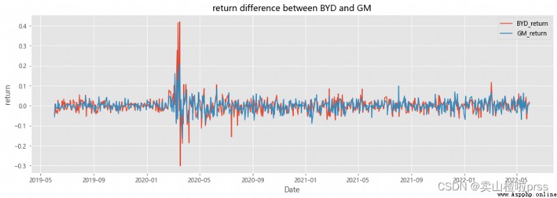
Up and down range analysis
BYD_return = BYD['Close'].pct_change()
GM_return = GM['Close'].pct_change()
BYD['diff_return'] = BYD_return - GM_return
cr = BYD['diff_return'][BYD['diff_return']==BYD['diff_return'].max()]
print(' Maximum yield difference ',cr.values[0])
# Maximum yield difference 0.2384556461576477
fig = plt.figure(figsize = (16,5))
plt.plot(BYD_return.index,BYD_return,label='BYD_return')
plt.plot(GM_return.index,GM_return,label='GM_return')
plt.title('return difference between BYD and GM')
plt.xlabel('Date')
plt.ylabel('return')
plt.legend()
plt.grid(True)
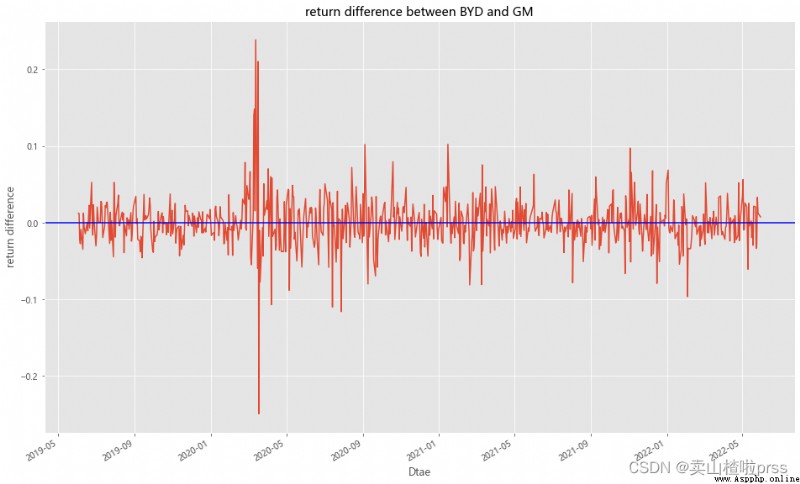
# Difference between rise and fall
BYD['diff_updown'] =BYD_return-GM_return
BYD['diff_updown'].plot(figsize=(16,10))
plt.title('return difference between BYD and GM')
plt.xlabel('Dtae')
plt.ylabel('return difference')
plt.axhline(BYD['diff_updown'].mean(),color='blue')
plt.grid(True)
# Cumulative rise and fall
def profit(closeCol):
try:
p=(closeCol.iloc[-1]-closeCol.iloc[0])/closeCol.iloc[0]*100.00
except Exception:
return None
return round(p,2)
for i in ['BYD','GM']:
closeCol=stocks1[i] # Get the closing price Close The data in this column
babaChange=profit(closeCol)# Call function , Get up and down
print(i,str(babaChange)+'%')
BYD 154.39%
GM 18.6%
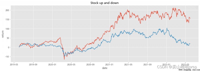
# Analysis of stock fluctuation
# Comparison of changes in fixed base increase
def show(stocks, axs=None):
n = []
drawer = plt if axs is None else axs
for i in stocks.columns:
drawer.plot(100*(stocks[i]/stocks[i].iloc[0]-1)) # normalization
drawer.grid(True)
drawer.legend(n, loc='best')
plt.figure(figsize = (16,5))
show(stocks[['BYD','GM']])
plt.title('Stock up and down')
plt.xlabel('date')
plt.ylabel('return')
plt.show()
Compare them against two major indices like the S&P 500
# The standard & poor's 500 Index The comparison
SPY = webdata.get_data_stooq('SPY',startDate,endDate)
stocks1 = pd.concat([stocks,SPY['Close']],axis=1)
stocks1.columns = ['F','TSLA','FSR','GM','NEE','SO','BYD','NIO','SOL','JKS','SPY']
stocks1
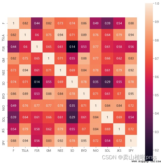
# Correlation matrix
# SPY And other stocks ( Price ) The correlation —— The last line
plt.figure(figsize = (10,10))
sns.heatmap(stocks1.corr(), annot=True, vmax=1, square=True) # draw df_corr Matrix thermodynamic diagram of
plt.show() # display picture
benchmark = TSeries(SPY['Close'].pct_change()[::-1])
dd={
}
dd['anlzd_ret']=str(round(benchmark.anlzd_ret()*100,2))+"%"
dd['cuml_ret']=str(round(benchmark.cuml_ret()*100,2))+"%"
dd['max_drawdown']=str(round(benchmark.max_drawdown()*100,2))+"%"
dd['sortino_ratio']=str(round(benchmark.sortino_ratio(freq=250),2))+"%"
dd['calmar_ratio']=str(round(benchmark.calmar_ratio()*100,2))+"%"
dd['sharpe_ratio'] = str(round(sharpe_ratio(benchmark)*100,2))+"%" # Sharp ratio (Sharpe Ratio): Risk adjusted return . Calculate the total risk per unit of the portfolio , How much excess compensation will be generated .
dd['annual_volatility'] = str(round(stats.annual_volatility(benchmark)*100,2))+"%" # Volatility
dd['omega_ratio'] = str(round(omega_ratio(benchmark)*100,2))+"%" # omega_ratio
df_benchmark =pd.DataFrame(dd.values(),index=dd.keys(),columns = ['SPY'])
df_benchmark

dff = pd.concat([dff,df_benchmark],axis=1)
dff
# Compare the annualized return of each stock 、 Cumulative income 、 Maximum withdrawal rate 、 Sotino ratio ( Downward volatility of the portfolio ,)、calmar Rate, etc
# Analysis of stock fluctuation
def show(stocks, axs=None):
n = []
drawer = plt if axs is None else axs
for i in stocks.columns:
if i != ' date ':
n.append(i)
drawer.plot(100*(stocks[i]/stocks[i].iloc[0]-1)) # normalization
drawer.grid(True)
drawer.legend(n, loc='best')
plt.figure(figsize = (16,10))
show(stocks)
plt.title('Stock up and down')
plt.xlabel('date')
plt.ylabel('return')
plt.show()
# Calculate the rise and fall of stocks =( Now the stock price - Buying price )/ Buying price
def profit(closeCol):
try:
p=(closeCol.iloc[0]-closeCol.iloc[-1])/closeCol.iloc[-1]*100.00
except Exception:
return None
return round(p,2)
for i in tickers+['SPY']:
closeCol=stocks1[i] # Get the closing price Close The data in this column
babaChange=profit(closeCol)# Call function , Get up and down
print(i,str(babaChange)+'%')
F -33.52%
TSLA -95.17%
FSR -0.1%
GM -15.68%
NEE -38.44%
SO -36.67%
BYD -60.69%
NIO -83.15%
SOL -72.26%
JKS -64.42%
SPY -36.19%
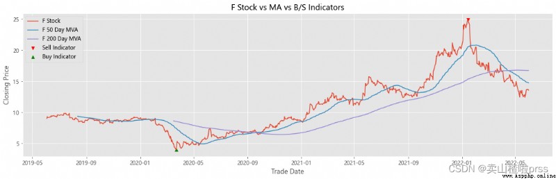
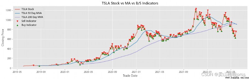
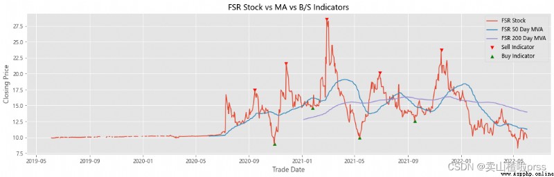
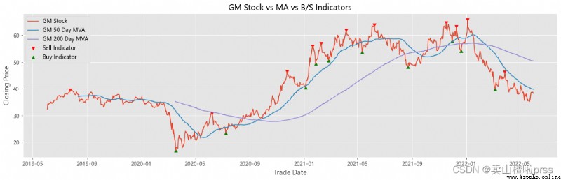
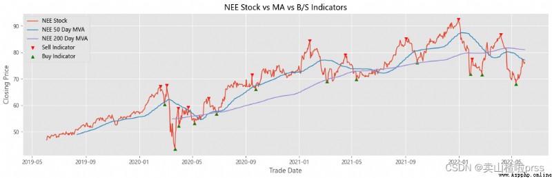
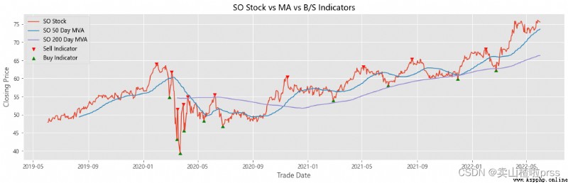
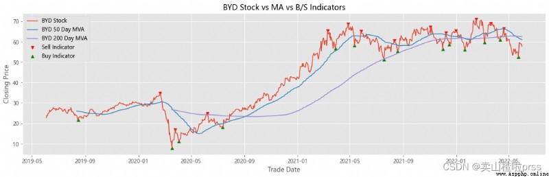
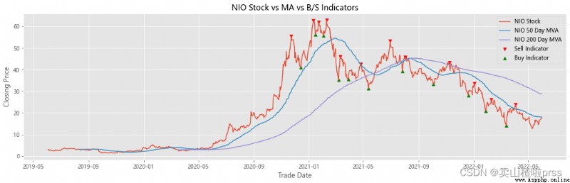
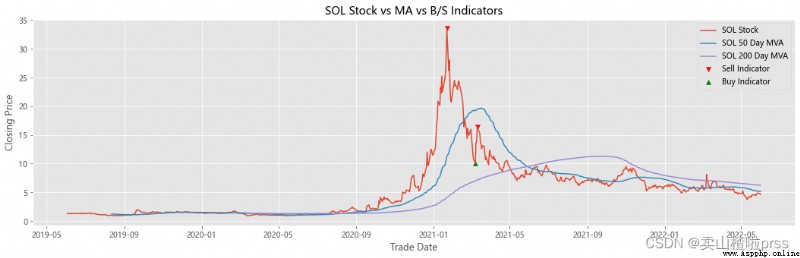
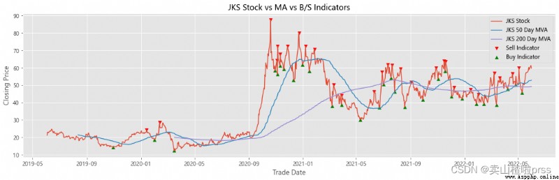
Add stocks, signals and moving averages to plot and visualize
# Stocks 、 Signals and moving averages to plot and visualize
# Check stock stability
# Some retail investors like to use the moving average to judge whether to buy or sell , For example, the common , Five days ma5 Wear the ten day moving average ma10 When buying stocks , On the contrary, sell stocks .
for i in tickers:
stock_close = stocks[i]
## Add stocks, signals and moving averages to plot and visualize
maximaIndex, _ = find_peaks(stock_close, prominence=5)
maxPrices = [stock_close[i] for i in maximaIndex]
minimaIndex, _ = find_peaks(stock_close * (-1), prominence=5)
minPrices = [stock_close[i] for i in minimaIndex]
fig, ax = plt.subplots(figsize = (18,5))
ax.scatter(stock_close.index[maximaIndex], maxPrices, marker='v', color='red', label='Sell Indicator')
ax.scatter(stock_close.index[minimaIndex], minPrices, marker='^', color='green', label='Buy Indicator')
ax.plot(stock_close.index, stock_close, label = '{} Stock'.format(i))
ax.set_xlabel('Trade Date')
ax.set_ylabel('Closing Price')
ax.set_title('{} Stock vs MA vs B/S Indicators'.format(i))
shortRollingMVA = stock_close.rolling(window=50).mean()
longRollingMVA = stock_close.rolling(window=200).mean()
ax.plot(shortRollingMVA.index, shortRollingMVA, label = '{} 50 Day MVA'.format(i))
ax.plot(longRollingMVA.index, longRollingMVA, label = '{} 200 Day MVA'.format(i))
ax.legend()
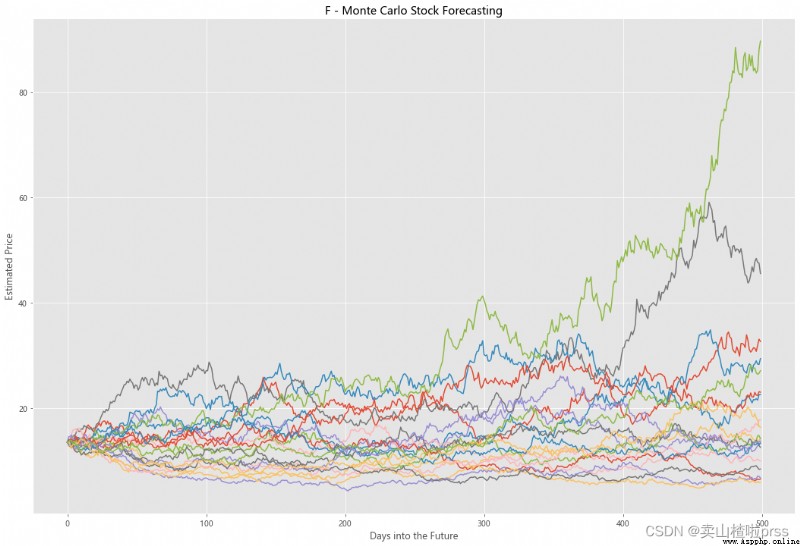
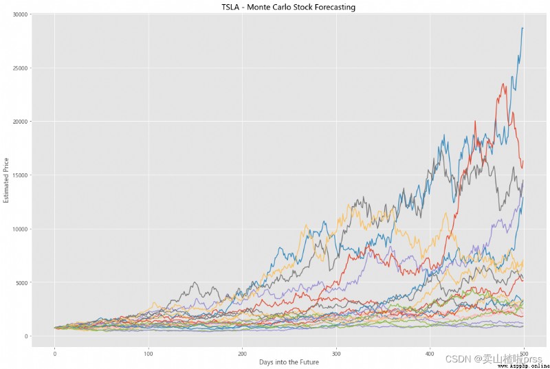
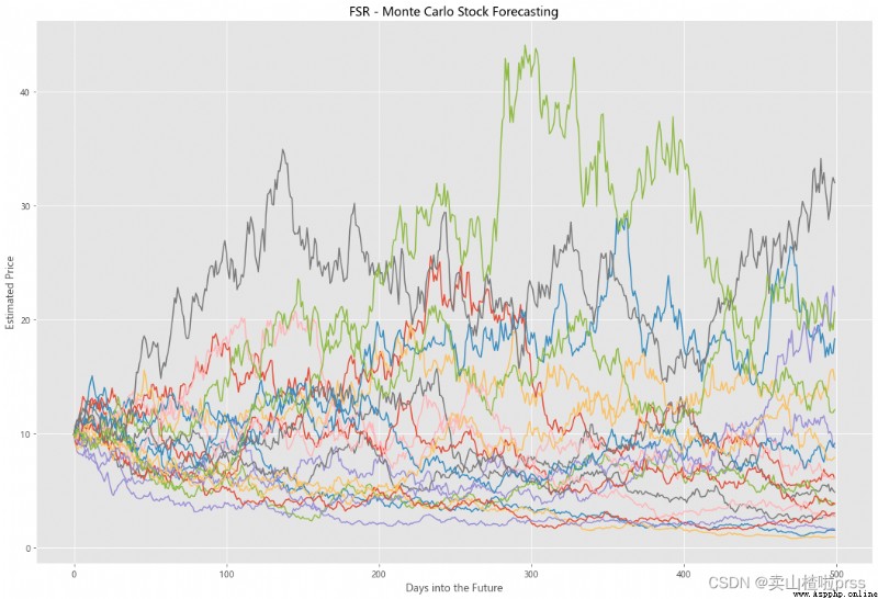
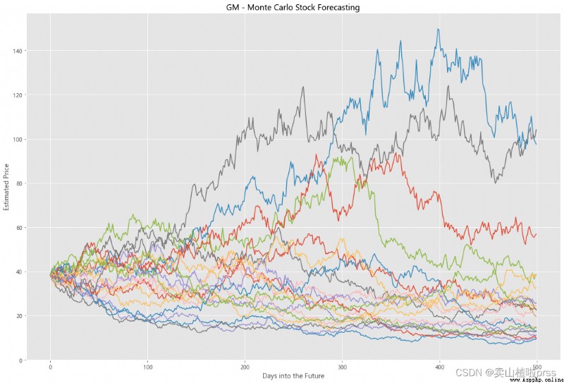
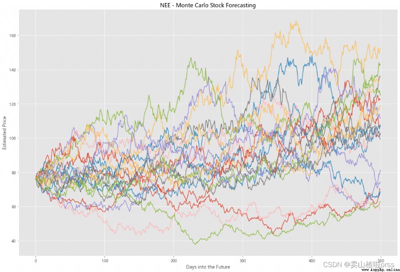
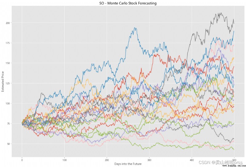
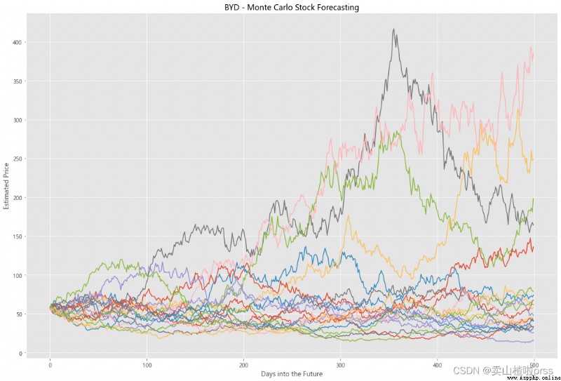
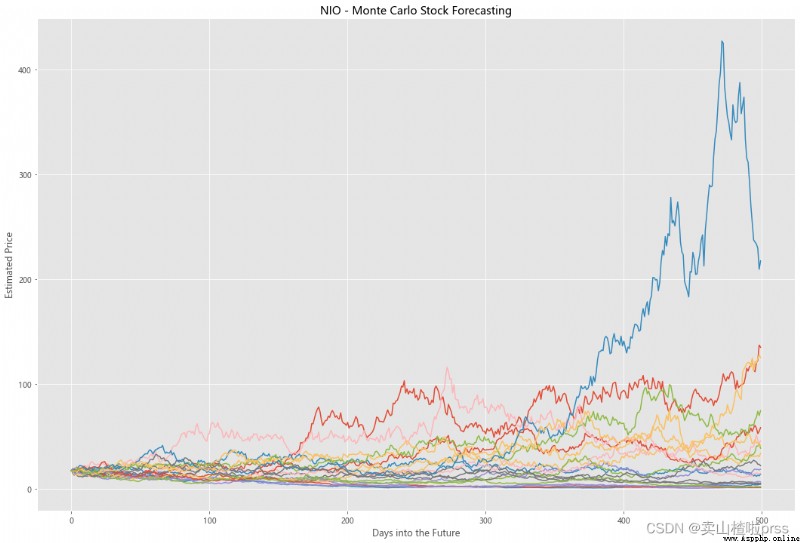
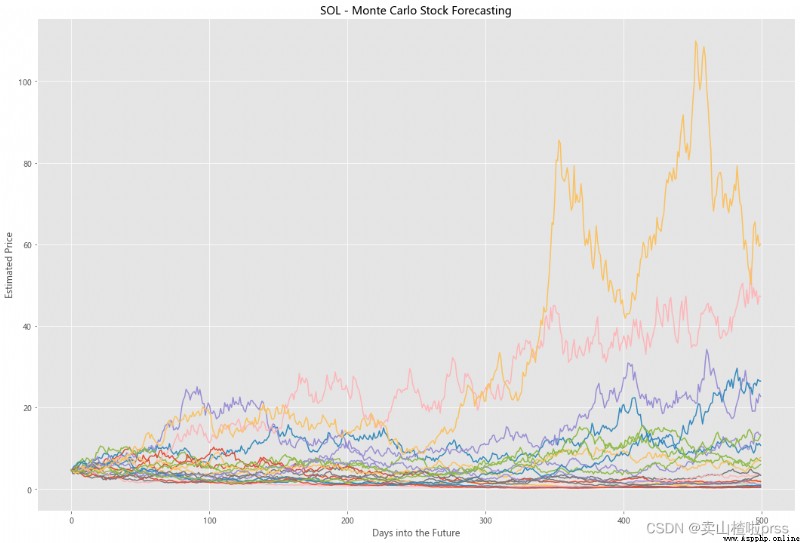
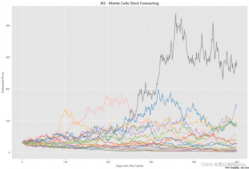
Try to forecast future stock movements via Monte Carlo Simulations
# Predict the future stock trend through Monte Carlo simulation
# Monte Carlo simulation is a statistical method , Used to simulate the evolution trend of data .
# Monte Carlo simulation in which 20 Simulation path diagram
for i in tickers:
stock_close = stocks[i]
logReturns = np.log(1+stock_close.pct_change())
## Need mean and standard deviation to calculate brownian motion (random walk) = r = drift + standard_deviation* e^r
mean = logReturns.mean()
variance = logReturns.var()
### Calculate drift which estimates how far the stock price will move in the future
drift = mean - (0.5 * variance)
standard_deviation = logReturns.std()
### Next needed component of brownina motion is a randomly generated variable, such as Z (Z-score), we are projecting how far the stock will deviate from the mean
simulations = 20
probability_z = norm.ppf(np.random.rand(simulations,2))
time_interval = 500 #Number of days into the future we go
dailyReturns = np.exp(drift + standard_deviation * norm.ppf(np.random.rand(time_interval, simulations))) # Estimate of returns
# Starting point of our analyysis is S_0, which is the last historical trading today (today)
S_0 = stock_close.iloc[-1]
# Create an array with estimated stock movements
prices = np.zeros_like(dailyReturns) # Empty array of 0s
prices[0] = S_0
for t in range(1, time_interval):
prices[t] = prices[t-1] * dailyReturns[t]
figMC, axMC = plt.subplots(figsize = (18,12))
axMC.set_xlabel('Days into the Future')
axMC.set_ylabel('Estimated Price')
axMC.set_title('%s - Monte Carlo Stock Forecasting'%i)
axMC.plot(prices)
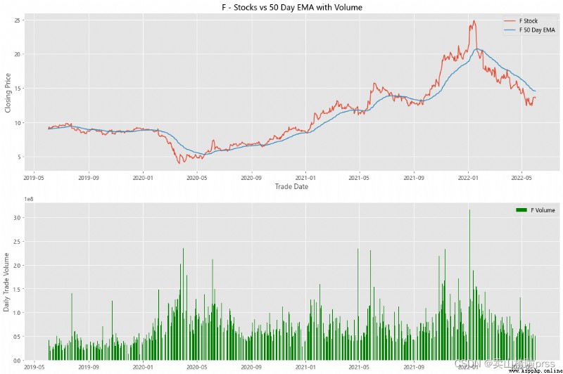
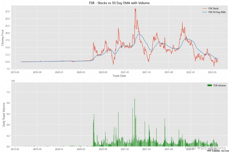
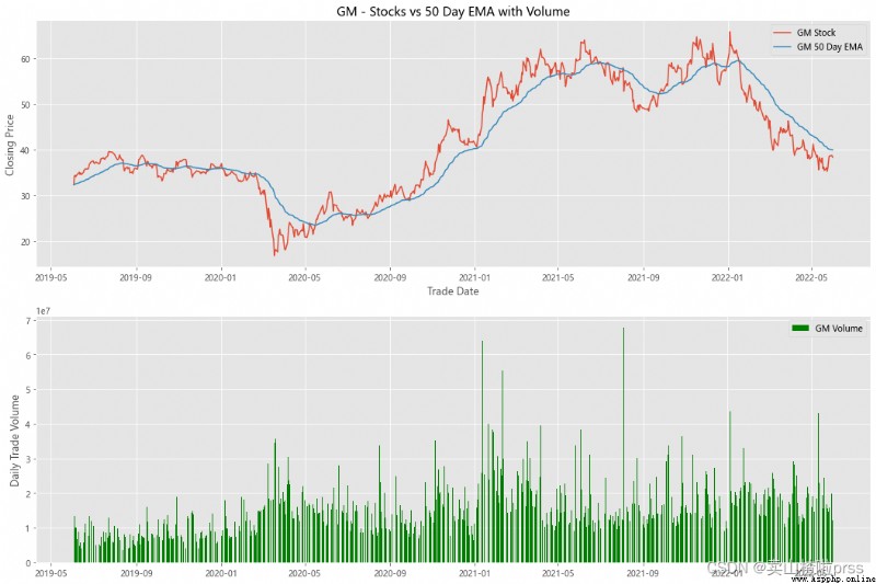
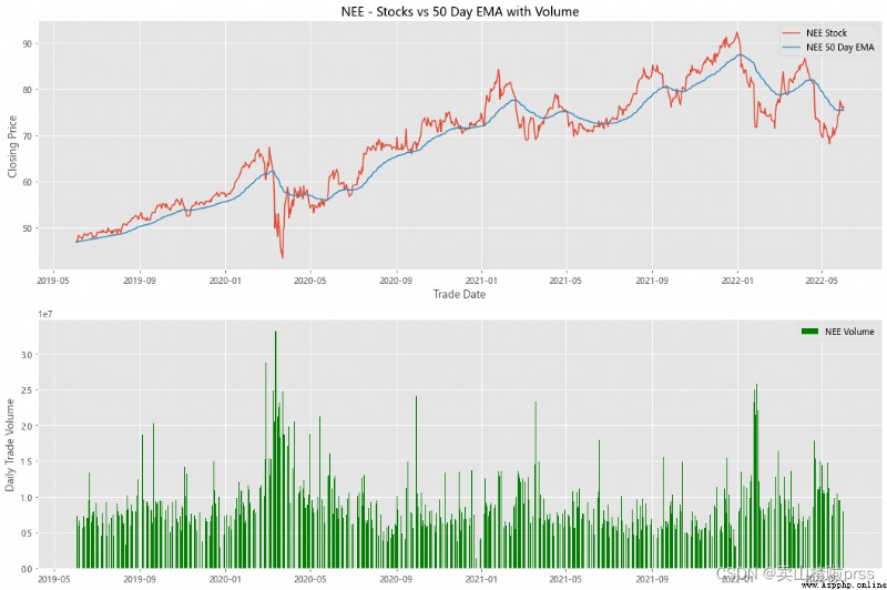
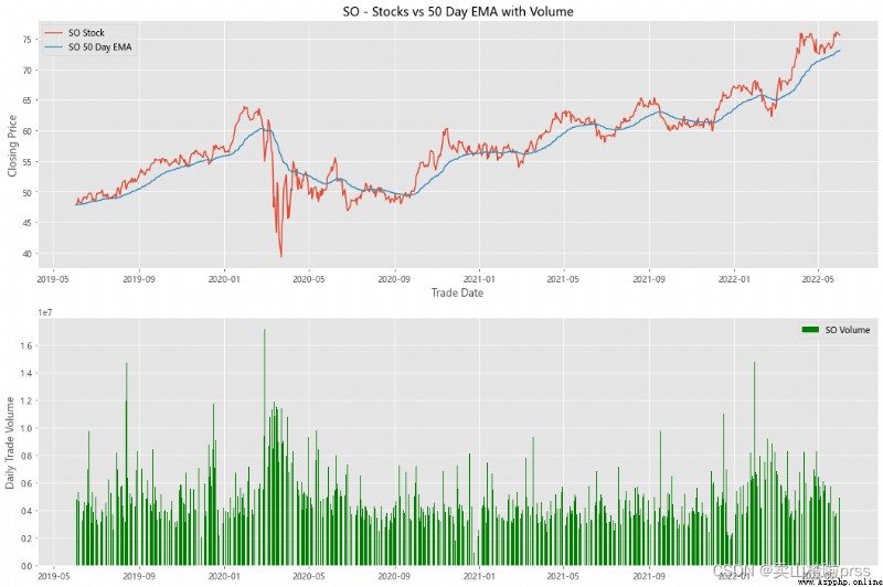
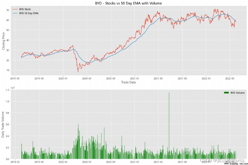
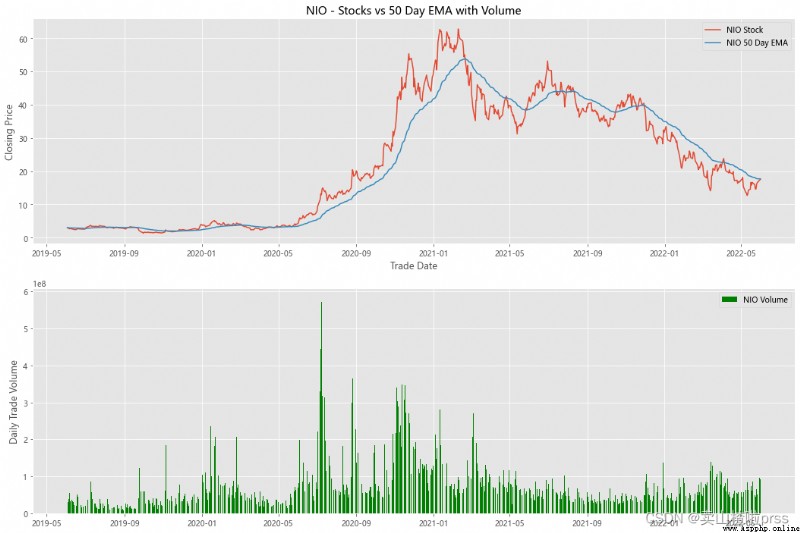
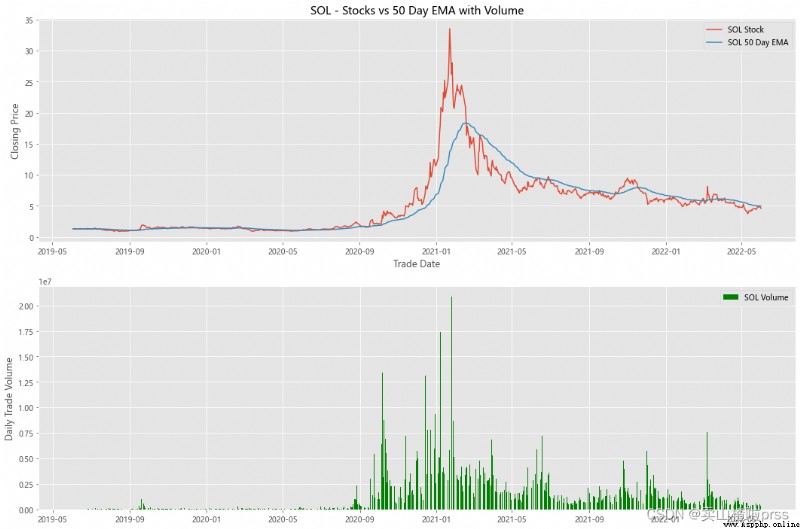
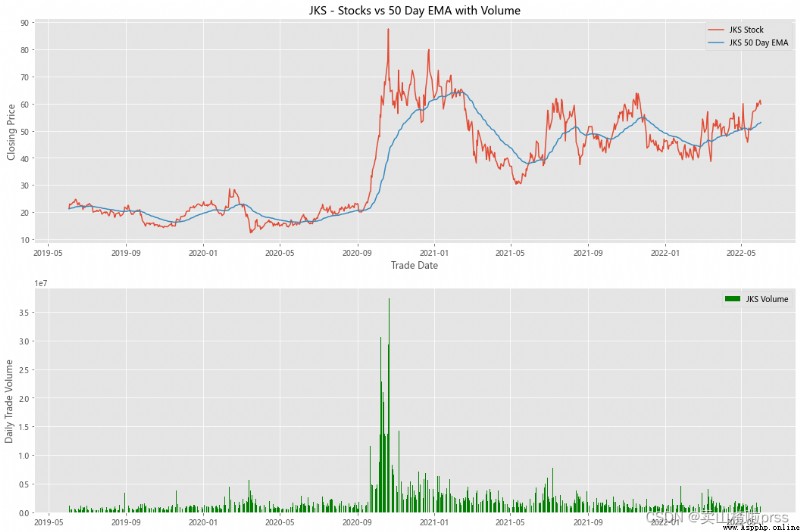
alculate Exponential Moving Averages and Volume
# Calculate the stock index moving average and trading volume
for i in tickers:
stock_close = stocks[i]
fig3, (ax3,ax4) = plt.subplots(2,1,figsize = (18,12))
emaShort = stock_close.ewm(span=50, adjust=False).mean()
ax3.plot(stock_close.index, stock_close, label = '{} Stock'.format(i))
ax3.plot(emaShort.index, emaShort, label = '{} 50 Day EMA'.format(i))
ax3.set_xlabel('Trade Date')
ax3.set_ylabel('Closing Price')
ax3.set_title('%s - Stocks vs 50 Day EMA with Volume'%i)
ax3.legend()
volume = eval(i)['Volume']
ax4.bar(volume.index, volume, label = '{} Volume'.format(i), color='green')
ax4.set_ylabel('Daily Trade Volume')
ax4.legend()

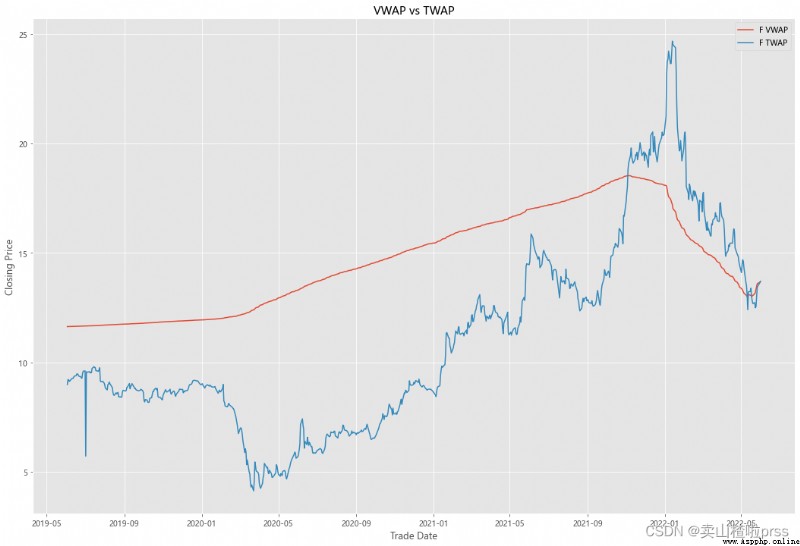
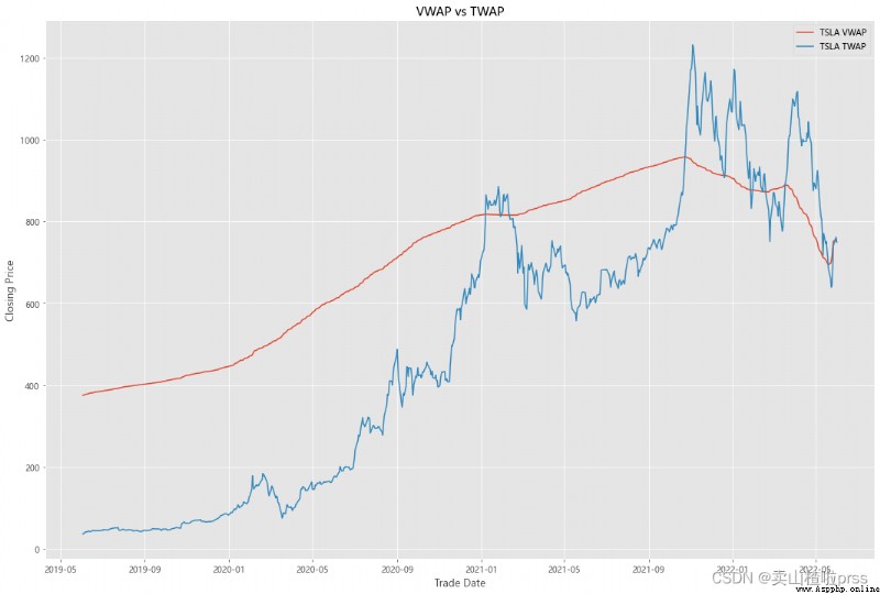
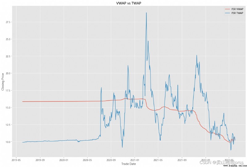
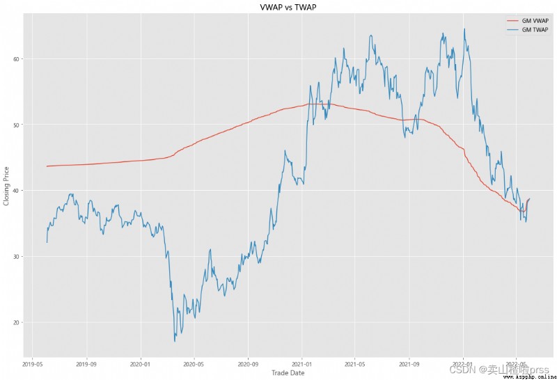
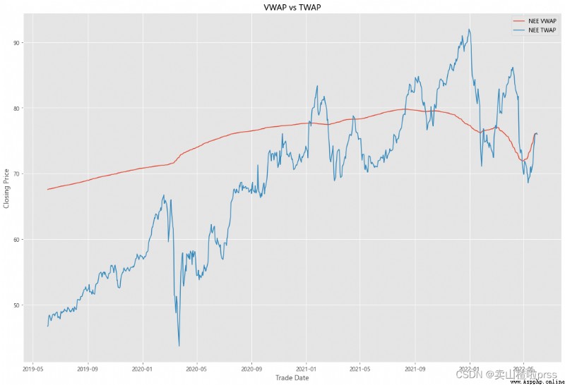
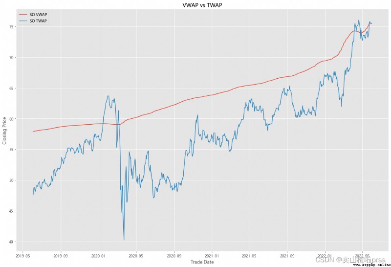
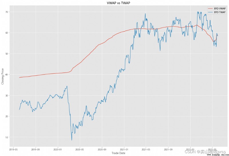
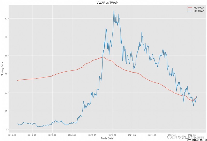
VWAP
#### Quick VWAP Calculation - This is better done with daily intraday data (1 minute ticks), since we dont have that, we are looking at just daily data
for i in tickers:
VWAP = eval(i)
VWAP['cumVol'] = VWAP['Volume'].cumsum()
VWAP['cumVolPrice'] = (VWAP['Volume'] * ((VWAP['High']+VWAP['Low']+VWAP['Open']+VWAP['Close'])/4)).cumsum()
VWAP['VWAP'] = VWAP['cumVolPrice']/VWAP['cumVol']
#### Quick TWAP Calculation
VWAP['TWAP'] = (VWAP['High']+VWAP['Low']+VWAP['Open']+VWAP['Close'])/4
fig5, ax5 = plt.subplots(figsize = (18,12))
ax5.plot(VWAP.index, VWAP['VWAP'], label = '{} VWAP'.format(i))
ax5.plot(VWAP.index, VWAP['TWAP'], label = '{} TWAP'.format(i))
ax5.set_xlabel('Trade Date')
ax5.set_ylabel('Closing Price')
ax5.set_title('VWAP vs TWAP')
ax5.legend()
thus