有的web項目選用Excel作為報表方案,在服務器端生成Excel文件,然後傳送到客戶端,由客戶端進行打印。在國內的環境下,相對PDF方式,Excel的安裝率應該比pdf閱讀器的安裝率要高,同時,微軟也為C#操作Excel提供了完備的接口,雖然ZedGraph和其他的商業報表工具生成的統計圖也很好,但是人家微軟畢竟是大品牌,值得信賴。
本文介紹使用C#調用Excel來生成統計圖(Chart)的以及Chart圖中各部分控制的一些方法。
在上一篇使用C#和Excel進行報表開發(二)-操作統計圖(Chart)中,我們使用一個預定義的Excel文件,通過改變Chart中的某個值來生成統計圖。本文進一步演示如何從指定的數據從頭生成統計圖。
首先當然要添加對Excel的引用,然後需要定義幾個要用到的Excel對象:
Excel.Application ThisApplication = null;

  Excel.Workbooks m_objBooks = null;

  Excel._Workbook ThisWorkbook = null;

  Excel.Worksheet xlSheet = null;
在創建一個新的_WorkBook對象的時候,默認的會含有3個Sheet,所以為了顯示清晰,將多余的Sheet都刪掉:
private void DeleteSheet()

  {

  foreach (Excel.Worksheet ws in ThisWorkbook.Worksheets)

  if (ws != ThisApplication.ActiveSheet)

  {

  ws.Delete();

  }

  foreach (Excel.Chart cht in ThisWorkbook.Charts)

  cht.Delete();

  }
再下來需要添加用來給Chart提供數據的Sheet:
private void AddDatasheet()

  {

  xlSheet = (Excel.Worksheet)ThisWorkbook.

  Worksheets.Add(Type.Missing, ThisWorkbook.ActiveSheet,

  Type.Missing, Type.Missing);

  xlSheet.Name = "數據";

  }
生成Chart用到的數據,因為是演示,所以這裡使用生成隨機數的方法來替代從數據庫中提取數據。
private void LoadData()

  {

  Random ran = new Random();

  for (int i = 1; i <= 12; i++)

  {

  xlSheet.Cells[i, 1] = i.ToString() + "月";

  xlSheet.Cells[i, 2] = ran.Next(2000).ToString();

  }

  }
好了,到此,准備工作全部已經就緒,下面要進行Chart的生成設置部分了:
生成一個統計圖對象:
Excel.Chart xlChart = (Excel.Chart)ThisWorkbook.Charts.

  Add(Type.Missing, xlSheet, Type.Missing, Type.Missing);
設定數據來源:
Excel.Range cellRange = (Excel.Range)xlSheet.Cells[1, 1];
通過向導生成Chart:
xlChart.ChartWizard(cellRange.CurrentRegion,

  Excel.XlChartType.xl3DColumn, Type.Missing,

  Excel.XlRowCol.xlColumns,1, 0, true ,

  "訪問量比較(dahuzizyd.cnblogs.com)", "月份", "訪問量",

  "");
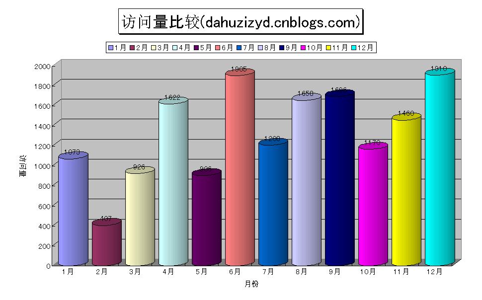
到此,Chart的生成就完成了,貌似比較簡單,下面我們對其作一些設置,好更漂亮些。
設置統計圖Sheet的名稱:
xlChart.Name = "統計";
現在的統計圖只有一個組,他們會顯示成一樣的顏色,我們來讓12個Bar都顯示不同的顏色:
Excel.ChartGroup grp = (Excel.ChartGroup)xlChart.ChartGroups(1);

  grp.GapWidth = 20;

  grp.VaryByCategories = true;
現在Chart的條目的顯示形狀是Box,我們讓它們變成圓柱形,並給它們顯示加上數據標簽:
Excel.Series s = (Excel.Series)grp.SeriesCollection(1);

  s.BarShape = XlBarShape.xlCylinder;

  s.HasDataLabels = true;
下面再來設置統計圖的標題和圖例的顯示:
xlChart.Legend.Position = XlLegendPosition.xlLegendPositionTop;

  xlChart.ChartTitle.Font.Size = 24;

  xlChart.ChartTitle.Shadow = true;

  xlChart.ChartTitle.Border.LineStyle = Excel.XlLineStyle.xlContinuous;
最後設置兩個軸的屬性,Excel.XlAxisType.xlValue對應的是Y軸,Excel.XlAxisType.xlCategory對應的是X軸:
Excel.Axis valueAxis = (Excel.Axis)xlChart.Axes(Excel.XlAxisType.xlValue, XlAxisGroup.xlPrimary);

  valueAxis.AxisTitle.Orientation = -90;

  Excel.Axis categoryAxis = (Excel.Axis)xlChart.Axes(Excel.XlAxisType.xlCategory, XlAxisGroup.xlPrimary);

  categoryAxis.AxisTitle.Font.Name = "MS UI Gothic";
到此,一切就緒了,下面要生成Chart,並將其存為一個Excel文件:
try

{

  ThisApplication = new Excel.Application();

  m_objBooks = (Excel.Workbooks)ThisApplication.Workbooks;

  ThisWorkbook = (Excel._Workbook)(m_objBooks.Add(Type.Missing));

  ThisApplication.DisplayAlerts = false;

  this.DeleteSheet();

  this.AddDatasheet();

  this.LoadData();

  CreateChart();

  ThisWorkbook.SaveAs("z:\\Book2.xls", Type.Missing, Type.Missing,

          Type.Missing, Type.Missing, Type.Missing, Excel.XlSaveAsAccessMode.xlNoChange,

        Type.Missing, Type.Missing, Type.Missing, Type.Missing);

  }

catch (Exception ex)

{

  MessageBox.Show(ex.Message);

}

finally

{

  ThisWorkbook.Close(Type.Missing, Type.Missing, Type.Missing);

  ThisApplication.Workbooks.Close();

  ThisApplication.Quit();

      System.Runtime.InteropServices.Marshal.ReleaseComObject(ThisWorkbook);

        System.Runtime.InteropServices.Marshal.ReleaseComObject(ThisApplication);

  ThisWorkbook = null;

  ThisApplication = null;

  GC.Collect();

  this.Close();

}
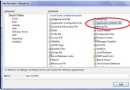
運行你的程序,打開生成的Excel文件,最終生成的Chart應該像這樣:
完成了Chart的生成,但是上面對於每個月只有一項數據,如果我想顯示多項呢,例如顯示每個月兩個頁面的范圍量的對比。方法很簡單,只要再多生成一組數據就可以了,我們修改下LoadData方法:
private void LoadData()

  {

  Random ran = new Random();

  for (int i = 1; i <= 12; i++)

  {

  xlSheet.Cells[i, 1] = i.ToString() + "月";

  xlSheet.Cells[i, 2] = ran.Next(2000).ToString();

  xlSheet.Cells[i, 3] = ran.Next(1500).ToString();

  }

  }
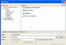
再次運行程序,生成Chart看看,應該像下面的效果:
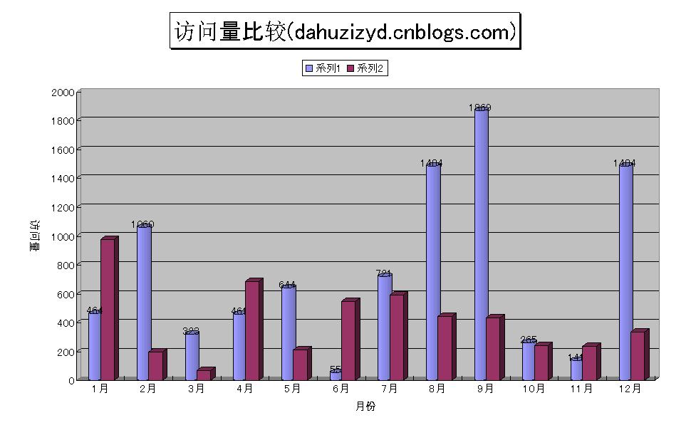
可以看到,兩組數據以不同的形狀顯示,同時,圖例部分也不再顯示1-12月共12項,而是顯示兩項,這是因為在上面的代碼中我們設置了ChartGroup的VaryByCategories 屬性:
grp.VaryByCategories = true;當我們有兩個以上的組時,這一項就失效了。
在用C#操作Excel的時候,恐怕最大的困難就在於不知道Excel提供的各個對象,以及它們的屬性,方法等信息,好在MSDN裡有關於Excel的接口說明-Excel Primary Interop Assembly Reference,參照這些,相信很快就能上手了。
最後是完整代碼:
private void button4_Click(object sender, EventArgs e)

{

  try

  {

    ThisApplication = new Excel.Application();

    m_objBooks = (Excel.Workbooks)ThisApplication.Workbooks;

    ThisWorkbook = (Excel._Workbook)(m_objBooks.Add(Type.Missing));

  ThisApplication.DisplayAlerts = false;

  this.DeleteSheet();

    this.AddDatasheet();

    this.LoadData();

  CreateChart();

  ThisWorkbook.SaveAs("z:\\Book2.xls", Type.Missing, Type.Missing,

          Type.Missing, Type.Missing, Type.Missing, Excel.XlSaveAsAccessMode.xlNoChange,

        Type.Missing, Type.Missing, Type.Missing, Type.Missing);

  }

  catch (Exception ex)

  {

    MessageBox.Show(ex.Message);

  }

  finally

  {

    ThisWorkbook.Close(Type.Missing, Type.Missing, Type.Missing);

    ThisApplication.Workbooks.Close();

  ThisApplication.Quit();

        System.Runtime.InteropServices.Marshal.ReleaseComObject(ThisWorkbook);

        System.Runtime.InteropServices.Marshal.ReleaseComObject(ThisApplication);

    ThisWorkbook = null;

    ThisApplication = null;

    GC.Collect();

    this.Close();

  }

  }

  Excel.Application ThisApplication = null;

Excel.Workbooks m_objBooks = null;

Excel._Workbook ThisWorkbook = null;

  Excel.Worksheet xlSheet = null;

  /**//// <summary>

/// 用生成的隨機數作數據

/// </summary>

private void LoadData()

{

  Random ran = new Random();

  for (int i = 1; i <= 12; i++)

  {

    xlSheet.Cells[i, 1] = i.ToString() + "月";

    xlSheet.Cells[i, 2] = ran.Next(2000).ToString();

  }

}

/**//// <summary>

/// 刪除多余的Sheet

/// </summary>

private void DeleteSheet()

{

  foreach (Excel.Worksheet ws in ThisWorkbook.Worksheets)

    if (ws != ThisApplication.ActiveSheet)

    {

      ws.Delete();

    }

  foreach (Excel.Chart cht in ThisWorkbook.Charts)

    cht.Delete();


}

/**//// <summary>

/// 創建一個Sheet,用來存數據

/// </summary>

private void AddDatasheet()

{

  xlSheet = (Excel.Worksheet)ThisWorkbook.

    Worksheets.Add(Type.Missing, ThisWorkbook.ActiveSheet,

    Type.Missing, Type.Missing);

  xlSheet.Name = "數據";

}

/**//// <summary>

/// 創建統計圖

/// </summary>

private void CreateChart()

{

  Excel.Chart xlChart = (Excel.Chart)ThisWorkbook.Charts.

    Add(Type.Missing, xlSheet, Type.Missing, Type.Missing);

  Excel.Range cellRange = (Excel.Range)xlSheet.Cells[1, 1];

  xlChart.ChartWizard(cellRange.CurrentRegion,

    Excel.XlChartType.xl3DColumn, Type.Missing,

    Excel.XlRowCol.xlColumns,1, 0, true ,

    "訪問量比較(dahuzizyd.cnblogs.com)", "月份", "訪問量",

    "");

  xlChart.Name = "統計";

  Excel.ChartGroup grp = (Excel.ChartGroup)xlChart.ChartGroups(1);

grp.GapWidth = 20;

  grp.VaryByCategories = true;

  Excel.Series s = (Excel.Series)grp.SeriesCollection(1);

  s.BarShape = XlBarShape.xlCylinder;

  s.HasDataLabels = true;

  xlChart.Legend.Position = XlLegendPosition.xlLegendPositionTop;

  xlChart.ChartTitle.Font.Size = 24;

  xlChart.ChartTitle.Shadow = true;

  xlChart.ChartTitle.Border.LineStyle = Excel.XlLineStyle.xlContinuous;


  Excel.Axis valueAxis = (Excel.Axis)xlChart.Axes(Excel.XlAxisType.xlValue, XlAxisGroup.xlPrimary);

  valueAxis.AxisTitle.Orientation = -90;

  Excel.Axis categoryAxis = (Excel.Axis)xlChart.Axes(Excel.XlAxisType.xlCategory, XlAxisGroup.xlPrimary);

  categoryAxis.AxisTitle.Font.Name = "MS UI Gothic";

}