Recently, many readers and classmates came to ask me ,Python There are too many drawing Libraries , I don't know which one to learn ? Even if I choose a drawing library , I am also I don't know how to learn , I don't know what to do first , I don't know what to do next , Four words Forget as soon as you learn .
In fact, I was very troubled A question of , I was finishing my study numpy and pandas after , He began matplotlib Learning from . I was very broken anyway , Every time I feel how much drawing code , The logic of the drawing is a complete mess , I don't know how to do it .
Later with their own repeated learning , I found learning Python The method of drawing library , That's how to learn it Drawing principle . As the saying goes :“ Enemy and know yourself , you can fight a hundred battles with no danger of defeat ”, Learned the principle , All that's left is the question of proficiency .
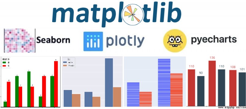
Today we will use an article , Let's take a look at it matplotlib、seaborn、plotly、pyecharts The principle of drawing , Let's make it easier for us to learn !
About matplotlib A more detailed description of the drawing , You can refer to the following article , I believe you will learn after reading .
matplotlib Drawing principle :http://suo.im/678FCo
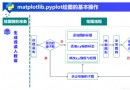
1) Illustration of the principle of drawing
Through my own learning and understanding , I will matplotlib The principle of drawing can be summarized as follows :
① Guide library ;
② establish figure Canvas object ;
③ Get the corresponding position of axes Coordinate system objects ;
④ call axes object , Draw the corresponding position ;
⑤ The graphics ;
2) Case description
# 1. Import related libraries
import matplotlib as mpl
import matplotlib.pyplot as plt
# 2. establish figure Canvas object
figure = plt.figure()
# 3. Get the corresponding position of axes Coordinate system objects
axes1 = figure.add_subplot(2,1,1)
axes2 = figure.add_subplot(2,1,2)
# 4. call axes object , Draw the corresponding position
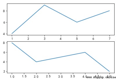
axes1.plot([1,3,5,7],[4,9,6,8])
axes2.plot([1,2,4,5],[8,4,6,2])
# 5. The graphics
figure.show()
give the result as follows :
In these four Libraries , Only matplotlib and seaborn There is a certain connection , There is no connection between the rest of the library , Even the principle of drawing is different .
seaborn yes matplotlib Of More advanced packaging . So learn seaborn Before , The first thing to know is matplotlib The principle of drawing . because seaborn yes matplotlib More advanced packaging of , about matplotlib Those of Tuning parameter settings , Can also be used in seaborn After drawing the graph, use .
We know , Use matplotlib mapping , A lot of drawing parameters need to be adjusted , There's a lot to remember . and seaborn be based on matplotlib More advanced packaging , bring Drawing is easier , It doesn't need to know a lot of underlying parameters , Can draw a lot of more delicate graphics . More Than This ,seaborn Also compatible numpy、pandas data structure , It plays a big role in organizing data , So as to help us complete the data visualization to a greater extent .
because seaborn The principle of drawing , and matplotlib Of The principle of drawing is consistent , I won't introduce it in detail here , You can refer to the above matplotlib The principle of drawing , To learn seaborn How to draw , Here or to provide a website for you .
seaborn Drawing principle :http://suo.im/5D3VPX
1) Case description
# 1. Import related libraries
import seaborn as sns
import matplotlib.pyplot as plt
df = pd.read_excel("data.xlsx",sheet_name=" data source ")
sns.set_style("dark")
plt.rcParams["font.sans-serif"] = ["SimHei"]
plt.rcParams["axes.unicode_minus"] = False
# Be careful :estimator Represents the sum of the sales quantity after grouping . The default is to find the mean value .
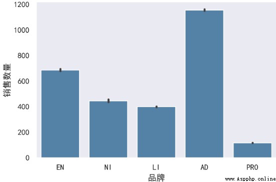
sns.barplot(x=" brand ",y=" sales volumes ",data=df,color="steelblue",orient="v",estimator=sum)
plt.show()
give the result as follows :
Be careful : You can see in the above drawing code , You should have such a feeling , There are both matplotlib Drawing code , Also have seaborn Drawing code . In fact, it's just like this , We just follow matplobt The principle of drawing is to draw graphics , It's just that some places have been changed to seaborn Specific code can be , The rest of the formatting , You can use matplotlib Adjust the method in .
First of all, before introducing the drawing principle of this diagram , Let's give you a brief introduction plotly This drawing library .
plotly It's based on javascript Drawing library of ,plotly There are many kinds of drawings , The effect is beautiful ;
Easy to save and share plotly Drawing results of , And can be compared with Web Seamless integration ;
ploty Default drawing result , It's a HTML Web page file , You can view it directly through the browser ;
Its drawing principle and matplotlib、seaborn It doesn't matter , You need to learn it alone . Also, I have provided a website for you , Let you study in more detail plotly.
plotly Drawing principle :http://suo.im/5vxNTu
1) Illustration of the principle of drawing
Through my own learning and understanding , I will plotly The principle of drawing can be summarized as follows :
① Drawing a graph track , stay ployly It's called trace, Every track is a trace.
② Wrap the tracks into a list , To form a “ Track list ”. A track is placed in a list , Multiple tracks are also placed in a list .
③ While creating the canvas , And put the above Track list , The incoming to Figure() in .
④ Use Layout() Add other drawing parameters , Perfect graphics .
⑤ Show graphics .
2) Case description
import numpy as np
import pandas as pd
import plotly as py
import plotly.graph_objs as go
import plotly.expression as px
from plotly import tools
df = pd.read_excel("plot.xlsx")
# 1. Drawing a graph track , stay ployly It's called `trace`, Every track is a trace.
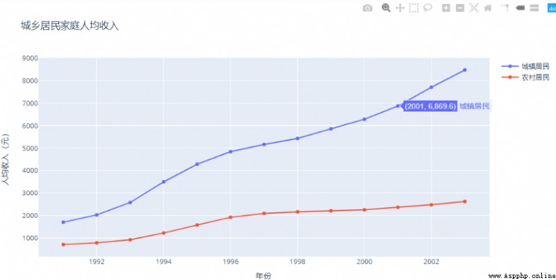
trace0 = go.Scatter(x=df[" year "],y=df[" Urban residents "],name=" Urban residents ")
trace1 = go.Scatter(x=df[" year "],y=df[" Rural residents "],name=" Rural residents ")
# 2. Wrap the tracks into a list , To form a “ Track list ”. A track is placed in a list , Multiple tracks are also placed in a list .
data = [trace0,trace1]
# 3. While creating the canvas , And put the above ` Track list `, The incoming to `Figure()` in .
fig = go.Figure(data)
# 4. Use `Layout()` Add other drawing parameters , Perfect graphics .
fig.update_layout(
title=" Per capita income of urban and rural households ",
xaxis_title=" year ",
yaxis_title=" Per capita income ( element )"
)
# 5. Show graphics .
fig.show()
give the result as follows :
Echarts Is a data visualization tool open source by Baidu , With good interaction , Exquisite graphic design , Has been recognized by many developers . and python It's an expressive language , Very suitable for data processing . When data analysis meets data visualization ,pyecharts The birth of .
pyecharts It is divided into v0.5 and v1 Two big versions ,v0.5 and v1 The two versions are not compatible ,v1 It's a brand new version of , So our study is as much as possible be based on v1 edition To operate .
and plotly equally ,pyecharts The principle of drawing is completely different from matplotlib and seaborn, We need to learn more about their drawing principles , Based on this , Also provide a URL for you , Let you study in more detail pyecharts.
pyecharts The principle of drawing :http://suo.im/5S1PF1
1) Illustration of the principle of drawing
Through my own learning and understanding , I will plotly The principle of drawing can be summarized as follows :
① Choose chart type ;
② Declare the graph class and add data ;
③ Select global variables ;
④ Display and save charts ;
2) Case description
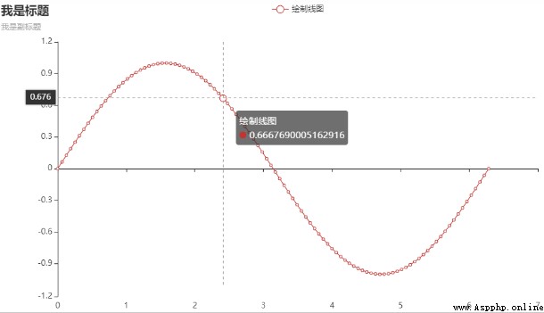
# 1. Choose chart type : We use line graphs , Directly from charts Import in module Line This module ;
from pyecharts.charts import Line
import pyecharts.options as opts
import numpy as np
x = np.linspace(0,2 * np.pi,100)
y = np.sin(x)
(
 # 2. What we're drawing is Line Line graph , You need to instantiate this graphic class , direct Line() that will do ;
 Line()
 # 3. Add data , Give to separately x,y Axis add data ;
 .add_xaxis(xaxis_data=x)
 .add_yaxis(series_name=" Draw line ",y_axis=y,label_opts=opts.LabelOpts(is_show=False))
 .set_global_opts(title_opts=opts.TitleOpts(title=" I'm the title ",subtitle=" I'm the subtitle ",title_link="https://www.baidu.com/"),
                  tooltip_opts=opts.TooltipOpts())
).render_notebook() # 4.render_notebook() Used to display and save charts ;
give the result as follows :
Learn from the above , I'm sure it will let you know the drawing principles of these libraries , There must be a new understanding .
In fact, no matter it is the drawing library of any programming software , They all have their drawing principles . Instead of blindly drawing all kinds of graphics , Why don't you just figure out how they do it , Then go to the drawing library graphics practice , Like this, , I think you will have a great improvement .
【python Study 】
learn Python The partners , Welcome to join the new exchange 【 Junyang 】:1020465983
Discuss programming knowledge together , Become a great God , There are also software installation packages in the group , Practical cases 、 Learning materials