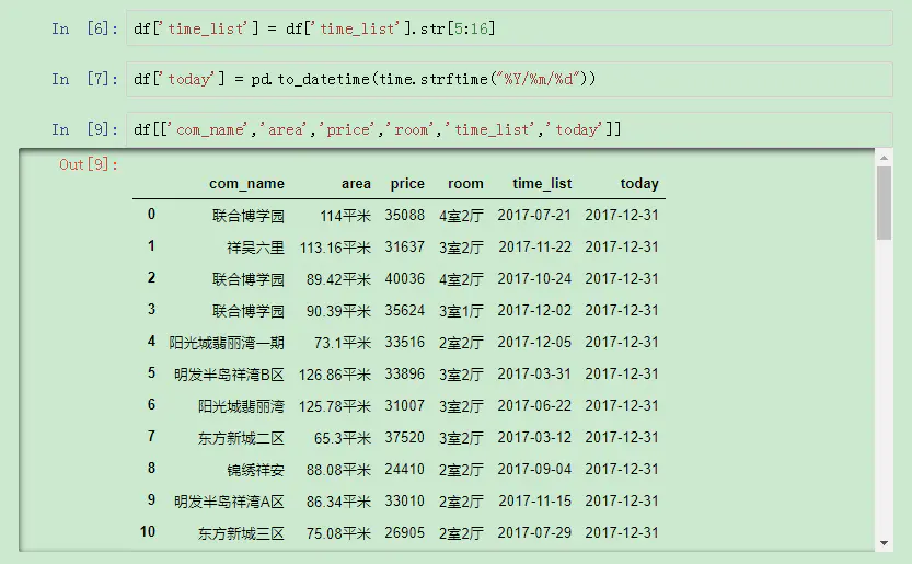
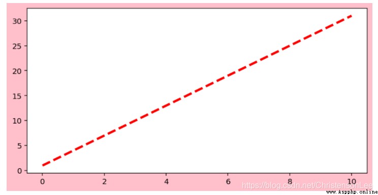
import numpy as np
import matplotlib.pyplot as plt
x = np.linspace(0, 10, 1000)
# Randomly generated 【0,10】 Between 1000 Of an arithmetic sequence x Value .
y = 3*x +1
plt.figure(figsize=(8,4),facecolor=('Pink'),edgecolor='blue')
plt.plot(x,y,color="red",linewidth=3,linestyle='--')
plt.show()
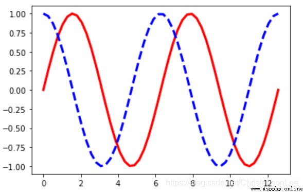
import numpy as np
import matplotlib.pyplot as plt
x = np.linspace(0, 4*np.pi)
y = np.sin(x)
z = np.cos(x)
plt.plot(x,y,color="red",linestyle='-',linewidth=3)
plt.plot(x,z,color="blue",linestyle='--',linewidth=3)
plt.show()
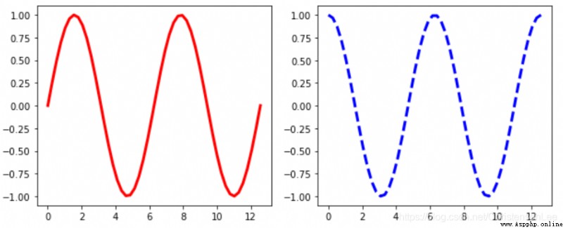
import numpy as np
import matplotlib.pyplot as plt
x = np.linspace(0, 4*np.pi)
y = np.sin(x)
z = np.cos(x)
plt.figure(figsize=(10,4))
plt.subplot(121)
plt.plot(x,y,color="red",linestyle='-',linewidth=3)
plt.subplot(122)
plt.plot(x,z,color="blue",linestyle='--',linewidth=3)
plt.show()
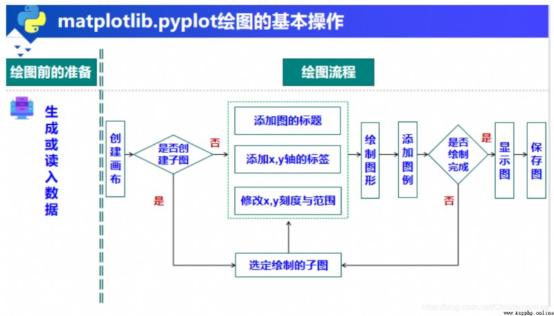
stay Matplotlib in , A drawing object can be divided into several drawing areas , Different images can be drawn in each drawing area , This form of drawing is called creating subgraphs .
Create subgraphs : Use subplot() function , The syntax format of this function :
plt.subplot(numRows,numCols,plotNum)
import matplotlib.pyplot as plt
import numpy as np
x=np.linspace(-10,10)
b1=np.sin(x)
c1=np.cos(x)
d1=2*x+4
e1=x**2+2*x+1
plt.figure(figsize=(8,4))
# Create drawing objects
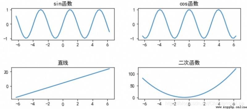
plt.subplot(2,2,1)
# Equivalent to plt.subplot(221)
plt.title('sin function ')
plt.plot(a1,b1)
plt.subplot(2,2,2)
plt.title('cos function ')
plt.plot(a1,c1)
plt.subplot(223)
plt.title(' A straight line ')
plt.plot(a1,d1)
plt.subplot(224)
plt.title(' Quadratic function ')
plt.plot(a1, e1)
plt.tight_layout(3,3,3)
plt.show()
When drawing figures , There are many properties to configure , Such as color 、 typeface 、 Line type, etc .Matplotlib Save the default configuration in “matplotlibrc” In profile , By modifying the profile , You can change the default style of the chart , This is called a rc Configuration or rc Parameters .
stay Matplotlib You can use more than one “matplotlibrc” The configuration file , Their search order :
1. current path 2. User configuration path 3. System configuration path
(1) modify rcParams A variable's value : Using Matplotlib When drawing , Sometimes, some symbols are involved in the annotation in the drawing , Especially Chinese , Negative signs, etc. may not be displayed normally .
plt.rcParams['font.family']=['SimHei']
# Show the Chinese characters in the figure
plt.rcParams['axes.unicode_minus']=False
# Show the minus sign in the figure
import matplotlib.pyplot as plt
import numpy as np
plt.rcParams['font.family']=['SimHei']
plt.rcParams['axes.unicode_minus']=False
x=np.linspace(-10,10)
b1=np.sin(x)
c1=np.cos(x)
d1=2*x+4
e1=x**2+2*x+1
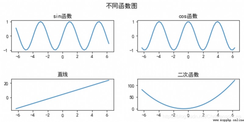
plt.figure(figsize=(8,4)) # Create a canvas
plt.suptitle(' Different function diagrams ',fontsize=14) # Displays the overall title of all subgraphs
plt.subplot(2,2,1) # plt.subplot(221)
plt.title('sin function ')
plt.plot(a1,b1)
plt.subplot(2,2,2)
plt.title('cos function ')
plt.plot(a1,c1)
plt.subplot(223)
plt.title(' A straight line ')
plt.plot(a1,d1)
plt.subplot(224)
plt.title(' Quadratic function ')
plt.plot(a1, e1)
plt.tight_layout(3,3,3)
plt.show()
(2) Use rc Function to modify parameter configuration :
Use rc Functions can be modified “matplotlibrc” Parameters in the configuration file ,rc Syntax of functions :
matplotlib.rc(group,**kwargs)
Modified the configuration file , You can call rcdefaults(), Restore to the default configuration . matplotlib.rcdefaults()
To reload the latest configuration file , You can call update().matplotlib.rcParams.update(matplotlib.rc_params())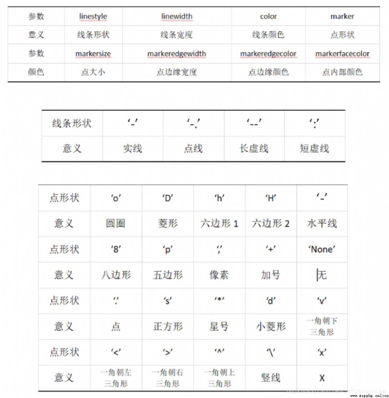
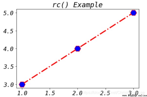
import matplotlib.pyplot as plt
import matplotlib
matplotlib.rc("lines", marker="H",markersize=17,markerfacecolor='b',linewidth=3,linestyle='-.')
font = {
'family' : 'monospace',
'style' : 'italic',
'size' : '16'}
matplotlib.rc("font", **font)
plt.title("rc() Example")
plt.plot([1,2,3],[3,4,5],color='r')
plt.show()
matplotlib.pyplot Add graph title , Axis name , Set the scale and range , There is no order .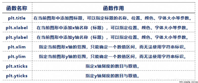
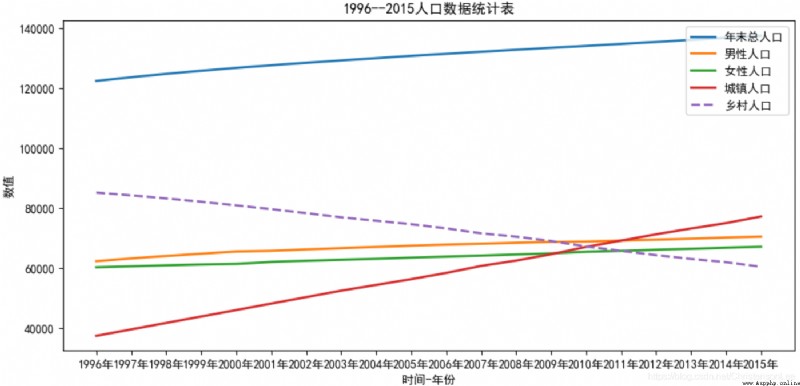
As attached 1 Shown :
analysis 1996~2015 Annual population changes .
file populations.csv It contains 1996~2015 Of the population , View each feature ( Total Population 、 Male population , Female population 、 Urban population and rural population ) Over time ( year ) Changes that occur over time .
import numpy as np
import matplotlib.pyplot as plt
import matplotlib
matplotlib.rcParams['font.sans-serif'] = 'SimHei'
## Set Chinese display
matplotlib.rcParams['axes.unicode_minus'] = False
# Read data by column
a0 = np.loadtxt('populations.csv',delimiter=',',dtype=np.str,
usecols=(0,),skiprows=1,unpack=False)
a1,a2,a3,a4,a5=np.loadtxt('populations.csv',delimiter=',',dtype=np.float,
usecols=(1,2,3,4,5),skiprows=1,unpack=True)
header = [' Total Population ',' Male population ',' Female population ',' Urban population ',' The rural population ']
# Data collation
a0,a1,a2,a3,a4,a5=a0[::-1],a1[::-1],a2[::-1],a3[::-1],a4[::-1],a5[::-1]
plt.figure(figsize=(12,6)) # Set the size of the drawing object ( canvas )
plt.xlabel(' Time - year ') # Set up x The title of the axis
plt.ylabel(' The number ') # Set up y The title of the axis
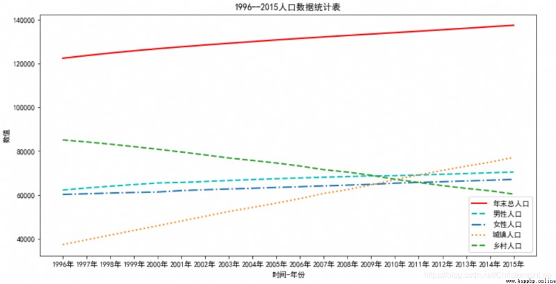
plt.title('1996--2015 Demographic tables ')
plt.plot(a0,a1,'r-',
a0,a2,'c--',
a0,a3,'-.',
a0,a4,':',
a0,a5,'--',linewidth='2',)
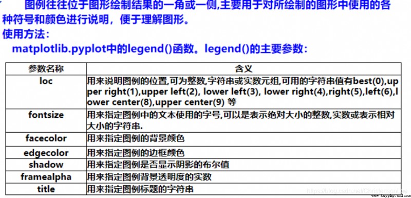
plt.legend(header) # Set legend
plt.show()
legend(title,loc,fontsize,facecolor,edgecolor,bbox_to_anchor)
import numpy as np
import matplotlib.pyplot as plt
import matplotlib
matplotlib.rcParams['font.sans-serif'] = 'SimHei'## Set Chinese display
matplotlib.rcParams['axes.unicode_minus'] = False
# Read data by column
a0 = np.loadtxt('populations.csv',delimiter=',',dtype=np.str,
usecols=(0,),skiprows=1,unpack=False)
a1,a2,a3,a4,a5=np.loadtxt('populations.csv',delimiter=',',dtype=np.float,
usecols=(1,2,3,4,5),skiprows=1,unpack=True)
header = [' Total Population ',' Male population ',' Female population ',' Urban population ',' The rural population ']
# Data collation
a0,a1,a2,a3,a4,a5=a0[::-1],a1[::-1],a2[::-1],a3[::-1],a4[::-1],a5[::-1]
plt.figure(figsize=(11,5)) # Set the size of the drawing object ( canvas )
plt.xlabel(' Time - year ') # Set up x The title of the axis
plt.ylabel(' The number ') # Set up y The title of the axis
plt.title('1996--2015 Demographic tables ')
plt.plot(a0,a1,
a0,a2,
a0,a3,
a0,a4,
a0,a5,'--',linewidth='2',)
plt.legend(header,loc=1)
plt.show()

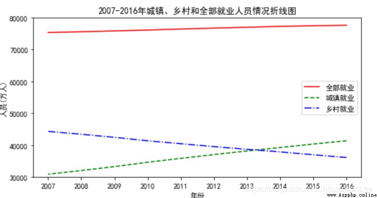
As attached 2 Shown :
Use different colors 、 Different line styles , draw 2007–2016 National employment in , Broken line chart of urban and rural employees (Employedpopulation.csv).
among , Employed persons nationwide ( ten thousand people ) Use solid red lines '-‘ Express , Urban employees ( ten thousand people ) Use a long green dotted line ’–' Express , Rural employees ( ten thousand people ) With blue dotted lines '-.' Express .
import numpy as np
import matplotlib.pyplot as plt
# Set up matplotlib Normal display of Chinese and minus sign
plt.rcParams['font.sans-serif']=['SimHei'] # Show Chinese in bold
plt.rcParams['axes.unicode_minus']=False # The minus sign is displayed normally
# Import data
Emp_data= np.loadtxt('Employedpopulation.csv',delimiter = ",",
usecols=(1,2,3,4,5,6,7,8,9,10),dtype=int)
# Create a drawing object , And set the width and height of the object
plt.figure(figsize=(8, 4))
plt.xlabel(' year ')
plt.ylabel(' personnel ( ten thousand people )')
year = [i for i in range(2007,2017)]
plt.ylim((30000,80000)) # Set up y Axis range
plt.xticks(year,year) # Set the scale
plt.title("2007-2016 Year town 、 Line chart of the situation of rural and all employed persons ")
# Draw the wiring diagram of employed persons
plt.plot(Emp_data[0],Emp_data[1],"r-",
Emp_data[0],Emp_data[2],"g--",
Emp_data[0],Emp_data[3],"b-.")
# Add legend
plt.legend([' Full employment ',' Urban employment ',' Rural employment '])
plt.savefig(' Line chart of employed persons .png')
plt.show()
A scatter chart uses coordinate points ( Scatter ) A graph that reflects the statistical relationship between features ( Distribution pattern of coordinate points ).
pyplot.scatter(x, y, s=None, c=None, marker=None, alpha=None)
Common parameters and descriptions :
x,y: A pair of data , It can also be accepted array, Express x Axis and y Data corresponding to the axis .
s: Specify the size of the point . Receive numeric or one-dimensional array, If you pass in one dimension array Represents the size of each point . The default is None
c: Specify the color of the point . Receive color or one-dimensional array, If you pass in one dimension array Represents the color of each point . The default is None
marker: The shape of the dot . Receive specific string.
alpha: transparency
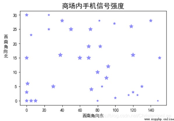
Three months after the opening of a shopping mall , Some customers reported that the mobile phone signal at some locations on the first floor of the shopping mall was poor , Sometimes, some cashiers cannot normally use wechat payment or Alipay , There are some places in the mall where wechat cannot be used normally . So , The mall arranges staff to test the signal strength of mobile phones at different locations in order to further improve the service quality and user experience , The test data is saved in a file “ Signal strength of mobile phones in shopping malls .txt” in . Three numbers separated by commas are used in each line of the document to represent a location in the shopping mall x、y Coordinates and signal strength , among x、y The coordinate value takes the southwest corner of the shopping mall as the coordinate origin and eastward as x Positive axis ( common 150 rice )、 To the north is y Positive axis ( common 30 rice ), The signal strength is measured in 0 No signal 、100 Indicates the strongest .
import matplotlib.pyplot as plt
import numpy as np
plt.rcParams['font.sans-serif']='simhei'
# Load data
data = np.loadtxt(' Signal strength of mobile phones in shopping malls .txt',dtype=np.int,delimiter=',')
plt.title(' Signal strength of mobile phones in shopping malls ',fontsize=16)
plt.ylabel(' In the west \n south \n horn \n towards \n north ',rotation=0,labelpad=16)
plt.xlabel(' Southwest corner to East ')
x_data = data[:,0] # x Coordinate data
y_data = data[:,1] # y Coordinate data
s_data = data[:,2] # Signal strength data
# Draw a scatter plot
plt.scatter(x_data,y_data,s=s_data,marker='*',c ='b',alpha=0.4)
#plt.grid(True) # Show gridlines
plt.show()
If attachments are required 1 and 2 Do exercises , Please add an article editor QQ:2122961493 receive .
above , About Python Language adoption matplotlib Library for data visualization , Have you learned ?