1. Source code
import numpy as np
import matplotlib.pyplot as plt
Emp_data= np.loadtxt('Employedpopulation.csv',delimiter = ",",
usecols=(1,2,3,4,5,6,7,8,9,10),dtype=int)
# Set up matplotlib Normal display of Chinese and minus sign
plt.rcParams['font.sans-serif']=['SimHei'] # Show Chinese in bold
plt.rcParams['axes.unicode_minus']=False # The minus sign is displayed normally
# Create a drawing object , And set the width and height of the object
plt.figure(figsize=(12, 4))
# Draw a histogram of all employed persons
plt.bar(Emp_data[0],Emp_data[1], width = 0.3,color = 'red')
# Draw a histogram of urban employees
plt.bar(Emp_data[0],Emp_data[2],width = 0.3,color = 'green')
# Draw a histogram of rural employees
plt.bar(Emp_data[0],Emp_data[3], width = 0.3,color = 'blue')
x = [i for i in range(2006,2017)]
plt.xlabel(' year ')
plt.ylabel(' personnel ( ten thousand people )')
plt.ylim((30000,80000))
plt.xlim(2006,2017)
plt.xticks(x)
plt.title("2007-2016 Year town 、 Histogram of rural and all employed persons ")
# Add legend
plt.legend((' Full employment ',' Urban employment ',' Rural employment '))
plt.savefig('Employedpopulation_bar.png')
plt.show()
2. Adjust the width of the histogram , Position of column display after translation 
import numpy as np
import matplotlib.pyplot as plt
Emp_data= np.loadtxt('Employedpopulation.csv',delimiter = ",",
usecols=(1,2,3,4,5,6,7,8,9,10),dtype=int)
# Set up matplotlib Normal display of Chinese and minus sign
plt.rcParams['font.sans-serif']=['SimHei'] # Show Chinese in bold
plt.rcParams['axes.unicode_minus']=False # The minus sign is displayed normally
# Create a drawing object , And set the width and height of the object
plt.figure(figsize=(12, 4))
# Draw a histogram of all employed persons , Translate the column forward 0.3
plt.bar(Emp_data[0]-0.3,Emp_data[1], width = 0.3,color = 'red')
# Draw a histogram of urban employees
plt.bar(Emp_data[0],Emp_data[2],width = 0.3,color = 'green')
# Draw a histogram of rural employees , Translate the column backwards 0.3,
plt.bar(Emp_data[0]+0.3,Emp_data[3], width = 0.3,color = 'blue')
x = [i for i in range(2006,2017)]
plt.xlabel(' year ')
plt.ylabel(' personnel ( ten thousand people )')
plt.ylim((30000,80000))
plt.xlim(2006,2017)
plt.xticks(x)
plt.title("2007-2016 Year town 、 Histogram of rural and all employed persons ")
# Add legend
plt.legend((' Full employment ',' Urban employment ',' Rural employment '))
plt.savefig('Employedpopulation_bar.png')
plt.show()
3. Add words to the picture text, plt.text()
Use the loop to set the position of text increase .
for x,y in zip(X,Y1):
plt.text(x+a, y+b, ‘%.2f’ % y, ha=‘center’, va= ‘bottom’)
among a,b For offset .
import numpy as np
import matplotlib.pyplot as plt
Emp_data= np.loadtxt('Employedpopulation.csv',delimiter = ",",
usecols=(1,2,3,4,5,6,7,8,9,10),dtype=int)
# Set up matplotlib Normal display of Chinese and minus sign
plt.rcParams['font.sans-serif']=['SimHei'] # Show Chinese in bold
plt.rcParams['axes.unicode_minus']=False # The minus sign is displayed normally
# Create a drawing object , And set the width and height of the object
plt.figure(figsize=(12, 4))
# Draw a histogram of all employed persons , Translate the column forward 0.3
plt.bar(Emp_data[0]-0.3,Emp_data[1], width = 0.3,color = 'red')
# Draw a histogram of urban employees
plt.bar(Emp_data[0],Emp_data[2],width = 0.3,color = 'green')
# Draw a histogram of rural employees , Translate the column backwards 0.3,
plt.bar(Emp_data[0]+0.3,Emp_data[3], width = 0.3,color = 'blue')
# Gituga text
X = Emp_data[0] # Set up X coordinate
Y1 = Emp_data[1] # Set up y coordinate
for x, y in zip(X, Y1):
plt.text(x - 0.3, y +1000, '%i' % y, ha='center')
Y2 = Emp_data[2]
for x, y in zip(X, Y2):
plt.text(x , y + 1000, '%i' % y, ha='center')
Y3 = Emp_data[3]
for x, y in zip(X, Y3):
plt.text(x + 0.3, y + 1000, '%i' % y, ha='center')
x = [i for i in range(2006,2017)]
plt.xlabel(' year ')
plt.ylabel(' personnel ( ten thousand people )')
plt.ylim((30000,81000))
plt.xlim(2006,2017)
plt.xticks(x)
plt.title("2007-2016 Year town 、 Histogram of rural and all employed persons ")
# Add legend
plt.legend((' Full employment ',' Urban employment ',' Rural employment '))
plt.savefig('Employedpopulation_bar.png')
plt.show()
4. Select column chart when there are few comparative data (bar()). You can also convert a column chart to a bar chart (barh())
plt.barh(y, width, height=0.8, left=None, *, align='center', **kwargs)
barh() Function height Represents the width of the horizontal column .
import numpy as np
import matplotlib.pyplot as plt
Emp_data= np.loadtxt('Employedpopulation.csv',delimiter = ",",
usecols=(1,2,3,4,5,6,7,8,9,10),dtype=int)
# Set up matplotlib Normal display of Chinese and minus sign
plt.rcParams['font.sans-serif']=['SimHei'] # Show Chinese in bold
plt.rcParams['axes.unicode_minus']=False # The minus sign is displayed normally
# Create a drawing object , And set the width and height of the object
plt.figure(figsize=(8, 4))
# Draw a histogram of all employed persons , Translate the column forward 0.3
plt.barh(Emp_data[0]+0.3,Emp_data[1], color = 'red',height=0.3)
# Draw a histogram of urban employees
plt.barh(Emp_data[0],Emp_data[2],color = 'green',height=0.3)
# Draw a histogram of rural employees , Translate the column backwards 0.3,
plt.barh(Emp_data[0]-0.3,Emp_data[3], color = 'blue',height=0.3)
# Gituga text
y = [i for i in range(2006,2017)]
plt.ylabel(' year ')
plt.xlabel(' personnel ( ten thousand people )')
plt.xlim((30000,81000))
plt.ylim(2006,2017)
plt.yticks(y)
plt.title("2007-2016 Year town 、 Histogram of rural and all employed persons ")
# Add legend
plt.legend((' Full employment ',' Urban employment ',' Rural employment '))
plt.savefig('Employedpopulation_bar.png')
plt.show()
5.bar() And barh() Selection of graph
import matplotlib.pyplot as plt
plt.rcParams['font.sans-serif'] = ['SimHei']
plt.rcParams['axes.unicode_minus'] = False
# Different website book price data
price = [39.5, 39.9, 45.4, 38.9, 33.34,37.89,37.5]
# Create a canvas
plt.figure(figsize=((8,6)))
plt.subplot(211)
# Draw the first picture
name=[' dangdang ', ' China Book Network ', ' Jingdong Mall books ',
' Tmall ',' Suning e-buy ',' TaoBao ',' Amazon - E-book ']
plt.barh(range(7), price, height=0.7, color='steelblue', alpha=0.8)
# Draw from the bottom up
plt.yticks(range(7),name )
plt.xlim(30,47)
plt.xlabel(" Price ")
plt.ylabel(' Different platforms ')
plt.title(" Different platforms 《XX》 The price list of the book -- Bar chart ")
for x, y in enumerate(price):
plt.text(y + 0.2, x - 0.1, '%s' % y)
plt.subplot(212)
plt.ylabel(' Price ')
plt.xlabel(' Different platforms ')
plt.xticks(range(7),name)
plt.title(" Different platforms 《XX》 The price list of the book -- Bar charts ")
plt.tight_layout(3,1,1)
plt.ylim(10,50)
for x, y in enumerate(price):
plt.text(x-0.2, y + 0.5, '%s' % y)
plt.bar(name,price,0.7,color='pink')
plt.show()
# Compare the effect of bar chart and bar chart !
Histogram (Histogram) Also known as mass distribution diagram , It's a two-dimensional statistical chart . It is represented by a series of longitudinal stripes or line segments with different heights , Generally, the horizontal axis is used to represent the category of data , Number or proportion in vertical axis .
plt.hist(x, bins=10, range=None,
weights=None, cumulative=False, bottom=None,
histtype=‘bar’, align=‘mid’, orientation=‘vertical’,
rwidth=None, log=False, color=None,
label=None, stacked=False)
Parameter description :
1)x: Specify the data to draw the histogram .
2)bins: Specify the number of histogram bars . receive int, Sequence or auto.
3)range: Specify the upper and lower bounds of histogram data , Ignore lower or higher outliers . The default contains the maximum and minimum values of plot data .
4)density=True Indicates the frequency distribution ;density=False It represents the frequency distribution . Default False.
5)weights: This parameter can set the weight for each data point . And x Weight array with the same shape . take x Each element in is multiplied by the corresponding weight value and then counted . If density The value is True, Then the weight will be normalized . This parameter can be used to draw the histogram of the merged data .
6)cumulative: Whether it is necessary to calculate the cumulative frequency or frequency . Boolean value , If True, Then calculate the cumulative frequency . If density The value is True, Then calculate the cumulative frequency .
7)bottom: You can add a baseline to each bar of the histogram , The default is 0. The bottom of each column is relative to y=0 The location of . If it's a scalar value , Then each column is relative to y=0 Up / The downward offset is the same . If it's an array , Move the corresponding column according to the value of the array element .
8)histtype: Specifies the type of histogram , The default is ’bar’, besides , also ’barstacked’,‘step’, ‘stepfilled’.
9)align: Set the alignment of bar boundary values , The default is mid, And then there is left and right.
10)orientation: Set the placement direction of histogram , The default is vertical direction .
11)rwidth: Set the width of the histogram bar .
12)color: Set the fill color of the histogram .
13)edgecolor: Set the histogram border color .
14)label: Set the label of histogram , It can be done by legend Show its legend .
15)stacked: When there are multiple data , Whether it is necessary to stack the histograms , Default horizontal placement .
1. Salary distribution
Draw the employee salary of a company (salary.csv) Distribution map .
By segment 1000-3000,3000-5000,5000-7000,7000-9000,9000~12000 Statistics of employees' wages .
import numpy as np
import matplotlib.pyplot as plt
salary= np.loadtxt('salary.csv',delimiter = ",",
usecols=(3,),skiprows=1,dtype=int)
plt.rcParams['font.sans-serif'] = ['SimHei']
plt.rcParams['axes.unicode_minus'] = False
plt.figure(figsize=((14,6)))
group = [i for i in range(1000,13000,2000)]
plt.xticks(group)
plt.hist(salary, group,rwidth=0.8,histtype='bar')
plt.show()
2.hist() The return value of
import numpy as np
import matplotlib.pyplot as plt
salary= np.loadtxt('salary.csv',delimiter = ",",
usecols=(3,),skiprows=1,dtype=int)
plt.rcParams['font.sans-serif'] = ['SimHei']
plt.rcParams['axes.unicode_minus'] = False
plt.figure(figsize=((14,6)))
group = [i for i in range(1000,13000,2000)]
plt.xticks(group)
return_V=plt.hist(salary, group,rwidth=0.8,histtype='bar')
print(return_V) # Returns a tuple
plt.show()
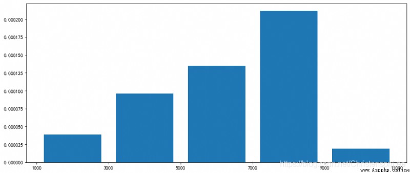
3.hist() Default frequency of ,density=True Frequency distribution
import numpy as np
import matplotlib.pyplot as plt
salary= np.loadtxt('salary.csv',delimiter = ",",
usecols=(3,),skiprows=1,dtype=int)
plt.rcParams['font.sans-serif'] = ['SimHei']
plt.rcParams['axes.unicode_minus'] = False
plt.figure(figsize=((14,6)))
group = [i for i in range(1000,13000,2000)]
plt.xticks(group)
plt.hist(salary, group,rwidth=0.8,histtype='bar',density=True)
plt.show()
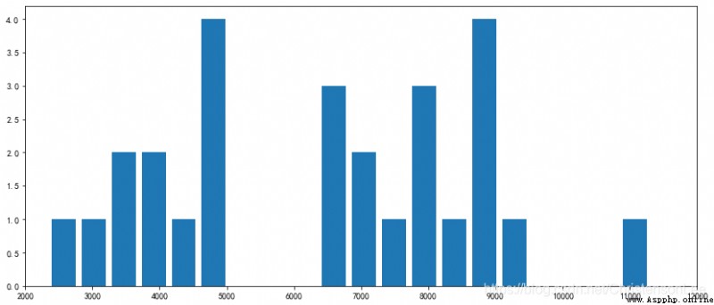
4. Not in groups , Set up bins Parameter plot distribution
import numpy as np
import matplotlib.pyplot as plt
salary= np.loadtxt('salary.csv',delimiter = ",",
usecols=(3,),skiprows=1,dtype=int)
plt.rcParams['font.sans-serif'] = ['SimHei']
plt.rcParams['axes.unicode_minus'] = False
plt.figure(figsize=((14,6)))
x=[i for i in range(1000,14000,1000)]
plt.xticks(x)
plt.xlim(2000,12000)
plt.hist(salary,bins=20,rwidth=0.8,histtype='bar')
plt.show()
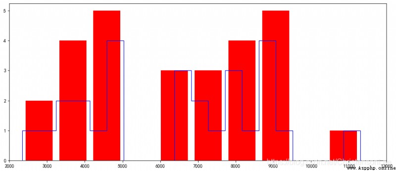
5.histtype Parameters .
Specifies the type of histogram (‘bar’( Default ),‘barstacked’,‘step’,‘stepfilled’)
1).'bar’ Is a traditional bar histogram ;
2).'barstacked’ Is a stacked bar histogram ;
3).'step’ Is an unfilled bar histogram , Only outer border ;
4).‘stepfilled’ Is a filled histogram .
When histtype The value is ’step’ or ’stepfilled’,rwidth The setting is invalid , That is, the spacing between columns cannot be specified , Connected together by default
import numpy as np
import matplotlib.pyplot as plt
salary= np.loadtxt('salary.csv',delimiter = ",",
usecols=(3,),skiprows=1,dtype=int)
plt.rcParams['font.sans-serif'] = ['SimHei']
plt.rcParams['axes.unicode_minus'] = False
plt.figure(figsize=((14,6)))
x=[i for i in range(1000,14000,1000)]
plt.xticks(x)
plt.xlim(2000,12000)
plt.hist(salary,bins=10,rwidth=0.8,histtype='barstacked',color='r')
plt.hist(salary,bins=20,rwidth=0.3,histtype='step',color='b')
plt.show()
The pie chart (Pie Graph) Is the ratio of the size of items in a data series to the sum of items .
The data points in the pie chart are displayed as a percentage of the whole pie chart . The pie chart can clearly reflect the parts and the parts 、 The proportional relationship between the part and the whole . It is easy to display the size of each group of data relative to the total number , And the display mode is intuitive .
For example, the profit proportion of different categories 、 Proportion of sales of different types of customers 、 The proportion of each component in the total .
pyplot The function for drawing pie chart in is pie, Its grammatical form :
pie(x, explode=None, labels=None, colors=None, autopct=None,
pctdistance=0.6, shadow=False, labeldistance=1.1, startangle=None,
radius=None, counterclock=True, wedgeprops=None, textprops=None,
center=(0, 0), frame=False, rotatelabels=False, hold=None, data=None)
Parameter description :
1)x: Drawing pie chart data ;
2)labels: Description of each area ( The outside of the pie chart shows );
3)explode : The distance from the center of each area ;
4)startangle : Starting angle , The default graph is from x The axis is drawn counterclockwise , If set =90 From y Draw in the positive direction of the axis ;
5)shadow : Draw a shadow under the pie chart . The default value is :False, No shadows ;
6)labeldistance :label The drawing position of the mark , The ratio to the radius , The default value is 1.1, Such as 1 It's on the inside of the pie ;
7)autopct : Control the percentage setting in the pie chart , have access to format String or format function
'%1.1f’ Refers to the number of digits before and after the decimal point ( Didn't fill in the blanks );
8)pctdistance : Be similar to labeldistance, Appoint autopct The position scale of , The default value is 0.6;
9)radius : Control the pie radius , The default value is 1;counterclock : Specify the direction of the pointer ; Boolean value , Optional parameters , The default is :True, That is, counter clockwise . Change the value to False It can be changed to clockwise .wedgeprops : Dictionary type , Optional parameters , The default value is :None. The parameter dictionary is passed to wedge Object is used to draw a pie chart . for example :wedgeprops={‘linewidth’:3} Set up wedge The line width is 3.
10)textprops : Set the label (labels) And the format of proportional text ; Dictionary type , Optional parameters , The default value is :None. Pass to text The dictionary parameter of the object .
11)colors: The color of the pie chart .
12)center : A list of floating point types , Optional parameters , The default value is :(0,0). The center of the icon .
13)frame : Boolean type , Optional parameters , The default value is :False. If it is true, Drawing axis frames with tables .
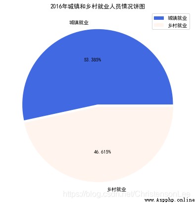
draw 2016 Urban and rural employees in (Employedpopulation.csv) The pie chart of .
1. Source code
import numpy as np
import matplotlib.pyplot as plt
# Import 2016 Annual employment data
Emp_data= np.loadtxt('Employedpopulation.csv',delimiter = ",",
usecols=(1),dtype=int)
# Set up matplotlib Normal display of Chinese and minus sign
plt.rcParams['font.sans-serif']=['SimHei']
plt.rcParams['axes.unicode_minus']=False
# extract 2016 The annual urban employment data and rural employment data are assigned to X
X = [Emp_data[2],Emp_data[3]]
# Create a drawing object , Set the canvas to square , The pie chart drawn is a positive circle
plt.figure(figsize=(7, 7))
label = [' Urban employment ',' Rural employment '] # Define the label of the pie chart , Tags are lists
explode = [0.01,0.02] # Set the distance from the center of the circle n radius
# Draw the pie chart ( data , radius , The label corresponding to the data , Keep two decimal places for the percentage )
plt.pie(X,explode = explode, labels=label,autopct='%.3f%%')
# Add the title
plt.title("2016 Pie chart of urban and rural employment in ")
# Add legend
plt.legend({
' Urban employment ',' Rural employment '})
plt.savefig('Employedpopulation_pie.png')
plt.show()
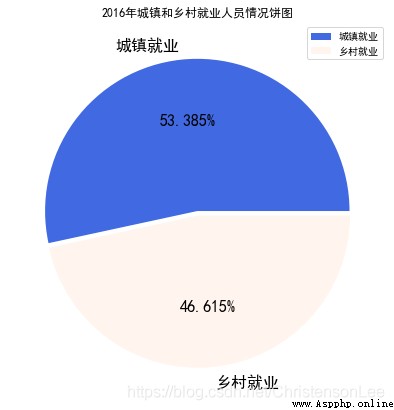
2. Set the color of the pie chart
import matplotlib._color_data as mcd
for key in mcd.CSS4_COLORS:
print('{}: {}'.format(key, mcd.CSS4_COLORS[key]))
# Create a drawing object , Set the canvas to square , The pie chart drawn is a positive circle
plt.figure(figsize=(7, 7))
# Set the color of the pie chart
color=['royalblue','#FFF5EE']
plt.pie(X,explode = explode, labels=label,autopct='%.3f%%',colors=color)
# Add the title
plt.title("2016 Pie chart of urban and rural employment in ")
# Add legend
plt.legend({
' Urban employment ',' Rural employment '})
plt.show()
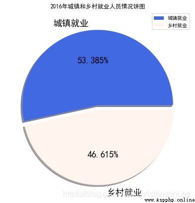
3. Set text labels
# Create a drawing object , Set the canvas to square , The pie chart drawn is a positive circle
plt.figure(figsize=(7, 7))
label = [' Urban employment ',' Rural employment '] # Define the label of the pie chart , Tags are lists
explode = [0.01,0.02] # Set the distance from the center of the circle n radius
# Set text labels
textprops={
'fontsize':16,'color':'k'}
color=['royalblue','#FFF5EE']
plt.pie(X,explode = explode, labels=label,autopct='%.3f%%',
colors=color,textprops=textprops)
# Add the title
plt.title("2016 Pie chart of urban and rural employment in ")
# Add legend
plt.legend({
' Urban employment ',' Rural employment '})
plt.show()
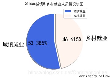
4. Set the separation and shadow of pie chart
# Create a drawing object , Set the canvas to square , The pie chart drawn is a positive circle
plt.figure(figsize=(7, 7))
label = [' Urban employment ',' Rural employment '] # Define the label of the pie chart , Tags are lists
# Set the radius of each item from the center of the circle
explode = [0.0,0.06]
# Set text labels
textprops={
'fontsize':18,'color':'k'}
color=['royalblue','#FFF5EE']
plt.pie(X,explode = explode, labels=label,autopct='%.3f%%',
colors=color,textprops=textprops,shadow=True)
# Add the title
plt.title("2016 Pie chart of urban and rural employment in ")
# Add legend
plt.legend({
' Urban employment ',' Rural employment '})
plt.show()
5. Set start angle startangle
plt.figure(figsize=(4,6))
plt.pie(X,explode = explode, labels=label,autopct='%.3f%%',
colors=color,textprops=textprops,shadow=True,startangle=90)
# Add the title
plt.title("2016 Pie chart of urban and rural employment in ")
# Add legend
plt.legend({
' Urban employment ',' Rural employment '})
plt.show()
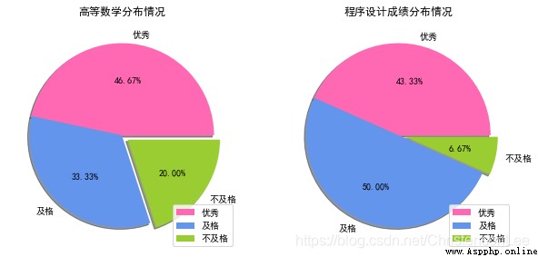
6. Project practice
import numpy as np
import matplotlib.pyplot as plt
# Set up matplotlib Normal display of Chinese and minus sign
plt.rcParams['font.sans-serif']=['SimHei']
plt.rcParams['axes.unicode_minus']=False
# Import student grades Advanced mathematics ma, Programming pr
data= np.loadtxt('student.csv',delimiter=',',
usecols=(1,2),dtype=np.int,skiprows=1)
# Count the number of people in each score segment
ma_count=[]
for num in data.T:
n=m=k=0
for i in num:
if i>=85:
n=n+1
elif i>=60:
m=m+1
else:
k=k+1
ma_count.append([n,m,k])
# Define the label and distance of the pie chart
label = [' good ',' pass ',' fail, ']
explode =[0.0,0.0,0.08]
# Color the pie chart
color=['#FF69B4','#6495ED','#9ACD32']
plt.figure(figsize=(10,10))
plt.subplot(121)
plt.title(" Distribution of advanced mathematics ")
plt.pie(ma_count[0], labels=label,autopct='%.2f%%',explode=explode,
colors=color,shadow=True)
plt.legend(loc=4)
plt.subplot(122)
plt.title(" Program design score distribution ")
plt.pie(ma_count[1], labels=label,autopct='%.2f%%',explode=explode,
colors=color,shadow=True)
# Add legend
plt.legend(loc=4)
plt.show()
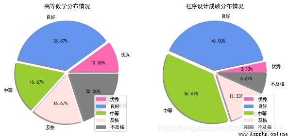
If set to five levels : good , good , secondary , pass , fail, .
import numpy as np
import matplotlib.pyplot as plt
# Set up matplotlib Normal display of Chinese and minus sign
plt.rcParams['font.sans-serif']=['SimHei']
plt.rcParams['axes.unicode_minus']=False
# Import student grades Advanced mathematics ma, Programming pr
data= np.loadtxt('student.csv',delimiter=',',
usecols=(1,2),dtype=np.int,skiprows=1)
# Count the number of people in each score segment
ma_count=[]
# Create an empty list
for num in data.T:
n=m=k=j=r=0
# Set initial value
for i in num:
if i>=95:
n=n+1
# The number of outstanding people
elif i>=85:
m=m+1
# Get good numbers
elif i>=70:
k=k+1
# Get a medium number
elif i>=60:
j=j+1
# The number of people who have passed
else:
r=r+1
# The number of people who failed
ma_count.append([n,m,k,j,r])
# Define the label and distance of the pie chart
label = [' good ',' good ',' secondary ',' pass ',' fail, ']
# It refers to the distance between this block and the center point
explode =[0.05,0.05,0.05,0.05,0.05]
# Color the pie chart
color=['#FF69B4','#6495ED','#9ACD32','#FFE4E1','#808080']
# Five colors are set
plt.figure(figsize=(10,10))
plt.subplot(121)
plt.title(" Distribution of advanced mathematics ")
plt.pie(ma_count[0], labels=label,autopct='%.2f%%',explode=explode,
colors=color,shadow=True)
# Add legend
plt.legend(loc=4)
plt.subplot(122)
plt.title(" Program design score distribution ")
plt.pie(ma_count[1], labels=label,autopct='%.2f%%',explode=explode,
colors=color,shadow=True)
# Add legend
plt.legend(loc=4)
#loc=4 Position it in the lower right corner , Otherwise, it will be placed where other systems think it is most appropriate
print(data)
plt.savefig('StudentsGrades_pie.png')
plt.show()
above ,matplotlib Library about histograms , Histogram , Bar chart , That's all for the pie chart , Have you learned ?
If you need the above data table to simulate , Please contact the editor QQ:2122961493 receive .