CSDN Topic challenge No 1 period
Event details address :https://marketing.csdn.net/p/bb5081d88a77db8d6ef45bb7b6ef3d7f
The topic of the competition :Python Wonderful third-party module recommendation
Topic description :Matplotlib Library to progressive 、 Interactive way to realize data visualization , Make data more intuitive , Make it clear at a glance , Next, several common graphic types are drawn in combination with actual projects .
Individuality signature : The most important part of the whole building is the foundation , The foundation is unstable , The earth trembled and the mountains swayed . And to learn technology, we should lay a solid foundation , Pay attention to me , Take you to firm the foundation of the neighborhood of each plate .
Blog home page : Qigui's blog
Included column :Python The Jianghu cloud of the three swordsmen
From the south to the North , Don't miss it , Miss this article ,“ wonderful ” May miss you yo
Triple attack( Three strikes in a row ):Comment,Like and Collect—>Attention
Matplotlib Kuo is python Excellent data visualization library , yes python A necessary tool for data analysis , Excellent data visualization will make your data analysis and other work icing on the cake , At the same time, you will also feel the beauty of data visualization . In the real world, there are always various numerical data , We want to encode these numerical data into a graph 、 Line 、 spot 、 Wait , In order to visually display the information contained in these values , At the same time, it can make the complex distributed data easier to understand and apply . This process is widely used in various occasions , Including comparative analysis 、 Growth rate tracking 、 Market distribution 、 Opinion polls, etc .
Use pylab or pyplot The general process of drawing is :
First generate or read data , Then draw a line chart according to actual needs 、 Scatter plot 、 Histogram 、 The pie chart 、 Radar chart or three-dimensional curve and surface , Next set up :
It is known that there is a barbecue shop near the school 2019 Annual turnover of each month . Write a program to draw a line chart to visualize the annual turnover of the barbecue shop , Connect the data of each month with a blue dotted line , And mark the data of each month with a circle .
import matplotlib.pyplot as plt
# Load Fonts
plt.rcParams['font.sans-serif'] = ['SimHei'] # Specify default font
# Monthly and monthly turnover
month = list(range(1, 13))
money = [4.2, 2.7, 5.8, 5.7, 7.3, 10.2,
18.7, 16.6, 20.5, 17.0, 9.8, 6.9]
plt.plot(month, money, c='b', linestyle='-.', marker='o')
plt.xlabel(' month ')
plt.ylabel(' Turnover ( Ten thousand yuan )')
plt.title(' Barbecue shop 2019 Annual turnover trend chart ')
# Tighten the space around , Expand the usable area of the drawing area
plt.tight_layout()
plt.show()
Output results :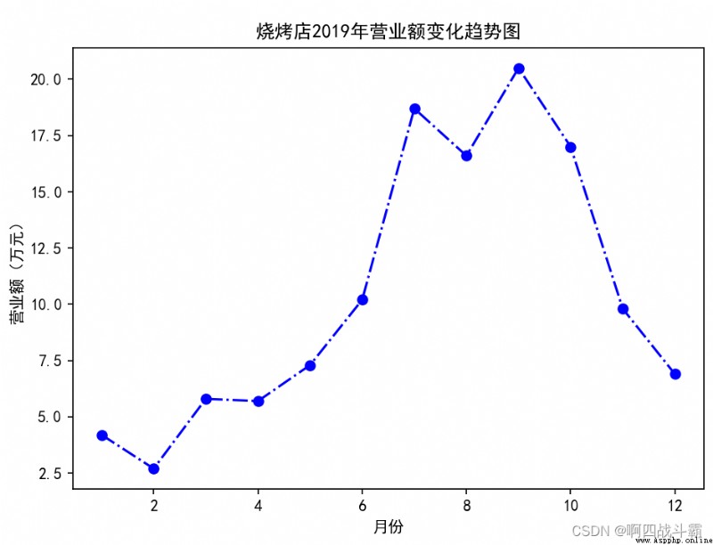
The data of the barbecue shop is plotted as a histogram , It is required that the color of each column can be set 、 Internal fill symbol 、 Stroke effect and label text .
import matplotlib.pyplot as plt
# Load Fonts
plt.rcParams['font.sans-serif'] = ['SimHei'] # Specify default font
# Monthly and monthly turnover
month = list(range(1, 13))
money = [4.2, 2.7, 5.8, 5.7, 7.3, 10.2,
18.7, 16.6, 20.5, 17.0, 9.8, 6.9]
# Draw the turnover of each month
for x, y in zip(month, money):
plt.bar(x, y,
color='y', width=0.6,
edgecolor='c', linestyle='-.', linewidth=1.5)
plt.text(x - 0.3, y + 0.2, '%.1f' % y)
plt.xlabel(' month ')
plt.ylabel(' Turnover ( Ten thousand yuan )')
plt.title(' Barbecue shop turnover ')
# Set up x Axis scale
plt.xticks(month)
# Set up y Axis scale
plt.ylim(0, 22)
plt.show()
Output results :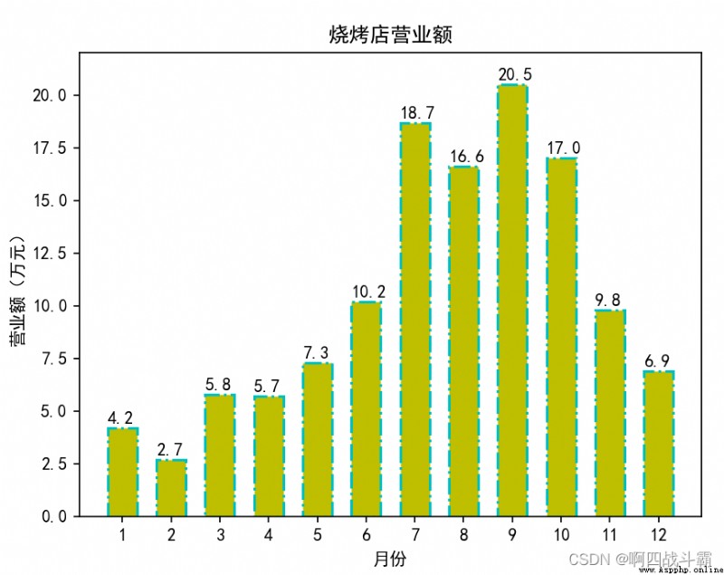
Know the data structure of a class 、 linear algebra 、 English and Python Course examination results , It is required to draw a pie chart to show the results of each course (85 More than )、 pass (60-84 branch )、 fail, (60 Below ) The proportion of .
from itertools import groupby
import matplotlib.pyplot as plt
# Set the Chinese font in the drawing
plt.rcParams['font.sans-serif'] = ['simhei']
# The grade of each course
scores = {
' data structure ': [89, 70, 49, 87, 92, 84, 73, 71, 78, 81, 90, 37,
77, 82, 81, 79, 80, 82, 75, 90, 54, 80, 70, 68, 61],
' linear algebra ': [70, 74, 80, 60, 50, 87, 68, 77, 95, 80, 79, 74,
69, 64, 82, 81, 78, 90, 78, 79, 72, 69, 45, 70, 70],
' English ': [83, 87, 69, 55, 80, 89, 96, 81, 83, 90, 54, 70, 79,
66, 85, 82, 88, 76, 60, 80, 75, 83, 75, 70, 20],
'Python': [90, 60, 82, 79, 88, 92, 85, 87, 89, 71, 45, 50,
80, 81, 87, 93, 80, 70, 68, 65, 85, 89, 80, 72, 75]}
# Custom grouping function , In the following groupby() Use in a function
def splitScore(score):
if score >= 85:
return ' optimal '
elif score >= 60:
return ' pass '
else:
return ' fail, '
# Count the top students in each course 、 pass 、 The number of people who failed
# ratios The format is {' Course name ':{' optimal ':3, ' pass ':5, ' fail, ':1},...}
ratios = dict()
for subject, subjectScore in scores.items():
ratios[subject] = {
}
# groupby() The function needs to sort the original scores in order to correctly classify
for category, num in groupby(sorted(subjectScore), splitScore):
ratios[subject][category] = len(tuple(num))
# establish 4 Subtext
fig, axs = plt.subplots(2, 2)
axs.shape = 4,
# In turn, it's 4 Draw a pie chart of each course in the subgraph
for index, subjectData in enumerate(ratios.items()):
# Select the subgraph
plt.sca(axs[index])
subjectName, subjectRatio = subjectData
plt.pie(list(subjectRatio.values()), # The value corresponding to each sector
labels=list(subjectRatio.keys()), # Label of each sector
autopct='%1.1f%%') # Percentage display format
plt.xlabel(subjectName)
plt.legend()
plt.gca().set_aspect('equal') # Set the aspect ratio equal
plt.show()
Output results :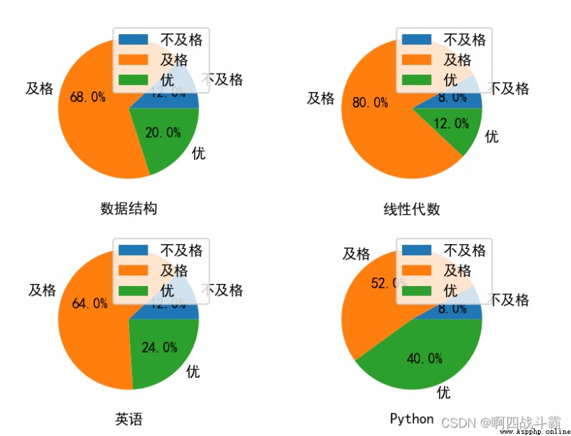
Suppose you get Changsha through the crawler 2019 year 4,10 The highest temperature during the day in January ( Respectively in the list a,b), At this time, how to find a certain rule that the temperature of the outlet gas changes with time
a = [11,17,16,11,12,11,12,13,10,14,8,13,12,15,14,17,18,21,16,17,30,14,15,15,15,19,21,22,22,22,23]
b = [26,26,28,19,21,17,16,19,18,20,20,19,22,23,17,20,21,20,22,15,11,15,5,13,15,10,11,13,12,13,6]
import matplotlib.pyplot as plt
# Set the Chinese font in the drawing
plt.rcParams['font.sans-serif'] = ['simhei']
# structure x,y
y_4 = [11, 17, 16, 11, 12, 11, 12, 13, 10, 14, 8, 13, 12, 15, 14, 17, 18, 21, 16, 17, 30, 14, 15, 15, 15, 19, 21, 22,
22, 22, 23]
y_10 = [26, 26, 28, 19, 21, 17, 16, 19, 18, 20, 20, 19, 22, 23, 17, 20, 21, 20, 22, 15, 11, 15, 5, 13, 15, 10, 11, 13,
12, 13, 6]
x_4 = range(1, 32) # 1~31
x_10 = range(51, 82) # 51~81
plt.scatter(x_4, y_4)
plt.scatter(x_10, y_10)
# scale :4 month 1 Number ... 4 month 31 Number 10 month 1 Number ..10 month 31 Number
x_t = list(x_4) + list(x_10)
x_l = ["4 month {} Number ".format(i) for i in x_4]
x_l += ["10 month {} Number ".format(i - 50) for i in x_10]
plt.xticks(x_t[::3], x_l[::3], rotation=90)
plt.tight_layout()
plt.show()
Output results :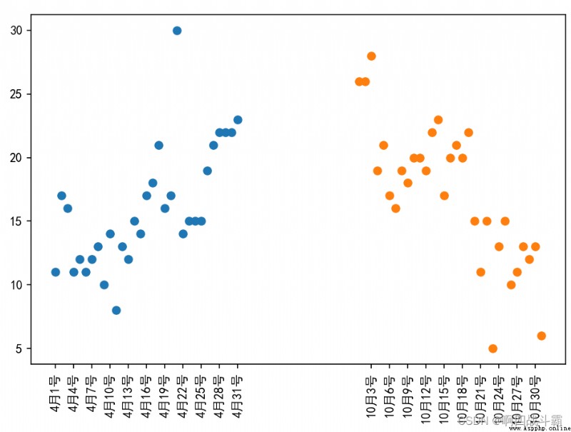
To analyze the details of household expenses , Also for better family financial management , Zhang San is right 2018 Vegetables every month throughout the year 、 Fruits 、 meat 、 Daily Necessities 、 tourism 、 All expenses such as gifts have been recorded in detail . Programming , Draw a bubble chart according to Zhang San's household expenses .
import matplotlib.pyplot as plt
import pandas as pd
# Set the drawing style
plt.style.use('ggplot')
# Deal with Chinese code
plt.rcParams['font.sans-serif'] = ['Microsoft YaHei']
x = list(range(1, 13))
# Monthly expenditure data
data = pd.DataFrame({

' vegetables ': [1350, 1500, 1330, 1550, 900, 1400, 980, 1100, 1370, 1250, 1000, 1100],
' Fruits ': [400, 600, 580, 620, 700, 650, 860, 900, 880, 900, 600, 600],
' meat ': [480, 700, 370, 440, 500, 400, 360, 380, 480, 600, 600, 400],
' daily expenses ': [1100, 1400, 1040, 1300, 1200, 1300, 1000, 1200, 950, 1000, 900, 950],
' clothes ': [650, 3500, 0, 300, 300, 3000, 1400, 500, 800, 2000, 0, 0],
' tourism ': [4000, 1800, 0, 0, 0, 0, 0, 4000, 0, 0, 0, 0],
' Courtesy ': [0, 4000, 0, 600, 0, 1000, 600, 1800, 800, 0, 0, 1000]
})
plt.figure(figsize=(10, 10))
# 1、 Draw a bubble chart of vegetables
plt.scatter(x=x,
y=data[' vegetables '],
s=2 * data[' vegetables '],
color='k', label=' vegetables ', alpha=0.6
)
# 2、 Draw the bubble diagram of the fruit
plt.scatter(x=x,
y=data[' Fruits '],
s=2 * data[' Fruits '],
color='r', label=' Fruits ', alpha=0.6
)
# 3、 Draw a bubble chart of meat
plt.scatter(x=x,
y=data[' meat '],
s=2 * data[' meat '],
color='g', label=' meat ', alpha=0.6
)
# 4、 Draw a bubble chart for daily use
plt.scatter(x=x,
y=data[' daily expenses '],
s=2 * data[' daily expenses '],
color='b', label=' daily expenses ', alpha=0.6
)
# 5、 Draw a bubble chart of clothes
plt.scatter(x=x,
y=data[' clothes '],
s=2 * data[' clothes '],
color='c', label=' clothes ', alpha=0.6
)
# 6、 Draw a bubble chart of tourism
plt.scatter(x=x,
y=data[' tourism '],
s=2 * data[' tourism '],
color='m', label=' tourism ', alpha=0.6
)
# 7、 Draw a bubble chart with gifts
plt.scatter(x=x,
y=data[' Courtesy '],
s=2 * data[' Courtesy '],
color='y', label=' Courtesy ', alpha=0.6
)
# add to x Axis and y Axis labels
plt.xlabel(' month ')
plt.ylabel(' spending ')
# Add the title
plt.title(' Monthly spending bubble chart ')
# Add legend
plt.legend()
# Set the scale range of the ordinate
plt.ylim((0, 7000))
# Tighten the space around , Expand the usable area of the drawing area
plt.tight_layout()
# The graphics
plt.show()
Output results :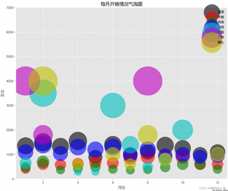
Data visualization is the core of machine learning , Using it helps to develop the right strategy to understand data . The visual representation of data helps us choose the right algorithm . One of the main goals of data visualization is to clearly express data with graphs and tables , So that we can be more accurate 、 Exchange information more effectively .
CSDN Topic challenge No 1 period
Event details address :https://marketing.csdn.net/p/bb5081d88a77db8d6ef45bb7b6ef3d7f