Preface
One 、 General bar chart
Two 、 Horizontal bar chart
3、 ... and 、 Drawing of grouped bar chart
Four 、 Stacked bar chart drawing
summary
Prefacematplotlib It's a very powerful one Python Third party drawing package , Can draw very many very beautiful graphics .
import numpy as npimport pandas as pdimport matplotlib.pyplot as pltfrom matplotlib import font_manager One 、 General bar chart The general bar chart uses pyplot.bar() Function to draw , Its form and parameters are as follows :
matplotlib.pyplot.bar(x, height, width=0.8, bottom=None, *, align='center', data=None, **kwargs) Explanation of main parameters :# x: An array or list , Representing the bar graph that needs to be drawn x The coordinate point of the axis .# height: An array or list , Represents the bar graph that needs to be drawn y The coordinate point of the axis .# width: The width of each bar , The default is 0.8 Width .# bottom:y The baseline of the axis , The default is 0, That is, the distance from the bottom is 0.# align: Alignment mode ,{'center','edge'}, The default is center, Align center ;edge Align to the side , Right or left , see width Plus or minus .# color: The color of the bar graph .# edgecolor : The color of the bar chart border .# linewidth : The width of the bar chart border . If 0, No borders are drawn pyplot.bar() The complete parameters are stamped here
Example :
One day movie box office data :
movies = { " Wandering the earth ":40.78, " Fast life ":15.77, " Crazy aliens ":20.83, " The king of new comedy ":6.10, " Integrity ":1.10, " Detective Pu Songling ":1.49, " Peppa pig has a big year ":1.22, " Bear haunt · primeval ages ":6.71}Directly obtain the key value of the dictionary as x,y Axis data
# The box office unit is 100 million yuan movies = { " Wandering the earth ":40.78, " Fast life ":15.77, " Crazy aliens ":20.83, " The king of new comedy ":6.10, " Integrity ":1.10, " Detective Pu Songling ":1.49, " Peppa pig has a big year ":1.22, " Bear haunt · primeval ages ":6.71}# Chinese display problem plt.rcParams['font.sans-serif'] = ['SimHei']plt.rcParams['axes.unicode_minus'] = Falseplt.rcParams['font.size'] = 13# Set the image size plt.figure(figsize=(15,8))x = list(movies.keys()) # obtain x Axis data ( Key to dictionary )y = list(movies.values()) # obtain y Axis data ( Dictionary value )plt.bar(x,y,width=0.5,bottom=0,align='edge',color='g',edgecolor ='r',linewidth=2)# Draw the title plt.title(" Movie box office data ",size=26)# Set axis labels plt.xlabel(" The movie name ",size=28)plt.ylabel(" box office / Billion ",size=28)plt.show()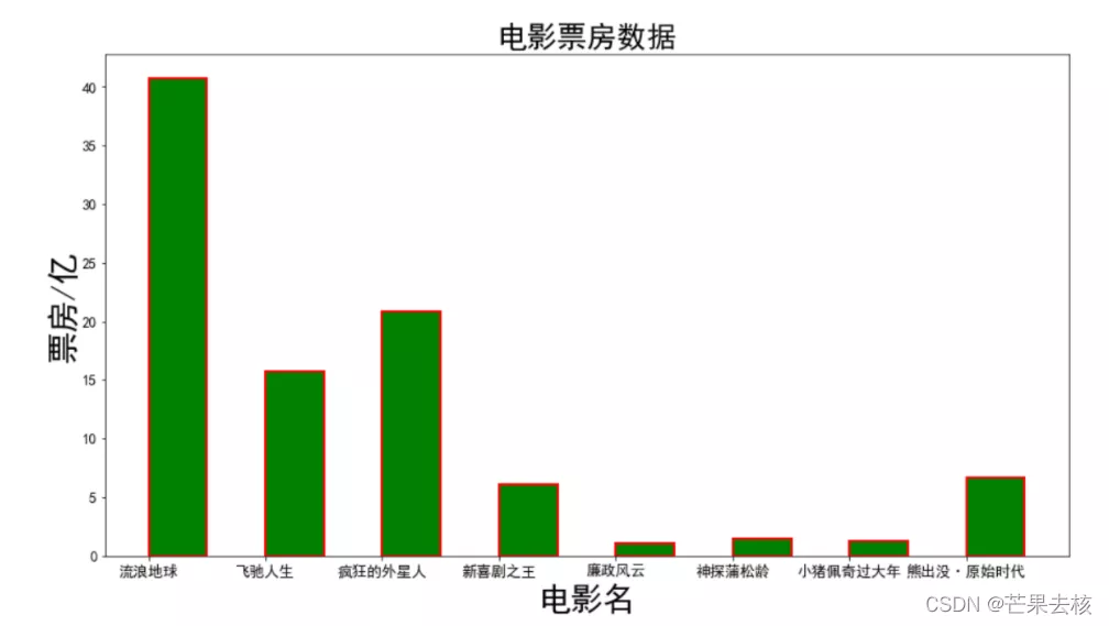
You can also use a dictionary to create DataFrame Indexes , adopt data Parameters of the incoming
# The box office unit is 100 million yuan movies = { " Wandering the earth ":40.78, " Fast life ":15.77, " Crazy aliens ":20.83, " The king of new comedy ":6.10, " Integrity ":1.10, " Detective Pu Songling ":1.49, " Peppa pig has a big year ":1.22, " Bear haunt · primeval ages ":6.71}movies_df = pd.DataFrame(data={"name":list(movies.keys()),"tickes":list(movies.values())}) # Create... From a dictionary DataFrame Indexes font = font_manager.FontProperties(fname='C:\Windows\Fonts\STSONG.TTF',size=12) # Use font_manager Module settings Chinese # Set the size of the graph , Pass in x,yplt.figure(figsize=(14,5))# Use plt.bar() Draw a bar graph plt.bar("name","tickes",data=movies_df,width=0.5,bottom=0,align='edge',color='g',edgecolor ='r',linewidth=2)# Set up X Axis scale , Set the font , You can also set the font size sizeplt.xticks(fontproperties=font)# Set title plt.title(" Movie box office data ",size=30)# Set up X,Y Axis name plt.ylabel(' box office ',fontproperties=font,size=25)plt.xlabel(' The name of the film ',fontproperties=font,size=25)# Set up Y scale plt.yticks(range(0,50,5),["%d"%x for x in range(0,50,5)],fontproperties=font1,size=20)# Keep only graphic information plt.show()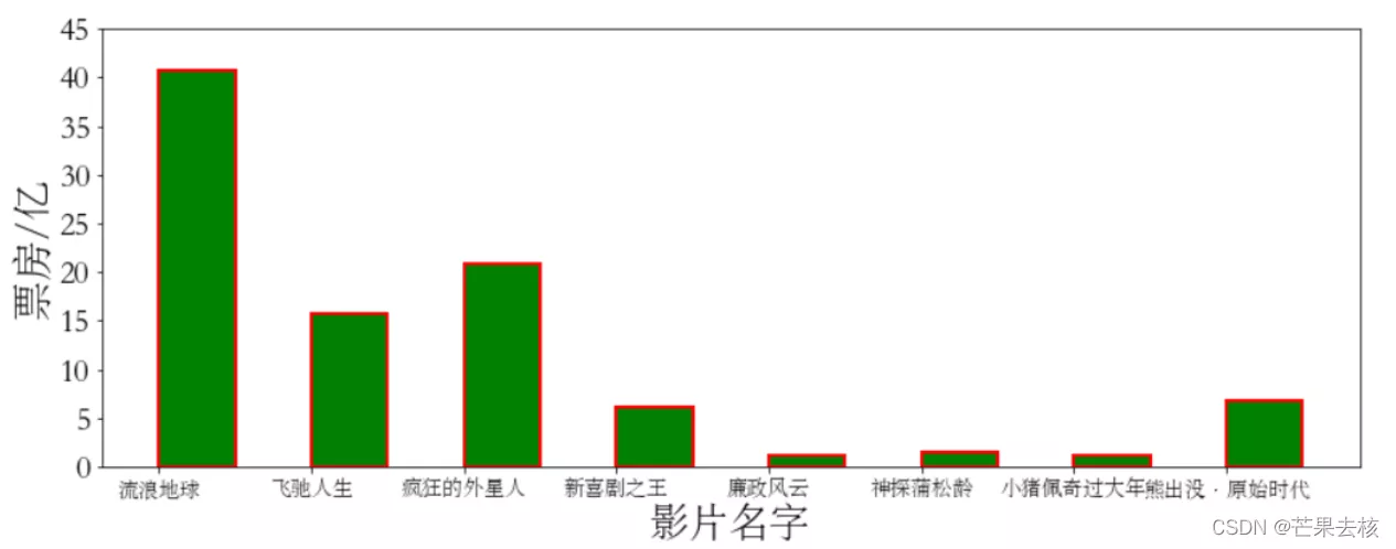
Horizontal bar charts need to use barh() This heel bar Very similar , Just rotate the direction . Parameters are also related to pyplot.bar() similar
matplotlib.pyplot.barh(y, width, height=0.8, left=None, *, align='center', **kwargs)# Explanation of main parameters :# y: Array or list , Represents the bar graph that needs to be drawn in y Coordinate points on the axis .# width: Array or list , Represents the bar graph that needs to be drawn in x The value on the axis ( That's the length ).# height: The height of the bar graph ( Width ), The default is 0.8.# left: The baseline of the bar graph , That's distance y Distance of axis . The default is 0pyplot.barh() Complete parameters
Example :
plt.barh()
movies = { " Wandering the earth ":40.78, " Fast life ":15.77, " Crazy aliens ":20.83, " The king of new comedy ":6.10, " Integrity ":1.10, " Detective Pu Songling ":1.49, " Peppa pig has a big year ":1.22, " Bear haunt · primeval ages ":6.71}font2 = font_manager.FontProperties(fname='C:\Windows\Fonts\STSONG.TTF')x1 = list(movies.keys())y1 = list(movies.values())# Set the size of the graph plt.figure(figsize=(10,5))# Use plt.barh()plt.barh(x1,y1,height=0.7,left=0,color='c',edgecolor='r')# Set up Y Axis scale , Set the font , You can also set the font size sizeplt.yticks(fontproperties=font2,size=20)plt.xlabel(" box office / Billion ",size=20)# Set title plt.title(" Movie box office data ",size=30)# Keep only graphic information plt.show()
Axes.barh(y, width, height=0.8, left=None, *, align='center', **kwargs)in addition , You can also use the returned axes Object drawing graphics
movies = { " Wandering the earth ":40.78, " Fast life ":15.77, " Crazy aliens ":20.83, " The king of new comedy ":6.10, " Integrity ":1.10, " Detective Pu Songling ":1.49, " Peppa pig has a big year ":1.22, " Bear haunt · primeval ages ":6.71}font2 = font_manager.FontProperties(fname='C:\Windows\Fonts\STSONG.TTF')mdf = pd.DataFrame(data={"name":list(movies.keys()),"tickes":list(movies.values())})fig,axes = plt.subplots() # By returning axes Object drawing graphics axes.barh("name","tickes",data = mdf,height=0.6,left=0,color='c',edgecolor='r')# Set up Y Axis scale , Set the font , You can also set the font size sizeplt.yticks(fontproperties=font2,size=20)plt.xlabel(" box office / Billion ",size=24)# Set title plt.title(" Movie box office data ",size=27)# Keep only graphic information plt.show()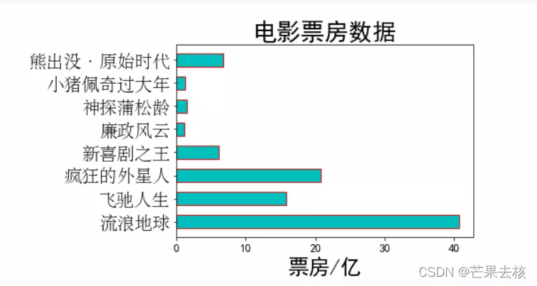
Five days of movie box office data ( Suppose the date is 1.1-1.5): And converted to DataFrame Indexes
movies = { " Wandering the earth ":[2.01,4.59,7.99,11.83,16], " Fast life ":[3.19,5.08,6.73,8.10,9.35], " Crazy aliens ":[4.07,6.92,9.30,11.29,13.03], " The king of new comedy ":[2.72,3.79,4.45,4.83,5.11], " Integrity ":[0.56,0.74,0.83,0.88,0.92], " Detective Pu Songling ":[0.66,0.95,1.10,1.17,1.23], " Peppa pig has a big year ":[0.58,0.81,0.94,1.01,1.07], " Bear haunt · primeval ages ":[1.13,1.96,2.73,3.42,4.05]}mdf = pd.DataFrame(movies) mdf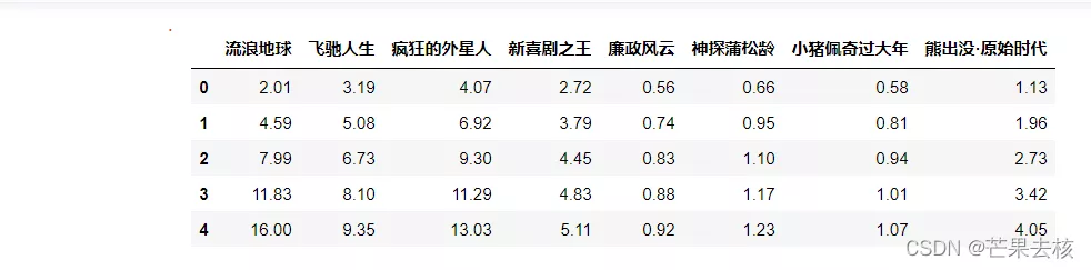
The idea of drawing group bar chart : First select the box office data of all films every day , You can use DataFrame.iloc[] Method to get , for example
# Get the box office data of the first day mdf.iloc[0] Wandering the earth 2.01 Fast life 3.19 Crazy aliens 4.07 The king of new comedy 2.72 Integrity 0.56 Detective Pu Songling 0.66 Peppa pig has a big year 0.58 Bear haunt · primeval ages 1.13Name: 0, dtype: float64 Then draw by day , Here, you need to determine a center point as the position of the bar chart of the intermediate date ( This is the third day ), As many films as there are, we need as many centers , You can use np.arange(len(movies)) obtain x Take the axis scale as the center point . Finally, adjust the position of the bar chart according to the width of the bar chart according to the date .
plt.figure(figsize=(15,5))# Set up X The axis scale is an array ( There's a broadcast function )xticks = np.arange(len(movies)) # Set the font font = font_manager.FontProperties(fname='C:\Windows\Fonts\STSONG.TTF')# Set bar width bar_width = 0.15# Set the position of all movie bars on the first day plt.bar(xticks-2*bar_width,mdf.iloc[0],width=bar_width,color='pink') # iloc[] take DataFrame A line # Set the location of all movie bars for the next day plt.bar(xticks-bar_width,mdf.iloc[1],width=bar_width)# Set the position of all movie bars on the third day , Default in [0 1 2 3 4 5 6 7]center It's about plt.bar(xticks,mdf.iloc[2],width=bar_width)# Set the position of all movie bars on the fourth day plt.bar(xticks+bar_width,mdf.iloc[3],width=bar_width)# Set the position of all movie bars on the fifth day plt.bar(xticks+2*bar_width,mdf.iloc[4],width=bar_width)# Set up X Axis information plt.xticks(xticks,mdf.columns,fontproperties=font,size=15)# Set up Y scale plt.yticks(range(0,20,2),["%d"%x for x in range(0,20,2)],fontproperties=font,size=16)# Set up X,Y Axis name plt.ylabel(' box office / Billion ',fontproperties=font,size=30)plt.xlabel(' The name of the film ',fontproperties=font,size=30)# Set title plt.title(" Five day box office data ",fontproperties=font,size=30)# Keep only graphic information plt.show()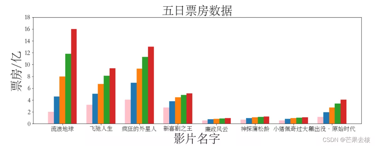
Use a loop to plot daily data
plt.figure(figsize=(16,5))# Set up X The axis scale is an array ( There's a broadcast function )#xticks1 = np.arange(len(movies)) # Set each movie like this X The distance of the axis is 1, If 5 The width of a bar chart is greater than 1 Will overlap with other films , You can set the step xticks1 = np.arange(0,7*len(movies),7) # Change the step size , To set X The axis information changes xticks( step *ticks labels) The first parameter of , Otherwise, it doesn't correspond to # Set the font font4 = font_manager.FontProperties(fname='C:\Windows\Fonts\STSONG.TTF')# Set bar width bar_width1 = 1.05# Use the cycle to draw a bar chart for the first five days for index in mdf.index: # plt.bar(xticks1+(-2+index)*bar_width1,mdf.iloc[index],width=bar_width1,label=' The first %d Day box office '%(index+1)) xs = xticks1+(-2+index)*bar_width1 # stay X Position of the shaft day_tickets = mdf.iloc[index] plt.bar(xs,day_tickets,width=bar_width*7,label=" The first %d Day box office "%(index+1)) # Set comment text # zip(day_tickets,xs) Packed as a list of tuples , The number of elements corresponds to the shortest list for ticket,x in zip(day_tickets,xs): # ticket yes day_tickets The value of the list ,x yes xs Value plt.annotate(ticket,xy=(x,ticket),xytext=(x-0.2,ticket+0.1))# Set up X Axis information plt.xticks(7*xticks,mdf.columns,fontproperties=font4,size=15)# Set up X,Y Axis name plt.ylabel(' box office / Billion ',fontproperties=font4,size=25)plt.xlabel(' The name of the film ',fontproperties=font4,size=25)# Set title plt.title(" Five day box office data ",fontproperties=font4,size=30)# Set legend font4.set_size(15) # Legend none size attribute , You can set the font font4 Change size in ( perhaps font.set_size(): Just change the legend plt.legend(prop=font4) # according to bar() Of functions label Label to set , An integral # set grid plt.grid()# Keep only graphic information plt.show()
Stacked bar chart is to draw graphics on the basis of existing data , Use bottom Parameters , Take the existing data as the base of new data to draw new data , It can achieve the purpose of adjusting the position of the bar chart .
Example :
# Equal distribution of different groups of men and women menMeans = (20, 35, 30, 35, 27)womenMeans = (25, 32, 34, 20, 25)groupNames = ('G1','G2','G3','G4','G5')xs = np.arange(len(menMeans)) # How many groups are there font5 = font_manager.FontProperties(fname='C:\Windows\Fonts\STSONG.TTF',size=16)plt.figure(figsize=(15,7))# Draw male scores plt.bar(xs,menMeans,label=' Men score ',width=0.4)# Draw female scores , Based on the maximum male score plt.bar(xs,womenMeans,bottom=menMeans,label=' Women score ',width=0.4)# Set legend plt.legend(prop=font5) # according to bar() Of functions label Label to set # Set up X Axis scale name plt.xticks(xs,groupNames)# Set the label plt.xlabel(" Group ",fontproperties=font5,size=23)plt.ylabel(" score ",fontproperties=font5,size=23)# Set title plt.title(" Men and women score in different groups ",fontproperties=font5,size=28)# Keep only graphics plt.show()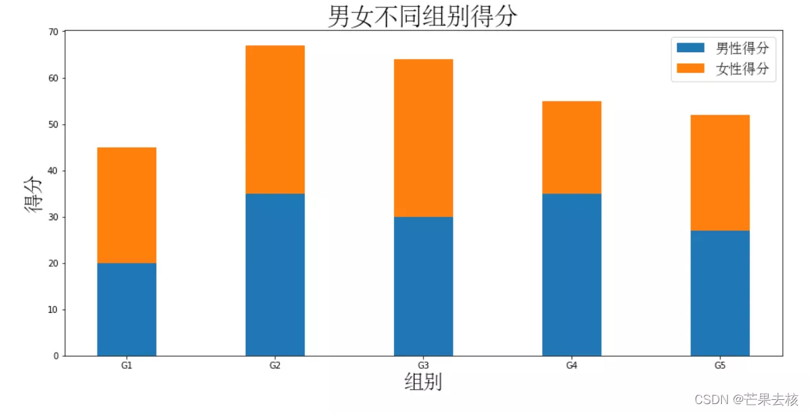
This is about how to use Python Matplotlib This is the end of the article on drawing bar charts , More about Python Matplotlib To draw the bar chart, please search the previous articles of SDN or continue to browse the relevant articles below. I hope you can support SDN in the future !