我對自己python畫的圖不是很滿意,最近對python畫圖做了一個總結,記錄如下
參考如下
1.https://blog.csdn.net/YMPzUELX3AIAp7Q/article/details/86746682?utm_medium=distribute.pc_relevant.none-task-blog-2~default~baidujs_baidulandingword~default-0-86746682-blog-100164942.pc_relevant_blogantidownloadv1&spm=1001.2101.3001.4242.1&utm_relevant_index=3
2.https://blog.csdn.net/qq_45759229/article/details/125157009
3. https://blog.csdn.net/qiu_xingye/article/details/121914314
4. https://matplotlib.org/stable/tutorials/colors/colormaps.html

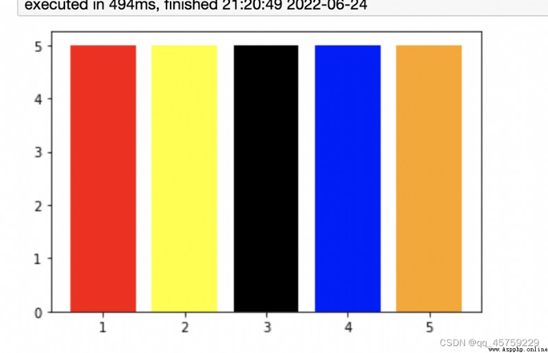
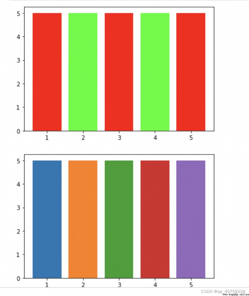
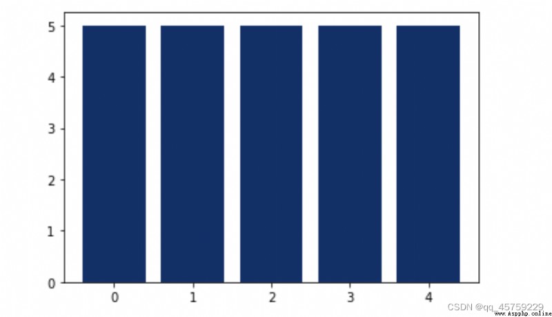
import matplotlib.pyplot as plt
#data
x = [1, 2, 3, 4, 5]
h = 5
c = ['red', 'yellow', 'black', 'blue', 'orange']
#bar plot
plt.bar(x, height = h, color = c)
plt.show()
import matplotlib.pyplot as plt
#data
x = [1, 2, 3, 4, 5]
h = 5
## 注意這裡給定的顏色集合並不要要求和點的個數相等,matplotlib會自己截斷,但是seaborn中是不能這麼做的
c=['#f00','#0f0','#f00','#0f0','#f00',"#f00"]
#bar plot
fig=plt.figure()
plt.bar(x, height = h, color = c)
plt.show()
## 16進制顯示color bar
#bar plot
fig=plt.figure()
colors_use=['#1f77b4', '#ff7f0e', '#2ca02c', '#d62728', '#9467bd', '#8c564b', '#e377c2', '#bcbd22', '#17becf', '#aec7e8', '#ffbb78', '#98df8a', '#ff9896', '#bec1d4', '#bb7784', '#0000ff', '#111010', '#FFFF00', '#1f77b4', '#800080', '#959595',
'#7d87b9', '#bec1d4', '#d6bcc0', '#bb7784', '#8e063b', '#4a6fe3', '#8595e1', '#b5bbe3', '#e6afb9', '#e07b91', '#d33f6a', '#11c638', '#8dd593', '#c6dec7', '#ead3c6', '#f0b98d', '#ef9708', '#0fcfc0', '#9cded6', '#d5eae7', '#f3e1eb', '#f6c4e1', '#f79cd4']
plt.bar(x, height = h, color = colors_use)
plt.show()
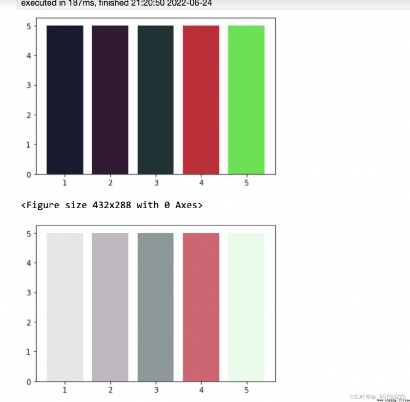
import matplotlib.pyplot as plt
#data
x = [1, 2, 3, 4, 5]
h = 5
## 使用三元組表示顏色########### RGB模式 ###################
c=[[0.1,0.1,0.2],[0.2,0.1,0.2],[0.1,0.2,0.2],[0.8,0.1,0.2],[0.1,0.9,0.2],[0.9,0.8,0.7]]
#bar plot
fig=plt.figure()
plt.bar(x, height = h, color = c)
plt.show()
############## RGBA 模式,最後一維表示透明度
fig=plt.figure()
c=[[0.1,0.1,0.2,0.1],[0.2,0.1,0.2,0.3],[0.1,0.2,0.2,0.5],[0.8,0.1,0.2,0.7],[0.1,0.9,0.2,0.1],[0.9,0.8,0.7,0.9]]
#bar plot
fig=plt.figure()
plt.bar(x, height = h, color = c)
plt.show()
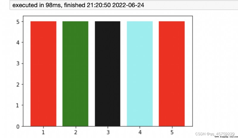
import matplotlib.pyplot as plt
#data
x = [1, 2, 3, 4, 5]
h = 5
## 注意這裡給定的顏色集合並不要要求和點的個數相等,matplotlib會自己截斷,但是seaborn中是不能這麼做的
c=['#f00','green',[0.1,0.1,0.1],[0.2,0.9,0.9,0.6],'#f00',"#f00"]
#bar plot
fig=plt.figure()
plt.bar(x, height = h, color = c)
plt.show()
上面使用的格式化的顏色定義給圖表元素配色,如果想畫出更加美觀的圖,那麼就要使用matplotlib中的colormap了
matplotlib除了內置單顏色,還有大量colormap顏色,可以理解為多種顏色合在一起的顏色條或者漸變色;

from matplotlib import cm
all_color_theme=dir(cm)
print(len(all_color_theme))
print(all_color_theme)
193
['Accent', 'Accent_r', 'Blues', 'Blues_r', 'BrBG', 'BrBG_r', 'BuGn', 'BuGn_r', 'BuPu', 'BuPu_r', 'CMRmap', 'CMRmap_r', 'Dark2', 'Dark2_r', 'GnBu', 'GnBu_r', 'Greens', 'Greens_r', 'Greys', 'Greys_r', 'LUTSIZE', 'MutableMapping', 'OrRd', 'OrRd_r', 'Oranges', 'Oranges_r', 'PRGn', 'PRGn_r', 'Paired', 'Paired_r', 'Pastel1', 'Pastel1_r', 'Pastel2', 'Pastel2_r', 'PiYG', 'PiYG_r', 'PuBu', 'PuBuGn', 'PuBuGn_r', 'PuBu_r', 'PuOr', 'PuOr_r', 'PuRd', 'PuRd_r', 'Purples', 'Purples_r', 'RdBu', 'RdBu_r', 'RdGy', 'RdGy_r', 'RdPu', 'RdPu_r', 'RdYlBu', 'RdYlBu_r', 'RdYlGn', 'RdYlGn_r', 'Reds', 'Reds_r', 'ScalarMappable', 'Set1', 'Set1_r', 'Set2', 'Set2_r', 'Set3', 'Set3_r', 'Spectral', 'Spectral_r', 'Wistia', 'Wistia_r', 'YlGn', 'YlGnBu', 'YlGnBu_r', 'YlGn_r', 'YlOrBr', 'YlOrBr_r', 'YlOrRd', 'YlOrRd_r', '_DeprecatedCmapDictWrapper', '__builtins__', '__cached__', '__doc__', '__file__', '__loader__', '__name__', '__package__', '__spec__', '_cmap_registry', '_gen_cmap_registry', '_reverser', 'afmhot', 'afmhot_r', 'autumn', 'autumn_r', 'binary', 'binary_r', 'bone', 'bone_r', 'brg', 'brg_r', 'bwr', 'bwr_r', 'cbook', 'cividis', 'cividis_r', 'cmap_d', 'cmaps_listed', 'colors', 'cool', 'cool_r', 'coolwarm', 'coolwarm_r', 'copper', 'copper_r', 'cubehelix', 'cubehelix_r', 'datad', 'flag', 'flag_r', 'functools', 'get_cmap', 'gist_earth', 'gist_earth_r', 'gist_gray', 'gist_gray_r', 'gist_heat', 'gist_heat_r', 'gist_ncar', 'gist_ncar_r', 'gist_rainbow', 'gist_rainbow_r', 'gist_stern', 'gist_stern_r', 'gist_yarg', 'gist_yarg_r', 'gnuplot', 'gnuplot2', 'gnuplot2_r', 'gnuplot_r', 'gray', 'gray_r', 'hot', 'hot_r', 'hsv', 'hsv_r', 'inferno', 'inferno_r', 'jet', 'jet_r', 'ma', 'magma', 'magma_r', 'mpl', 'nipy_spectral', 'nipy_spectral_r', 'np', 'ocean', 'ocean_r', 'pink', 'pink_r', 'plasma', 'plasma_r', 'prism', 'prism_r', 'rainbow', 'rainbow_r', 'register_cmap', 'revcmap', 'seismic', 'seismic_r', 'spring', 'spring_r', 'summer', 'summer_r', 'tab10', 'tab10_r', 'tab20', 'tab20_r', 'tab20b', 'tab20b_r', 'tab20c', 'tab20c_r', 'terrain', 'terrain_r', 'turbo', 'turbo_r', 'twilight', 'twilight_r', 'twilight_shifted', 'twilight_shifted_r', 'viridis', 'viridis_r', 'winter', 'winter_r']
# https://scipy-cookbook.readthedocs.io/items/Matplotlib_Show_colormaps.html
#!python
from pylab import *
from numpy import outer
rc('text', usetex=False)
a=outer(arange(0,1,0.01),ones(10))
figure(figsize=(10,5))
subplots_adjust(top=0.8,bottom=0.05,left=0.01,right=0.99)
maps=[m for m in cm.datad if not m.endswith("_r")]
maps.sort()
l=len(maps)+1
for i, m in enumerate(maps):
subplot(1,l,i+1)
axis("off")
imshow(a,aspect='auto',cmap=get_cmap(m),origin="lower")
title(m,rotation=90,fontsize=10)
#savefig("colormaps.png",dpi=100,facecolor='gray')
print(l)
76

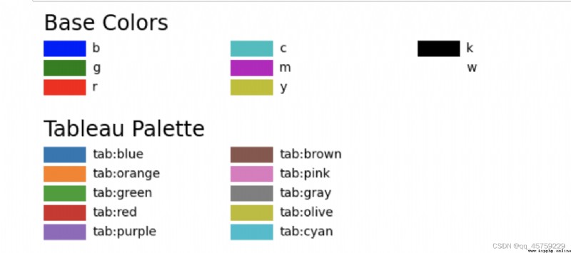
import matplotlib.pyplot as plt
import matplotlib.colors as mcolors
def plot_colortable(colors, title, sort_colors=True, emptycols=0):
cell_width = 212
cell_height = 22
swatch_width = 48
margin = 12
topmargin = 40
# Sort colors by hue, saturation, value and name.
if sort_colors is True:
by_hsv = sorted((tuple(mcolors.rgb_to_hsv(mcolors.to_rgb(color))),
name)
for name, color in colors.items())
names = [name for hsv, name in by_hsv]
else:
names = list(colors)
n = len(names)
ncols = 4 - emptycols
nrows = n // ncols + int(n % ncols > 0)
width = cell_width * 4 + 2 * margin
height = cell_height * nrows + margin + topmargin
dpi = 72
fig, ax = plt.subplots(figsize=(width / dpi, height / dpi), dpi=dpi)
fig.subplots_adjust(margin/width, margin/height,
(width-margin)/width, (height-topmargin)/height)
ax.set_xlim(0, cell_width * 4)
ax.set_ylim(cell_height * (nrows-0.5), -cell_height/2.)
ax.yaxis.set_visible(False)
ax.xaxis.set_visible(False)
ax.set_axis_off()
ax.set_title(title, fontsize=24, loc="left", pad=10)
for i, name in enumerate(names):
row = i % nrows
col = i // nrows
y = row * cell_height
swatch_start_x = cell_width * col
swatch_end_x = cell_width * col + swatch_width
text_pos_x = cell_width * col + swatch_width + 7
ax.text(text_pos_x, y, name, fontsize=14,
horizontalalignment='left',
verticalalignment='center')
ax.hlines(y, swatch_start_x, swatch_end_x,
color=colors[name], linewidth=18)
return fig
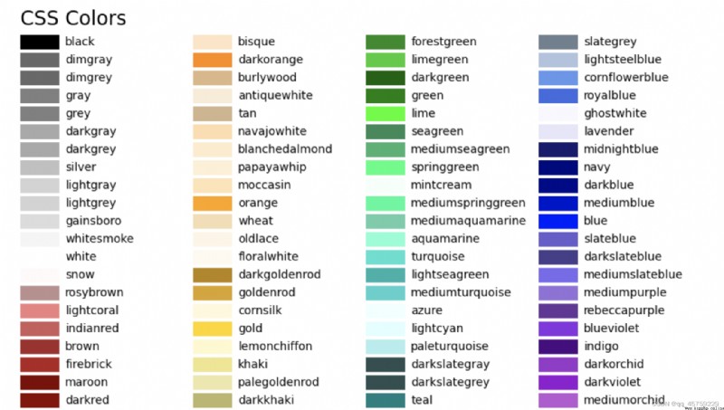
plot_colortable(mcolors.BASE_COLORS, "Base Colors",
sort_colors=False, emptycols=1)
plot_colortable(mcolors.TABLEAU_COLORS, "Tableau Palette",
sort_colors=False, emptycols=2)
#sphinx_gallery_thumbnail_number = 3
plot_colortable(mcolors.CSS4_COLORS, "CSS Colors")
# Optionally plot the XKCD colors (Caution: will produce large figure)
#xkcd_fig = plot_colortable(mcolors.XKCD_COLORS, "XKCD Colors")
#xkcd_fig.savefig("XKCD_Colors.png")
plt.show()
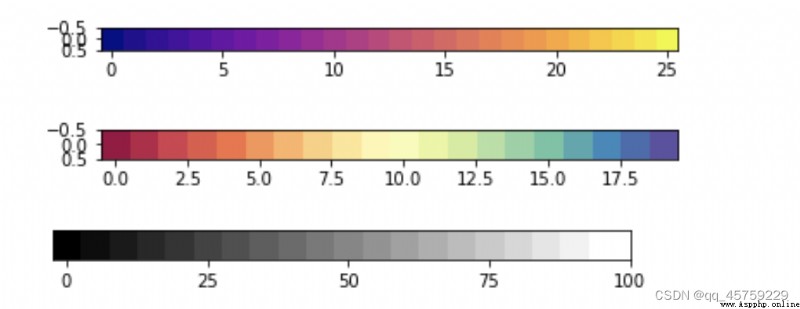
import numpy as np
import matplotlib.pyplot as plt
fig=plt.figure()
n=26
m = np.zeros((1,n))
m[0]=np.linspace(0,1,n)
plt.imshow(m, cm.get_cmap("plasma"))
plt.show()
fig=plt.figure()
n=20
m = np.zeros((1,n))
m[0]=np.linspace(0,1,n)
plt.imshow(m, cm.get_cmap("Spectral"))
plt.show()
fig=plt.figure()
m = np.zeros((1,20))
for i in range(20):
m[0,i] = (i*5)/100.0
#plt.imshow(m, cmap='gray', aspect=2)
plt.imshow(m, cmap='gray')
plt.yticks(np.arange(0))
plt.xticks(np.arange(0,25,5), [0,25,50,75,100])
plt.show()
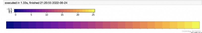
import numpy as np
import matplotlib.pyplot as plt
import seaborn as sns
## matplotlib顯示顏色條
fig=plt.figure()
n=26
m = np.zeros((1,n))
m[0]=np.linspace(0,1,n)
plt.imshow(m, cm.get_cmap("plasma"))
plt.show()
# seaborn顯示顏色條
sns.palplot(cm.get_cmap("plasma")(m[0]))
## 可以看到顏色結果是一致的
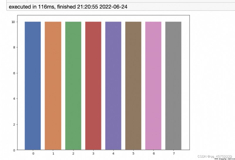
import matplotlib.pyplot as plt
from matplotlib import cm
import seaborn as sns
plt.figure(dpi=50,figsize=(10,8))
N=8
palette =sns.color_palette("deep", N)
plt.bar(range(N),10,color=palette)
plt.show()
# https://stackoverflow.com/questions/37902459/seaborn-color-palette-as-matplotlib-colormap
## 我想給每個點賦予一個特殊的顏色
##
import networkx as nx
import seaborn as sns
import matplotlib.pyplot as plt
from matplotlib.colors import ListedColormap
fig=plt.figure()
N=8
G = nx.erdos_renyi_graph(N, 0.1)
#cmap = ListedColormap(sns.color_palette())
## 注意這裡這裡一定要轉換成ListedColormap圖像
color_map=ListedColormap(sns.color_palette("bright"))
# 對於nx.draw圖像,color_map一定要加入range(N)
nx.draw(G, node_color=color_map(range(N)), with_labels=True,node_size=1000)
plt.show()
結果如下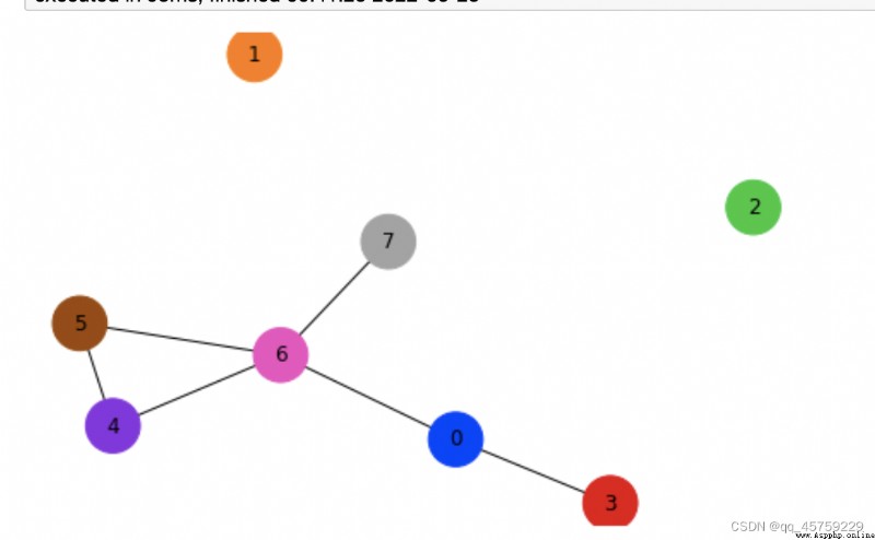
https://www.freesion.com/article/7870940757/
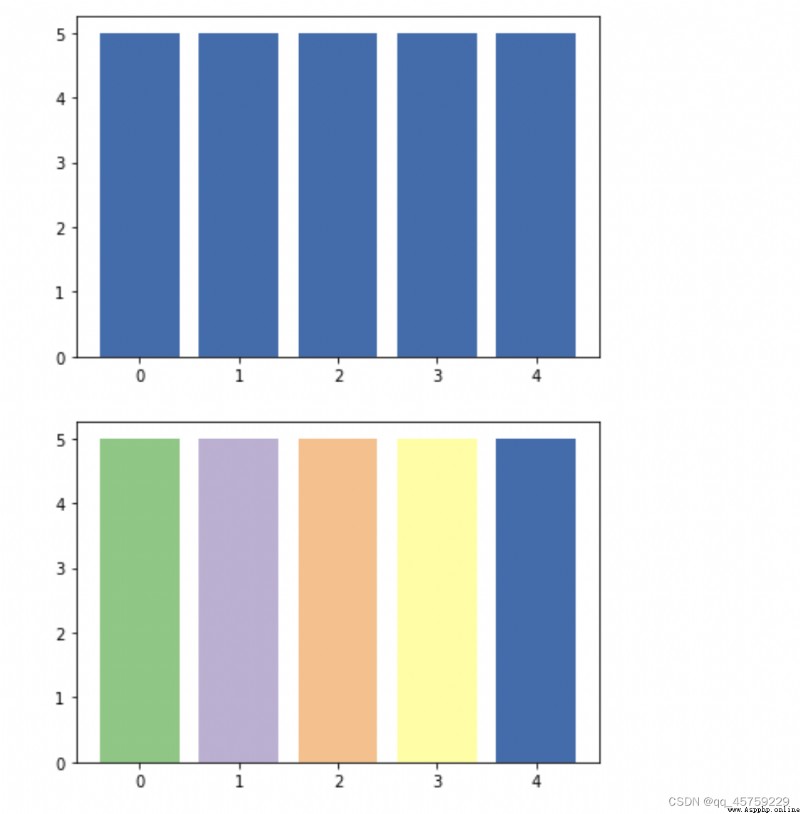
import matplotlib.pyplot as plt
from matplotlib import cm
#plt.figure(dpi=50,figsize=(5,4))
######################離散型# 這裡需要注意,Accent只有8種顏色####################
#取某一種顏色
fig=plt.figure()
plt.bar(range(5),5,color=plt.cm.Accent(4))
plt.show()
#ListedColormap
# 取5種顏色
fig=plt.figure()
plt.bar(range(5),5,color=plt.get_cmap('Accent')(range(5)))
plt.show()
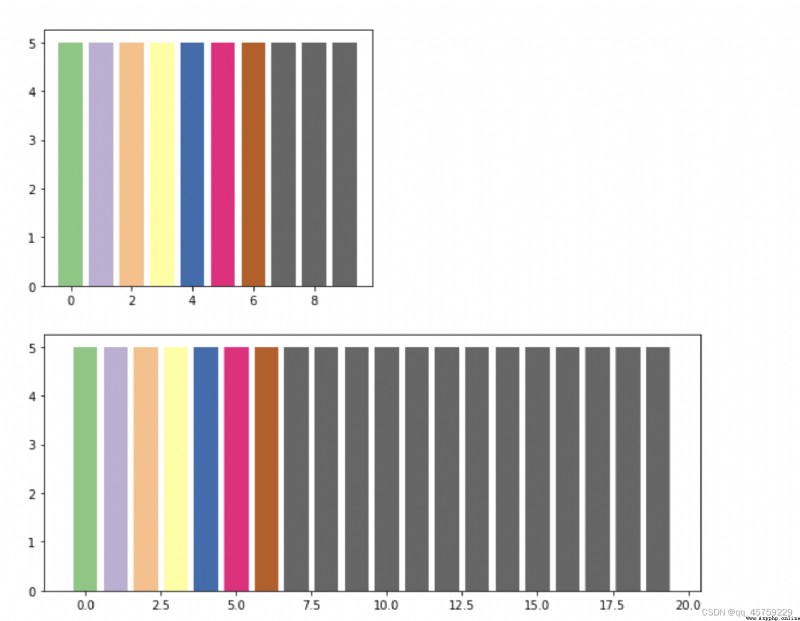
# 取10種顏色
N=10
fig=plt.figure(figsize=(5,4))
plt.bar(range(N),5,color=plt.get_cmap('Accent')(range(N)))
plt.show()
N=20
fig=plt.figure(figsize=(10,4))
plt.bar(range(N),5,color=plt.get_cmap('Accent')(range(N)))
plt.show()
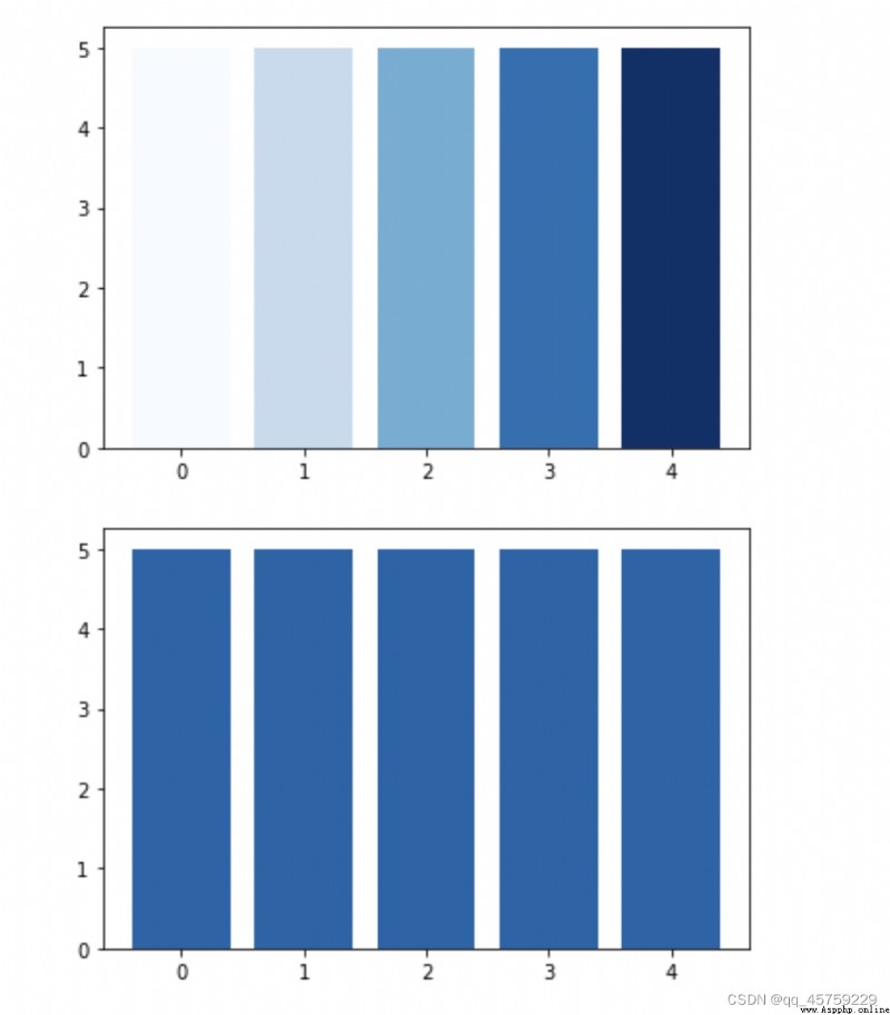
########################## 連續型 顏色######################
fig=plt.figure()
plt.bar(range(5),5,color=plt.get_cmap('Blues')(np.linspace(0, 1, 5)))
plt.show()
fig=plt.figure()
plt.bar(range(5),5,color=plt.get_cmap('Blues')(0.8)) # 傳入一個0-1之間的小數即可
plt.show()
fig=plt.figure()
plt.bar(range(5),5,color=plt.get_cmap('Blues')(1.0))
plt.show()
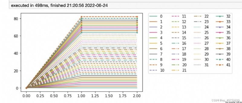
import itertools
import matplotlib as mpl
import matplotlib.pyplot as plt
N = 8*4+10
l_styles = ['-','--','-.',':']
m_styles = ['','.','o','^','*']
colormap = mpl.cm.Dark2.colors # Qualitative colormap
for i,(marker,linestyle,color) in zip(range(N),itertools.product(m_styles,l_styles, colormap)):
plt.plot([0,1,2],[0,2*i,2*i], color=color, linestyle=linestyle,marker=marker,label=i)
plt.legend(bbox_to_anchor=(1.05, 1), loc=2, borderaxespad=0.,ncol=4);
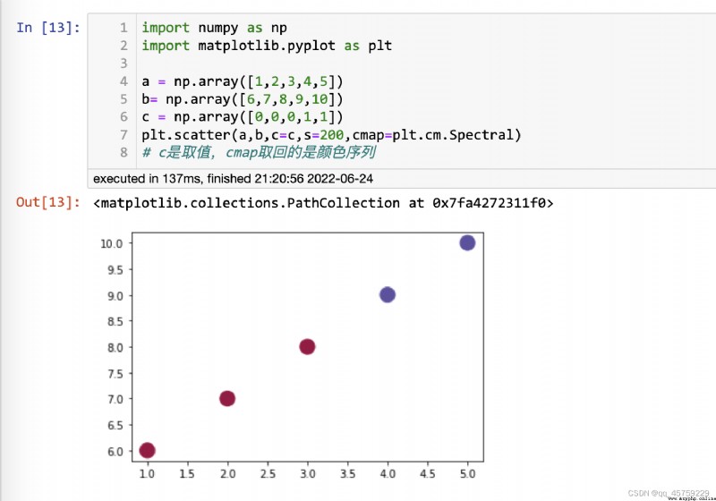
import numpy as np
import matplotlib.pyplot as plt
a = np.array([1,2,3,4,5])
b= np.array([6,7,8,9,10])
c = np.array([0,0,0,1,1])
plt.scatter(a,b,c=c,s=200,cmap=plt.cm.Spectral)
# c是取值,cmap取回的是顏色序列
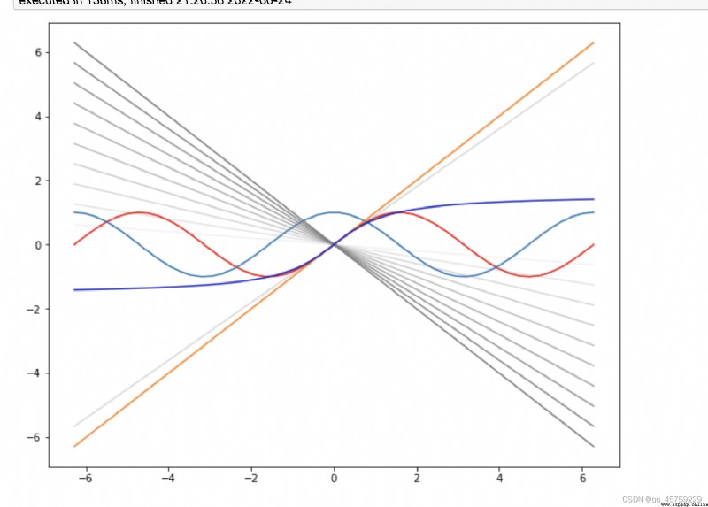
plt.rcParams['figure.figsize'] = (10.0, 8.0)### 設置figure大小
# 上面的做法是全局設置,我之前都是使用fig=plt.figure(figsize=(10,8))設置設置方式
x=np.linspace(-2*np.pi,2*np.pi)
y=np.sin(x)
z=np.cos(x)
#s=np.tan(x)
plt.plot(x,y,c="red") ## 普通使用,或者使用縮寫c="r"也是可以的
plt.plot(x,z,c='#1f77b4')## 直接設置16進制的顏色也是可以的
plt.plot(x,x,c=colors_use[1]) ## 直接使用自定義的顏色,
plt.plot(x,-x,c=(0.5,0.5,0.5)) ## 直接使用自定義的顏色,現在三元組表示
for alpha in np.linspace(0.9,0.1,9):
plt.plot(x,-alpha*x,c=(0.5,0.5,0.5,alpha)) ## 當然可以使用四元組表示顏色,最後一維表示透明度,注意RGBA都是[0,1]的小數,不能是別的范圍
plt.plot(x,0.9*x,c=(0.5,0.5,0.5,0.3)) ## 直接使用自定義的顏色,現在三元組表示
plt.plot(x,np.arctan(x),c=[0.1,0.1,0.8]) ## 直接使用自定義的顏色,可以使用三元列表
plt.show()
https://chrisalbon.com/code/python/data_visualization/seaborn_color_palettes/
sns.palplot(sns.color_palette("deep", 10))

sns.palplot(sns.color_palette("bright", 10)) # 確實好亮
sns.palplot(sns.color_palette("dark", 10))
sns.palplot(sns.color_palette("colorblind", 10))
sns.palplot(sns.color_palette("Paired", 10))

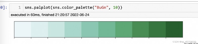
sns.palplot(sns.color_palette("BuGn", 10))
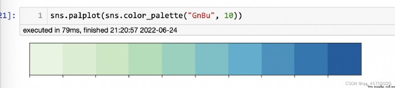
sns.palplot(sns.color_palette("GnBu", 10))
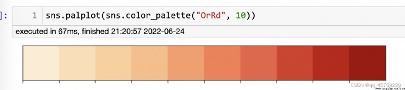
sns.palplot(sns.color_palette("OrRd", 10))
sns.palplot(sns.color_palette("PuBu", 10))

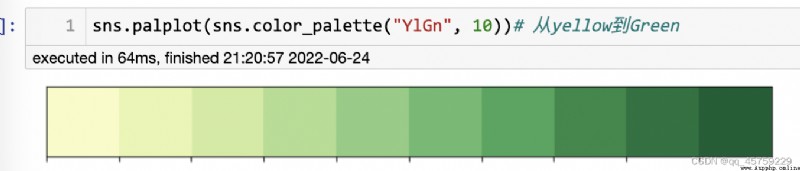
sns.palplot(sns.color_palette("YlGn", 10))# 從yellow到Green
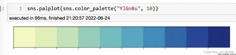
sns.palplot(sns.color_palette("YlGnBu", 10))
sns.palplot(sns.color_palette("YlOrBr", 10))

sns.palplot(sns.color_palette("YlOrRd", 10))

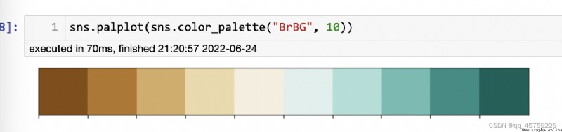
sns.palplot(sns.color_palette("BrBG", 10))
sns.palplot(sns.color_palette("PiYG", 10))

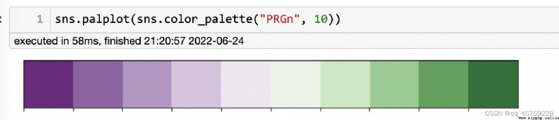
sns.palplot(sns.color_palette("PRGn", 10))
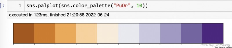
sns.palplot(sns.color_palette("PuOr", 10))
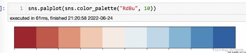
sns.palplot(sns.color_palette("RdBu", 10))
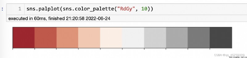
sns.palplot(sns.color_palette("RdGy", 10))
sns.palplot(sns.color_palette("RdYlBu", 10))
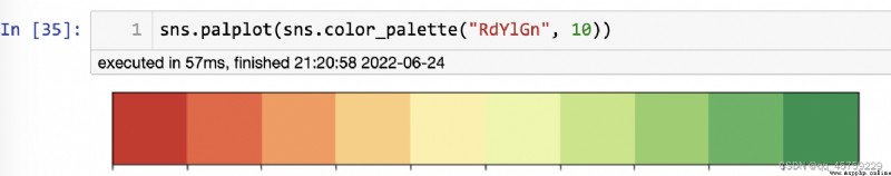
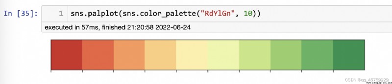
sns.palplot(sns.color_palette("RdYlGn", 10))
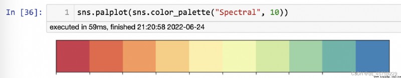
sns.palplot(sns.color_palette("Spectral", 10))
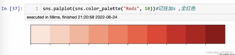
sns.palplot(sns.color_palette("Reds", 10))#記住加s ,全紅色
import seaborn as sns
sns.choose_colorbrewer_palette("qualitative")
## 這個很方便,就不用我自己一個一個自己打印查看了
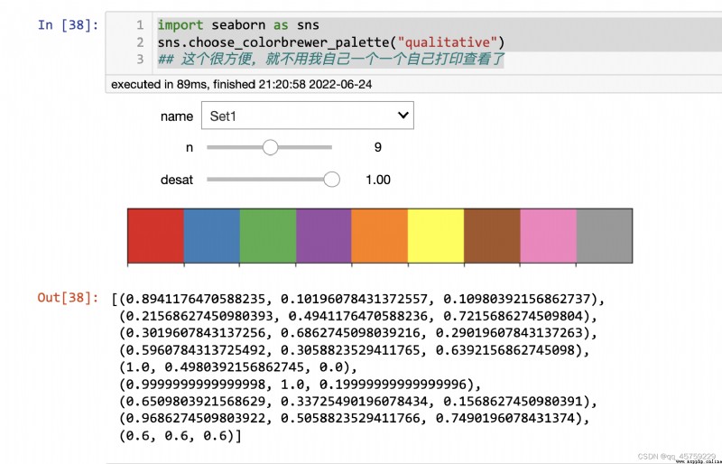
[(0.8941176470588235, 0.10196078431372557, 0.10980392156862737),
(0.21568627450980393, 0.4941176470588236, 0.7215686274509804),
(0.3019607843137256, 0.6862745098039216, 0.29019607843137263),
(0.5960784313725492, 0.3058823529411765, 0.6392156862745098),
(1.0, 0.4980392156862745, 0.0),
(0.9999999999999998, 1.0, 0.19999999999999996),
(0.6509803921568629, 0.33725490196078434, 0.1568627450980391),
(0.9686274509803922, 0.5058823529411766, 0.7490196078431374),
(0.6, 0.6, 0.6)]
import seaborn as sns
sns.choose_dark_palette()
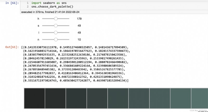
[(0.14135330736111978, 0.14951274600325057, 0.1481436717094509),
(0.16219560832714164, 0.18641978556477623, 0.18281574337590473),
(0.1830379092931635, 0.22332682512630186, 0.2174878150423586),
(0.204624578150829, 0.2615519732435963, 0.25339817498261435),
(0.22546687911685087, 0.29845901280512194, 0.2880702466490682),
(0.24705354797451634, 0.3366841609224164, 0.323980606589324),
(0.2678958489405382, 0.373591200483942, 0.35865267825577785),
(0.2894825177982037, 0.4118163486012364, 0.3945630381960336),
(0.3103248187642256, 0.448723388162762, 0.4292351098624875),
(0.33116711973024743, 0.4856304277242877, 0.46390718152894134)]
sns.choose_colorbrewer_palette("sequential")
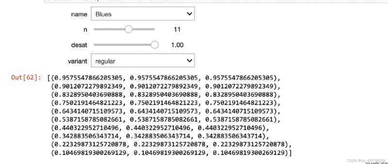
[(0.9575547866205305, 0.9575547866205305, 0.9575547866205305),
(0.9012072279892349, 0.9012072279892349, 0.9012072279892349),
(0.8328950403690888, 0.8328950403690888, 0.8328950403690888),
(0.7502191464821223, 0.7502191464821223, 0.7502191464821223),
(0.6434140715109573, 0.6434140715109573, 0.6434140715109573),
(0.5387158785082661, 0.5387158785082661, 0.5387158785082661),
(0.440322952710496, 0.440322952710496, 0.440322952710496),
(0.342883506343714, 0.342883506343714, 0.342883506343714),
(0.22329873125720878, 0.22329873125720878, 0.22329873125720878),
(0.10469819300269129, 0.10469819300269129, 0.10469819300269129)]
import seaborn as sns
import numpy as np
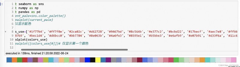
import pandas as pd
#current_pale=sns.color_palette()
#sns.palplot(current_pale)
## 可以顯示配色
colors_use=['#1f77b4', '#ff7f0e', '#2ca02c', '#d62728', '#9467bd', '#8c564b', '#e377c2', '#bcbd22', '#17becf', '#aec7e8', '#ffbb78', '#98df8a', '#ff9896', '#bec1d4', '#bb7784', '#0000ff', '#111010', '#FFFF00', '#1f77b4', '#800080', '#959595',
'#7d87b9', '#bec1d4', '#d6bcc0', '#bb7784', '#8e063b', '#4a6fe3', '#8595e1', '#b5bbe3', '#e6afb9', '#e07b91', '#d33f6a', '#11c638', '#8dd593', '#c6dec7', '#ead3c6', '#f0b98d', '#ef9708', '#0fcfc0', '#9cded6', '#d5eae7', '#f3e1eb', '#f6c4e1', '#f79cd4']
sns.palplot(colors_use)
#sns.palplot([colors_use[0]])# 僅顯示第一個顏色
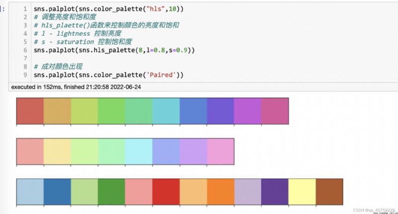
sns.palplot(sns.color_palette("hls",10))
# 調整亮度和飽和度
# hls_plaette()函數來控制顏色的亮度和飽和
# l - lightness 控制亮度
# s - saturation 控制飽和度
sns.palplot(sns.hls_palette(8,l=0.8,s=0.9))
# 成對顏色出現
sns.palplot(sns.color_palette('Paired'))
## 默認配色方案
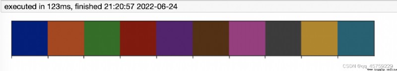
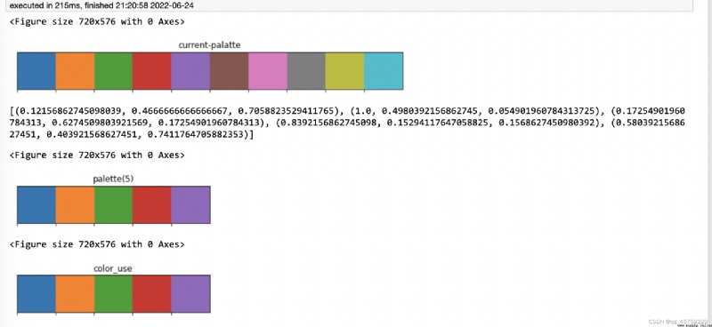
import matplotlib.pyplot as plt
import seaborn as sns
fig=plt.figure()
current_pale=sns.color_palette()
sns.palplot(current_pale)
plt.title("current-palatte")
plt.show()
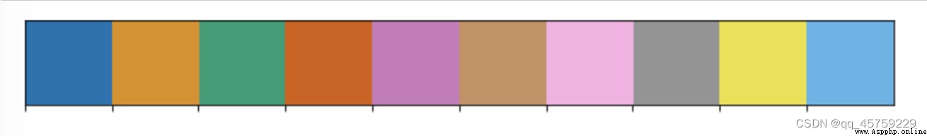
figure=plt.figure()
N=5
## 取默認配色前5種顏色
color_use=[]
palette = sns.color_palette(None, N)
for i in palette:
color_use.append(i)
#print(i)
print(color_use)## 這裡就取出來了5種顏色
sns.palplot(palette) ### 直接使用palette即可
plt.title("palette(5)")
plt.show()
figure=plt.figure()
sns.palplot(color_use) # 可以直接畫顏色的,這樣的話我倒是可以和matplotlib對比一下
plt.title("color_use")
plt.show()
[(0.12156862745098039, 0.4666666666666667, 0.7058823529411765), (1.0, 0.4980392156862745, 0.054901960784313725), (0.17254901960784313, 0.6274509803921569, 0.17254901960784313), (0.8392156862745098, 0.15294117647058825, 0.1568627450980392), (0.5803921568627451, 0.403921568627451, 0.7411764705882353)]
## 使用案例
data=np.random.normal(size=(20,8))
sns.boxplot(data=data,palette=sns.color_palette("hls",8))

https://www.jianshu.com/p/2961bc740614
import pandas as pd
import seaborn as sns
import numpy as np
import matplotlib.pyplot as plt
%matplotlib inline
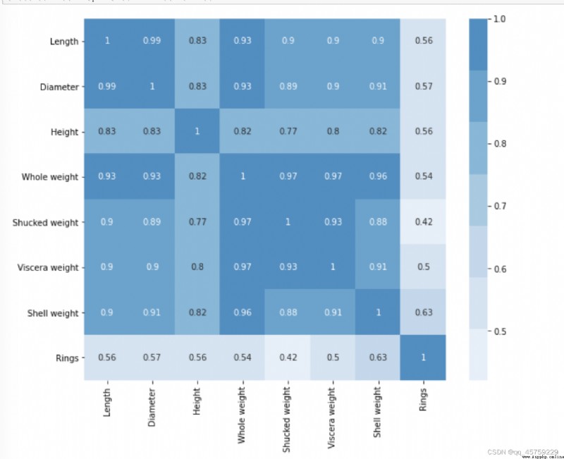
df=pd.read_csv("/Users/xiaokangyu/Desktop/dataset/other/abalone/abalone.csv")
dfData = df.corr()
fig=plt.figure(figsize=(10,8))# 如果不設置這個,圖片看起來很小
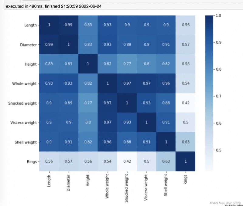
sns.heatmap(dfData, annot=True, vmax=1, square=True, cmap="Blues")
plt.show()
import pandas as pd
import seaborn as sns
import numpy as np
import matplotlib.pyplot as plt
%matplotlib inline
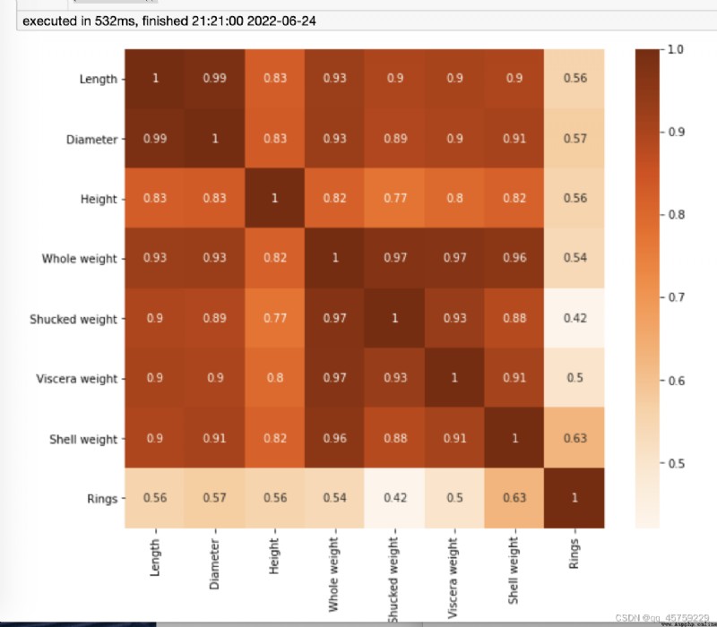
df=pd.read_csv("/Users/xiaokangyu/Desktop/dataset/other/abalone/abalone.csv")
dfData = df.corr()
fig=plt.figure(figsize=(10,8))# 如果不設置這個,圖片看起來很小
sns.heatmap(dfData, annot=True, vmax=1, square=True, cmap="Oranges")
plt.show()
import pandas as pd
import seaborn as sns
import numpy as np
import matplotlib.pyplot as plt
%matplotlib inline
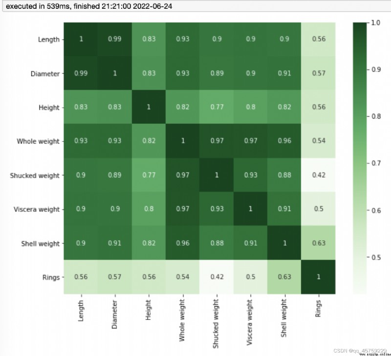
df=pd.read_csv("/Users/xiaokangyu/Desktop/dataset/other/abalone/abalone.csv")
dfData = df.corr()
fig=plt.figure(figsize=(10,8))# 如果不設置這個,圖片看起來很小
sns.heatmap(dfData, annot=True, vmax=1, square=True, cmap="Greens")
plt.show()
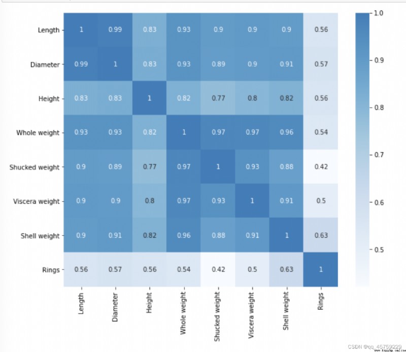
import pandas as pd
import seaborn as sns
import numpy as np
import matplotlib.pyplot as plt
%matplotlib inline
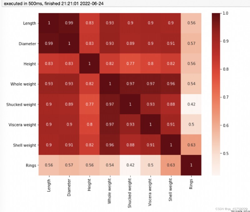
df=pd.read_csv("/Users/xiaokangyu/Desktop/dataset/other/abalone/abalone.csv")
dfData = df.corr()
fig=plt.figure(figsize=(10,8))# 如果不設置這個,圖片看起來很小
sns.heatmap(dfData, annot=True, vmax=1, square=True, cmap="Reds")
plt.show()
import pandas as pd
import seaborn as sns
import numpy as np
import matplotlib.pyplot as plt
%matplotlib inline
df=pd.read_csv("/Users/xiaokangyu/Desktop/dataset/other/abalone/abalone.csv")
dfData = df.corr()
fig=plt.figure(figsize=(10,8))# 如果不設置這個,圖片看起來很小
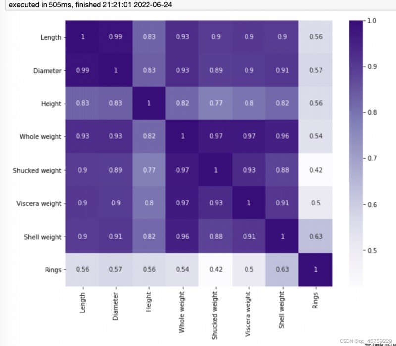
sns.heatmap(dfData, annot=True, vmax=1, square=True, cmap="Purples")
plt.show()
import pandas as pd
import seaborn as sns
import numpy as np
import matplotlib.pyplot as plt
%matplotlib inline
df=pd.read_csv("/Users/xiaokangyu/Desktop/dataset/other/abalone/abalone.csv")
dfData = df.corr()
fig=plt.figure(figsize=(10,8))# 如果不設置這個,圖片看起來很小
sns.heatmap(dfData, annot=True, vmax=1, square=True, cmap="Greys")
plt.show()

import pandas as pd
import seaborn as sns
import numpy as np
import matplotlib.pyplot as plt
%matplotlib inline
df=pd.read_csv("/Users/xiaokangyu/Desktop/dataset/other/abalone/abalone.csv")
dfData = df.corr()
######## Accent離散調色 #####
fig=plt.figure(figsize=(10,8))# 如果不設置這個,圖片看起來很小
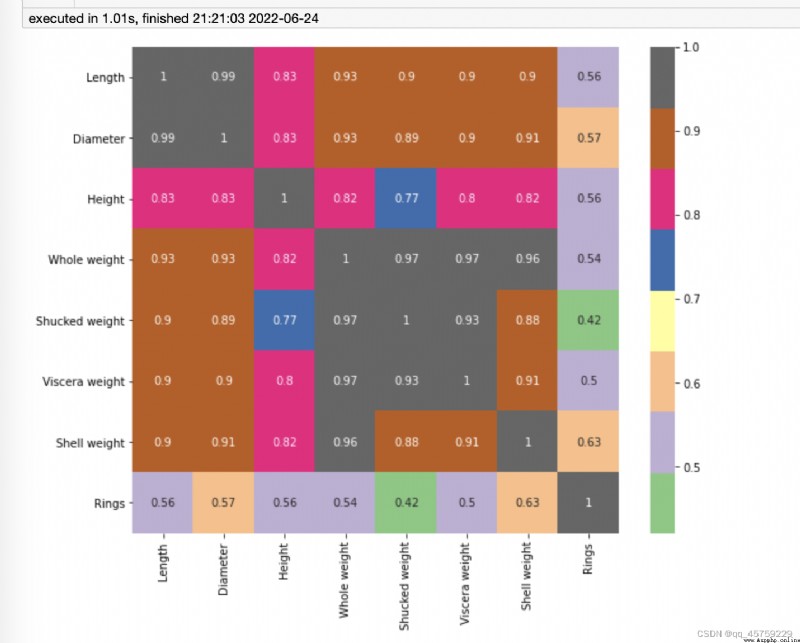
sns.heatmap(dfData, annot=True, vmax=1, square=True, cmap="Accent")
plt.show()
######## A
fig=plt.figure(figsize=(10,8))# 如果不設置這個,圖片看起來很小
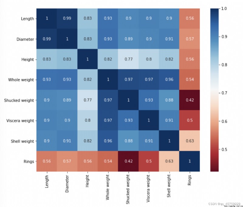
sns.heatmap(dfData, annot=True, vmax=1, square=True, cmap="RdBu")
plt.show()
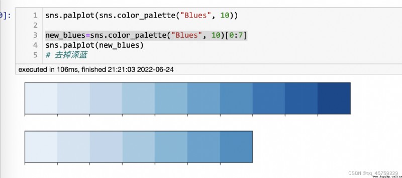
sns.palplot(sns.color_palette("Blues", 10))
new_blues=sns.color_palette("Blues", 10)[0:7]
sns.palplot(new_blues)
# 去掉深藍
import pandas as pd
import seaborn as sns
import numpy as np
import matplotlib.pyplot as plt
%matplotlib inline
df=pd.read_csv("/Users/xiaokangyu/Desktop/dataset/other/abalone/abalone.csv")
dfData = df.corr()
fig=plt.figure(figsize=(10,8))# 如果不設置這個,圖片看起來很小
new_blues=sns.color_palette("Blues", 10)[0:7]
sns.heatmap(dfData, annot=True, vmax=1, square=True, cmap=new_blues)
plt.show()
# 上圖的藍色如果只取7個,可以看到顏色還是明顯的分塊了,我還是可以把這個顏色給連續化,只需要分多份
# 然後我也取7/10就可以了
import pandas as pd
import seaborn as sns
import numpy as np
import matplotlib.pyplot as plt
%matplotlib inline
df=pd.read_csv("/Users/xiaokangyu/Desktop/dataset/other/abalone/abalone.csv")
dfData = df.corr()
fig=plt.figure(figsize=(10,8))# 如果不設置這個,圖片看起來很小
new_blues=sns.color_palette("Blues", 1000)[0:700]
sns.heatmap(dfData, annot=True, vmax=1, square=True, cmap=new_blues)
plt.show()
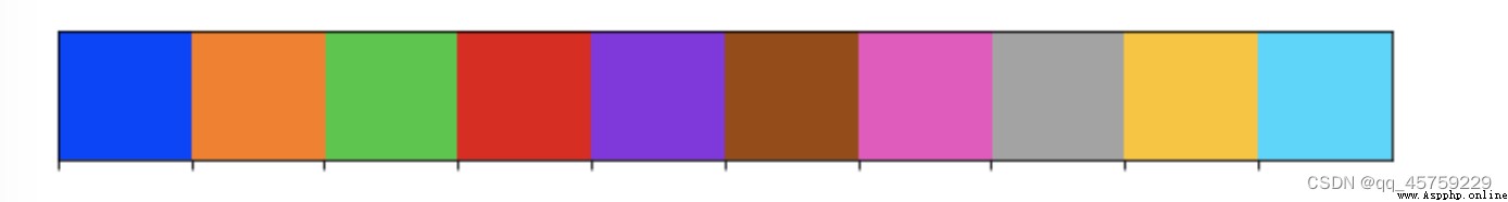
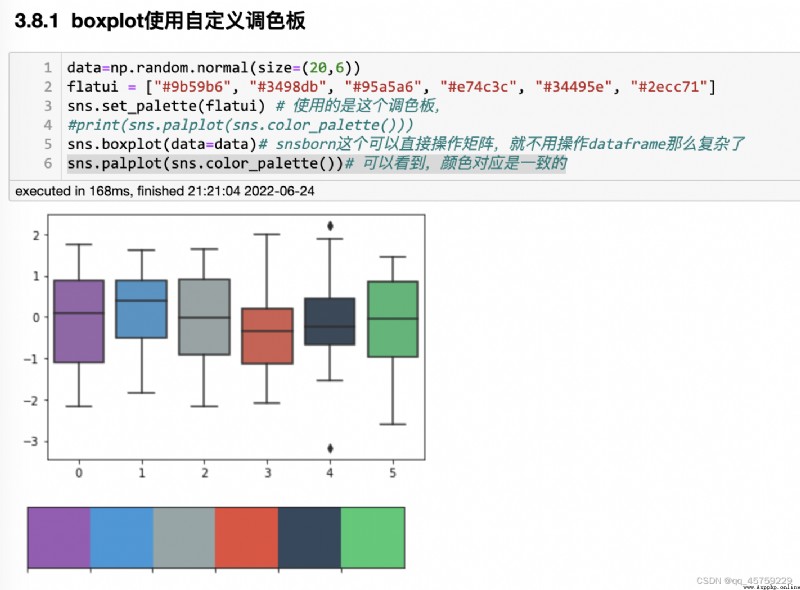
flatui = ["#9b59b6", "#3498db", "#95a5a6", "#e74c3c", "#34495e", "#2ecc71"]
sns.set_palette(flatui) ## 設置調色板
sns.palplot(sns.color_palette())
sns.palplot(flatui)#

data=np.random.normal(size=(20,6))
flatui = ["#9b59b6", "#3498db", "#95a5a6", "#e74c3c", "#34495e", "#2ecc71"]
sns.set_palette(flatui) # 使用的是這個調色板,
#print(sns.palplot(sns.color_palette()))
sns.boxplot(data=data)# snsborn這個可以直接操作矩陣,就不用操作dataframe那麼復雜了
sns.palplot(sns.color_palette())# 可以看到,顏色對應是一致的
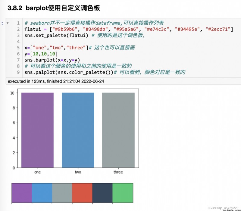
# seaborn並不一定得直接操作dataframe,可以直接操作列表
flatui = ["#9b59b6", "#3498db", "#95a5a6", "#e74c3c", "#34495e", "#2ecc71"]
sns.set_palette(flatui) # 使用的是這個調色板,
x=["one","two","three"]# 這個也可以直接畫
y=[10,10,10]
sns.barplot(x=x,y=y)
# 可以看這個顏色的使用和之前的使用是一致的
sns.palplot(sns.color_palette())# 可以看到,顏色對應是一致的
fig=plt.figure()
x=np.array([[1,1],[2,2],[3,3],[4,4],[5,5]])
## sns設置自己的palette
sns.scatterplot(x=x[:,0],y=x[:,1],s=1000,hue=x[:,0],palette=["red","blue","green","pink","yellow"])
plt.show()
fig=plt.figure()
x=np.array([[1,1],[2,2],[3,3],[4,4],[5,5]])
## sns設置自己的palette,這種做法也是可以的。注意這裡你可以設置sns的調色板,但是你還是得顯式調用
flatui = ["#9b59b6", "#3498db", "#95a5a6", "#e74c3c",[0.1,0.5,0.5]] # 這個顏色的數量和hue的顏色數量必須一致
sns.scatterplot(x=x[:,0],y=x[:,1],s=1000,hue=x[:,0],palette=flatui)
plt.show()

import palettable
from palettable.cartocolors.qualitative import Bold_9
Bold_9.show_discrete_image()#Bold_9各種顏色條圖片
print(Bold_9.colors)#Bold_9 colormap中每種顏色的RGB格式色號
print(Bold_9.hex_colors)#Bold_9 colormap中每種顏色的hex格式色號
print(Bold_9.mpl_colors)#RGB tuples in the range 0-1 as used by matplotlib
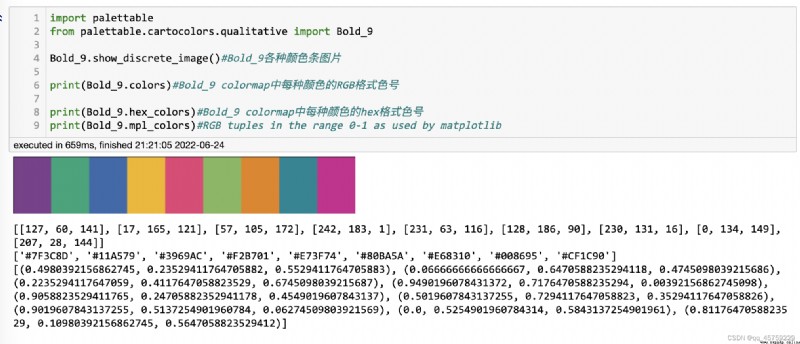
[[127, 60, 141], [17, 165, 121], [57, 105, 172], [242, 183, 1], [231, 63, 116], [128, 186, 90], [230, 131, 16], [0, 134, 149], [207, 28, 144]]
['#7F3C8D', '#11A579', '#3969AC', '#F2B701', '#E73F74', '#80BA5A', '#E68310', '#008695', '#CF1C90']
[(0.4980392156862745, 0.23529411764705882, 0.5529411764705883), (0.06666666666666667, 0.6470588235294118, 0.4745098039215686), (0.2235294117647059, 0.4117647058823529, 0.6745098039215687), (0.9490196078431372, 0.7176470588235294, 0.00392156862745098), (0.9058823529411765, 0.24705882352941178, 0.4549019607843137), (0.5019607843137255, 0.7294117647058823, 0.35294117647058826), (0.9019607843137255, 0.5137254901960784, 0.06274509803921569), (0.0, 0.5254901960784314, 0.5843137254901961), (0.8117647058823529, 0.10980392156862745, 0.5647058823529412)]
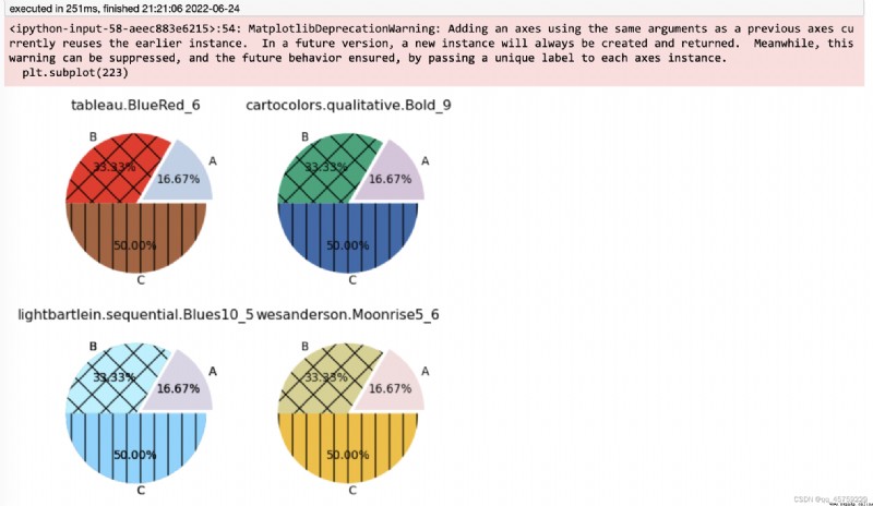
import matplotlib.pyplot as plt
import matplotlib as mpl
import palettable
mpl.rc_file_defaults()
my_dpi = 96
plt.figure(figsize=(580 / my_dpi, 580 / my_dpi), dpi=my_dpi)
plt.subplot(221)
patches, texts, autotexts = plt.pie(
x=[1, 2, 3],
labels=['A', 'B', 'C'],
#使用palettable.tableau.BlueRed_6
colors=palettable.tableau.BlueRed_6.mpl_colors[0:3],
autopct='%.2f%%',
explode=(0.1, 0, 0))
patches[0].set_alpha(0.3)
patches[2].set_hatch('|')
patches[1].set_hatch('x')
plt.title('tableau.BlueRed_6', size=12)
mpl.rc_file_defaults()
plt.subplot(222)
patches, texts, autotexts = plt.pie(
x=[1, 2, 3],
labels=['A', 'B', 'C'],
#使用palettable.cartocolors.qualitative.Bold_9
colors=palettable.cartocolors.qualitative.Bold_9.mpl_colors[0:3],
autopct='%.2f%%',
explode=(0.1, 0, 0))
patches[0].set_alpha(0.3)
patches[2].set_hatch('|')
patches[1].set_hatch('x')
plt.title('cartocolors.qualitative.Bold_9', size=12)
mpl.rc_file_defaults()
plt.subplot(223)
patches, texts, autotexts = plt.pie(
x=[1, 2, 3],
labels=['A', 'B', 'C'],
#使用palettable.cartocolors.qualitative.Bold_9
colors=palettable.cartocolors.qualitative.Bold_9.mpl_colors[0:3],
autopct='%.2f%%',
explode=(0.1, 0, 0))
patches[0].set_alpha(0.3)
patches[2].set_hatch('|')
patches[1].set_hatch('x')
plt.title('cartocolors.qualitative.Bold_9', size=12)
plt.subplot(223)
patches, texts, autotexts = plt.pie(
x=[1, 2, 3],
labels=['A', 'B', 'C'],
#使用palettable.lightbartlein.sequential.Blues10_5
colors=palettable.lightbartlein.sequential.Blues10_5.mpl_colors[0:3],
autopct='%.2f%%',
explode=(0.1, 0, 0))
#matplotlib.patches.Wedge
patches[0].set_alpha(0.3)
patches[2].set_hatch('|')
patches[1].set_hatch('x')
plt.title('lightbartlein.sequential.Blues10_5', size=12)
plt.subplot(224)
patches, texts, autotexts = plt.pie(
x=[1, 2, 3],
labels=['A', 'B', 'C'],
colors=palettable.wesanderson.Moonrise5_6.mpl_colors[0:3],
autopct='%.2f%%',
explode=(0.1, 0, 0))
patches[0].set_alpha(0.3)
patches[2].set_hatch('|')
patches[1].set_hatch('x')
plt.title('wesanderson.Moonrise5_6', size=12)
plt.show()
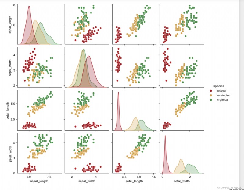
import seaborn as sns
iris_sns = sns.load_dataset("iris")
import palettable
g = sns.pairplot(
iris_sns,
hue='species',
palette=palettable.tableau.TrafficLight_9.mpl_colors[0:3], #Matplotlib顏色
)
sns.set(style='whitegrid')
g.fig.set_size_inches(10, 8)
sns.set(style='whitegrid', font_scale=1.5)
import networkx as nx
fig=plt.figure()
G = nx.erdos_renyi_graph(20, 0.1)
color_map = []
for node in G:
if node < 10:
color_map.append("yellow")
else:
color_map.append('red')
nx.draw(G, node_color=color_map, with_labels=True)
plt.show()
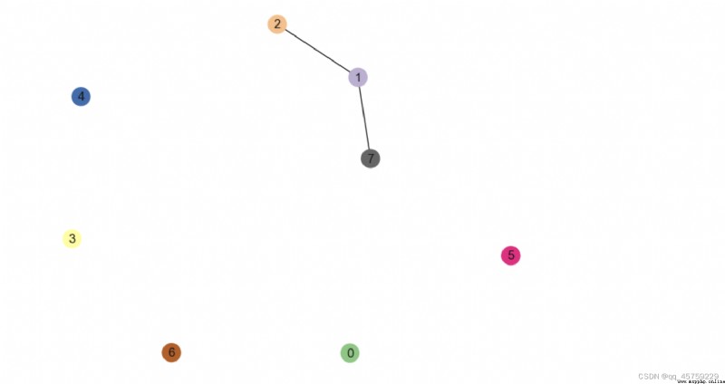
## 我想給每個點賦予一個特殊的顏色
import networkx as nx
fig=plt.figure()
G = nx.erdos_renyi_graph(8, 0.1)
## 注意這裡不能直接使用
# color_map= plt.cm.get_cmap("Accent"),要求的是float或者string
color_map = plt.cm.get_cmap("Accent")(range(8))##這裡得到的是float
print(color_map)
nx.draw(G, node_color=color_map, with_labels=True)
plt.show()
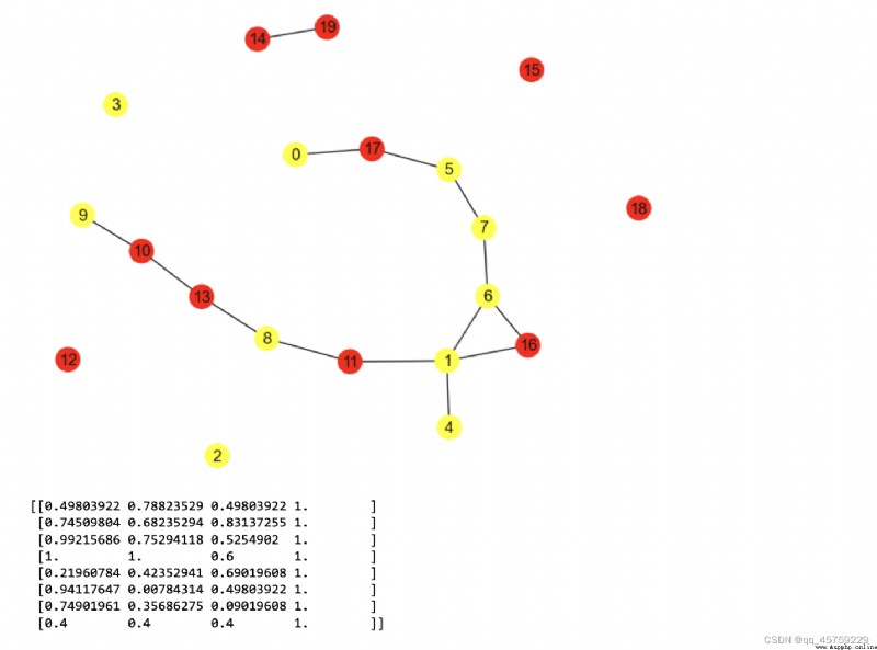
[[0.49803922 0.78823529 0.49803922 1. ]
[0.74509804 0.68235294 0.83137255 1. ]
[0.99215686 0.75294118 0.5254902 1. ]
[1. 1. 0.6 1. ]
[0.21960784 0.42352941 0.69019608 1. ]
[0.94117647 0.00784314 0.49803922 1. ]
[0.74901961 0.35686275 0.09019608 1. ]
[0.4 0.4 0.4 1. ]]