The import module
1. Read test data
2. View the data
3. Screening differential genes
4. View the data , Found more type This column
5. Number of Statistics
6. Map the volcano
7. Save the picture
The import moduleimport numpy as npimport pandas as pd1. Read test data data=pd.read_csv(r'E:\ZYH\R.project\rna-seq\lianxi1\exon_level\df.csv')2. View the data data.head()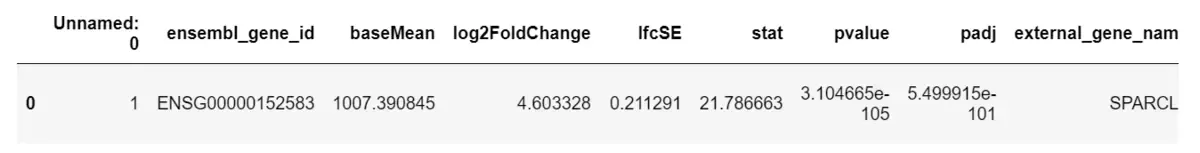
# 3. Try to write down - and up-regulated gene classification assignment to "up" and "down" and "nosig" Join in pvalue Conditions ###loc function : By row index "Index" To get the row data based on the specific value in ( If you take "Index" by "A" The line of )data.loc[(data.log2FoldChange>1)&(data.padj<0.05),'type']='up'data.loc[(data.log2FoldChange<-1)&(data.padj<0.05),'type']='down'data.loc[(abs(data.log2FoldChange)<=1)|(data.padj>=0.05),'type']='nosig'4. View the data , Found more type This column data.head()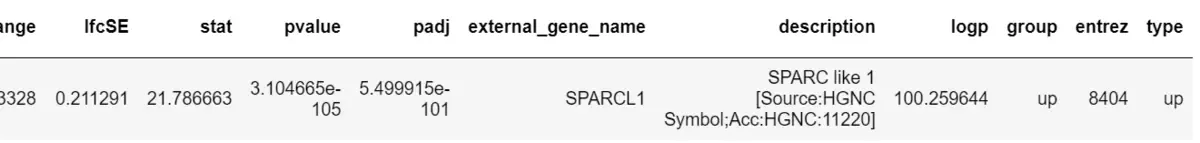
data.type.value_counts()up 123down 103Name: type, dtype: int646. Map the volcano import seaborn as snsimport mathimport matplotlib.pyplot as pltimport matplotlib as mpl%matplotlib inline# Yes padj Take one -log10 logarithm data['-logpadj']=-data.padj.apply(math.log10)# see data[['log2FoldChange','padj','type','-logpadj']].head()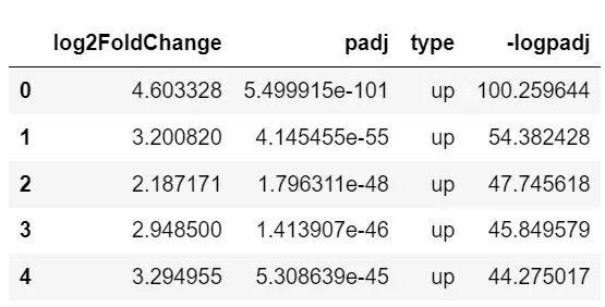
# First set your own color colors = ["#01c5c4","#ff414d", "#686d76"]sns.set_palette(sns.color_palette(colors))# mapping ax=sns.scatterplot(x='log2FoldChange', y='-logpadj',data=data, hue='type',# Color mapping edgecolor = None,# Point boundary color s=8,# Point size )# label ax.set_title("vocalno")ax.set_xlabel("log2FC")ax.set_ylabel("-log10(padj)")# Move the legend position ax.legend(loc='center right', bbox_to_anchor=(0.95,0.76), ncol=1)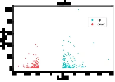
fig = ax.get_figure()fig.savefig('./python_vocalno.pdf')That's all python Details of the example of data visualization drawing volcano map , More about python For information about data visualization volcano map, please pay attention to other relevant articles on software development network !