一、繪制帶趨勢線的散點圖
二、繪制邊緣直方圖
一、繪制帶趨勢線的散點圖實現功能:
在散點圖上添加趨勢線(線性擬合線)反映兩個變量是正相關、負相關或者無相關關系。
實現代碼:
import pandas as pdimport matplotlib as mplimport matplotlib.pyplot as pltimport seaborn as snsimport warningswarnings.filterwarnings(action='once')plt.style.use('seaborn-whitegrid')sns.set_style("whitegrid")print(mpl.__version__)print(sns.__version__)def draw_scatter(file): # Import Data df = pd.read_csv(file) df_select = df.loc[df.cyl.isin([4, 8]), :] # Plot gridobj = sns.lmplot( x="displ", y="hwy", hue="cyl", data=df_select, height=7, aspect=1.6, palette='Set1', scatter_kws=dict(s=60, linewidths=.7, edgecolors='black')) # Decorations sns.set(, font_scale=1.5) gridobj.set(xlim=(0.5, 7.5), ylim=(10, 50)) gridobj.fig.set_size_inches(10, 6) plt.tight_layout() plt.title("Scatterplot with line of best fit grouped by number of cylinders") plt.show()draw_scatter("F:\數據雜壇\datasets\mpg_ggplot2.csv")實現效果:
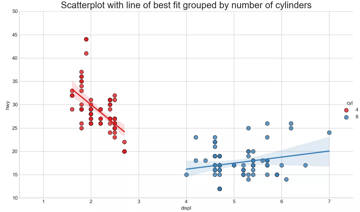
在散點圖上添加趨勢線(線性擬合線)反映兩個變量是正相關、負相關或者無相關關系。紅藍兩組數據分別繪制出最佳的線性擬合線。
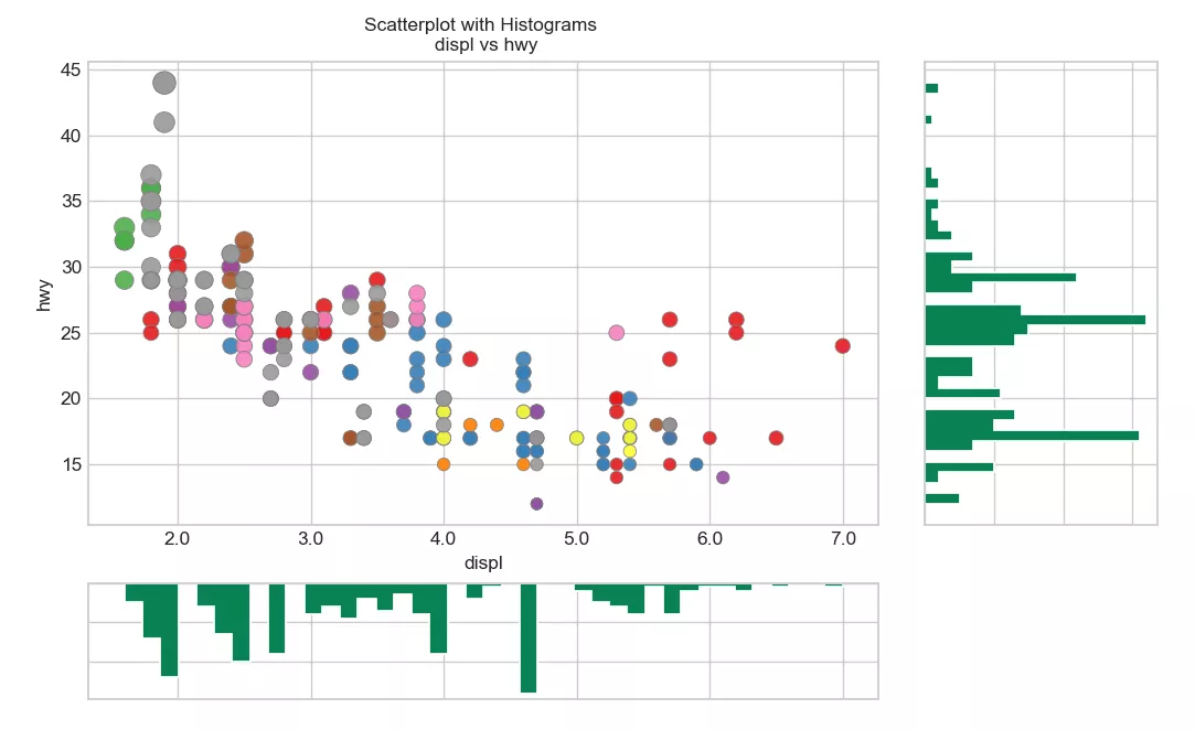
二、繪制邊緣直方圖實現功能:
python繪制邊緣直方圖,用於展示X和Y之間的關系、及X和Y的單變量分布情況,常用於數據探索分析。
實現代碼:
import pandas as pdimport matplotlib as mplimport matplotlib.pyplot as pltimport seaborn as snsimport warningswarnings.filterwarnings(action='once')plt.style.use('seaborn-whitegrid')sns.set_style("whitegrid")print(mpl.__version__)print(sns.__version__)def draw_Marginal_Histogram(file): # Import Data df = pd.read_csv(file) # Create Fig and gridspec fig = plt.figure(figsize=(10, 6), dpi=100) grid = plt.GridSpec(4, 4, hspace=0.5, wspace=0.2) # Define the axes ax_main = fig.add_subplot(grid[:-1, :-1]) ax_right = fig.add_subplot(grid[:-1, -1], xticklabels=[], yticklabels=[]) ax_bottom = fig.add_subplot(grid[-1, 0:-1], xticklabels=[], yticklabels=[]) # Scatterplot on main ax ax_main.scatter('displ', 'hwy', s=df.cty * 4, c=df.manufacturer.astype('category').cat.codes, alpha=.9, data=df, cmap="Set1", edgecolors='gray', linewidths=.5) # histogram on the right ax_bottom.hist(df.displ, 40, histtype='stepfilled', orientation='vertical', color='#098154') ax_bottom.invert_yaxis() # histogram in the bottom ax_right.hist(df.hwy, 40, histtype='stepfilled', orientation='horizontal', color='#098154') # Decorations ax_main.set(title='Scatterplot with Histograms \n displ vs hwy', xlabel='displ', ylabel='hwy') ax_main.title.set_fontsize(10) for item in ([ax_main.xaxis.label, ax_main.yaxis.label] + ax_main.get_xticklabels() + ax_main.get_yticklabels()): item.set_fontsize(10) xlabels = ax_main.get_xticks().tolist() ax_main.set_xticklabels(xlabels) plt.show()draw_Marginal_Histogram("F:\數據雜壇\datasets\mpg_ggplot2.csv")實現效果:
到此這篇關於python可視化分析繪制帶趨勢線的散點圖和邊緣直方圖的文章就介紹到這了,更多相關python繪制內容請搜索軟件開發網以前的文章或繼續浏覽下面的相關文章希望大家以後多多支持軟件開發網!