One 、 Dimensionless data processing ( Heat map )
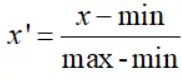
1. Dimensionless data processing ( Only the methods used in this article ):min-max normalization
2. Code display
3. Effect display
Two 、 Pierce coefficient correlation ( Heat map )
1. Math knowledge
2. Code display
3.seaborn.heatmap Property introduction
4 Effect display
summary
One 、 Dimensionless data processing ( Heat map )1. Dimensionless data processing ( Only the methods used in this article ):min-max normalizationThis method is a linear transformation of the original data , Map it to [0,1] Between , This method is also known as dispersion standardization .
In the above formula ,min Is the minimum value of the sample ,max Is the maximum value of the sample . Since the maximum and minimum values may vary dynamically , At the same time, it is also very vulnerable to noise ( Outliers 、 outliers ) influence , Therefore, it is generally suitable for small data scenarios . Besides , There are two other benefits of this method :
1) If a property / The variance of features is very small , Such as height :np.array([[1.70],[1.71],[1.72],[1.70],[1.73]]), actual 5 The data are different in the characteristic of height , But it's weak , This is not conducive to model learning , Conduct min-max After normalization, it is :array([[ 0. ], [ 0.33333333], [ 0.66666667], [ 0. ], [ 1. ]]), It's equivalent to amplifying the difference ;
2) Keep the sparse matrix as 0 The entry of .
2. Code displayimport pandas as pdimport numpy as npimport matplotlib.pyplot as pltimport seaborn as snsfrom sklearn.datasets import load_winewine = load_wine()data = wine.data # data lables = wine.target # label feaures = wine.feature_namesdf = pd.DataFrame(data, columns=feaures) # Raw data # First step : Dimensionless def standareData(df): """ df : Raw data return : data Standardized data """ data = pd.DataFrame(index=df.index) # Name , A new dataframe columns = df.columns.tolist() # Extract the column names for col in columns: d = df[col] max = d.max() min = d.min() mean = d.mean() data[col] = ((d - mean) / (max - min)).tolist() return data# A column is used as a reference sequence , Others are comparative sequences def graOne(Data, m=0): """ return: """ columns = Data.columns.tolist() # Extract the column names # First step : Dimensionless data = standareData(Data) referenceSeq = data.iloc[:, m] # Reference sequence data.drop(columns[m], axis=1, inplace=True) # Delete reference column compareSeq = data.iloc[:, 0:] # Contrast sequence row, col = compareSeq.shape # The second step : Reference sequence - Contrast sequence data_sub = np.zeros([row, col]) for i in range(col): for j in range(row): data_sub[j, i] = abs(referenceSeq[j] - compareSeq.iloc[j, i]) # Find out the maximum and minimum maxVal = np.max(data_sub) minVal = np.min(data_sub) cisi = np.zeros([row, col]) for i in range(row): for j in range(col): cisi[i, j] = (minVal + 0.5 * maxVal) / (data_sub[i, j] + 0.5 * maxVal) # The third step : Calculate the relevance result = [np.mean(cisi[:, i]) for i in range(col)] result.insert(m, 1) # The reference column is 1 return pd.DataFrame(result)def GRA(Data): df = Data.copy() columns = [str(s) for s in df.columns if s not in [None]] # [1 2 ,,,12] # print(columns) df_local = pd.DataFrame(columns=columns) df.columns = columns for i in range(len(df.columns)): # Each column is a reference sequence , Find the correlation coefficient df_local.iloc[:, i] = graOne(df, m=i)[0] df_local.index = columns return df_local# Heat map display def ShowGRAHeatMap(DataFrame): colormap = plt.cm.hsv ylabels = DataFrame.columns.values.tolist() f, ax = plt.subplots(figsize=(15, 15)) ax.set_title('Wine GRA') # Set the display half , If you don't need to comment out mask that will do mask = np.zeros_like(DataFrame) mask[np.triu_indices_from(mask)] = True # np.triu_indices Upper triangular matrix with sns.axes_style("white"): sns.heatmap(DataFrame, cmap="YlGnBu", annot=True, mask=mask, ) plt.show()data_wine_gra = GRA(df)ShowGRAHeatMap(data_wine_gra)3. Effect display 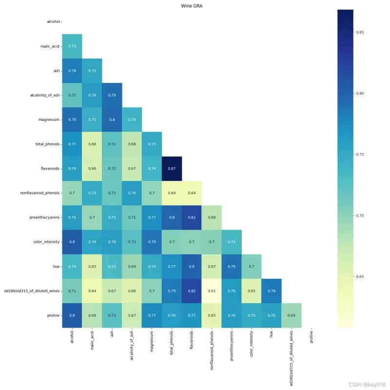
Using the thermodynamic diagram, we can see the similarity of multiple features in the data table .
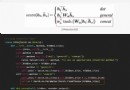
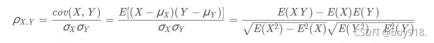
Similarity is measured by Pearson correlation coefficient .
The Pearson correlation coefficient between two variables is defined as the quotient of the covariance and standard deviation between two variables :
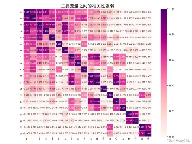
import pandas as pdimport numpy as npimport matplotlib.pyplot as pltimport seaborn as sns# ==== Heat map from matplotlib.ticker import FormatStrFormatterencoding="utf-8"data = pd.read_csv("tu.csv", encoding="utf-8") # Reading data data.drop_duplicates()data.columns = [i for i in range(data.shape[1])]# Calculate the Pearson correlation coefficient between two attributes corrmat = data.corr()f, ax = plt.subplots(figsize=(12, 9))# Back to press “ Column ” In descending order n That's ok k = 30cols = corrmat.nlargest(k, data.columns[0]).index# Returns the Pearson product moment correlation coefficient cm = np.corrcoef(data[cols].values.T)sns.set(font_scale=1.25)hm = sns.heatmap(cm, cbar=True, annot=True, square=True, fmt=".3f", vmin=0, # Scale threshold vmax=1, linewidths=.5, cmap="RdPu", # Scale color annot_kws={"size": 10}, xticklabels=True, yticklabels=True) #seaborn.heatmap Related properties # Solve the problem of Chinese display plt.rcParams['font.sans-serif'] = ['SimHei']plt.rcParams['axes.unicode_minus'] = False# plt.ylabel(fontsize=15,)# plt.xlabel(fontsize=15)plt.title(" The correlation between the main variables is strong or weak ", fontsize=20)plt.show()3.seaborn.heatmap Property introduction 1)Seaborn Is based on matplotlib Of Python Visualization Library
seaborn.heatmap() Heat map , The correlation coefficient matrix used to show a set of variables , Data distribution of contingency table , Through the thermodynamic diagram, we can intuitively see the difference of the given values .
seaborn.heatmap(data, vmin=None, vmax=None, cmap=None, center=None, robust=False, annot=None, fmt='.2g', annot_kws=None, linewidths=0, linecolor='white', cbar=True, cbar_kws=None, cbar_ax=None, square=False, xticklabels='auto', yticklabels='auto', mask=None, ax=None, **kwargs)2) Parameter output ( All are default values )
sns.heatmap( data, vmin=None, vmax=None, cmap=None, center=None, robust=False, annot=None, fmt='.2g', annot_kws=None, linewidths=0, linecolor=‘white', cbar=True, cbar_kws=None, cbar_ax=None, square=False, xticklabels=‘auto', yticklabels=‘auto', mask=None, ax=None,)3) Specific introduction
(1) Thermodynamic diagram input data parameters4 Effect displaydata: Matrix data sets , It can be numpy Array of (array), It can also be pandas Of DataFrame. If it is DataFrame, be df Of index/column The information will correspond to heatmap Of columns and rows, namely df.index It's the row mark of the heat map ,df.columns Is the column label of the heat map
(2) Thermal map matrix block color parametersvmax,vmin: They are the maximum and minimum range of color values in the thermal diagram , Default is based on data The values in the data table are determined
(3) Thermal map matrix block annotation parameters
cmap: Mapping from numbers to color space , The value is matplotlib In the bag colormap Name or color object , Or a list of colors ; Change the default value of the parameter : according to center Parameter setting
center: When the data table values are different , Set the color center alignment value of the thermal map ; By setting center value , You can adjust the overall color of the generated image ; Set up center Data time , If there is data overflow , Manually set vmax、vmin Will change automatically
robust: The default value False; If it is False, And it's not set vmin and vmax Value , The color mapping range of the thermal map is set according to the quantile with robustness , Instead of using extreme valuesannot(annotate Abbreviation ): The default value False; If it is True, Write data in each square of the thermal diagram ; If it's a matrix , Write the corresponding position data of the matrix in each square of the thermodynamic diagram
(4) Interval and interval line parameters between matrix blocks of thermodynamic diagram
fmt: String format code , The data format for identifying numbers on a matrix , For example, keep a few digits after the decimal point
annot_kws: The default value False; If it is True, Set the size, color and font of the numbers on the thermal chart matrix ,matplotlib package text Font settings under class ;linewidths: Define the heat map “ A matrix representing the pairwise characteristic relationship ” The size of the interval between
(5) Thermal diagram color scale bar parameters
linecolor: The color of the line that splits each matrix block on the thermodynamic diagram , The default value is ’white’cbar: Whether to draw color scale bar on the side of thermal diagram , The default value is True
(6)square: Set the block shape of the heat map matrix , The default value is False
cbar_kws: When drawing color scale bar on the side of thermal diagram , Related font settings , The default value is None
cbar_ax: When drawing color scale bar on the side of thermal diagram , Scale bar position setting , The default value is Nonexticklabels, yticklabels:xticklabels Controls the output of each column label name ;yticklabels Control the output of each line of signature . The default value is auto. If it is True, with DataFrame Use the column name of as the tag name . If it is False, No line mark signature is added . If it's a list , Then the tag name is changed to the content given in the list . If it's an integer K, On the graph every K One label at a time . If it is auto, Then the label spacing is automatically selected , The non overlapping part of the tag name ( Or all ) Output
mask: Controls whether a matrix block is displayed . The default value is None. If it's Boolean DataFrame, Will DataFrame in True Cover the position with white
ax: Set the axis of the drawing , Generally, when drawing multiple subgraphs, you need to modify the value of different subgraphs
**kwargs: All other keyword parameters are passed to ax.pcolormesh.
This is about python This is the end of the article on the realization of thermodynamic diagram , More about python Please search the previous articles of the software development network or continue to browse the following related articles. I hope you can support the software development network in the future !