author : Yu Han Gao
Time :2022.6.19 11:07 Father's Day
Blog :blog.csdn.net/cg_i
“ Everyone can't bear it , Reach the point where he can endure , Ren also ; Everyone does something wrong , Reach for what they do , Righteousness also .”—— Mencius said
Recently, to verify whether the new environment can adapt to the existing business , Temporarily transfer from each group 16 Teachers are divided into 5 Teams to help with business testing . In order to master the whole test work in time 、 Group and individual progress , At the end of the daily test, all teachers are required to , Report and summarize the number of transactions and cases that have passed the respective tests .
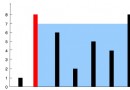
In the spirit of not Repeat the wheel The guiding ideology of . Data filling and collection . In limine , I want to write a simple little program by myself . but , Turn to think “ Though sparrows are small ” There is no shortage of things to do . for example , Interface design 、 Code writing 、 Input validity check 、 database 、 Hosting platform, etc . The original plan was to use 2 Weeks to complete the test , In this way, the input-output ratio is not high ( Talk is talk : It's not worth it ). Sui , Find out if there is an alternative online , Look for it Jinshan form Jump into the eye , Here I want to blow it up ( My previous knowledge of Jinshan was limited to WPS) Its rich templates and highly customizable functions , The most important thing is to free . These are just what I need , The first problem in front of me was solved . The following figure is my customized form interface .
Solved the problem of data collection , Only half of the problem has been solved . Jinshan form will collect the data , With a very large and complex Excel The table shows ( This is the same as your custom form 、 Data sizes vary ) Can you analyze the result data you want from the table below ?
For all of you Excel Master, ( It may be you who read this article ) With this table, we can use it again Excel Function to analyze the relevant data , It is enough to get the desired result . Unfortunately , I am right. Excel You can only set whether the four edges of a cell are real or virtual .
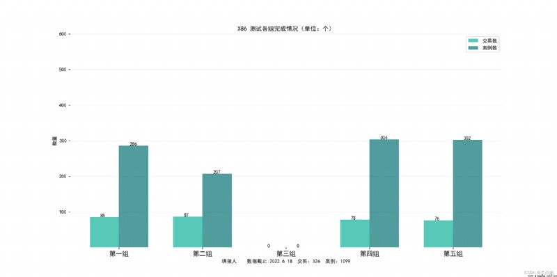
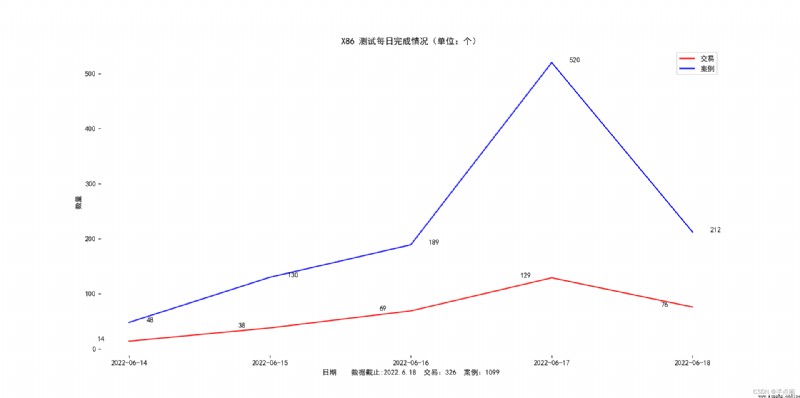
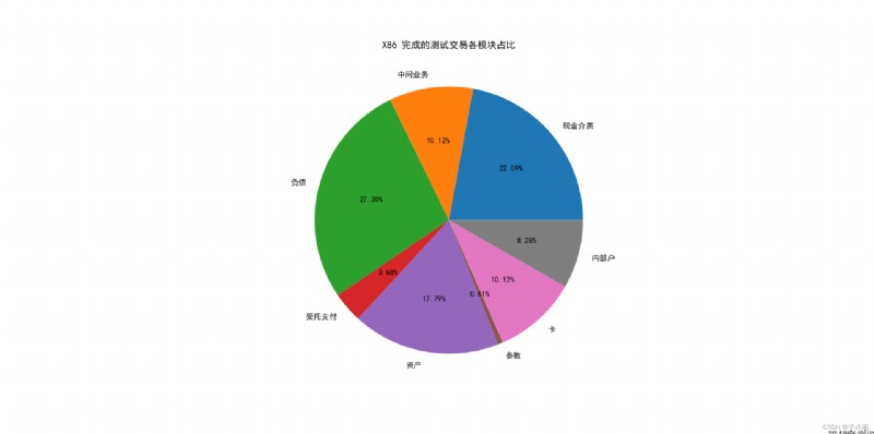
The brain chases images , Not words . In the activity of the brain , A picture is worth a thousand words . In order to explain the problem and create a rich feeling for the reader , I decided to present the results of the analysis in the form of charts , The following figure shows the generated results , Is it more interesting to you than boring words .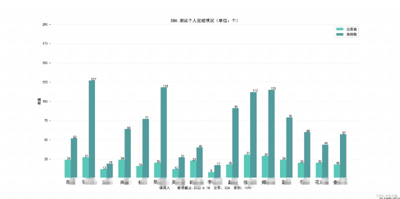
The analysis is given here Excel Data and chart drawing complete code , You can use it in your programs or documents . Unless you use the same form as I do , Otherwise, according to your Excel Modify the data accordingly . For this kind of Only once The program , I didn't optimize the algorithm , There are redundant code and hard coding in the program , Careful you may also find that there is a lack of necessary exception handling . These are not problems in my application , But if it is used, you may have to be very careful .
'''
function : Analyze tabular data and chart as needed
author : Yu Han Gao
Time :2022.6.19
'''
import numpy as np
import openpyxl
import matplotlib.pyplot as plt
def open_excel(fileName, sheetName):
work = openpyxl.load_workbook(fileName)
sheet = work.get_sheet_by_name(sheetName)
return sheet
def person(sheet, thead):
'''
Statistics by person
'''
record = {}
for row in range(2, sheet.max_row + 1):
'''
{} Initialization part
'''
name = sheet.cell(row=row, column=thead['info']).value
if name not in record:
record.setdefault(name, {})
rq = sheet.cell(row=row, column=thead['rq']).value
rq = rq.strftime('%Y-%m-%d')
if rq not in record[name]:
record[name].setdefault(rq, {})
record[name][rq].setdefault('al', 0) # Number of cases
record[name][rq].setdefault('jym', 0) # Number of transactions
for col in thead['jym']:
jym = sheet.cell(row=row, column=col).value
# Assume Only one transaction code is registered in each column
if jym != "" and jym != None and jym.find(' nothing ') == -1:
record[name][rq]['jym'] += 1
for col in thead['al']:
al = sheet.cell(row=row, column=col).value
if al != "" and al != None:
record[name][rq]['al'] += int(al)
return record
def thead_position(sheet):
'''
Locate the title row Transaction code , Number of cases , Filled by Position in the table
'''
thead = {'jym':[], 'al':[], 'info':0, 'mk':0, 'rq':''}
for col in range(1, sheet.max_column + 1):
value = sheet.cell(row=1, column=col).value
if value.find(" Name of transaction ") >=0:
thead['jym'].append(col)
elif value.find(" Number of cases ") >=0:
thead['al'].append(col)
elif value.find(" date ") >=0:
thead['rq'] = col
elif value.find(" modular ") >=0:
thead['mk'] = col
elif value.find(" Filled by ") >=0:
thead['info'] = col
return thead
def graph_line(record):
'''
Draw a line chart
'''
dateCount = {} # Count by day
for name in record.keys():
for rq in record[name].keys():
if rq not in dateCount:
dateCount.setdefault(rq, {'jym':0, 'al':0})
dateCount[rq]['jym'] += record[name][rq]['jym']
dateCount[rq]['al'] += record[name][rq]['al']
labels = [rq for rq in dateCount.keys()]
line_jym = []
line_al = []
sum_jym = 0
sum_al = 0
for rq in labels:
line_jym.append(dateCount[rq]['jym'])
line_al.append(dateCount[rq]['al'])
sum_jym += dateCount[rq]['jym']
sum_al += dateCount[rq]['al']
bar_width = 0.35
plt.rcParams['font.sans-serif'] = ['SimHei']
plt.rcParams['axes.unicode_minus'] = False
plt.title("X86 Test daily completion ( Company : individual )")
plt.xlabel(f" date Data as :2022.6.18 transaction :{sum_jym} Case study :{sum_al}")
plt.ylabel(" Number ")
plt.box(False)
line1, = plt.plot(labels,line_jym, color='r', label=' transaction ')
line2, = plt.plot(labels, line_al, color='b', label=' Case study ')
plt.legend(handles=[line1, line2], labels=[' transaction ',' Case study '], loc='best')
for i, j in enumerate(line_jym):
plt.text(i-0.5*bar_width-0.05, j+0.1, str(j))
for i, j in enumerate(line_al):
plt.text(i+0.5*bar_width-0.05, j+0.1, str(j))
plt.show()
def mk(sheet, thead):
'''
Statistics by module
'''
record = {}
for row in range(2, sheet.max_row + 1):
'''
{} Initialization part
'''
mk = sheet.cell(row=row, column=thead['mk']).value
if mk not in record:
record.setdefault(mk, {'jym':0, 'al': 0})
for col in thead['jym']:
jym = sheet.cell(row=row, column=col).value
# Assume Only one transaction code is registered in each column
if jym != "" and jym != None and jym.find(' nothing ') == -1:
record[mk]['jym'] += 1
# Count the number of cases
for col in thead['al']:
al = sheet.cell(row=row, column=col).value
if al != "" and al != None:
record[mk]['al'] += int(al)
return record
def graph_group(record):
'''
Statistics by group
'''
one = [' Zhao ', ' Zhang ', ' smell ', ' Shen ']
two = [' flowers ', ' Zhou ', ' Han ', ' Li ', ' Zhao ']
three = []
four = [' Chen ', ' Lou ', ' Chen ', ' Yang ']
five = [' Li ', ' zheng ', ' Zhang ']
group_count = {
'one': {'jym':0, 'al':0},
'two':{'jym':0, 'al':0},
'three':{'jym':0, 'al':0},
'four':{'jym':0, 'al':0},
'five':{'jym':0, 'al':0}
}
for name in record.keys():
for rq in record[name].keys():
if name in one:
group_count['one']['jym'] += record[name][rq]['jym']
group_count['one']['al'] += record[name][rq]['al']
elif name in two:
group_count['two']['jym'] += record[name][rq]['jym']
group_count['two']['al'] += record[name][rq]['al']
elif name in three:
group_count['three']['jym'] += record[name][rq]['jym']
group_count['three']['al'] += record[name][rq]['al']
elif name in four:
group_count['four']['jym'] += record[name][rq]['jym']
group_count['four']['al'] += record[name][rq]['al']
elif name in five:
group_count['five']['jym'] += record[name][rq]['jym']
group_count['five']['al'] += record[name][rq]['al']
labels = [' The first group ', ' The second group ', ' The third group ', ' Group 4 ', ' Group five ']
bar1 = []
bar2 = []
sum_jym = 0
sum_al = 0
for g in group_count.keys():
bar1.append( group_count[g]['jym'] )
bar2.append( group_count[g]['al'] )
sum_jym += group_count[g]['jym']
sum_al += group_count[g]['al']
bar_width = 0.35
plt.rcParams['font.sans-serif'] = ['SimHei']
plt.rcParams['axes.unicode_minus'] = False
plt.bar(np.arange(len(bar1))-0.5*bar_width, bar1, label=' Number of transactions ',
width=bar_width, color='#58c9b9')
plt.bar(np.arange(len(bar2))+0.5*bar_width, bar2, label=' Number of cases ',
width=bar_width, color='#519d9e')
plt.xlabel(f" Filled by Data as :2022.6.18 transaction :{sum_jym} Case study :{sum_al}")
plt.ylabel(" Number ")
plt.title("X86 Test the completion of each group ( Company : individual )")
plt.ylim([1,600])
plt.legend()
plt.xticks(np.arange(len(labels)), labels, fontsize=13)
plt.box(False)
plt.grid(color='0.4', axis='y', linestyle='solid', alpha=0.1)
for i, j in enumerate(bar1):
plt.text(i-0.5*bar_width-0.05, j+0.1, str(j))
for i, j in enumerate(bar2):
plt.text(i+0.5*bar_width-0.05, j+0.1, str(j))
plt.show()
def graph_pie(sheet, thead):
'''
Draw the pie chart
'''
record = mk(sheet, thead)
labels = [m for m in record.keys()]
pie_jym = []
pie_al = []
for m in labels:
pie_jym.append(record[m]['jym'])
pie_al.append(record[m]['al'])
plt.rcParams['font.sans-serif'] = ['SimHei'] # Used to display Chinese
plt.rcParams['axes.unicode_minus'] = False # Used to display negative signs normally
plt.pie(pie_jym, labels=labels, autopct='%1.2f%%')
plt.title('X86 The proportion of each module of the completed test transaction ')
plt.show()
def graph_bar(record):
'''
Draw a strong picture of columns
'''
labels = [name for name in record.keys()]
bar_width = 0.35
bar1 = []
bar2 = []
sum_jym = 0
sum_al = 0
for n in labels:
jym = 0
al = 0
# Statistics
for rq in record[n].keys():
jym += record[n][rq]['jym']
al += record[n][rq]['al']
bar1.append(jym)
bar2.append(al)
sum_jym += jym
sum_al += al
plt.rcParams['font.sans-serif'] = ['SimHei'] # Used to display Chinese
plt.rcParams['axes.unicode_minus'] = False # Used to display negative signs normally
plt.bar(np.arange(len(bar1))-0.5*bar_width, bar1, label=' Number of transactions ',
width=bar_width, color='#58c9b9')
plt.bar(np.arange(len(bar2))+0.5*bar_width, bar2, label=' Number of cases ',
width=bar_width, color='#519d9e')
plt.xlabel(f" Filled by Data as :2022.6.18 transaction :{sum_jym} Case study :{sum_al}")
plt.ylabel(" Number ")
plt.title("X86 Test individual completion ( Company : individual )")
plt.ylim([1,200])
plt.legend()
plt.xticks(np.arange(len(labels)), labels, fontsize=13)
plt.box(False)
plt.grid(color='0.4', axis='y', linestyle='solid', alpha=0.1)
for i, j in enumerate(bar1):
plt.text(i-0.5*bar_width-0.05, j+0.1, str(j))
for i, j in enumerate(bar2):
plt.text(i+0.5*bar_width-0.05, j+0.1, str(j))
plt.show()
if __name__ == '__main__':
sheet = open_excel('xxx.xlsx', ' Collection table ')
# Position the title
thead = thead_position(sheet)
# Statistics by person
record = person(sheet, thead)
# Draw a strong picture of columns
graph_bar(record)
graph_group(record)
# Draw a line chart
graph_line(record)
# Draw a pie chart
graph_pie(sheet, thead)