I believe you are familiar with some conventional visual charts , For example, a line chart 、 Histogram 、 Pie charts and so on , Today Xiaobian passed Plotly Express Module to draw some unusual but amazing charts for you .
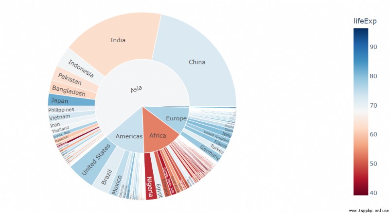
SunBurst Chart It is generally called the rising sun chart or the sun chart , And the structure of pie chart is very similar , But it can express the hierarchy and belonging more clearly than the latter . In the rising sun chart , The closer to the dot, the higher the level , In the two adjacent layers, the inner layer contains the outer layer .
Use the sunrise chart in actual projects , Not only is the data intuitive , And the chart is very cool to use , It can quickly improve the appearance of data reporting . The code is as follows
import plotly.express as px
import numpy as np
df = px.data.gapminder().query("year == 2002")
fig = px.sunburst(df, path=['continent', 'country'], values='pop',
                  color='lifeExp', hover_data=['iso_alpha'],
                  color_continuous_scale='RdBu',
                  color_continuous_midpoint=np.average(df['lifeExp'], weights=df['pop']))
fig.show()
output
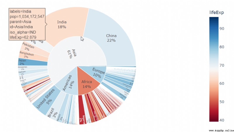
In the middle of textinfo Parameter to adjust the expression of the label , For example, the proportion is displayed as a percentage , The code is as follows
fig = px.sunburst(... Same as the code above ...)
fig.update_traces(
    textinfo="label+percent entry"
)
fig.show()
output
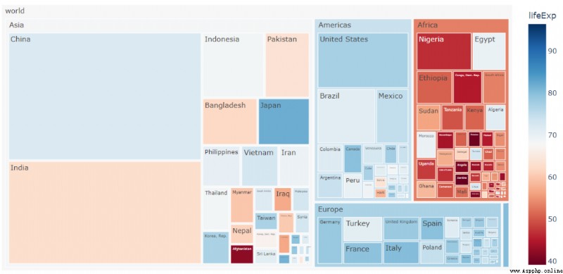
Tree diagram (Treemap) It is applicable to data with more distinct hierarchical structure , In a tree diagram , The chart is divided into several rectangles , The size of the rectangle depends on the size of the numerical value , Let's take a look at the specific code implementation
fig = px.treemap(df, path=[px.Constant("world"), 'continent', 'country'], values='pop',
                  color='lifeExp', hover_data=['iso_alpha'],
                  color_continuous_scale='RdBu',
                  color_continuous_midpoint=np.average(df['lifeExp'], weights=df['pop']))
fig.update_layout(margin = dict(t=50, l=25, r=25, b=25))
fig.show()
output
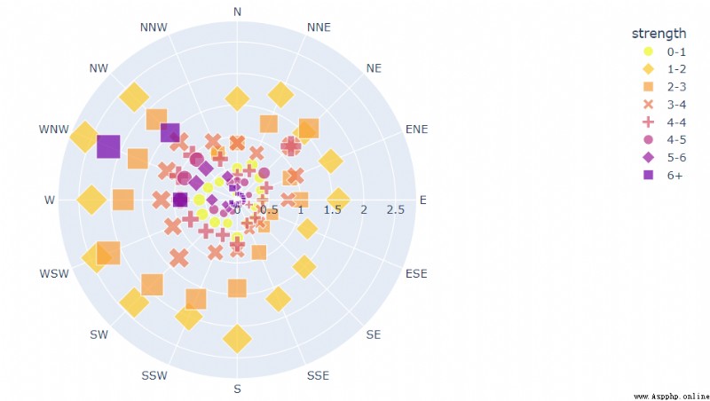
stay plotly.express Modules , We can add scatter points to the polar chart , You can also place a polyline on it , The scatter plot in polar coordinates calls px.scatter_polar() Method to implement , The code is as follows
import plotly.express as px
df = px.data.wind()
fig = px.scatter_polar(df, r="frequency", theta="direction",
                       color="strength", symbol="strength", size="frequency",
                       color_discrete_sequence=px.colors.sequential.Plasma_r)
fig.show()
output
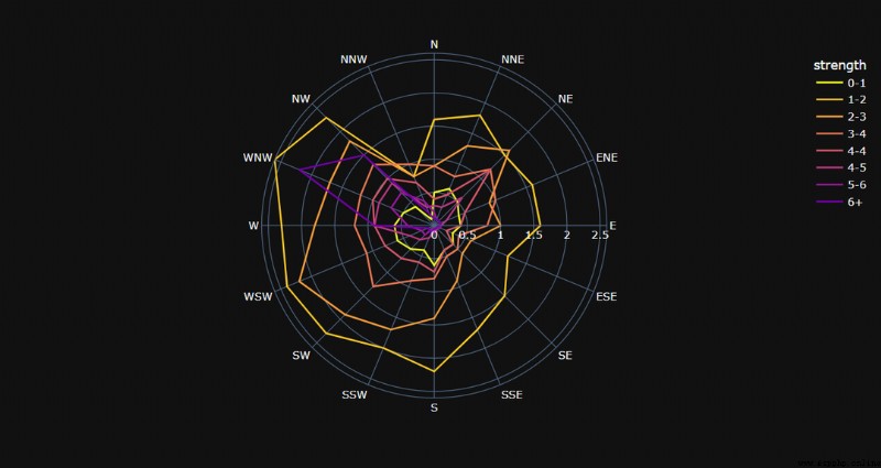
The line graph in polar coordinates calls px.line_polar() Method , The code is as follows
fig = px.line_polar(df, r="frequency", theta="direction", color="strength", line_close=True,
                    color_discrete_sequence=px.colors.sequential.Plasma_r,
                    template="plotly_dark",)
fig.show()
output
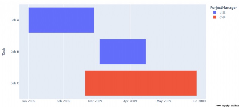
Gantt Chart (Gantt Charts) It is very helpful to show the progress of the project , The vertical axis represents the name of the project , The horizontal axis indicates the date , It can visually express the cycle and progress of the project , The code is as follows
df = pd.DataFrame([
    dict(Task="Job A", Start='2009-01-01', Finish='2009-02-28'),
    dict(Task="Job B", Start='2009-03-05', Finish='2009-04-15'),
    dict(Task="Job C", Start='2009-02-20', Finish='2009-05-30')
])
df.head()
output

The data includes the start date and end date of the project , Then we call px.timeline Method to draw a sanggi diagram , The code is as follows
fig = px.timeline(df, x_start="Start", x_end="Finish", y="Task")
fig.update_yaxes(autorange="reversed")
fig.show()
output

Of course, if different projects are handled by different people , We can also mark it on the chart , The code is as follows
df = pd.DataFrame([
    dict(Task="Job A", StartDate='2009-01-01', FinishDate='2009-02-28', PorjectManager=" Xiao Wang "),
    dict(Task="Job B", StartDate='2009-03-05', FinishDate='2009-04-15', PorjectManager=" Xiao Wang "),
    dict(Task="Job C", StartDate='2009-02-20', FinishDate='2009-05-30', PorjectManager=" petty thief ")
])
fig = px.timeline(df, x_start="StartDate", x_end="Finish", y="Task", color="PorjectManager")
fig.update_yaxes(autorange="reversed")
fig.show()
output
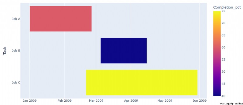
Of course, the progress of the project can also be shown on the chart , The code is as follows
df = pd.DataFrame([
    dict(Task="Job A", StartDate='2009-01-01', FinishDate='2009-02-25', Completion_pct=60),
    dict(Task="Job B", StartDate='2009-03-05', FinishDate='2009-04-15', Completion_pct=40),
    dict(Task="Job C", StartDate='2009-02-20', FinishDate='2009-05-30', Completion_pct=75)
])
fig = px.timeline(df, x_start="StartDate", x_end="FinishDate", y="Task", color="Completion_pct")
fig.update_yaxes(autorange="reversed")
fig.show()
output
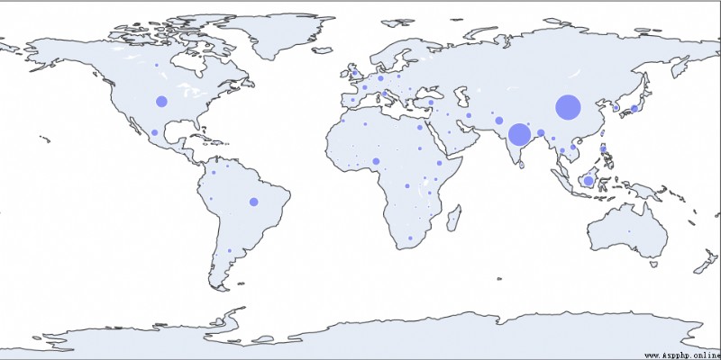
stay plotly.express It is also very simple to draw a map in the module , For example, what we draw is a scatter chart in the map , It's called scatter_geo() Method , The code is as follows
df = px.data.gapminder().query("year == 2002")
fig = px.scatter_geo(df, locations="iso_alpha",
                     size="pop",
                     )
fig.show()
output
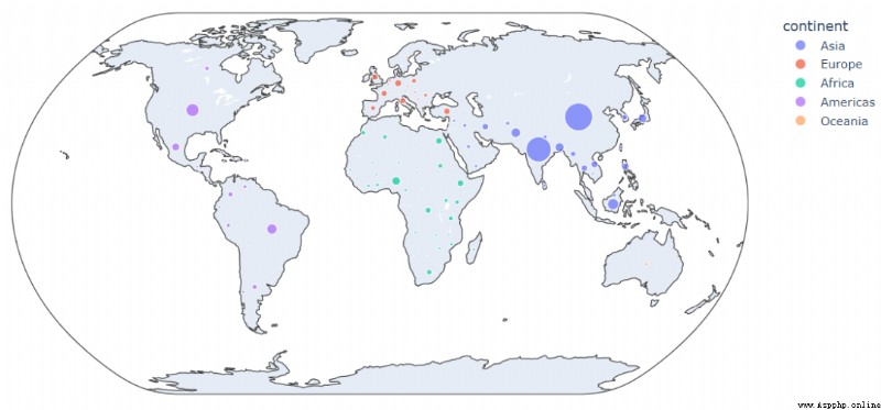
We can further beautify the chart on this basis , For example, different countries represent different states, which are represented by scattered dots of different colors , The code is as follows
fig = px.scatter_geo(df, locations="iso_alpha",
                     color="continent",
                     hover_name="country",
                     size="pop",
                     projection="natural earth")
fig.show()
output
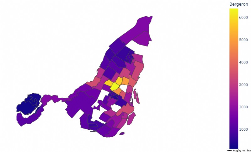
And the hierarchical statistical chart (Choropleth map), It refers specifically to the entire mapping area , Each division unit is classified according to the number of divisions , It's called px.choropleth() Method
fig = px.choropleth(df, geojson=geojson, color="Bergeron",
                    locations="district", featureidkey="properties.district",
                    projection="mercator"
                   )
fig.update_geos(fitbounds="locations", visible=False)
fig.update_layout(margin={"r":0,"t":0,"l":0,"b":0})
fig.show()
output
NO.1
Previous recommendation
Historical articles
20 A beautiful large visual screen template , The data of various industries are directly applied ( Including source code )
50 That's ok Python Code drawing data screen , This visual framework is really amazing
Share an interesting Python Visualization techniques
One line of code makes a data analysis crosstab , It's so convenient
Share 、 Collection 、 give the thumbs-up 、 I'm looking at the arrangement ?


 Python solves the real problem of ccf-csp 202206-3 - role authorization
Students who want to check the
 Python program keeps reporting errors modulenotfounderror: no module namedpygame
I use it when coding import py