Preface
Blog :【 Red eye aromatherapy blog _CSDN Blog - Computer theory ,2022 Blue Bridge Cup ,MySQL Domain Blogger 】
This article is written by 【 Red eye aromatherapy 】 original , First appeared in CSDN
2022 The greatest wish of the year :【 Serve millions of technical people 】
Python Initial environment address :【Python Visual data analysis 01、python Environment building 】
Environmental requirements
Environmental Science :win10
development tool :PyCharm Community Edition 2021.2
database :MySQL5.6
Catalog
Python Visual data analysis 10、Matplotlib library
Preface
Environmental requirements
Pre environment
Preface
Draw a straight line
plot function
Draw a histogram
Stacked histogram
Draw a side-by-side histogram
Draw histogram
Draw the pie chart
Draw a split pie chart
Draw a scatter plot
draw 3D Images
3D Surface graph
3D Scatter plot
3D Bar chart
pip3 config set global.index-url https://repo.huaweicloud.com/repository/pypi/simple
pip3 config list
pip3 install --upgrade pip
pip3 install numpy
pip3 install matplotlib
 Things are relatively large, and the introduction is slower , Don't worry. .
Matplotlib yes Python One of the most commonly used visualization tools in , It is very convenient to create massive 2D Charts and some basic 3D Chart .
Matplotlib First published in 2007 year , Driven by open source and the community , Now based on Python It has been widely used in various fields of scientific computing .
Matplotlib The most widely used module in is pyplot modular ,pyplot Each drawing function in the module can make some changes to the graph .
import numpy as np
from matplotlib import pyplot as plt
plt.rcParams['font.sans-serif'] = ['SimHei'] # Used to display Chinese labels normally
plt.rcParams['axes.unicode_minus'] = False # Used to display negative sign normally
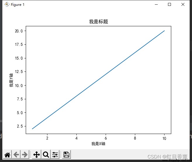
x = np.arange(1, 11)
y = 2 * x
plt.title(" I'm the title ")
plt.xlabel(" I am a X Axis ")
plt.ylabel(" I am a Y Axis ")
plt.plot(x, y)
plt.show()
Irregular value
import numpy as np
from matplotlib import pyplot as plt
plt.rcParams['font.sans-serif'] = ['SimHei'] # Used to display Chinese labels normally
plt.rcParams['axes.unicode_minus'] = False # Used to display negative sign normally
x = np.arange(1, 11)
y = 2 * x
plt.title(" I'm the title ")
plt.xlabel(" I am a X Axis ")
plt.ylabel(" I am a Y Axis ")
plt.plot((1, 5, 1, 5, 7, 5, 5, 9, 1, 5), y)
plt.show()
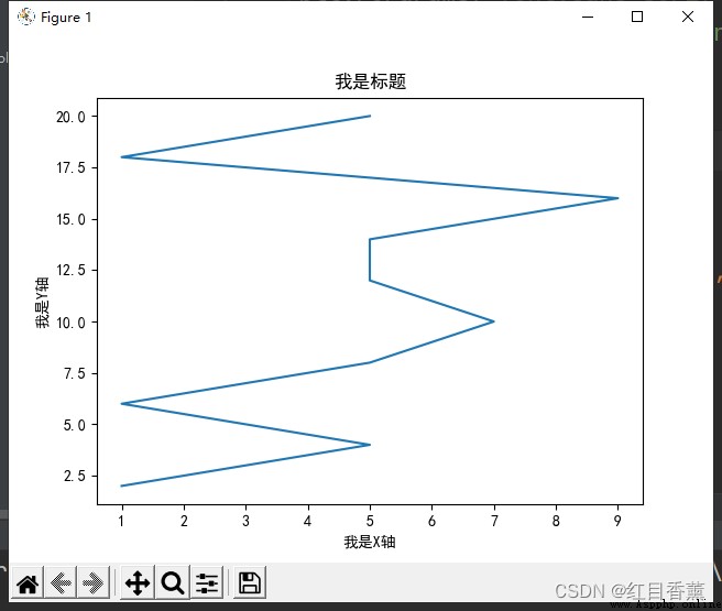
plot() Functions can pass in multiple parameters , Among them the first 3 Parameters represent the color and type of the line , The first 4 Parameters represent the width of the line
character
meaning
-
Solid line pattern
--
Short horizontal line pattern
-.
Dash pattern
:
Dashed pattern
.
Dot the mark
,
Pixel marker
o
Circle marks
v
Inverted triangle
^
Positive triangle sign
<
Left triangle
>
Right triangle
1
Down arrow mark
2
Up arrow mark
3
Left arrow mark
4
Right arrow mark
s
A square mark
p
Pentagonal sign
*
Star sign
h
Hexagon sign 1
'H'
Hexagon sign 2
+
Plus sign
x
X Mark
D
Diamond mark
'd'
Narrow diamond mark
|
Vertical line marking
_
Horizontal line marking
b
Blue
g
green
r
Red
c
Cyan
m
magenta
y
yellow
k
black
w
white
import numpy as np
from matplotlib import pyplot as plt
plt.rcParams['font.sans-serif'] = ['SimHei'] # Used to display Chinese labels normally
plt.rcParams['axes.unicode_minus'] = False # Used to display negative sign normally
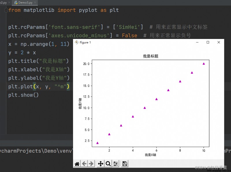
x = np.arange(1, 11)
y = 2 * x
plt.title(" I'm the title ")
plt.xlabel(" I am a X Axis ")
plt.ylabel(" I am a Y Axis ")
plt.plot(x, y, "^m")
plt.show()
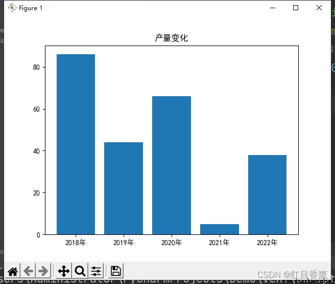
import numpy as np
import matplotlib.pyplot as plt
plt.rcParams['font.sans-serif'] = ['SimHei'] # Used to display Chinese labels normally
plt.rcParams['axes.unicode_minus'] = False # Used to display negative sign normally
x = ['2018 year ', '2019 year ', '2020 year ', '2021 year ', '2022 year ']
y = np.random.randint(0, 100, 5)
plt.bar(x, y)
plt.title(" Yield change ")
plt.show()
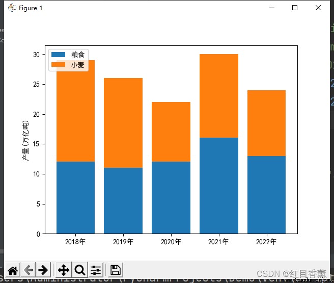
import numpy as np
import matplotlib.pyplot as plt
plt.rcParams['font.sans-serif'] = ['SimHei'] # Used to display Chinese labels normally
plt.rcParams['axes.unicode_minus'] = False # Used to display negative sign normally
x = ['2018 year ', '2019 year ', '2020 year ', '2021 year ', '2022 year ']
y1 = np.random.randint(10, 20, 5)
y2 = np.random.randint(10, 20, 5)
plt.bar(x, y1)
plt.bar(x, y2, bottom=y1)
plt.ylabel(" yield ( Trillion tons )")
plt.legend(labels=[" food ", " Wheat "], loc="upper left")
plt.show()
import numpy as np
import matplotlib.pyplot as plt
plt.rcParams['font.sans-serif'] = ['SimHei'] # Used to display Chinese labels normally
plt.rcParams['axes.unicode_minus'] = False # Used to display negative sign normally
x1 = np.arange(5)
y1 = np.random.randint(10, 20, 5)
y2 = np.random.randint(10, 20, 5)
bar_width = 0.35
plt.bar(x1, y1, bar_width)
plt.bar(x1 + bar_width, y2, bar_width)
plt.ylabel(" yield ( Trillion tons )")
tick_label = ['2018 year ', '2019 year ', '2020 year ', '2021 year ', '2022 year ']
plt.xticks(x1 + bar_width / 2, tick_label)
plt.legend(labels=[" food ", " Wheat "], loc="upper left")
plt.show()

import numpy as np
import matplotlib.pyplot as plt
import random
plt.rcParams['font.sans-serif'] = ['SimHei'] # Used to display Chinese labels normally
plt.rcParams['axes.unicode_minus'] = False # Used to display negative sign normally
a = [random.randint(80, 150) for i in range(250)]
print(a)
print(max(a) - min(a))
# Count groups
d = 3 # Group spacing
num_bins = (max(a) - min(a)) // d
# Set graphic size
plt.figure(figsize=(20, 8), dpi=80)
plt.hist(a, num_bins)
# Set up x Axis scale
plt.xticks(range(min(a), max(a) + d, d))
# set grid
plt.grid(alpha=0.4)
plt.show()

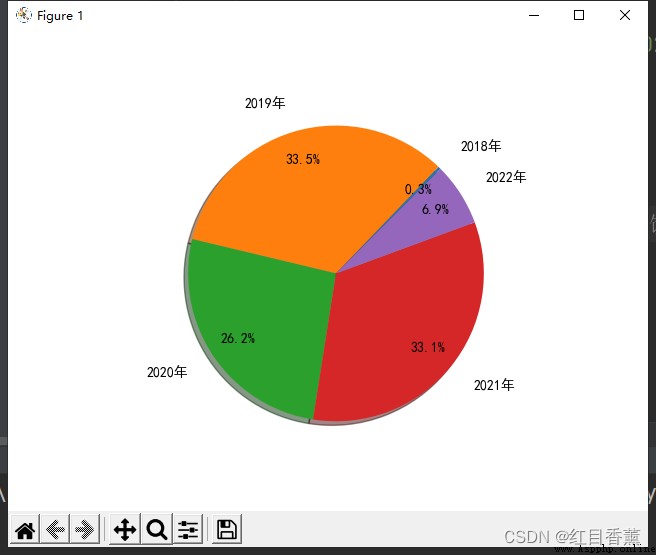
import numpy as np
import matplotlib.pyplot as plt
plt.rcParams['font.sans-serif'] = ['SimHei'] # Used to display Chinese labels normally
plt.rcParams['axes.unicode_minus'] = False # Used to display negative sign normally
labels =['2018 year ', '2019 year ', '2020 year ', '2021 year ', '2022 year ']
y = np.random.rand(5)
plt.pie(y,
labels=labels,
autopct="%3.1f%%",
startangle=45, # First slice rotation angle
shadow=True,
pctdistance=0.8,
labeldistance=1.2)
plt.show()
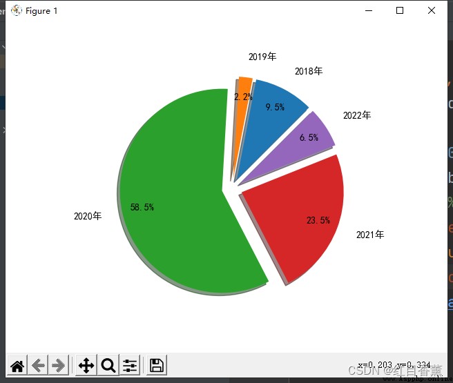
import numpy as np
import matplotlib.pyplot as plt
plt.rcParams['font.sans-serif'] = ['SimHei'] # Used to display Chinese labels normally
plt.rcParams['axes.unicode_minus'] = False # Used to display negative sign normally
labels =['2018 year ', '2019 year ', '2020 year ', '2021 year ', '2022 year ']
y = np.random.rand(5)
plt.pie(y,
explode=(0.1, 0.1, 0.1, 0.1, 0.1), # Percentage of edge deviation from diameter
labels=labels,
autopct="%3.1f%%",
startangle=45, # First slice rotation angle
shadow=True,
pctdistance=0.8,
labeldistance=1.2)
plt.show()
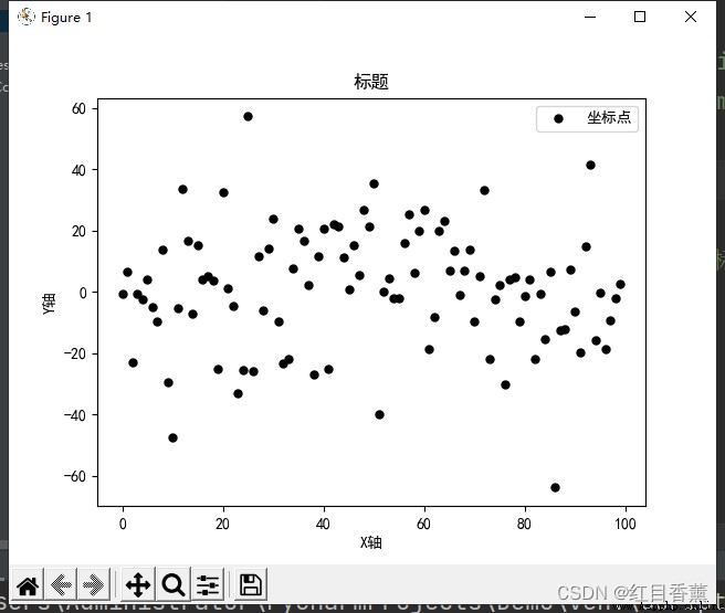
Scatter diagram is also called scatter distribution diagram , It takes a feature as the abscissa , Take another feature as ordinate , Using coordinate points ( Scatter ) The distribution form of reflects the statistical relationship between characteristics .
Scatterplot can provide two kinds of key information :
Whether there is a numerical or quantitative correlation trend between features , Is the correlation trend linear or nonlinear
If a point or several points deviate from most points , Then these points are outliers , We can further analyze whether these outliers have a great impact on modeling analysis
import numpy as np
import matplotlib.pyplot as plt
plt.rcParams['font.sans-serif'] = ['SimHei'] # Used to display Chinese labels normally
plt.rcParams['axes.unicode_minus'] = False # Used to display negative sign normally
x = np.arange(0, 100)
y = np.random.normal(1, 20, 100)
plt.scatter(x, y, label=' Coordinates ', color='k', s=25, marker="o")
plt.xlabel('X Axis ')
plt.ylabel('Y Axis ')
plt.title(' title ')
plt.legend()
plt.show()
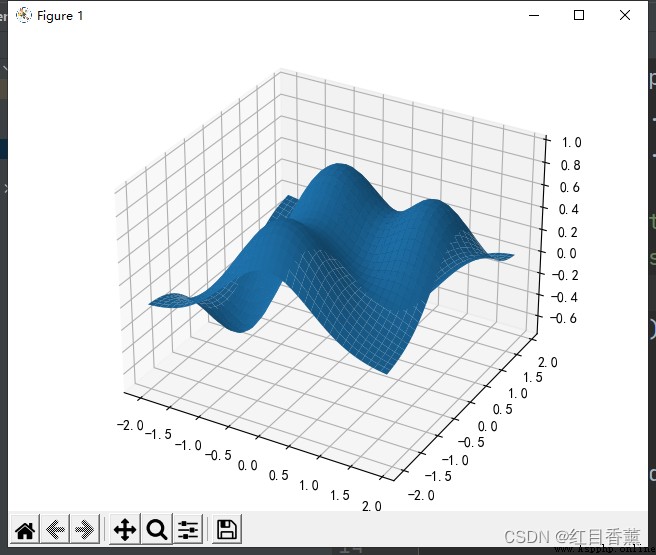
import numpy as np
import matplotlib.pyplot as plt
from mpl_toolkits.mplot3d import Axes3D
plt.rcParams['font.sans-serif'] = ['SimHei'] # Used to display Chinese labels normally
plt.rcParams['axes.unicode_minus'] = False # Used to display negative sign normally
fig = plt.figure() # Use figure object
ax = Axes3D(fig) # establish 3D Axis objects
X = np.arange(-2, 2, 0.1) # X Coordinate data
Y = np.arange(-2, 2, 0.1) # Y Coordinate data
X, Y = np.meshgrid(X, Y) # Calculation 3 Dimension surface grid coordinates
# Used to calculate X/Y Corresponding Z value
def f(x, y):
return (1 - y ** 5 + x ** 5) * np.exp(-x ** 2 - y ** 2)
# plot_surface() Function to draw the corresponding surface
ax.plot_surface(X, Y, f(X, Y), rstride=1, cstride=1)
plt.show() # The graphics
import numpy as np
import matplotlib.pyplot as plt
from mpl_toolkits.mplot3d import Axes3D
plt.rcParams['font.sans-serif'] = ['SimHei'] # Used to display Chinese labels normally
plt.rcParams['axes.unicode_minus'] = False # Used to display negative sign normally
xs = np.random.randint(30, 40, 100)
ys = np.random.randint(20, 30, 100)
zs = np.random.randint(10, 20, 100)
xs2 = np.random.randint(50, 60, 100)
ys2 = np.random.randint(30, 40, 100)
zs2 = np.random.randint(50, 70, 100)
xs3 = np.random.randint(10, 30, 100)
ys3 = np.random.randint(40, 50, 100)
zs3 = np.random.randint(40, 50, 100)
fig = plt.figure()
ax = Axes3D(fig)
ax.scatter(xs, ys, zs)
ax.scatter(xs2, ys2, zs2, c='r', marker='^')
ax.scatter(xs3, ys3, zs3, c='g', marker='*')
ax.set_xlabel('X label')
ax.set_ylabel('Y label')
ax.set_zlabel('Z label')
plt.show()

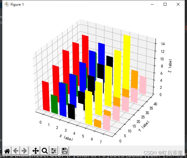
import numpy as np
import matplotlib.pyplot as plt
from mpl_toolkits.mplot3d import Axes3D
plt.rcParams['font.sans-serif'] = ['SimHei'] # Used to display Chinese labels normally
plt.rcParams['axes.unicode_minus'] = False # Used to display negative sign normally
x = np.arange(8)
y = np.random.randint(0, 10, 8)
y2 = y + np.random.randint(0, 3, 8)
y3 = y2 + np.random.randint(0, 3, 8)
y4 = y3 + np.random.randint(0, 3, 8)
y5 = y4 + np.random.randint(0, 3, 8)
clr = ['red', 'green', 'blue', 'black', 'white', 'yellow', 'orange', 'pink']
fig = plt.figure()
ax = Axes3D(fig)
ax.bar(x, y, 0, zdir='y', color=clr)
ax.bar(x, y2, 10, zdir='y', color=clr)
ax.bar(x, y3, 20, zdir='y', color=clr)
ax.bar(x, y4, 30, zdir='y', color=clr)
ax.bar(x, y5, 40, zdir='y', color=clr)
ax.set_xlabel('X label')
ax.set_ylabel('Y label')
ax.set_zlabel('Z label')
plt.show()