When we analyze data , If there is only a pile of data in front of you , You must look uncomfortable . It is better to change the data , Present through graphics , After realizing data visualization , We can be faster 、 More easily 、 Understand the data more clearly 、 Message conveyed .
Python In terms of data presentation , There are a lot of good tools , such as Matplotlib、Seaborn、Pygal etc. , Are popular feature packs . So let's see , How to display local data , And the data obtained from the network .
Visual view , Generally speaking, we can divide it into 4 Categories: , Namely :
frequently-used 10 Species view : Scatter plot 、 Broken line diagram 、 Histogram 、 Bar chart 、 The pie chart 、 Heat map 、 Box figure 、 Spiders 、 Binary variable distribution diagram 、 In pairs .
Open the terminal , Input pip install matplotlib Can be installed automatically .
If you want to see Matplotlib Developer documentation , Input python -m pydoc -p 8899 that will do , Visit after startup http://localhost:8899, stay .../site-packages Found under column matplotlib(package) Is it .
Have you seen the title again recently 「 The worst graduation season in history 」 My article ? Actually , It's written like this every year , Every year is the most difficult 、 The worst .
Actually , We can find the corresponding data , Draw it as a line chart , You can see the trend of the number of graduates .
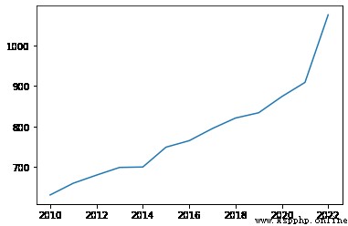
This is a 2010 year ~2022 Data of college graduates in ( Company : ten thousand ):
According to the data given above , Let's draw a line chart first , Let's see 2010 Year to 2022 The changing trend of the number of college graduates between . among , We X The axis is the year ,Y Number of people on axis , The code is as follows :
# Definition X Axis and Y Axis data
# among ,X The axis is the year ;Y The axis is the number of graduates ( Company : ten thousand )
xData = [2010,2011,2012,2013,2014,2015,2016,2017,2018,2019,2020,2021,2022]
yData = [631,660,680,699,700,749,765,795,821,834,874,909,1076]
# Parameters 1, Set the value of abscissa
# Parameters 2, Set the value of the vertical coordinate
plt.plot(xData, yData, xData, yData2)
# Show the image
plt.show()
Running results , As shown in the figure :
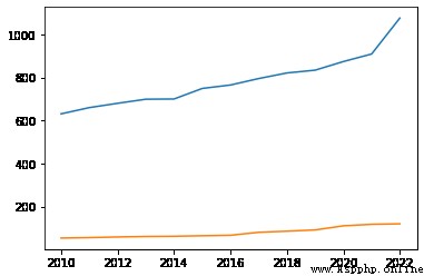
Well, if you say , I want to see if the number of graduate students has also increased so much , So exaggerated ? It's not hard , Pass in multiple delegates X Axis 、Y Just list the axis data , You can get a composite line chart .
The code is as follows :
# Definition X Axis and Y Axis data
# among ,X The axis is the year ;Y The axis is the number of graduates ( Company : ten thousand )
xData = [2010,2011,2012,2013,2014,2015,2016,2017,2018,2019,2020,2021,2022]
yData = [631,660,680,699,700,749,765,795,821,834,874,909,1076]
# Number of graduate students
yData2 = [53.82,56.02,58.97,61.14,62.13,64.51,66.71,80.61,85.8,91.65,110.66,117.65,120]
# Parameters 1, Set the value of abscissa
# Parameters 2, Set the value of the vertical coordinate
# Parameters 3, Set the value of the abscissa of the second polyline
# Parameters 4, Set the value of the vertical coordinate of the second polyline
plt.plot(xData, yData, xData, yData2)
# Show the image
plt.show()
Running results , As shown in the figure :
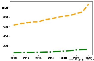
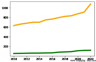
even to the extent that , You can also change the color of the broken line 、 thickness , It's also very simple. . such as , adopt color You can specify the corresponding color , adopt linewidth You can specify the thickness of the polyline , The code is as follows :
# adopt color You can specify the corresponding color
# adopt linewidth You can specify a thickness value
plt.plot(xData, yData, color='orange', linewidth=5.0)
plt.plot(xData, yData2, color='green', linewidth=5.0)
# Show the image
plt.show()
Running results , As shown in the figure :
If you don't like it 「 Solid line 」 Lines of , You can also pass linestyle To change the , There are four common types , Namely :
The first one is ,- Said solid line ( The default value is );
The second kind :-- Said the dotted line ;
The third kind of :: Represents an imaginary point ;
A fourth :-. Indicates a short line 、 The combination of points .
The code is as follows :
plt.plot(xData, yData, color='orange', linewidth=5.0, linestyle='--')
plt.plot(xData, yData2, color='green', linewidth=5.0, linestyle='-.')
# Show the image
plt.show()
Running results , As shown in the figure :