Import modules and load pictures
Extract colors and integrate them into a table
Charting
The actual combat
Today, let's share an interesting visualization technique , How to extract colors from a picture and draw a visual chart , As shown in the figure below
There are various colors in the sample photos , We will pass Python The visualization module and opencv Module to identify all the color elements in the picture , And add it to the color matching of the visual chart
Then by convention , The first step is usually to import modules , The modules used for visualization are matplotlib modular , We will extract the colors from the image and save them in the color mapping table , So we need to use colormap modular , You also need to import
import numpy as npimport pandas as pdimport matplotlib.pyplot as pltimport matplotlib.patches as patchesimport matplotlib.image as mpimgfrom PIL import Imagefrom matplotlib.offsetbox import OffsetImage, AnnotationBboximport cv2import extcolorsfrom colormap import rgb2hexThen let's load the image first , The code is as follows
input_name = 'test_1.png'img = plt.imread(input_name)plt.imshow(img)plt.axis('off')plt.show()output
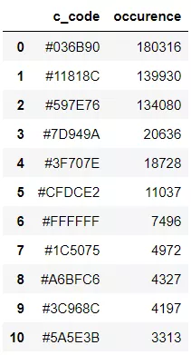
What we're calling is extcolors Module to extract colors from images , The output is zero RGB The color of the form , The code is as follows
colors_x = extcolors.extract_from_path(img_url, tolerance=12, limit = 12)colors_xoutput
([((3, 107, 144), 180316),
((17, 129, 140), 139930),
((89, 126, 118), 134080),
((125, 148, 154), 20636),
((63, 112, 126), 18728),
((207, 220, 226), 11037),
((255, 255, 255), 7496),
((28, 80, 117), 4972),
((166, 191, 198), 4327),
((60, 150, 140), 4197),
((90, 94, 59), 3313),
((56, 66, 39), 1669)],
538200)
We integrate the above results into a DataFrame Data sets , The code is as follows
def color_to_df(input_color): colors_pre_list = str(input_color).replace('([(', '').split(', (')[0:-1] df_rgb = [i.split('), ')[0] + ')' for i in colors_pre_list] df_percent = [i.split('), ')[1].replace(')', '') for i in colors_pre_list] # take RGB Convert to hex color df_color_up = [rgb2hex(int(i.split(", ")[0].replace("(", "")), int(i.split(", ")[1]), int(i.split(", ")[2].replace(")", ""))) for i in df_rgb] df = pd.DataFrame(zip(df_color_up, df_percent), columns=['c_code', 'occurence']) return df We try to call our custom function above , Output results to DataFrame In the dataset
df_color = color_to_df(colors_x)df_coloroutput
The next step is to draw the chart , What is used is matplotlib modular , The code is as follows
fig, ax = plt.subplots(figsize=(90,90),dpi=10)wedges, text = ax.pie(list_precent, labels= text_c, labeldistance= 1.05, colors = list_color, textprops={'fontsize': 120, 'color':'black'} )plt.setp(wedges, width=0.3)ax.set_aspect("equal")fig.set_facecolor('white')plt.show()output
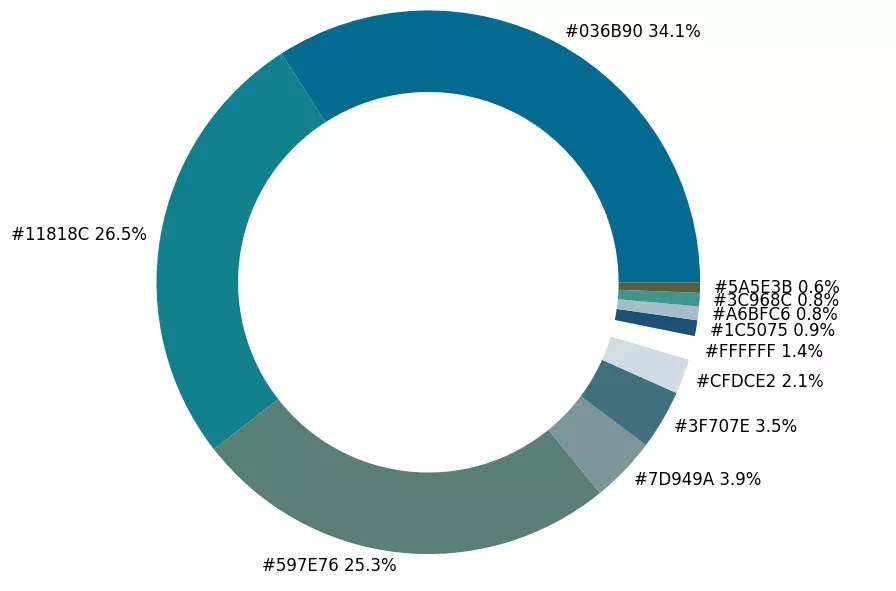
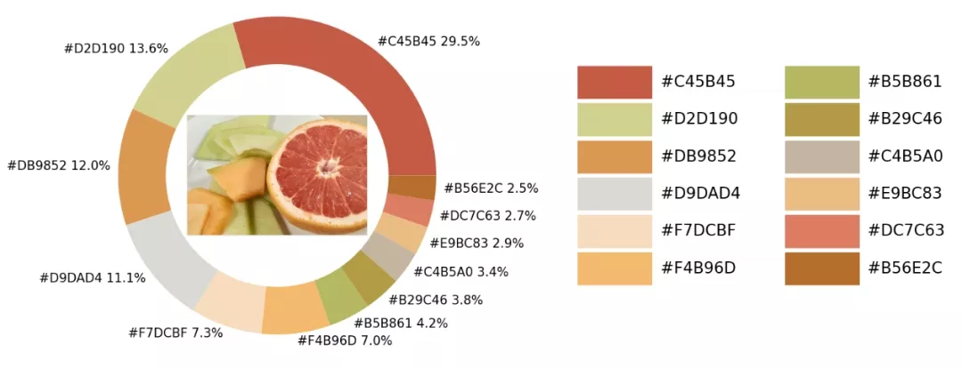
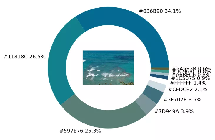
The pie chart shows the proportion of each different color , Let's go a step further and place the original image in the circle ,
imagebox = OffsetImage(img, zoom=2.3)ab = AnnotationBbox(imagebox, (0, 0))ax1.add_artist(ab)output
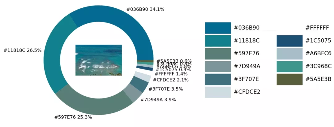
Finally, make a palette , List the different colors in the original picture , The code is as follows
## Palette x_posi, y_posi, y_posi2 = 160, -170, -170for c in list_color: if list_color.index(c) <= 5: y_posi += 180 rect = patches.Rectangle((x_posi, y_posi), 360, 160, facecolor = c) ax2.add_patch(rect) ax2.text(x = x_posi+400, y = y_posi+100, s = c, fontdict={'fontsize': 190}) else: y_posi2 += 180 rect = patches.Rectangle((x_posi + 1000, y_posi2), 360, 160, facecolor = c) ax2.add_artist(rect) ax2.text(x = x_posi+1400, y = y_posi2+100, s = c, fontdict={'fontsize': 190})ax2.axis('off')fig.set_facecolor('white')plt.imshow(bg) plt.tight_layout()output
This is the actual combat link , We encapsulate all the above code into a complete function
def exact_color(input_image, resize, tolerance, zoom): output_width = resize img = Image.open(input_image) if img.size[0] >= resize: wpercent = (output_width/float(img.size[0])) hsize = int((float(img.size[1])*float(wpercent))) img = img.resize((output_width,hsize), Image.ANTIALIAS) resize_name = 'resize_'+ input_image img.save(resize_name) else: resize_name = input_image fig.set_facecolor('white') ax2.axis('off') bg = plt.imread('bg.png') plt.imshow(bg) plt.tight_layout() return plt.show()exact_color('test_2.png', 900, 12, 2.5)output
That's all Python Realize the detailed content of extracting the color in the picture and drawing a visual chart , More about Python Please pay attention to other relevant articles on software development network for information about extracting image colors !