1. The basic steps of drawing
1.1 Step by step
2. Scatter plot
3. Drawing a bar chart
4. Drawing of four subgraphs
5. Drawing of pie chart
6. Drawing of thermal diagram
summary
plt Is the most commonly used interface
1. The basic steps of drawing1. The import module
import matplotlib as mplimport matplotlib.pyplot as plt2. Create a palette , Then adjust the drawing board
3. Defining data
4. Drawing graphics ( Including the setting of coordinate axis , Data import , Style of line , Color , And the title , legend , wait )
5.plt.show()
1.1 Step by step1.1.1**( One ) First step : Create and define a " Drawing board "**( You will draw on the drawing board you define ).
fig=plt.figure()# Define a drawing board and name it figstay plt.figure() There are also some parameters in brackets
for example :
huaban=plt.figure(figsize=(6,10),facecolor='b',dpi=500)#figsize Is to adjust the scale of your image , As shown above : Long / wide =6/10#facecolor Is to set the background color of the drawing board , Generally, the color code is the first letter of English #dpi Set the resolution of the image , The higher the resolution, the clearer the image #edgcolor It is a parameter for setting the border color 1.1.2**( Two ). The second step : Define your x,y data **
Here we use numpy Library functions to produce some data
So we have to import numpy function
import numpy as np# Set up xy Value x=np.linspace(-5,5,11)# Here is the -5 To 5 Divide it into eleven shares on average ,(-5,-4,-3,.....)y=[1,6,3,-3,6,8,3,6,9,1,-5]1.1.3**( 3、 ... and ). The third step : Set up x,y The size of the shaft , scale ,…**
# add to p1 To the sketchpad p1=fig.add_subplot(111)# there 111 It refers to dividing the drawing board into rows and columns , hold p1 Add to the first picture # Limit the length of the function axis p1.axis([-5,5,-10,10])#x The length of the shaft is -5 To 5,y The length of the shaft is -10 To 10# Set up x,y Axis scale plt.xticks(x)plt.yticks(y)# Here means :x,y The scale of the axis is defined previously x,y Data list # Set the upper and lower limits of the coordinate axis plt.xlim(-5,5)plt.ylim(-10,10)1.1.4( Four ). The plot , Import x,y data , Set line style , Color , thickness , Add legend , title …
# The plot p1.plot(x,y,marker='o',ms=5,lw=2,ls='--',label='band')#x,y It is the data defined at the beginning #marker Set inflection point style :o/h/^/./+ wait #ms Is the mark size for setting the inflection point #lw Is to set the line thickness , The larger the number, the thicker the line #ls Is to set the line style , here '--' It's a dotted line #label Is to set the name and title of this line p1.legend(loc='best')# Add legend , among best It refers to adding the position of the legend to the best position ,# You can also set the location yourself , for example :upper left( top left corner )# Add the title plt.title('NUM',fontsize=24)# Set the title of the image ,fontsize Is to set the size of the title text plt.xlabel('Value',fontsize=14)# Set up x The title of the axis plt.ylabel('ARG',fontsize=14)# Set up y The title of the axis Now it is basically set , Because I draw pictures in the script , So I need to add one at the end of the code :plt.show(), It will automatically enable an event loop , And find all currently available drawing objects , Then open an interactive window to display the graphics .
1.1.5 The complete code above ( There are some details added ):
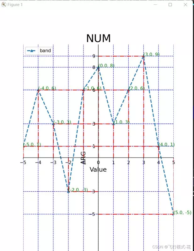
import matplotlib.pyplot as pltimport numpy as np# Set up xy Value x=np.linspace(-5,5,11)y=[1,6,3,-3,6,8,3,6,9,1,-5]# Create a drawing board huaban=plt.figure(figsize=(6,10))# add to p1 To the sketchpad p1=huaban.add_subplot(111)# Limit the length of the function axis p1.axis([-5,5,-10,10])# Set up x,y Axis scale plt.xticks(x)plt.yticks(y)# Remove the right border p1.spines['right'].set_color('none')# Remove the top border p1.spines['top'].set_color('none')# The following two lines of code will xy The intersection of axes is changed to (0,0)p1.spines['bottom'].set_position(('data',0))p1.spines['left'].set_position(('data',0))# The plot p1.plot(x,y,marker='^',ms=5,lw=2,ls='--',label='band')p1.legend(loc='upper left')# Add the title plt.title('NUM',fontsize=24)plt.xlabel('Value',fontsize=14)plt.ylabel('ARG',fontsize=14)# Add auxiliary dotted line for i in range(len(x)): x1=[x[i],x[i]] y1=[0,y[i]] plt.plot(x1,y1,'r-.')for i in range(len(x)): x2=[0,x[i]] y2=[y[i],y[i]] p1.plot(x2,y2,'r-.')# Add the coordinates of each break point for i in range(len(x)): p1.text(x[i],y[i],(x[i],y[i]),c='green')plt.grid(c='b',ls='--')# This function is the function of generating grid plt.show()Output results :
In fact, most of the syntax of the scatter diagram is similar to the above , Just put the plt.polt() Change it to plt.scatter()
Here we only need to draw a picture as an example , Just omit the steps of creating a Sketchpad , The steps of creating a Sketchpad will be useful later .
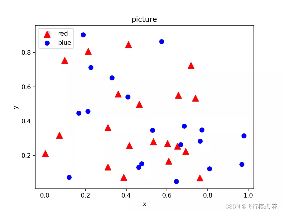
import numpy as npimport matplotlib.pyplot as plt# Randomly generate some data N=20x=np.random.rand(N)y=np.random.rand(N)x1=np.random.rand(N)y1=np.random.rand(N)plt.scatter(x,y,s=100,c='red',marker='^',label='red')#c yes color For short , Set the color plt.legend(loc='best')plt.scatter(x1,y1,s=50,c='blue',marker='o',label='blue')plt.legend(loc='upper left')# Add a legend in the upper left corner plt.xlabel('x')# Label abscissa plt.ylabel('y')# Label the ordinates plt.title('picture')# Label the image plt.show()# Display images Output results :
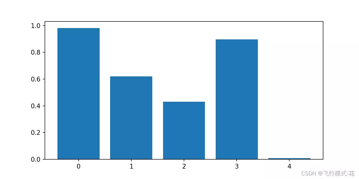
Use plt.bar() Drawing
import numpy as npimport matplotlib.pyplot as pltx=[1,2,3,4,5]y=np.random.rand(5)plt.figure(figsize=(8,4))plt.bar(x,y)x_t=list(range(len(x)))plt.xticks(x,x_t)plt.show()Output results :
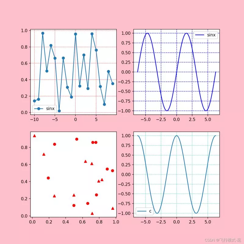
To draw a subgraph, you need to create a Sketchpad , Then divide the drawing board , Then draw different images at the separated positions .
The point is here :
p1 = huaban.add_subplot(221)p2=huaban.add_subplot(222)p3=huaban.add_subplot(223)p4=huaban.add_subplot(224)# These numbers mean , Divide the drawing board into two rows and two columns , Four positions , then p1 In position 1,p2 In position 2,p3 In position 3.......import numpy as npimport matplotlib.pyplot as pltx=range(-10,10,1)y=np.random.rand(20)huaban=plt.figure(facecolor='pink',figsize=(8,8),dpi=100)p1 = huaban.add_subplot(221)p1.plot(x,y,label="sinx",marker='o')plt.legend(loc='best')plt.grid(c='r',linestyle=':')p2=huaban.add_subplot(222)x1=np.linspace(-np.pi*2,np.pi*2,1000)y1=np.sin(x1)p2.plot(x1,y1,label="sinx",color='blue')plt.legend(loc='best')plt.grid(c='b',linestyle='--')p3=huaban.add_subplot(223)x2=np.random.rand(10)y2=np.random.rand(10)x3=np.random.rand(10)y3=np.random.rand(10)p3.scatter(x2,y2,c='red',marker='o',label=" Scatter plot ")p3.scatter(x3,y3,c='red',marker='^',label=" scattered 1")p4=huaban.add_subplot(2,2,4)p4.plot(x1,np.cos(x1),label="cosx")plt.legend('best')plt.grid(c='c',linestyle=':')plt.show()Output results :
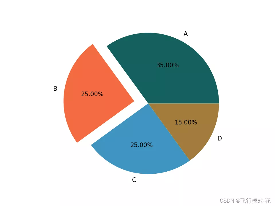
import matplotlib.pyplot as pltx=[35,25,25,15]colors=["#14615E", "#F46C40", "#3E95C0", "#A17D3B"]name=['A','B','C','D']label=['35.00%','25.00%','25.00%','15.00%']huaban=plt.figure()p1=huaban.add_subplot(111)p1.pie(x,labels=name,colors=colors,autopct='%1.2f%%',explode = (0, 0.2, 0, 0))plt.axis('equal')plt.show()Output results :
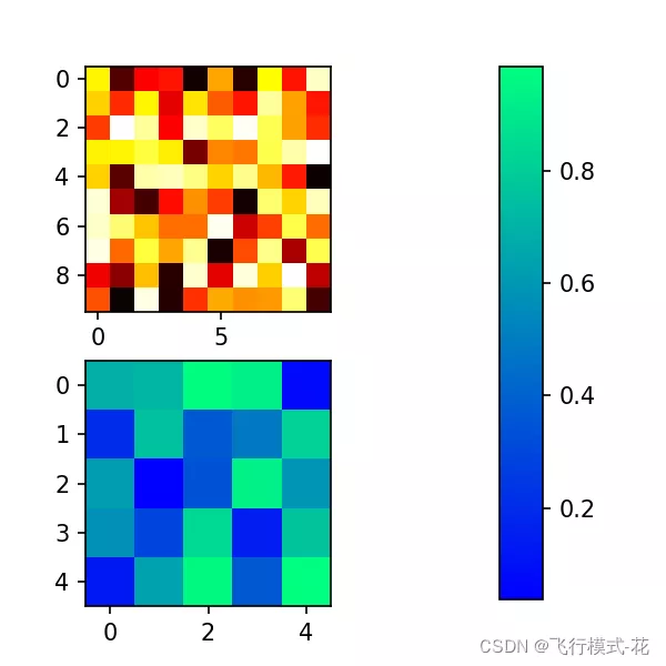
import matplotlib.pyplot as pltimport numpy as npplt.figure(figsize=(4,4))# Fixing random state for reproducibility#np.random.seed(19680801)# Create subgraphs 1plt.subplot(211)plt.imshow(np.random.random((10, 10)), cmap="hot")# Create subgraphs 2plt.subplot(212)plt.imshow(np.random.random((5, 5)), cmap="winter")plt.subplots_adjust(bottom=0.09, right=0.5, top=0.9)cax = plt.axes([0.75, 0.1, 0.065, 0.8])plt.colorbar(cax=cax)plt.show()Output results :
This is about Python Matplotlib That's all for the article on drawing basics , More about Python Matplotlib Please search the previous articles of SDN or continue to browse the relevant articles below. I hope you will support SDN more in the future !