Bowen author wangzirui32
Like can give the thumbs-up Collection Pay attention to ~~
My number 162 An original work
This article was first published in CSDN, Reprint is prohibited without permissionhello, Hello everyone , I am a wangzirui32, Today we are going to learn how to analyze and forecast the GDP , Start learning !
The data covers 2010-2021 Gross domestic product csv file , come from National bureau of statistics Official data :
Select the time in turn (2010-2021), download CSV file , Named as 2010.csv,2011.csv( year +.csv), give the result as follows :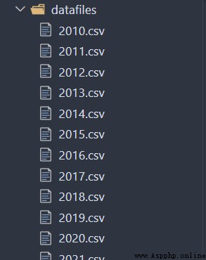
2010 The contents of the data file for the year are as follows :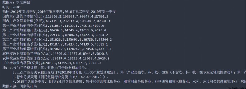
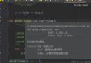
You can see , The real data is in the... Of the file 3 From the beginning of the line to the penultimate 6 That's ok , We need to extract the data , And carry out gbk Encoding conversion ( The source file is gbk code , Demand is UTF8 code ), Put the data file into datafiles In the folder , Then create a directory on the upper level of this directory Python file collate_data.py, Write code :
import os
import codecs
for i in os.listdir("datafiles"):
path = "datafiles/{}".format(i)
try:
# Put the data file gbk Code to utf-8
with codecs.open(path, "rb", "gb2312") as f:
content = f.read()
with codecs.open(path, "wb", "utf-8") as f:
f.write(content)
except: pass
# The introduction information of the data file is removed
with codecs.open(path, "rb", "utf-8") as f:
new_content = f.readlines()[2:-5]
with codecs.open(path, "wb", "utf-8") as f:
f.writelines(new_content)
Execute this code , The data is cleaned .
With the help of pandas Reading data ,matplotlib Draw statistical chart for analysis , Install library command :
pip install pandas matplotlib
The code is as follows :
import pandas
import matplotlib
import matplotlib.pyplot as plt
import os
# Extract the data
gdp_Q1 = [] # first quarter gdp
gdp_Q2 = [] # The second quarter gdp
gdp_Q3 = [] # The third quarter gdp
gdp_Q4 = [] # In the fourth quarter gdp
gdp_all_year = [] # Throughout the year gdp
years = [] # All years
# Solve the Chinese garbled code
matplotlib.rcParams['font.family'] = 'SimHei'
plt.rcParams['axes.unicode_minus'] = False
# Read the data in each file
for filename in os.listdir("datafiles"):
year = filename.split(".")[0]
path = "datafiles/{}".format(filename)
df = pandas.read_csv(path)
df.columns = [' indicators ',' In the fourth quarter ', ' The third quarter ', ' The second quarter ', ' first quarter ']
gdp_Q1.append(df[' first quarter '][0])
gdp_Q2.append(df[' The second quarter '][0])
gdp_Q3.append(df[' The third quarter '][0])
gdp_Q4.append(df[' In the fourth quarter '][0])
gdp_all_year.append(df[' In the fourth quarter '][1])
years.append(year)
# Draw a statistical chart
Q1_line, = plt.plot(years, gdp_Q1, color="blue")
Q2_line, = plt.plot(years, gdp_Q2, color="pink")
Q3_line, = plt.plot(years, gdp_Q3, color="green")
Q4_line, = plt.plot(years, gdp_Q4, color="orange")
all_year_line, = plt.plot(years, gdp_all_year, color="red")
plt.title("2010-2021 GDP analysis and forecast ")
plt.xlabel(" year ")
plt.ylabel(" GDP ( One hundred million yuan )")
plt.xticks(years)
plt.legend([Q1_line, Q2_line, Q3_line, Q4_line, all_year_line],
[' first quarter ',' The second quarter ', ' The third quarter ', ' In the fourth quarter ', ' Annual total value '],
loc='upper right')
plt.show()
The effect is as follows :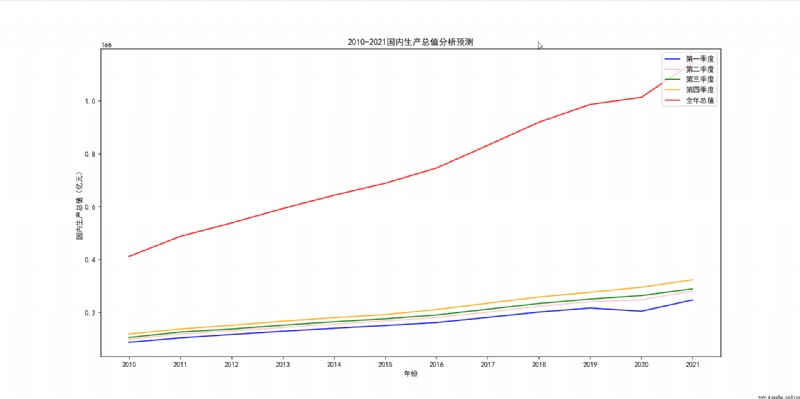
The code is as follows :
import pandas
import matplotlib
import matplotlib.pyplot as plt
import os
# Extract the data
gdp_all_year = [] # Throughout the year gdp
years = [] # All years
# Solve the Chinese garbled code
matplotlib.rcParams['font.family'] = 'SimHei'
plt.rcParams['axes.unicode_minus'] = False
# Read the data in each file
for filename in os.listdir("datafiles"):
year = filename.split(".")[0]
path = "datafiles/{}".format(filename)
df = pandas.read_csv(path)
df.columns = [' indicators ',' In the fourth quarter ', ' The third quarter ', ' The second quarter ', ' first quarter ']
gdp_all_year.append(df[' In the fourth quarter '][1])
years.append(year)
# Draw a statistical chart
plt.bar(years, gdp_all_year, width=0.5, label="numbers")
all_year_line, = plt.plot(years, gdp_all_year, color="red")
plt.title("2010-2021 GDP analysis ", loc="center")
plt.xlabel(" year ", fontsize=14)
plt.ylabel(" GDP ( One hundred million yuan )", fontsize=14)
plt.show()
The effect is as follows :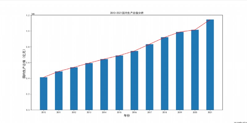
You can see ,2020 Because of the epidemic , The gross domestic product has declined , But in recent years, the overall situation is still on the rise .
We will use sklearn Machine learning library to fit linear regression equation , Its installation command is as follows :
pip install scikit-learn
Ideas as follows , We use sklearn Library fitting linear regression equation , By the end of 1 Quarter as a parameter , The equation that generates the prediction , The code is as follows :
import pandas
import matplotlib
import matplotlib.pyplot as plt
import os
from sklearn import linear_model
# Extract the data
gdp_Q1 = [] # first quarter gdp
gdp_Q2 = [] # The second quarter gdp
gdp_all_year = [] # Throughout the year gdp
years = [] # All years
# Solve the Chinese garbled code
matplotlib.rcParams['font.family'] = 'SimHei'
plt.rcParams['axes.unicode_minus'] = False
# Read the data in each file
for filename in os.listdir("datafiles"):
year = filename.split(".")[0]
path = "datafiles/{}".format(filename)
df = pandas.read_csv(path)
df.columns = [' indicators ',' In the fourth quarter ', ' The third quarter ', ' The second quarter ', ' first quarter ']
gdp_Q1.append(df[' first quarter '][0])
gdp_Q2.append(df[' The second quarter '][0])
gdp_all_year.append(df[' In the fourth quarter '][1])
years.append(year)
# Draw a statistical chart
Q1_line, = plt.plot(years, gdp_Q1, color="blue")
Q2_line, = plt.plot(years, gdp_Q2, color="pink")
all_year_line, = plt.plot(years, gdp_all_year, color="red")
plt.title("2010-2021 GDP analysis and forecast ")
plt.xlabel(" year ")
plt.ylabel(" GDP ( One hundred million yuan )")
plt.xticks(years)
# Formulate the equation
# Create a linear regression model
model = linear_model.LinearRegression()
model.fit(list(zip(gdp_Q1)), gdp_all_year)
# Acquisition coefficient
coef = model.coef_
# Acquisition intercept
intercept = model.intercept_
# equation
equation = "y = x*{} + {}".format(coef[0], intercept)
print(" Linear regression equation :", equation)
# Calculate equation data
forecast_value = [i*coef[0]+intercept for i in gdp_Q1]
# Draw equation polyline
forecast_line, = plt.plot(years, forecast_value, color="green")
plt.legend([Q1_line, Q2_line, all_year_line, forecast_line],
[' first quarter ',' The second quarter ', ' Annual total value ', ' Equation simulation '],
loc='upper right')
plt.show()
The effect is as follows :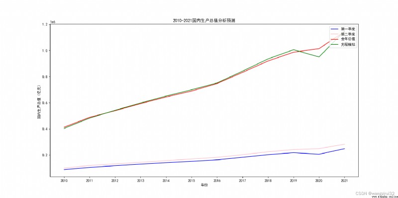
You can see , Equation basic fitting curve , But because 2020 The GDP fell in the first quarter of the year , Furthermore, the predicted annual data also produced a large gap , So what do we do ?
We can take the first 1,2 Quarter as a parameter , The code is as follows :
import pandas
import matplotlib
import matplotlib.pyplot as plt
import os
from sklearn import linear_model
# Extract the data
gdp_Q1 = [] # first quarter gdp
gdp_Q2 = [] # The second quarter gdp
gdp_all_year = [] # Throughout the year gdp
years = [] # All years
# Solve the Chinese garbled code
matplotlib.rcParams['font.family'] = 'SimHei'
plt.rcParams['axes.unicode_minus'] = False
# Read the data in each file
for filename in os.listdir("datafiles"):
year = filename.split(".")[0]
path = "datafiles/{}".format(filename)
df = pandas.read_csv(path)
df.columns = [' indicators ',' In the fourth quarter ', ' The third quarter ', ' The second quarter ', ' first quarter ']
gdp_Q1.append(df[' first quarter '][0])
gdp_Q2.append(df[' The second quarter '][0])
gdp_all_year.append(df[' In the fourth quarter '][1])
years.append(year)
# Draw a statistical chart
Q1_line, = plt.plot(years, gdp_Q1, color="blue")
Q2_line, = plt.plot(years, gdp_Q2, color="pink")
all_year_line, = plt.plot(years, gdp_all_year, color="red")
plt.title("2010-2021 GDP analysis and forecast ")
plt.xlabel(" year ")
plt.ylabel(" GDP ( One hundred million yuan )")
plt.xticks(years)
# Formulate the equation
model = linear_model.LinearRegression()
model.fit(list(zip(gdp_Q1, gdp_Q2)), gdp_all_year)
coef = model.coef_
intercept = model.intercept_
equation = "y = x1*{} + x2*{} + {}".format(coef[0], coef[1], intercept)
print(" Linear regression equation :", equation)
# Calculate the predicted results
forecast_value = [i[0]*coef[0]+i[1]*coef[1]+intercept for i in list(zip(gdp_Q1, gdp_Q2))]
forecast_line, = plt.plot(years, forecast_value, color="green")
plt.legend([Q1_line, Q2_line, all_year_line, forecast_line],
[' first quarter ',' The second quarter ', ' Annual total value ', ' Equation simulation '],
loc='upper right')
plt.show()
The effect is as follows :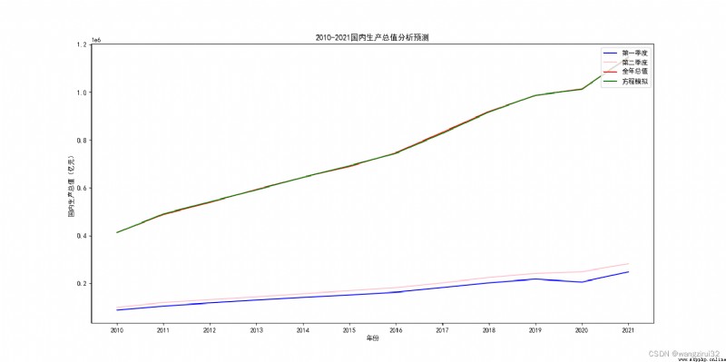
You can see , The fitting result of this equation is very good , It can be used as a prediction equation .
The linear regression equation is :
y = x1*0.20405068090604006 + x2*3.8656156020304238 + 9671.424027125235
Equivalent to :
GDP = GDP in the first quarter *0.20405068090604006 + GDP in the second quarter *3.8656156020304238 + 9671.424027125235
This completes the whole process of analysis and prediction .
Okay , That's all for today's lesson , I am a wangzirui32, You can collect and pay attention to what you like , See you next time !