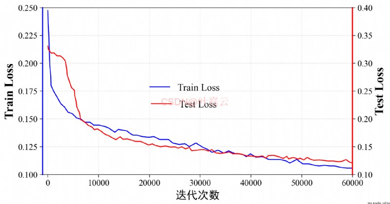
When visualizing the drawing , Sometimes you need to A few curves In the same diagram , But the range of these curve values is different , Different scales are required . If you use the same Y Axis scale , The curve change with small value will not be obvious ( Such as deep learning, training and testing Loss change ). Let's take the loss function change of a deep learning model training as an example , Beautifully painted double Y Axis line chart visualization , Explain the code implementation process , The result comes out first :
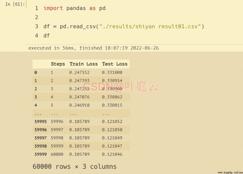
Read the recorded data :
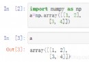
import pandas as pd
df = pd.read_csv("./results/shiyan result01.csv")
df
Visual double Y Axonometric chart :
from mpl_toolkits