One 、 Draw a scatter chart with a trend line
Two 、 Draw edge histogram
One 、 Draw a scatter chart with a trend lineRealization function :
Add a trend line to the scatter chart ( Linear fitting line ) Reflect that the two variables are positively correlated 、 Negative or no correlation .
Implementation code :
import pandas as pdimport matplotlib as mplimport matplotlib.pyplot as pltimport seaborn as snsimport warningswarnings.filterwarnings(action='once')plt.style.use('seaborn-whitegrid')sns.set_style("whitegrid")print(mpl.__version__)print(sns.__version__)def draw_scatter(file): # Import Data df = pd.read_csv(file) df_select = df.loc[df.cyl.isin([4, 8]), :] # Plot gridobj = sns.lmplot( x="displ", y="hwy", hue="cyl", data=df_select, height=7, aspect=1.6, palette='Set1', scatter_kws=dict(s=60, linewidths=.7, edgecolors='black')) # Decorations sns.set(, font_scale=1.5) gridobj.set(xlim=(0.5, 7.5), ylim=(10, 50)) gridobj.fig.set_size_inches(10, 6) plt.tight_layout() plt.title("Scatterplot with line of best fit grouped by number of cylinders") plt.show()draw_scatter("F:\ Data Arena \datasets\mpg_ggplot2.csv")Realization effect :
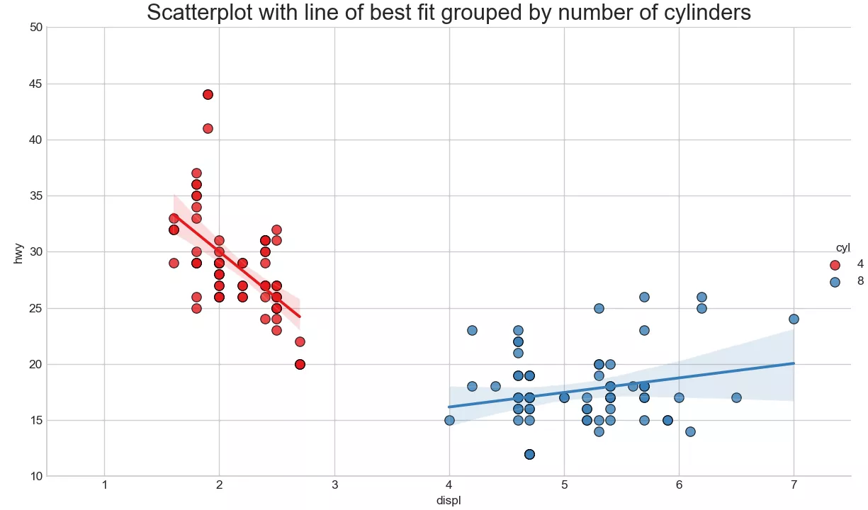
Add a trend line to the scatter chart ( Linear fitting line ) Reflect that the two variables are positively correlated 、 Negative or no correlation . The best linear fitting line is drawn for the red and blue data respectively .
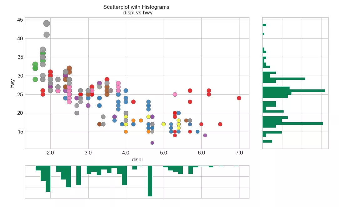
Two 、 Draw edge histogramRealization function :
python Draw edge histogram , For display X and Y The relationship between 、 And X and Y Univariate distribution of , It is often used for data exploration and analysis .
Implementation code :
import pandas as pdimport matplotlib as mplimport matplotlib.pyplot as pltimport seaborn as snsimport warningswarnings.filterwarnings(action='once')plt.style.use('seaborn-whitegrid')sns.set_style("whitegrid")print(mpl.__version__)print(sns.__version__)def draw_Marginal_Histogram(file): # Import Data df = pd.read_csv(file) # Create Fig and gridspec fig = plt.figure(figsize=(10, 6), dpi=100) grid = plt.GridSpec(4, 4, hspace=0.5, wspace=0.2) # Define the axes ax_main = fig.add_subplot(grid[:-1, :-1]) ax_right = fig.add_subplot(grid[:-1, -1], xticklabels=[], yticklabels=[]) ax_bottom = fig.add_subplot(grid[-1, 0:-1], xticklabels=[], yticklabels=[]) # Scatterplot on main ax ax_main.scatter('displ', 'hwy', s=df.cty * 4, c=df.manufacturer.astype('category').cat.codes, alpha=.9, data=df, cmap="Set1", edgecolors='gray', linewidths=.5) # histogram on the right ax_bottom.hist(df.displ, 40, histtype='stepfilled', orientation='vertical', color='#098154') ax_bottom.invert_yaxis() # histogram in the bottom ax_right.hist(df.hwy, 40, histtype='stepfilled', orientation='horizontal', color='#098154') # Decorations ax_main.set(title='Scatterplot with Histograms \n displ vs hwy', xlabel='displ', ylabel='hwy') ax_main.title.set_fontsize(10) for item in ([ax_main.xaxis.label, ax_main.yaxis.label] + ax_main.get_xticklabels() + ax_main.get_yticklabels()): item.set_fontsize(10) xlabels = ax_main.get_xticks().tolist() ax_main.set_xticklabels(xlabels) plt.show()draw_Marginal_Histogram("F:\ Data Arena \datasets\mpg_ggplot2.csv")Realization effect :
This is about python This is the end of the article on visual analysis and drawing of scatter chart and edge histogram with trend line , More about python Please search the previous articles of SDN or continue to browse the related articles below. I hope you will support SDN more in the future !