Catalog
Seaborn Introduce
Seaborn install
Official documents
Seaborn Drawing style
sns.axes_style
sns.set_style()
sns.set
sns.despine
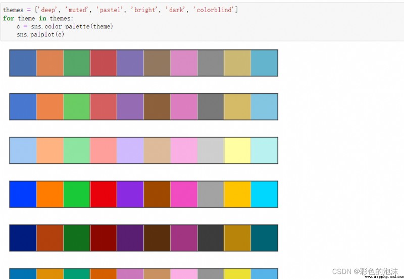
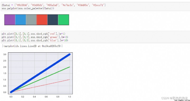
Seaborn Color style
Seaborn stay Axes mapping
Seaborn mapping
Relational drawing
seaborn.relplot()
Basic use
hun Parameters
add to col and row Parameters
Draw line chart
Classification drawing
Classified scatter plot
Classification map
Classified statistical chart
Bar chart
Bar charts
Point line diagram
Distribution plot
Univariate distribution
Bivariate distribution
pairplot
Linear regression plot
Add
Heat map and EDA Exploratory analysis
Seaborn It's based on matplotlib And the data structure is similar to pandas Unified statistical map making library . He has defined his own style in advance . Then it also encapsulates a series of convenient drawing functions , Passed before matplotlib It takes a lot of code to implement the completed diagram , Use seaborn It could be very simple , One line of code .
1. adopt pip:pip install seaborn;
2. adopt anaconda:conda install seaborn;
Official website :seaborn: statistical data visualization — seaborn 0.11.2 documentation (pydata.org) http://seaborn.pydata.org/
Chinese learning document :
An introduction to seaborn-Seaborn 0.9 Chinese document (cntofu.com)https://www.cntofu.com/book/172/docs/1.md
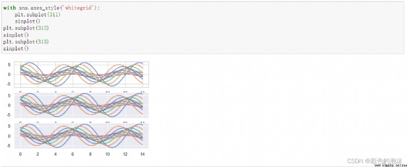
stay seaborn in , You can set the style through three functions . Namely sns.set_style;sns.axes_style;sns.set Method .
(1) If no parameters are passed , The field properties are returned ;
(2) Temporary style ;
with sns.axes_style("dark",{"ytick.left":True}):
sns.scatterplot(x="total_bill",y="tip",data=tips)
for example :
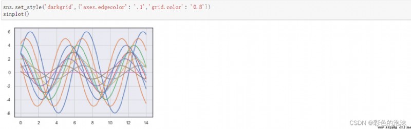
The sum of this function sns.axes_style equally , It is also used to set the drawing style . But the style setting of this function , It's not temporary , But once set , Then all the following drawing styles will use this style .
sns.set_style("darkgrid")
sns.scatterplot(x="total_bill",y="tip",data=tips)
for example :
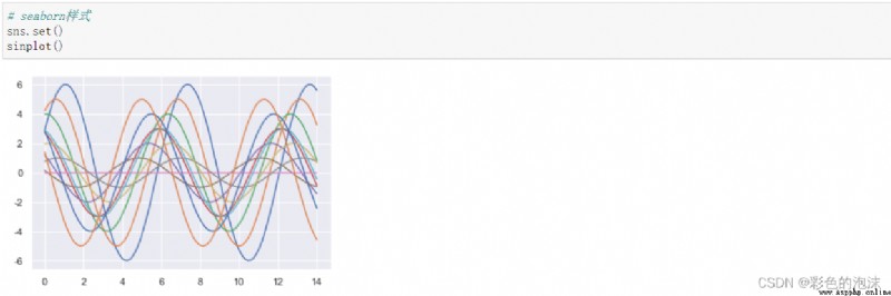
set Method is also used to set the style , It's more powerful . except style outside , You can also set the color palette , typeface , font size , Color, etc. , You can also set other matplotlib.rcParams Acceptable parameters .
sns.set(rc={"lines.linewidth":4})
fmri = sns.load_dataset("fmri")
sns.lineplot(x="timepoint",y="signal",data=fmri)
for example :
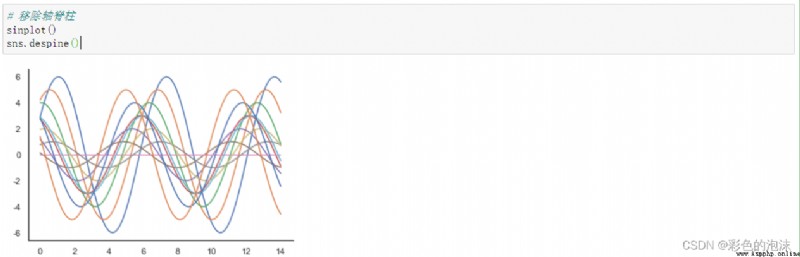
Remove axis spine function ;
for example :
It is not recommended to use ( It's not very convenient to use ) Not too much description here .
example :
actually seaborn There are also a lot of direct use in the drawing function of Axes For drawing , The type of the graph has been specified in the function name , This kind of diagram uses Axes Drawn . such as sns.scatterplot,sns.lineplot,sns.barplot etc. .Axes Drawing can be used directly before matplotlib Some elements of the setup diagram .
fig,ax = plt.subplots(1,2,figsize=(20,5))
sns.scatterplot(x="total_bill",y="tip",data=tips,ax=ax[0])
sns.barplot(x="day",y="total_bill",data=tips,ax=ax[1])
For example, draw a bar chart
Draw a scatter plot
This function is very powerful , It can be used to represent the relationship between multiple variables . By default, scatter plots are drawn , You can also draw a line diagram , What graphics are drawn through kind Parameters . In fact, the next two functions are relplot The special case of :
Scatter type :scatterplot -> relplot(kind="scatter");
Linear type :lineplot -> replot(kind="line");
import seaborn as sns
tips = sns.load_dataset("tips",cache=True)
sns.relplot(x="total_bill",y="tip",data=tips)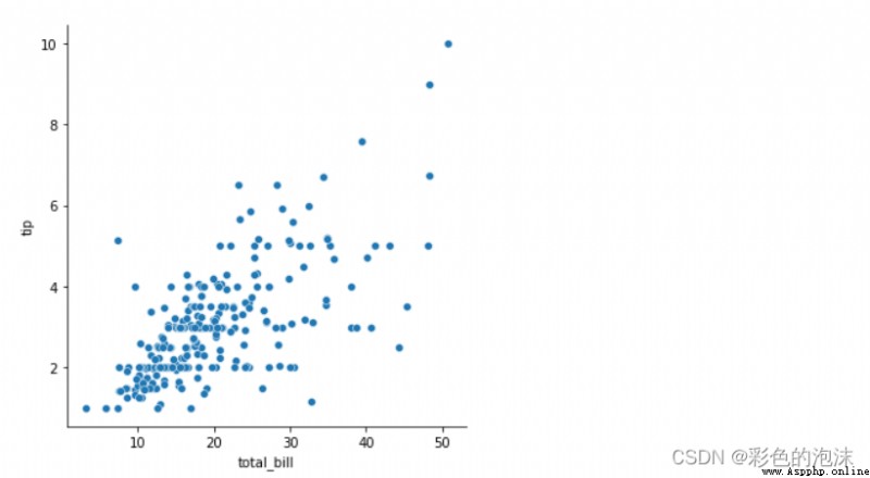
hue Parameter is used to control the color display of the third variable . For example, on the basis of the above figure, we show the parameter of the day of the week , Then it can be realized through the following code :
sns.relplot(x="total_bill",y="tip",hue="day",data=tips)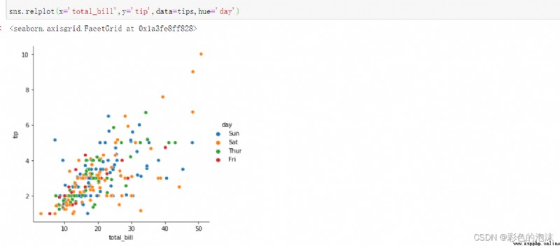
col and row , The graph can be divided into multiple columns or rows according to the number of values of a certain attribute . For example, on the basis of the above figure, we want to put lunch and dinner Split into two figures to show , be :
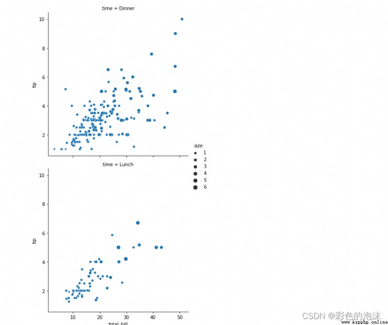
# col_wrap=1 Control line feed
# size Size of points
sns.relplot(x='total_bill',y='tip',data=tips,col='time',col_wrap=1,size="size")
sns.relplot(x='total_bill',y='tip',data=tips,col='time')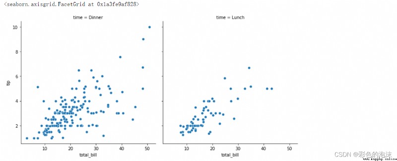
relplot By setting kind="line" You can draw a line chart . And its functional ratio is plt.plot More powerful .plot Only specific... Can be specified x Axis and y Axis of the data . and relplot You can automatically calculate and plot in two groups of data .
"""
demand :signal And timepoint Changing relationships --- > Broken line diagram
Image Reading
Line --- mean value
shadow --- confidence interval
ci=None
style:region Different areas use different line styles
"""
sns.relplot(x='timepoint',y='signal',data=fmri,kind='line',ci=None,hue="region",col="event",)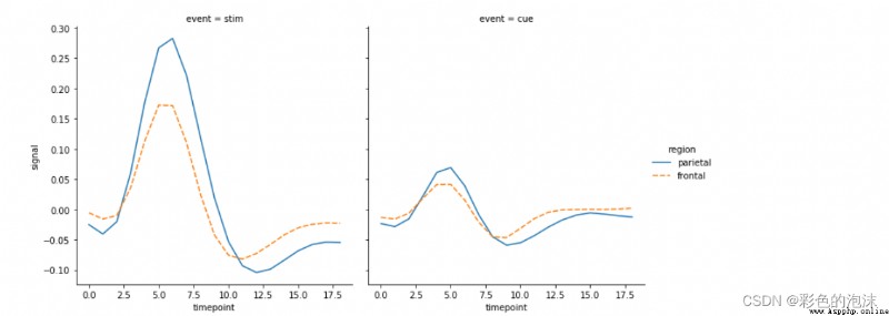
Drawing of classification map , It's using sns.catplot To achieve .cat yes category Abbreviation , By default, this method draws Classified scatter plot , If you want to draw other types of diagrams , Also through kind Parameter to specify .
It is mainly divided into
(1) Classified scatter plot ;
(2) Classification map ;
(3) Classified statistical chart ;
The classified scatter diagram is more suitable for the situation where there is not a lot of data , It is to use catplot To achieve , But there are also two special methods :
(1)stripplot():catplot(kind="strp") default ;
(2)swarmplot():catplot(kind="swarm");
sns.catplot(x="day",y="total_bill",data=tips,hue="sex")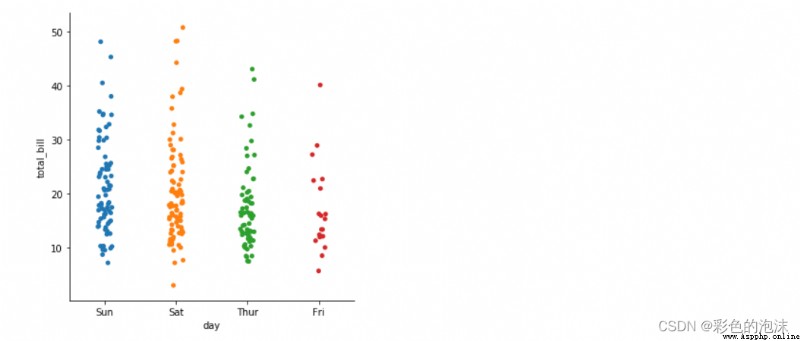
"""
Clustering scatter graph
shortcoming The amount of data is huge Do not apply
"""
sns.catplot(x="day",y="total_bill",data=tips,hue="sex",kind="swarm")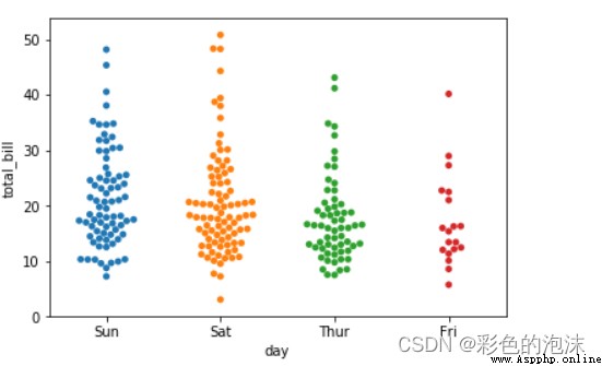
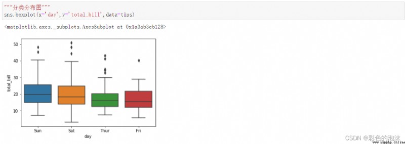
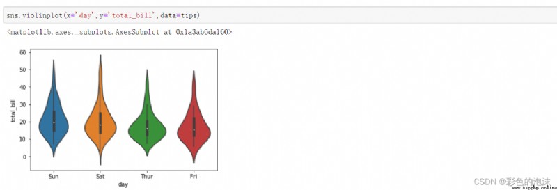
Classification map , Mainly according to the classification , Then the distribution of data under each category . through catplot
To achieve , The following three methods are different kind Parameters of :
(1) Box figure :boxplot() (kind="box")
(2) Violin chart :vioinplot() (kind=”violin")
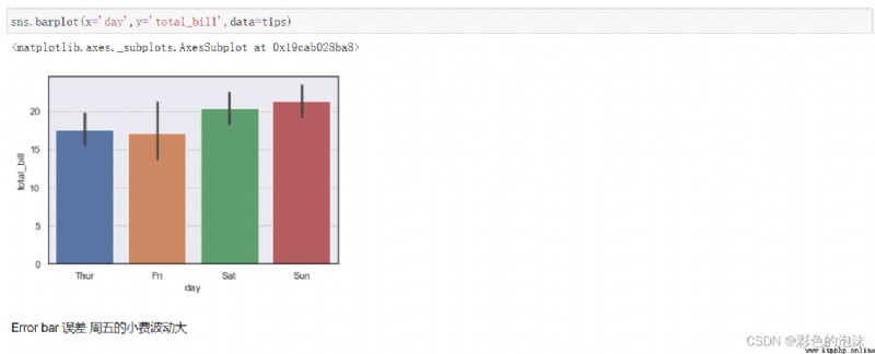
Classified statistical chart , It is classified according to , Count the number or proportion of data under each category . There are several ways :
(1) Bar chart :barplot() (kind="bar")
(2) Bar charts :countplot() (kind="count")
(3) Point line diagram :pointplot() (kind="point")
seaborn The bar chart in has statistical function , You can calculate the proportion , The average , You can also make statistics according to the statistical function you want .
"""
Classified statistical chart
demand : Visualize different dates total_bill Number
Black line confidence interval The longer the line, the more discrete the data
estimator : function
"""
sns.catplot(x='day',y='total_bill',data=tips,kind='bar',estimator=sum)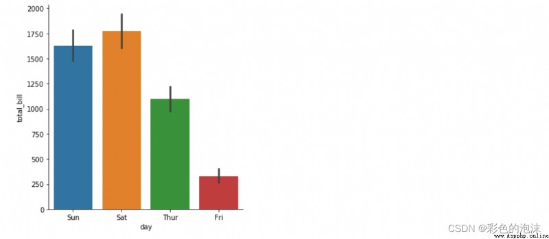
Column chart is a graph specially used to count the number of a single variable .
sns.catplot(x="sex",data=titanic,kind="count")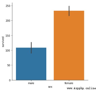
It is very convenient to see the trend changes between variables in the dotted line diagram .
sns.catplot(x="sex",y="survived",data=titanic,kind="point",hue="class")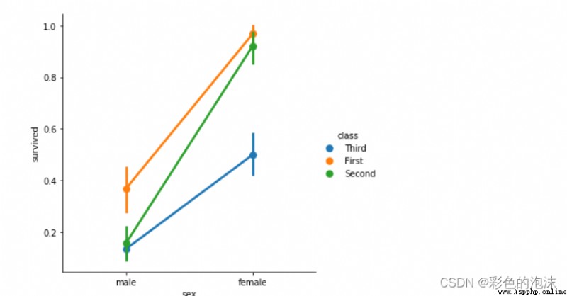
The distribution plot is mainly divided into univariate distribution, bivariate distribution and pairplot;
Single variable is mainly controlled by histogram , stay seaborn This kind of histogram is drawn by distplot, among dist yes distribution Abbreviation , No histogram Abbreviation .
titanic = pd.read_csv("./seaborn-data-master/titanic.csv")
titanic.head()
sns.distplot(titanic["age"])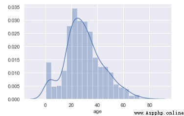
Parameter changes
"""
demand : Observe the age distribution of all people
Univariate distribution diagram -- > Histogram
- kde Whether to show kde curve
- bins Specify the number of groups
- rug The more dense the data is, the more centralized it is
- hist Whether to display histogram
"""
sns.distplot(age_titanic['age'],bins=30,rug=True,hist=False)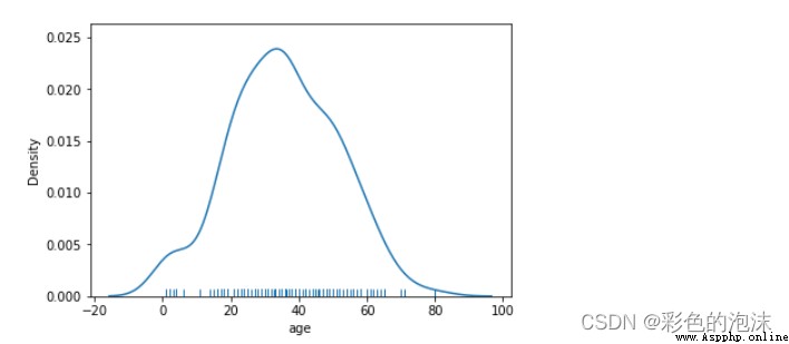
The multivariate distribution diagram shows the distribution relationship between the two variables . It is generally represented by multiple graphs . The function used in the multivariate distribution diagram is jointplot.
"""
Bivariate distribution
kind='hex' Point of hexagon
gridsize Size of points
height Figure size 20*20
ratio Scale between primary and secondary drawings
space The distance between the primary graph and the secondary graph
marginal_kws
"""
sns.jointplot(x='total_bill',y='tip',data=tips,kind='hex',gridsize=15,height=5,ratio=3,space=0,marginal_kws={"rug":True,"kde":True},color="red")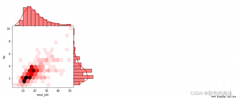
It is usually used for machine learning to select the appropriate model before modeling .
sns.pairplot(tips,vars=["total_bill","tip"])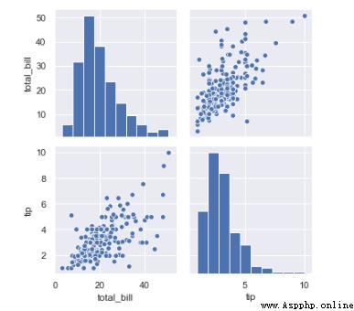
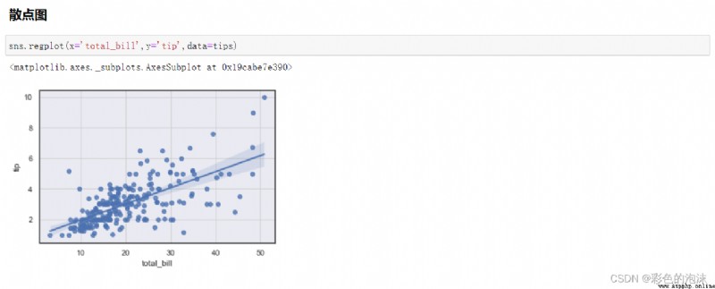
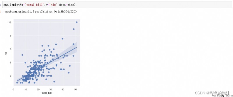
The linear regression chart can help us see the relationship trend of the data . stay seaborn Species can pass through regplot and lmplot Two functions implement .regplot Of x and y It can be for Numpy Array ,Series Equivariant . and lmplot Of x and y Must be a string , also data The value of cannot be empty :
(1)regplot(x,y,data=None);
(2)lmplot(x,y,data).
# Enter the library you want to use
%matplotlib inline
import pandas as pd
import numpy as np
import matplotlib
matplotlib.use('TkAgg')
import matplotlib.pyplot as plt
import seaborn as sns
from pandas_profiling import ProfileReport
""" Data analysis """
# Heat map
# Analyze the correlation between features and visualize .
plt.figure(figsize=(15,10))
sns.heatmap(dataset.corr(),annot=True)
#EDA Exploratory analysis
profile = ProfileReport(dataset, title='EDA', explorative=True)
#" The first one can't use the second one " https://blog.csdn.net/weixin_44527237/article/details/110096564
profile.to_widgets()
profile.to_notebook_iframe()