One 、 Draw a scatter plot
Two 、 Draw boundary bubble
One 、 Draw a scatter plotRealization function :
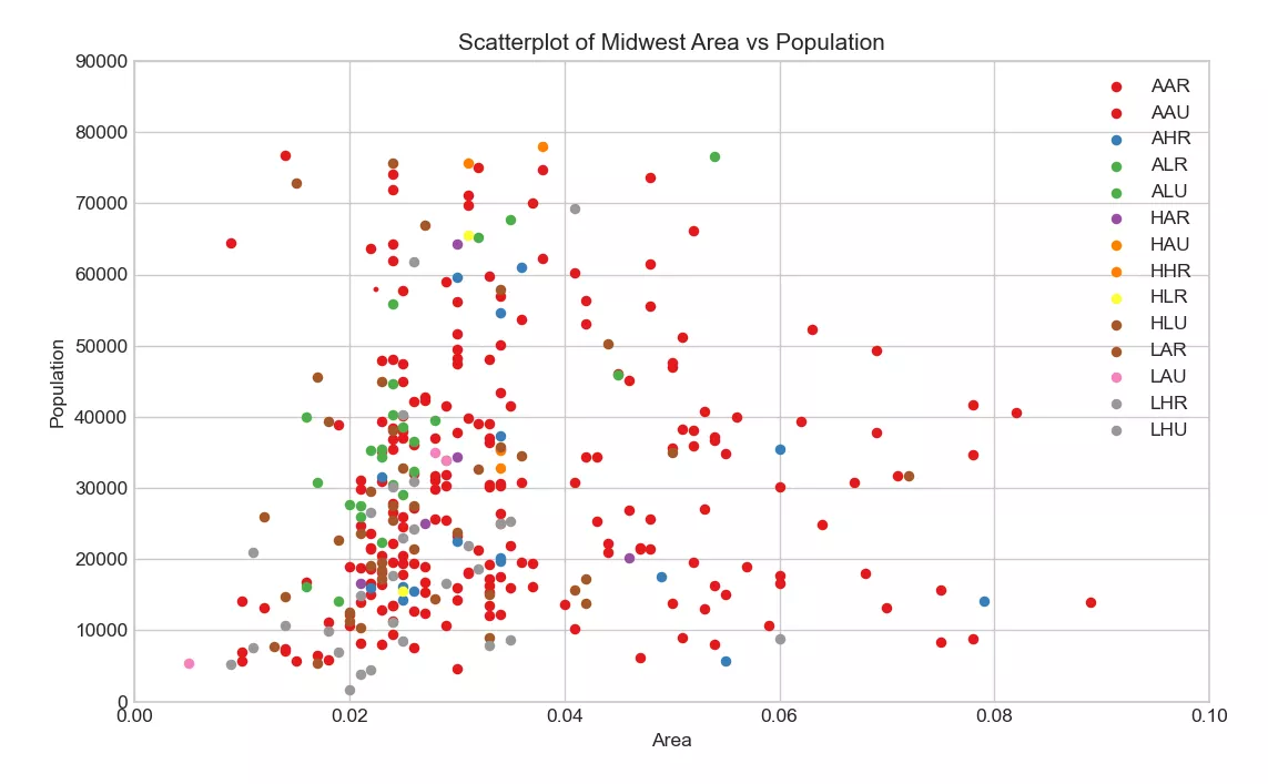
python Draw a scatter plot , Show the relationship between two variables , When the data contains multiple groups , Use different colors and shapes to distinguish .
Implementation code :
import numpy as npimport pandas as pdimport matplotlib as mplimport matplotlib.pyplot as pltimport seaborn as snsimport warningswarnings.filterwarnings(action='once')plt.style.use('seaborn-whitegrid')sns.set_style("whitegrid")print(mpl.__version__)print(sns.__version__)def draw_scatter(file): # Import dataset midwest = pd.read_csv(file) # Prepare Data # Create as many colors as there are unique midwest['category'] categories = np.unique(midwest['category']) colors = [plt.cm.Set1(i / float(len(categories) - 1)) for i in range(len(categories))] # Draw Plot for Each Category plt.figure(figsize=(10, 6), dpi=100, facecolor='w', edgecolor='k') for i, category in enumerate(categories): plt.scatter('area', 'poptotal', data=midwest.loc[midwest.category == category, :],s=20,c=colors[i],label=str(category)) # Decorations plt.gca().set(xlim=(0.0, 0.1), ylim=(0, 90000),) plt.xticks(fontsize=10) plt.yticks(fontsize=10) plt.xlabel('Area', fontdict={'fontsize': 10}) plt.ylabel('Population', fontdict={'fontsize': 10}) plt.title("Scatterplot of Midwest Area vs Population", fontsize=12) plt.legend(fontsize=10) plt.show()draw_scatter("F:\ Data Arena \datasets\midwest_filter.csv")Realization effect :
Realization function :
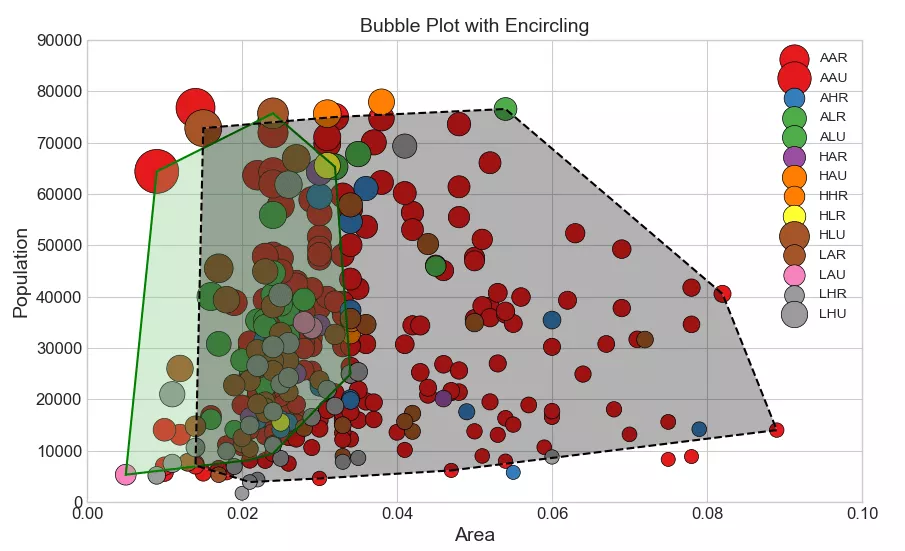
Bubble chart is a type of scatter chart , It can show the relationship between three numerical variables , The previous article introduced that the general scatter diagram reflects the relationship between two numerical variables , So if you want to add the information of the third numerical variable through the scatter diagram , You can generally use bubble charts . The essence of bubble chart is to control the size of each scatter point through the third numerical variable , The bigger the dot , The higher the value of the third dimension , vice versa . The boundary bubble chart adds the information of the fourth category variable to the bubble chart , Select some important points and connect them .
Implementation code :
import numpy as npimport pandas as pdimport matplotlib as mplimport matplotlib.pyplot as pltimport seaborn as snsimport warningsfrom scipy.spatial import ConvexHullwarnings.filterwarnings(action='once')plt.style.use('seaborn-whitegrid')sns.set_style("whitegrid")print(mpl.__version__)print(sns.__version__)def draw_scatter(file): # Step 1: Prepare Data midwest = pd.read_csv(file) # As many colors as there are unique midwest['category'] categories = np.unique(midwest['category']) colors = [plt.cm.Set1(i / float(len(categories) - 1)) for i in range(len(categories))] # Step 2: Draw Scatterplot with unique color for each category fig = plt.figure(figsize=(10, 6), dpi=80, facecolor='w', edgecolor='k') for i, category in enumerate(categories): plt.scatter('area','poptotal',data=midwest.loc[midwest.category == category, :],s='dot_size',c=colors[i],label=str(category),edgecolors='black',linewidths=.5) # Step 3: Encircling # https://stackoverflow.com/questions/44575681/how-do-i-encircle-different-data-sets-in-scatter-plot def encircle(x, y, ax=None, **kw): # Definition encircle function , Circle the key points if not ax: ax = plt.gca() p = np.c_[x, y] hull = ConvexHull(p) poly = plt.Polygon(p[hull.vertices, :], **kw) ax.add_patch(poly) # Select data to be encircled midwest_encircle_data1 = midwest.loc[midwest.state == 'IN', :] encircle(midwest_encircle_data1.area,midwest_encircle_data1.poptotal,ec="pink",fc="#74C476",alpha=0.3) encircle(midwest_encircle_data1.area,midwest_encircle_data1.poptotal,ec="g",fc="none",linewidth=1.5) midwest_encircle_data6 = midwest.loc[midwest.state == 'WI', :] encircle(midwest_encircle_data6.area,midwest_encircle_data6.poptotal,ec="pink",fc="black",alpha=0.3) encircle(midwest_encircle_data6.area,midwest_encircle_data6.poptotal,ec="black",fc="none",linewidth=1.5,linestyle='--') # Step 4: Decorations plt.gca().set(xlim=(0.0, 0.1),ylim=(0, 90000),) plt.xticks(fontsize=12) plt.yticks(fontsize=12) plt.xlabel('Area', fontdict={'fontsize': 14}) plt.ylabel('Population', fontdict={'fontsize': 14}) plt.title("Bubble Plot with Encircling", fontsize=14) plt.legend(fontsize=10) plt.show()draw_scatter("F:\ Data Arena \datasets\midwest_filter.csv")Realization effect :
This is about python This is the end of the article on visual analysis and drawing of scatter plot and boundary bubble plot , More about python Please search the previous articles of SDN or continue to browse the related articles below. I hope you will support SDN more in the future !