Today, let's talk about several methods of drawing maps I often use in my daily work and life , Next, I will introduce the mapping methods of these visualization Libraries , Of course, drawing beautiful visual maps and many excellent class libraries , There is no way to enumerate
pyecharts、plotly、folium、bokeh、basemap、geopandas、cartopy
First of all, let's introduce Boken Method of drawing map
Bokeh Support the creation of basic map visualization and map visualization based on processing geographic data
Draw a map of the world
from bokeh.plotting import figure, show
from bokeh.tile_providers import CARTODBPOSITRON, get_provider
from bokeh.io import output_notebook
output_notebook()
tile_provider = get_provider(CARTODBPOSITRON)
p = figure(x_range=(-2000000, 6000000), y_range=(-1000000, 7000000),
           x_axis_type="mercator", y_axis_type="mercator")
p.add_tile(tile_provider)
show(p)
Draw another map of China
from bokeh.plotting import curdoc, figure
from bokeh.models import GeoJSONDataSource
from bokeh.io import show
#  Read in the map data of China and send it to GeoJSONDataSource
with open("china.json", encoding="utf8") as f:
    geo_source = GeoJSONDataSource(geojson=f.read())
#  Set a canvas
p = figure(width=500, height=500)
#  Use patches Function and geo_source Make a map
p.patches(xs='xs', ys='ys', source=geo_source)
show(p)
We go through GEO It's also very convenient to draw maps from geographic data , But the map looks a little monotonous , Let's draw different provinces into different colors to see
with open("china.json", encoding="utf8") as f:
    data = json.loads(f.read())
#  Judgment is not    Beijing area data
def isBeijing(district):
    if 'beijing' in district['properties']['woe-name'].lower():
        return True
    return False
# data['features'] = list(filter(isInLondon, data['features']))
#  Filtering data
#  Add one... For each region color attribute
for i in range(len(data['features'])):
    data['features'][i]['properties']['color'] = ['red', 'blue', 'yellow', 'orange', 'gray', 'purple'][i % 6]
    data['features'][i]['properties']['number'] = random.randint(0, 20_000)
geo_source = GeoJSONDataSource(geojson=json.dumps(data))
p = figure(width=500, height=500, tooltips="@name, number: @number")
p.patches(xs='xs', ys='ys', fill_alpha=0.7,
        line_color='white',
        line_width=0.5,
        color="color",   #  Add color attribute , there "color" For each region color attribute
        source=geo_source)
p.axis.axis_label = None
p.axis.visible = False
p.grid.grid_line_color = None
show(p)
You can see that it already has an internal flavor , The only drawback is that the 13 segment line in the South China Sea is not displayed
GeoPandas Is based on Pandas Map visualization tool , Its data structure is completely inherited from Pandas, It is very friendly to the students who are familiar with master pan
First draw a map of the world
import pandas as pd
import geopandas
import matplotlib.pyplot as plt
%matplotlib inline
world = geopandas.read_file(geopandas.datasets.get_path('naturalearth_lowres'))
world.plot()
plt.show()
This is also geopandas Classic pictures on the official website , You can see that it's very simple , remove import Code , Just three lines , The map is drawn
Now let's continue to draw a map of China , This time we add Nine Segment Information
china_nine = geopandas.read_file(r"geojson/ Nine section line GS(2019)1719 Number .geojson")
china = geopandas.read_file('china-new.json')
fig, ax = plt.subplots(figsize=(12, 8),dpi=80)
ax = china.plot(ax=ax, column='number')
ax = china_nine.plot(ax=ax)
plt.show()
We reuse the previously processed china.json data , Inside number Fields are randomly generated test data , Effect and Bokeh Be roughly the same
Next, let's introduce plotly, This is also a very easy to use Python Visualization tools , If you want to draw map information , We need to install the following dependencies
!pip install geopandas==0.3.0
!pip install pyshp==1.2.10
!pip install shapely==1.6.3
Next, let's draw a map of the world
import plotly.graph_objects as go
fig = go.Figure(go.Scattermapbox(
    mode = "markers+lines",
    lon = [10, 20, 30],
    lat = [10, 20,30],
    marker = {'size': 10}))
fig.add_trace(go.Scattermapbox(
    mode = "markers+lines",
    lon = [-50, -60,40],
    lat = [30, 10, -20],
    marker = {'size': 10}))
fig.update_layout(
    margin ={'l':0,'t':0,'b':0,'r':0},
    mapbox = {
        'center': {'lon': 113.65000, 'lat': 34.76667},
        'style': "stamen-terrain",
        'center': {'lon': -20, 'lat': -20},
        'zoom': 1})
fig.show()
Here we use the bottom layer API plotly.graph_objects.Choroplethmapbox To draw
Now let's continue to draw a map of China , Use an advanced API plotly.express.choropleth_mapbox
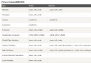
 10,000-word long text Python interview questions, it is recommended to collect first
p{margin:10px 0}.markdown-body
 Premium stuff!Django implements an access control management system based on face recognition [source code]
項目介紹基於人臉識別的門禁管理系統(Python+Djang