(1) preparation
Drawing visual graphics , Will be used to Matplotlib In the library pyplot package .
Matplotlib yes Python Drawing library of , Among them pyplot Package encapsulates many drawing functions .
Matplotlib.pyplot Contains a series of similar MATLAB Correlation function of drawing function in .
So before drawing a graph , Put this pyplot Lead in
# Import pyplot Package and alias it plt
import matplotlib.pyplot as plt
plot() Function is used to draw a line graph
【 Parameters and syntax 】:
plt.plot(x,y,format_string,**Kwargs)
x:x Axis data , List or array
y:y Axis data , List or array
format_string: Control the format string of the curve
**kwargs: The second group or more (x,y,format_string) You can draw figures with multiple polylines ( If don't write , In the drawing , There is only one broken line )
Other style settings , One rate is placed at the end of all parameter settings , for example linewidth Set the thickness and size of the line .These belong to other parameter settings , All belong to **kwargs( Keyword multivariable parameter transfer ) After all the parameters ( At the end of the parameter list )
【 color: Control the color ,color=’green’
linestyle: Line style ,linestyle=’dashed’
marker: Tagging style ,marker = ‘o’
markerfacecolor: Mark the color ,markerfacecolor = ‘blue’
markersize: Mark dimensions ,markersize = ‘20’
linewidth: Line width ,linewidth=4
…
】
format_string Value Details are as follows :
Color characters | explain
'b' Blue
'g' green
'r' Red
'c' Turquoise
'#008000' RGB A certain color
'm' Magenta magenta
'y' yellow
'k' black
'w' white
'0.8' Grayscale value character
Style character | explain
'- ' Solid line
'--' Broken line
'-.' Point line
':' Dotted line
'' ' ' Wireless strip
Mark characters | explain
'.' Dot the mark
',' Pixel marker
'o' Solid circle mark
'v' Inverted triangle
'^' Upper triangle mark
'>' Right triangle
'<' Left triangle
'1' Lower flower triangle mark
'2' Flower triangle mark
'3' Left flower triangle mark
'4' Right flower triangle mark
's' Solid square marker
'p' Black pentagonal mark
'*' Star Mark
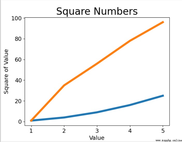
(2) Draw line chart
def show_zx():
input_values = [1, 2, 3, 4, 5]
squares = [1, 4, 9, 16, 25]
i=[1,35,56,78,96]
# Drawing graphics
# Parameters linewidth Set up plot() The thickness of the drawn line
plt.plot(input_values, squares,input_values,i, linewidth=5)
# grammar :plot(x Axis coordinates ,y Axis coordinates , Other parameter settings )
# Set chart title , Set font size
# function title() Assign a title to the chart , Parameters fontsize Specifies the size of the text in the chart .
plt.title("Square Numbers", fontsize=24)
# to x Axis add label , Set font size
plt.xlabel("Value", fontsize=14)
# to y Axis add label , Set font size
plt.ylabel("Square of Value", fontsize=14)
# Set the value range of each axis
plt.axis([0, 6, 0, 100]) #[x.x,x.y,y.x,y.y]
# tick_params() Set the scale mark size , Set the style of the scale
plt.tick_params(axis='both', labelsize=14)
# open matplotlib viewer , And display the drawn graphics
plt.show()
【 Correlation function analysis 】:
(1)plt.title() Set the title of the chart
(2)plt.xlabel() Set up x Axis labels plt.ylabel() Set up y Axis labels
(3)plt.tick_params() Set the scale mark size , And set the scale style
…
There are many more related functions , Will be based on actual needs , Use... For query
 Python graduation design works are based on the django framework enterprise company website. The finished product (1) Development overview
The whole project includes: op