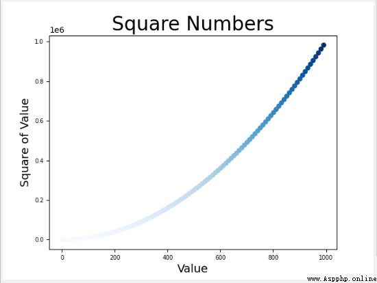
** Color mapping (colormap) It's a series of colors , They gradient from the start color to the end color .** In Visualization , Color mapping is used to highlight the regularity of data changes , for example , You may use lighter colors to display smaller values , And use deep To display larger values . modular pyplot Built in a set of color mappings . To use these color maps , You need to tell pyplot How to set the color of each point in the dataset .
# With simple settings c=“ Color ” Change the color of the point , You can also use color mapping (colormap)
def anypoints():
# Realize automatic calculation of data Use Python Self iteration , Get the coordinates of the points
x_values = list(range(1, 1001,10))# establish x Value of coordinates
y_values = [x ** 2 for x in x_values] # List of analytical Automatically add list element values
# The default color is black outline , Blue dot
# How to base on the y Value to set its color
#c=y_values c The parameter sets a y List of values ,cmap=plt.cm.Blues Specify which color mapping to use , Based on the y The size of the value changes , And change the color of the scatter
plt.scatter(x_values, y_values, c=y_values, cmap=plt.cm.Blues, edgecolor='none', s=40)
# We'll set the parameters c Set to a y List of values , And use parameters cmap tell pyplot Which color map to use
# Set the chart title and label the axis
plt.title("Square Numbers", fontsize=24)
plt.xlabel("Value", fontsize=14)
plt.ylabel("Square of Value", fontsize=14)
# Set the scale mark size
plt.tick_params(axis='both', which='major', labelsize=7)
# Set the value range of each axis
# plt.axis([0, 1100, 0, 1100000])
# Chart display
plt.show()
# Chart storage plt.savefig(" Save filename ")
plt.savefig('squares_plot.png',bbox_inches = 'tight')
#bbox_inches = 'tight' Specify to crop out the extra blank area of the chart
** Color mapping principle :** The parameter c Set to a list of dependent values , And use parameters cmap tell pyplot Which color map to use
python When drawing figures , According to the size of the current dependency value , Use colors of different depths , Draw a scatter . commonly : The larger the current dependency value , The deeper the color .
c=y_values, cmap=plt.cm.Blues
To understand pyplot All color mappings in , Please visit http: // matplotlib.org / , single click Examples, Scroll down to ColorExamples, Click again colormaps_reference.
( See specific API)