Data sets :diabetes.csv
Reference books :《Machine Learning Mastery With Python Understand Your Data, Create Accurate Models and work Projects End-to-End》
For a link :https://github.com/aoyinke/ML_learner
from pandas import read_csv
path = "diabetes.csv"
names = ['preg', 'plas', 'pres', 'skin', 'test', 'mass', 'pedi', 'age', 'class']
data = read_csv(path,names=names,skiprows=1)
# Before observing the data 5 That's ok
print(data.head())
# Observe the dimensions of the data
print(data.shape)
"""
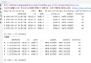
preg plas pres skin test mass pedi age class
0 6 148 72 35 0 33.6 0.627 50 1
1 1 85 66 29 0 26.6 0.351 31 0
2 8 183 64 0 0 23.3 0.672 32 1
3 1 89 66 23 94 28.1 0.167 21 0
4 0 137 40 35 168 43.1 2.288 33 1
(768, 9) 768 That's ok ,9 Column
"""
# Observe the type of each data
print(types)
"""
preg int64
plas int64
pres int64
skin int64
test int64
mass float64
pedi float64
age int64
class int64
"""
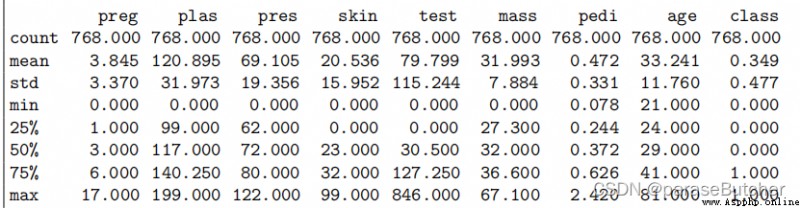
from pandas import set_option
set_option('display.width', 100)
set_option('precision', 3)
description = data.describe()
print(description)
class_counts = data.groupby('class').size()
print(class_counts)
"""
class
0 500
1 268
"""

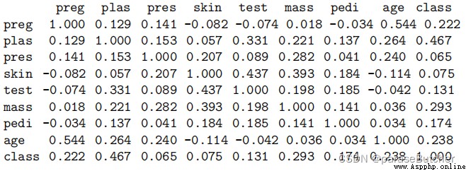
from pandas import set_option,read_csv
data = read_csv(filename, names=names)
set_option('display.width', 100)
set_option('precision', 3)
correlations = data.corr(method='pearson')
print(correlations)
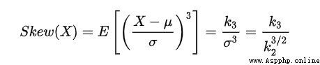
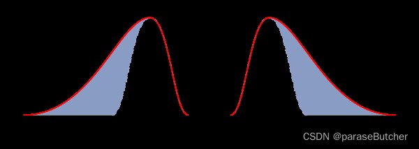
In the formula ,Sk—— skewness ;E—— expect ;μ—— Average ;μ3——3 Moment of order center ;σ—— Standard deviation . In general , When the statistical data is right biased ,Sk>0, And Sk The bigger the value is. , The higher the right deviation ;
When the statistical data is left biased distribution ,Sk< 0, And Sk The smaller the value. , The higher the left deviation . When the statistical data are symmetrically distributed , Obviously there is Sk= 0.
So we should pay attention to deal with skew more ( The absolute value ) The variable of
skew = data.skew()
print(skew)
"""
preg 0.901674
plas 0.173754
pres -1.843608
skin 0.109372
test 2.272251
mass -0.428982
pedi 1.919911
age 1.129597
class 0.635017
"""
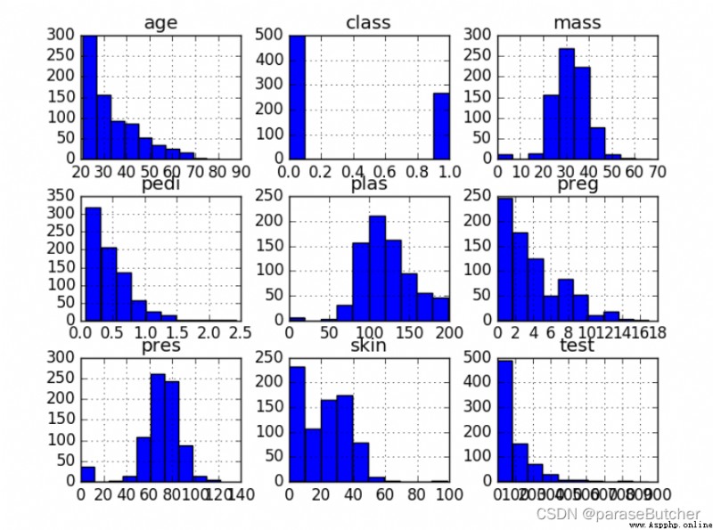
# Univariate Histograms
from matplotlib.pyplot as plt
from pandas import read_csv
path = "diabetes.csv"
names = ['preg', 'plas', 'pres', 'skin', 'test', 'mass', 'pedi', 'age', 'class']
data = read_csv(path , names=names,skiprows=1)
data.hist()
plt.show()
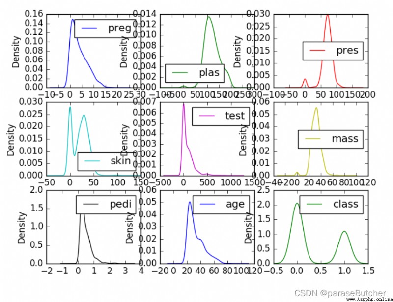
Density maps are another way to quickly understand the distribution of each attribute
data.plot(kind=?density?, subplots=True, layout=(3,3), sharex=False)
plt.show()
summary :
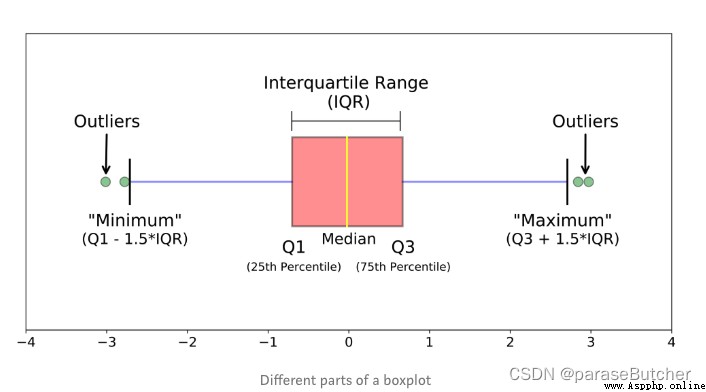
The boxplot is for continuous variables , Focus on the average level when interpreting 、 Volatility and outliers .
When the box is pressed flat , Or there are many abnormal times , Try logarithmic transformation .
When there is only one continuous variable , It is not suitable for drawing box line diagram , Histograms are a more common choice .
The most effective way to use box diagram is to make comparison , With one or more qualitative data , Draw group box diagram
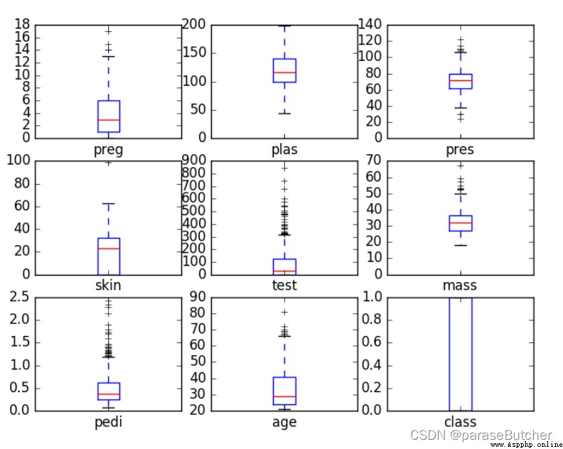
data.plot(kind=‘box’, subplots=True, layout=(3,3), sharex=False, sharey=False)
plt.show()
import matplotlib.pyplot as plt
import numpy as np
from pandas import read_csv
path = "diabetes.csv"
names = ['preg', 'plas', 'pres', 'skin', 'test', 'mass', 'pedi', 'age', 'class']
data = read_csv(filename, names=names)
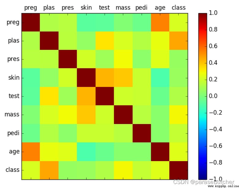
correlations = data.corr(method='pearson') # The Pearson correlation coefficient is obtained
# plot correlation matrix
fig = plt.figure() # Equivalent to getting a canvas
ax = fig.add_subplot(1,1,1) # Create a subgraph with rows and columns
cax = ax.matshow(correlations, vmin=-1, vmax=1)
fig.colorbar(cax) # Change the color bar ( The one standing on the right ) Add to the diagram
ticks = np.arange(0,9,1)
# ticks = [0 1 2 3 4 5 6 7 8] Construct a 0-8,step=1 Of np Array
ax.set_xticks(ticks)
ax.set_yticks(ticks)
ax.set_xticklabels(names) # In the play index, The default is number
ax.set_yticklabels(names)
plt.show()
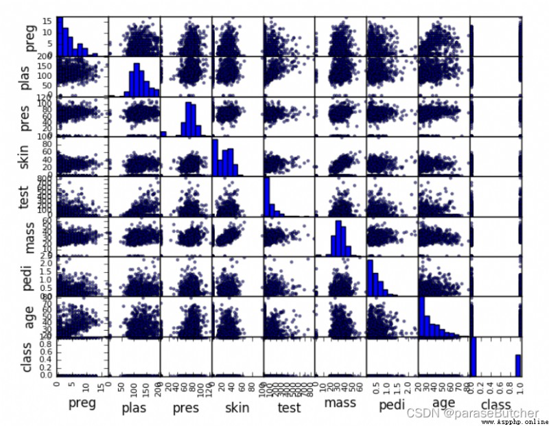
from matplotlib.pyplot as plt
from pandas import read_csv
from pandas.tools.plotting import scatter_matrix
path = "diabetes.csv"
names = ['preg', 'plas', 'pres', 'skin', 'test', 'mass', 'pedi', 'age', 'class']
data = read_csv(filename, names=names)
scatter_matrix(data)
plt.show()
Summary:
Stay hugry, stay foolish.
 Python+selenium+mongodb crawls the product data of Jingdong website with specific keywords
List of articles python Crawl
 Computer graduation design Python+djang library book borrowing and returning management system (source code + system + mysql database + Lw document)
項目介紹論文闡述了圖書管理系統,並對該系統的需求分析及系統需