Catalog
One 、K-Means principle
1. Introduction to clustering
① Hierarchical clustering
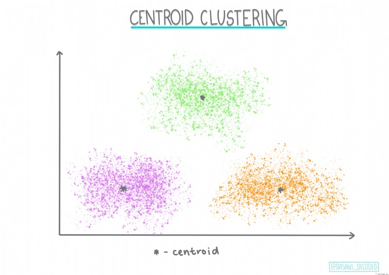
② Centroid clustering
③ Other clusters
2.K-means Principle
3.K-means Application scenarios of
Two 、K-Means Case practice of
1. View
① Data import and structure view
② Check the data description
2. Data visualization and preprocessing
① Bar chart
② Heat map
③ Nuclear density map
④ Scatter plot
⑤ Box figure
3. Model training and accuracy evaluation
① Sample selection
② model training
③ Accuracy evaluation
④ Model parameter adjustment
3、 ... and 、 Conclusion
In this paper , You will learn to :
0 K-means The mathematical principle of
1 K-means Of Scikit-Learn Function interpretation
2 K-means Case practice of
Machine learning algorithms include 100 A variety of clustering algorithms , Their use depends on the nature of the data at hand . We discuss some of the main algorithms .
Hierarchical clustering . If an object is classified according to its proximity to nearby objects rather than to distant objects , Then a cluster is formed according to the distance between its members and other objects .
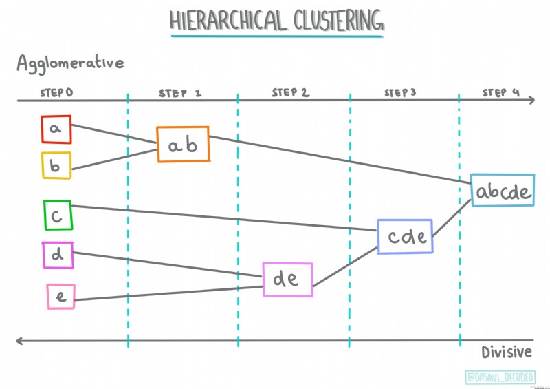
Centroid clustering . This popular clustering algorithm needs to be selected K( Cluster number ), Then the algorithm determines the centroid of the cluster and collects data around the centroid .K Mean clustering Is a popular version of centroid clustering . The centroid is determined by the mean value of all sample points in its category , Hence the name .
Distribution based clustering . Based on statistical modeling , Distribution based clustering analysis focuses on determining the probability that data points belong to clustering , And assign it accordingly . Gaussian mixture method belongs to this type .
Clustering based on density . Data points are assigned to clusters according to their density or grouping among them . Data points away from the group are considered outliers or noise .DBSCAN、 Mean shift and so on all belong to this type of clustering .
Grid based clustering . For cubes , A mesh will be created , And divide the data between the cells of the grid , To create a cluster .
For the convenience of learning , In this article, we only discuss K-Means Algorithm , I will write another article to explain other clustering algorithms .
Let's start with a classic K-means The story :
0 Once upon a time , There are four priests going to the suburban footpath , At first the priest chose a few sermons at random , And announced the situation of these sermons to all residents in the suburbs , So every resident went to the nearest preaching place to his own home to attend a lecture .
1 After class , People think the distance is too far , So each priest counted the addresses of all the residents in his class , Moved to the heart of all addresses , And updated the location of his sermon point on the poster .
2 Every time the priest moves, he can't be closer to everyone , Some people find that A After the priest moves, he might as well go B The priest is closer to the lecture , So every resident went to the nearest preaching place ... That's it , The priest updates his position every week , Residents choose preaching sites according to their own conditions , Finally stabilized .
This is a K-means The calculation steps of :
0 First define the total number of categories ( cluster )
1 Put each cluster center ( centroid ) Randomly assign coordinate positions
2 Associate each sample data point to the centroid closest to the sample point , Assign its category
3 For each cluster, find the center point of all associated points ( The mean value of Euclidean distance between the sample and the center of mass )
4 Take the mean point as the new centroid of the category
5 Train like this , Until the position of the points owned by each cluster does not change
Be careful ! The process, , Only the position of the center of mass is changing , The sample point position remains unchanged !
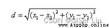
This is the Euclidean distance from the center of mass to the sample point :
This classic story is right K The understanding of mean value is very helpful , In the story , The priest's position is the center of mass , The location of the residents' home is the sample point . Every time the priest's position is adjusted One iteration . Different types of K-means The distance calculation method corresponding to the algorithm is also different .
0 Classification classifier
1 Item transfer optimization
2 Identify the location of the event
3 The user classification
4 Personnel status analysis
5 Insurance fraud detection
6 Ride data analysis
7 Network analysis criminals
8 Tyson polygon
...
Enter the following code , Import the Nigerian music data set we need notebook And view its organizational structure .
import matplotlib.pyplot as plt
import pandas as pd
df = pd.read_csv("nigerian-songs.csv")# With pandas Library read_csv Function read csv file
df.head()# See the former 5 Row data
The output is as follows :
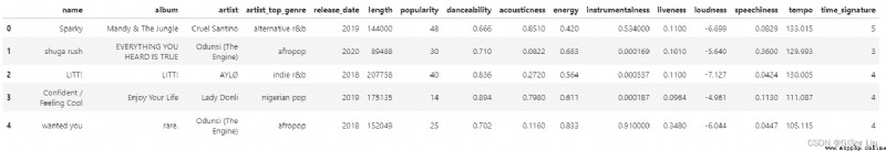
There are basic information about music ( name 、 The artist 、 Release date, etc ), Enter the following code , Look at its data structure :
df.info()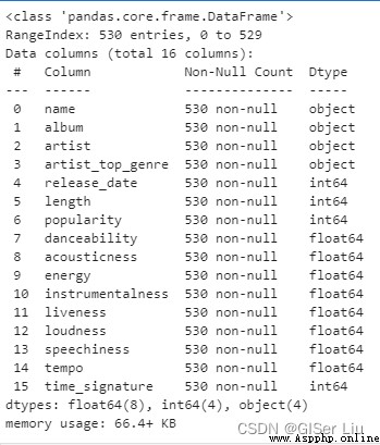
You can see , The Nigerian music data set contains 539 Row sample . Yes 16 Data characteristics to be selected : Numerical data has 12 individual , Character data has 4 individual .
Enter the following code to view the data description :
df.describe()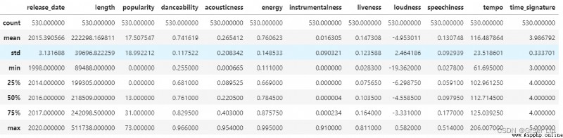 By viewing the description of the data , We can see the number of different data features 、 mean value 、 Variance and values at different levels . This information can help us select the appropriate model or processing method in the following processing .
If we use cluster analysis , This is an unsupervised method that does not require tagging data , Why do we need this information ? In the data exploration phase , They will come in handy !
Visualization data , Visually view the characteristics of the data . The author uses seaborn Library to visualize ,seaborn The library is based on matplotlib Library encapsulated , Better visualization !
Before that, we remove the samples with missing values in the data , Avoid its effects . Check the data for missing or abnormal values , Enter the following code :
df.isnull().sum()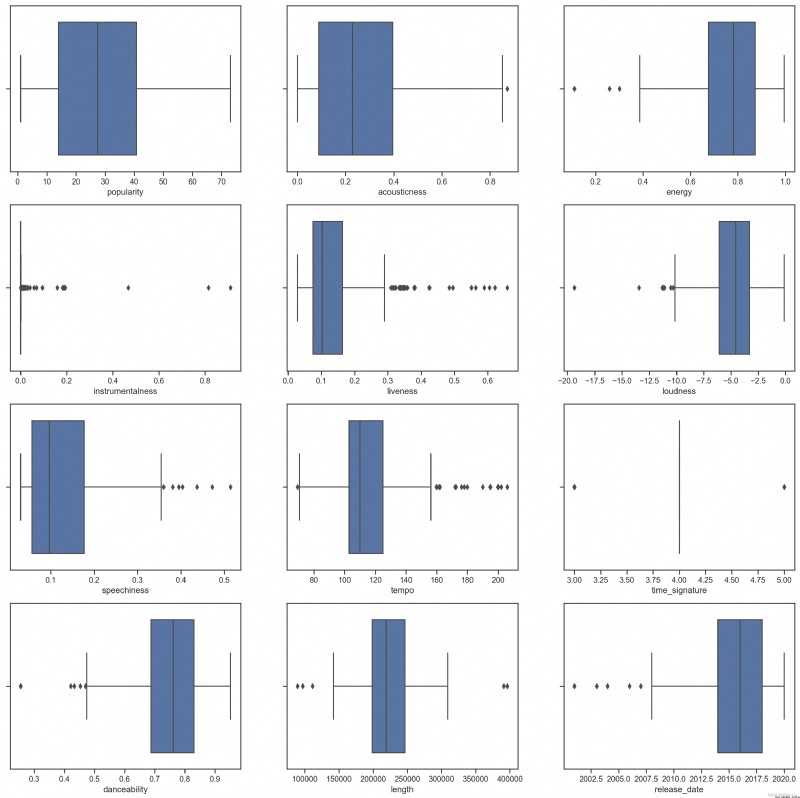
You can see , This time the data is clean , No missing value . We started visualizing !
Enter the following code to view the number in the dataset 5 A bar chart showing the number of artist types by name :
import seaborn as sns# Import seaborn package
top = df['artist_top_genre'].value_counts()# Make statistical summary for different types of musicians , The format is list
plt.figure(figsize=(10,7))# Set chart size
sns.barplot(x=top[:5].index,y=top[:5].values)# Before removal 5 Row data index As X Shaft type , The amount of music as Y Draw a bar graph of axis values
plt.xticks(rotation=45)# if X The axis label is too long, resulting in poor visualization , The label can be rotated for adjustment
plt.title('Top genres',color = 'blue')# Set bar chart title content and color 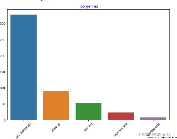
You can see , front 5 Of the three styles ,afro dancehall Style music has the largest number ; Sharp eyed students may find , Some of the data is “Missing”, This means that this part of the data has no type label , For convenience of analysis , We discard this part of the data !
In most data sets ,🤨 Be similar to "Missing" Types of data are not easy to find in missing value filtering , But they often occupy a larger part , We can draw a bar graph of these features to find them and eliminate them !
Continue to visualize all the data . Enter the following code :
df = df[df['artist_top_genre'] != 'Missing']# Delete the data without music style label
top = df['artist_top_genre'].value_counts()# Count the number of different music styles
plt.figure(figsize=(10,7))# Set the canvas size
sns.barplot(x=top.index,y=top.values)# Draw a bar chart for labels and quantities of all music style data
plt.xticks(rotation=45)# adjustment X Axis label angle
plt.title('Top genres',color = 'blue')# Set Title Properties 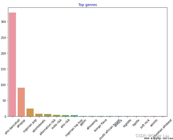
In this way , The music data of different styles will be clearly displayed .
In order to facilitate our clustering experiment , We extracted the largest number of three types of samples and the popularity was greater than 0 The sample of is used as the main body of the data set for subsequent clustering . Enter the following code :
df = df[(df['artist_top_genre'] == 'afro dancehall') | (df['artist_top_genre'] == 'afropop') | (df['artist_top_genre'] == 'nigerian pop')]# Take the first three samples
df = df[(df['popularity'] > 0)]# Draw more people than 0 The sample of Do a quick test , See which features in the data are highly correlated . We calculate the correlation coefficient of the filtered data , And show the correlation in the form of thermal diagram . Enter the following code :
corrmat = df.corr()# Used to calculate the correlation coefficient
f, ax = plt.subplots(figsize=(12, 9))#subplots() The function creates a canvas containing the subgraph area , Another figure Graphic objects .
sns.heatmap(corrmat, vmax=.8, square=True)#corrmat The value is the correlation coefficient ,vmax The maximum correlation coefficient value is used to define the mapping range of color ,square by bool Type parameter , Whether to make each cell of the thermal diagram square , The default is False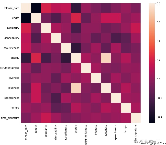
Exclude the correlation on the diagonal of the matrix ( I am highly related to myself ), We can see energy and loudness The feature correlation shape is high . That's not surprising , Because loud music is usually full of passion .
Please note that , Correlation doesn't mean causation ! We prove that they are related , But it can not prove the causal relationship between them .
According to their popularity , Are there any significant differences between the three genres in the view of danceability ? Take the popularity of music data as X Axis , It depends on whether it can dance Y Axis plot kernel density (KDE) Figure view the distribution of data . Enter the following code :
sns.set_theme()#set_style( ) It's used to set the theme ,Seaborn There are five preset themes : darkgrid , whitegrid , dark , white , and ticks
g = sns.jointplot(#jointplot Function to plot a bivariate graph
data=df,# The data is filtered and preprocessed
x="popularity", y="danceability", hue="artist_top_genre",# Choose two variables , increase hue Variable will add conditional colors to the drawing , And draw a separate density curve on the edge axis
kind="kde",# Set the drawing type KDE Refers to the nuclear density diagram
)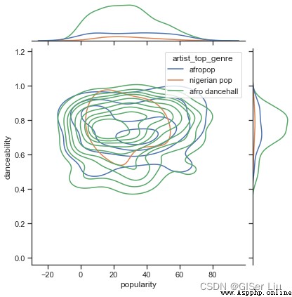
In the data exploration stage, we are free to explore the relationship between different features , If you feel cumbersome You can also use batch functions to quickly view the results , Although this is less interesting .
See from the graph , These three genres are loosely aligned in terms of popularity and danceability . This shows that it will be troublesome to cluster it , The data difference is too small .
Let's continue to create a scatter plot of these two features to see the data distribution . Enter the following code :
sns.FacetGrid(df, hue="artist_top_genre", size=5) \
.map(plt.scatter, "popularity", "danceability") \
.add_legend()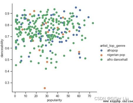
Uh huh , It verifies our above conjecture , The data distribution is very complex , Is a mess .
For cluster analysis , We can usually use a scatter diagram to visually display data clustering , Mastering this type of visualization is very useful .
For confusing data , We can use the box chart to visually view the data distribution , Find out the abnormal data and eliminate it . Enter the following code to view the box diagram distribution of different numerical characteristics :
plt.figure(figsize=(20,20), dpi=200)
plt.subplot(4,3,1)#subplot The function divides 4 That's ok 3 Column canvas area , The third parameter represents the position of the image in it
sns.boxplot(x = 'popularity', data = df)
plt.subplot(4,3,2)
sns.boxplot(x = 'acousticness', data = df)
plt.subplot(4,3,3)
sns.boxplot(x = 'energy', data = df)
plt.subplot(4,3,4)
sns.boxplot(x = 'instrumentalness', data = df)
plt.subplot(4,3,5)
sns.boxplot(x = 'liveness', data = df)
plt.subplot(4,3,6)
sns.boxplot(x = 'loudness', data = df)
plt.subplot(4,3,7)
sns.boxplot(x = 'speechiness', data = df)
plt.subplot(4,3,8)
sns.boxplot(x = 'tempo', data = df)
plt.subplot(4,3,9)
sns.boxplot(x = 'time_signature', data = df)
plt.subplot(4,3,10)
sns.boxplot(x = 'danceability', data = df)
plt.subplot(4,3,11)
sns.boxplot(x = 'length', data = df)
plt.subplot(4,3,12)
sns.boxplot(x = 'release_date', data = df)
We can see ,* An asterisk indicates an outlier , The position of the box represents the distribution area of the data . A large number of features in the graph are unevenly distributed , The sample features with more outliers are not suitable for clustering , We can further eliminate it .
Now? , Select the characteristic columns that will be used in the cluster analysis exercise . These characteristic columns need to have similar ranges ; And the text column data needs to be encoded as numeric data :
from sklearn.preprocessing import LabelEncoder
le = LabelEncoder()# Create an encoder
X = df.loc[:,('artist_top_genre','popularity','danceability','acousticness','loudness','energy')]#loc by Selection by Label function , That is to get data by label ; Take out the required label data as X Training feature samples
y = df['artist_top_genre']# Take the artist genre as Y Verify model accuracy labels
X['artist_top_genre'] = le.fit_transform(X['artist_top_genre'])# Label text data into numeric format
y = le.transform(y)# Label text data into numeric format Now? , We need to select a cluster for clustering ( cluster ) Number . We know we can take it out 3 Types of songs , So we will nclusters The assignment is 3, Enter the following code :
from sklearn.cluster import KMeans
nclusters = 3 # Initialize the number of centroids , Because we want to divide 3 Chinese music types , So assign it to 3
seed = 0 # Select random initialization seed
km = KMeans(n_clusters=nclusters, random_state=seed)# One random_state A random number seed corresponding to a random initialization of the centroid . If you do not specify a random number seed , be sklearn Medium KMeans You don't just choose a random pattern and throw the result
km.fit(X)# Yes Kmeans Model training
# Use the trained model to predict
y_cluster_kmeans = km.predict(X)
y_cluster_kmeans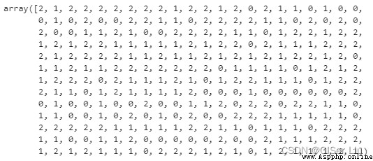
The array is K-means The prediction results of the model , The number is the clustering result of each row of samples (0、1 or 2).
We then use this prediction to calculate “ Profile factor ”, Enter the following code :
from sklearn import metrics
score = metrics.silhouette_score(X, y_cluster_kmeans)# metrics.silhouette_score The function is used to calculate the contour coefficient
score
0 Profile factor (Silhouette Coefficient), It is an evaluation method of clustering effect .
The best value is 1, The worst is -1. near 0 The value of represents overlapping clusters . A negative value usually indicates that the sample has been assigned to the wrong cluster , Because different clusters are more similar like .
1 The formula of contour coefficient by :S=(b-a)/max(a,b), among a Is the average distance between a single sample and all samples in the same cluster ,b Is the average of all samples from a single sample to different clusters .
The contour coefficient represents the minimization of the distance between similar samples , The measure of the largest distance between samples of different classes
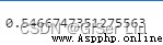
Our model The contour factor is 0.54, This indicates that our data is not particularly suitable for this type of clustering , But this does not affect our teaching , There are always various troubles in practical work . We went on training :
Import third-party library , Adjust parameters for a new round of training , We batch the number of clusters , See how many parameter values work best :
from sklearn.cluster import KMeans
wcss = []
for i in range(1, 11):
kmeans = KMeans(n_clusters = i, init = 'k-means++', random_state = 42)
kmeans.fit(X)
wcss.append(kmeans.inertia_)
Parameter Introduction :
0 range(): Here we use for The loop is to iterate the number of training rounds , Here we set up training 10 round
1 random_state: Determine the random number generation of the initialization centroid .
2 wcss: Used to store “ Sum of squares within the cluster ” Measure the square average distance from all points in the cluster to the cluster centroid .
3 inertia_:K-Means The algorithm tries to select the centroid to minimize “ inertia ”,“ Measure the scale of internal coherent clustering ”. This value is appended to each iteration wcss variable . This evaluation parameter represents the sum of the distances from a certain point in the cluster to the cluster , Although this method shows the fineness of clustering when the evaluation parameters are the smallest
4 k-means++: stay Scikit-learn in , You can use 'k-means++' Optimize , it “ Initialize the centroid ( Usually ) They are far away from each other , It may have better results than random initialization .
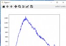
We use lineplot The function is drawn along with the category ( cluster ) An increase in quantity ,inertia_ Line chart of parameter value change trend .
plt.figure(figsize=(10,5))
sns.lineplot(range(1, 11), wcss,marker='o',color='red')
plt.title('Elbow')
plt.xlabel('Number of clusters')
plt.ylabel('WCSS')
plt.show()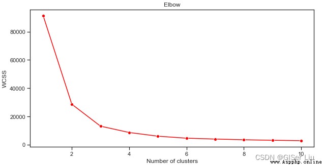
It can be seen from this picture that ,K Mean algorithm when the number of clusters is 3 when , Its inertia_ The parameter effect is good , We can choose 3 Class or 4 Class to perform secondary prediction on the data set , Evaluate its accuracy .
Try again the process of model training and accuracy evaluation , This time the settings 3 Round clustering , The clustering results are displayed in a scatter diagram :
from sklearn.cluster import KMeans
kmeans = KMeans(n_clusters = 3)# Set the cluster of the cluster ( Category ) Number
kmeans.fit(X)# Train the model
labels = kmeans.predict(X)# Output predicted value
plt.scatter(df['popularity'],df['danceability'],c = labels)# Take popularity as X Axis , The danceability is Y Axis , Labels plot scatter plots for categories
plt.xlabel('popularity')
plt.ylabel('danceability')
plt.show()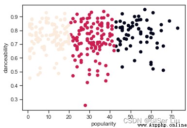
Um. ?
Enter the following code to check the accuracy of the model :
labels = kmeans.labels_# Extract the predicted value of the sample in the model labels
correct_labels = sum(y == labels)# Statistics predict the correct value
print("Result: %d out of %d samples were correctly labeled." % (correct_labels, y.size))
print('Accuracy score: {0:0.2f}'. format(correct_labels/float(y.size)))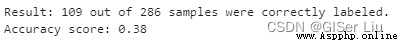
It can be seen that , Although we adjusted the parameters ; Of all the samples , Only 38% Of the samples were successfully predicted , let me put it another way , our K-means The model is not good .🤨 But the reality is that most of the time , I have given you the method of analysis , Maybe you can choose other features or other clustering models to further improve the performance of the model .
In this paper , We learned K-means The mathematical principle of the algorithm , The author takes the Nigerian music data set as a case . It shows you how to find the potential features in the data through visualization . Finally, for those who have trained well K-means The model was evaluated .

If you think my article is helpful , Three even + Attention is the greatest encouragement to my creation !
“ All articles on this site are original , Welcome to reprint , Please indicate the source of the article :https://blog.csdn.net/qq_45590504/category_11752103.html?spm=1001.2014.3001.5482 Baidu and all kinds of collection stations are not credible , Search carefully to identify . Technical articles generally have timeliness , I am used to revise and update my blog posts from time to time , So visit the source to see the latest version of this article .”
The series recommends
Machine learning series 0 Machine learning ideas _GISer Liu The blog of -CSDN Blog
Machine learning series 1 History of machine learning _GISer Liu The blog of -CSDN Blog
Machine learning series 2 The fairness of machine learning _GISer Liu The blog of -CSDN Blog _ Fair machine learning
Machine learning series 3 The process of machine learning _GISer Liu The blog of -CSDN Blog
Machine learning series 4 Use Python establish Scikit-Learn The regression model _GISer Liu The blog of -CSDN Blog
Machine learning series 5 utilize Scikit-learn Building regression models : Prepare and visualize data ( Nanny class course )_GISer Liu The blog of -CSDN Blog
Machine learning series 6 Use Scikit-learn Building regression models : Simple linear regression 、 Polynomial regression and multiple linear regression _GISer Liu The blog of -CSDN Blog _ Multivariate polynomial regression Machine learning series 7 be based on Python Of Scikit-learn Library to build logistic regression model _GISer Liu The blog of -CSDN BlogMachine learning series 8 be based on Python structure Web Apply to use machine learning models _GISer Liu The blog of -CSDN Blog
Understand the whole process of machine learning classification _GISer Liu The blog of -CSDN Blog
be based on Python Build machine learning Web application _GISer Liu The blog of -CSDN Blog