https://www.lixinger.com/ You can download csv file
It should be noted that , Remember to delete the last of the first line The data comes from : Almond management website (lixinger.com) this sentence , Text and time series cannot be processed together
The first method
import pandas as pd
import matplotlib.pyplot as plt
# Need to install xlrd pip install xlrd==1.2.0
data = pd.read_excel('data/zhongzheng500.xlsx',sheet_name ='Sheet1',usecols=[0,2,4,5],index_col=[0])
#sheet_name Pass table name .usecols from 0 Start , Confirm to use column .index_col Use the 0 Column time as index
data.plot(xticks=pd.date_range('2010-12-02','2020-12-02',freq='M'),rot=90)
# Show x The problem with the axis , And rotate 90 degree , Because I think there are too few default dates
plt.rcParams['font.sans-serif']=['SimHei','SimSun'] # Show Chinese tags
plt.rcParams['axes.unicode_minus']=False
plt.show()
Use data.plot(xticks=pd.date_range(‘2010-12-02’,‘2020-12-02’,freq=‘M’),rot=90) Image 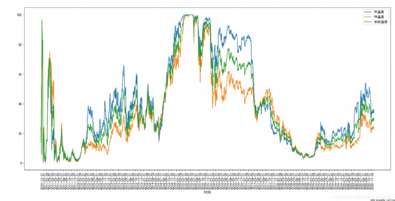
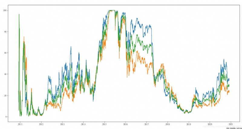
Don't use data.plot(xticks=pd.date_range(‘2010-12-02’,‘2020-12-02’,freq=‘M’),rot=90)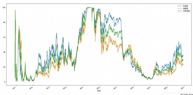
The second method
import pandas as pd
import numpy as np
import matplotlib.pyplot as plt
# Need to install xlrd pip install xlrd==1.2.0
time = pd.read_excel('data/zz500zhishu.xlsx',sheet_name ='Sheet1',usecols=[0])
time_v = time.values
PE = pd.read_excel('data/zz500zhishu.xlsx',sheet_name ='Sheet1',usecols=[2])
PE_v = PE.values
PB = pd.read_excel('data/zz500zhishu.xlsx',sheet_name ='Sheet1',usecols=[4])
PB_v = PB.values
temp = pd.read_excel('data/zz500zhishu.xlsx',sheet_name ='Sheet1',usecols=[5])
temp_v = temp.values
plt.plot(time_v,PE_v)
plt.plot(time_v,PB_v)
plt.plot(time_v,temp_v)
plt.show()
import pandas as pd
import matplotlib.pyplot as plt
data = pd.read_csv('data/yiming.csv',na_values=0,index_col=[0],encoding='GBK',usecols=[0,1,2])
data.plot()
plt.rcParams['font.sans-serif']=['SimHei','SimSun'] # Show Chinese tags
plt.rcParams['axes.unicode_minus']=False
# Show x The problem with the axis , And rotate 90 degree
plt.show()
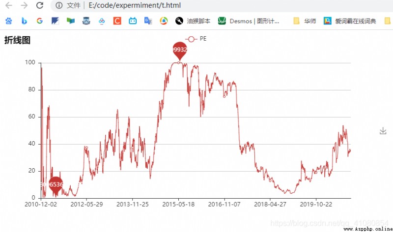
from pyecharts import Line# pip install pyecharts==0.1.9.4
import numpy as np
import pandas as pd
def to_time(T):
time_LIST = []
for time in T:
temp=time.strftime('%Y-%m-%d')
time_LIST.append(temp)
return time_LIST
time = pd.read_excel('data/zz500zhishu.xlsx',sheet_name ='Sheet1',usecols=[0])
time_list = time[' Time '].to_list()# Convert it to list
time_v = to_time(time_list)
PE = pd.read_excel('data/zz500zhishu.xlsx',sheet_name ='Sheet1',usecols=[2])
PE_v = PE['PE temperature '].tolist()# Convert it to list
line=Line(" Broken line diagram ")
line.add('PE',time_v,PE_v,mark_point=["max","min"])
line.render('t.html')