pack Common properties
pack Class provides the following functions ( Call with component instance object )
grid Property settings
grid Class provides the following functions ( Call with component instance object )
place Property settings
place Class provides the following functions ( Call with component instance object )
The so-called layout , It means to control the controls in the form container ( Components ) Location relationship of .
tkinter There are three geometry layout managers , Namely :
pack Layout
grid Layout
place Layout
pack Layout
Use pack Layout , Components will be added to the container , The first added component is at the top , Then add down .
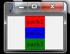
from tkinter import *root = Tk()# Create three Label Add to respectively root In form #Label Is a component used to display text or pictures Label(root,text = 'pack1',bg = 'red').pack() Label(root, text = 'pack2', bg = 'blue').pack() Label(root, text = 'pack3', bg = 'green').pack() root.mainloop()Pictured :
Be careful : All values in the above table are constants ,YES Equivalent to "yes", You can also directly pass in a string value . In addition, when the interface complexity increases , To achieve a certain layout effect , Layering is required to achieve .
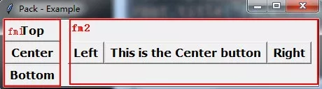
from tkinter import * # Pay attention to the module import mode , Otherwise the code will be different class App: def __init__(self, master): # Use Frame Add a layer of containers fm1 = Frame(master) #Button It's a button component , And Label similar , It's just that there's a click response function Button(fm1, text='Top').pack(side=TOP, anchor=W, fill=X, expand=YES) Button(fm1, text='Center').pack(side=TOP, anchor=W, fill=X, expand=YES) Button(fm1, text='Bottom').pack(side=TOP, anchor=W, fill=X, expand=YES) fm1.pack(side=LEFT, fill=BOTH, expand=YES) fm2 = Frame(master) Button(fm2, text='Left').pack(side=LEFT) Button(fm2, text='This is the Center button').pack(side=LEFT) Button(fm2, text='Right').pack(side=LEFT) fm2.pack(side=LEFT, padx=10)root = Tk()root.title("Pack - Example")display = App(root)root.mainloop()Above , Create a Frame Containers fm1, Arrange three vertically Button Components use pack Put the layout into fm1 In the container , Then create fm2 Containers , Also arrange three horizontally Button Component in , In the end, there will be two Frame Containers as components , Use pack Put the layout into the root form container .
Such a layered layout , It realizes the relatively complex interface requirements .
grid Layout
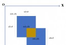
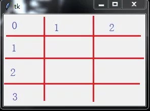
grid Layout is also called grid layout , Is the most recommended layout . Most programs have rectangular interfaces , We can easily divide it into a grid of rows and columns , Then according to the row number and column number , Place components in the grid . Use grid Layout time , You need to specify two parameters inside , Use them separately row Said line ,column The column . It should be noted that row and column The serial numbers are from 0 Start .
Here's the picture , Suppose you divide the interface into grids .
place Property settings Property name Attribute analysis Value Value description anchor Anchor options , Same as pack Layout The default value is NW Same as pack Layout x、y In the upper left corner of the assembly x、y coordinate Integers , The default value is 0 Absolute position coordinates , Unit pixel relx、rely Component relative to parent container x、y coordinate 0~1 Floating point number between The relative position ,0.0 It means the left edge ( Or upper edge ),1.0 It means the right edge ( Or lower edge )width、height Width of components 、 Height Non-negative integer Unit pixel relwidth、relheight The width of the component relative to the parent container 、 Height 0~1 Floating point number between And relx(rely) Values are similarplace Layout .
The simplest and most flexible layout , Use the component coordinates to place the location of the component . But it is not recommended to use , At different resolutions , The interface is often quite different .
bordermode If set to INSIDE, The size and position inside the component are relative , Excluding borders ; If it is OUTSIDE, The external size of the component is relative , Including borders INSIDE、OUTSIDE( The default value is INSIDE) You can use constants INSIDE、OUTSIDE, You can also use string form "inside"、"outside"
place Class provides the following functions ( Call with component instance object ) Function name describe place_slaves() Return all sub component objects of this component in list mode .place_configure(option=value) to pack Layout manager settings properties , Use attributes (option)= Value (value) Mode setting propagate(boolean) Set to True Indicates that the geometry size of the parent component is determined by the child component ( The default value is ), Otherwise, it has nothing to do with it .place_info() return pack Value corresponding to the provided option .grid_forget()Unpack Components , Hide components and ignore old settings , Object still exists , It can be used pack(option, …), Display it .location(x, y)x, y Is a point in pixels , Function returns whether the point is in a cell , In which cell . Return cell row and column coordinates ,(-1, -1) Means not in it size() Return the cells contained in the component , Reveal component size .The above is personal experience , I hope I can give you a reference , I also hope you can support the software development network .
