# Course link
Introduction to actual combat , Tell me about the company's wechat applet 【django+drf+ Applet practice 】_ Bili, Bili _bilibili
# Document links
Wechat open documents
# Course content
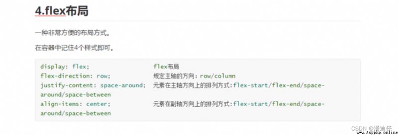
(1)flex Layout
(2)flex Layout ( Add ?)
(3)flex Example
(4) Homework _ Direct the above figure to the code
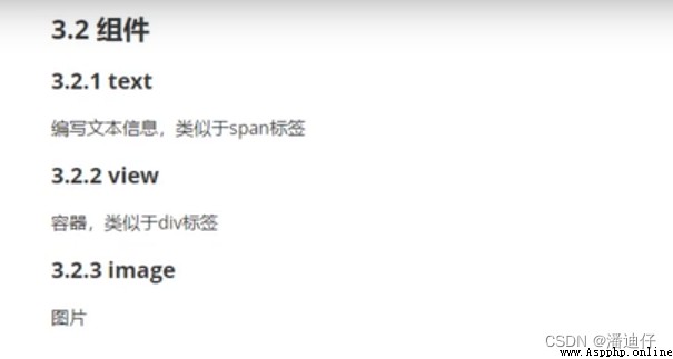
# (1)text and view Components .
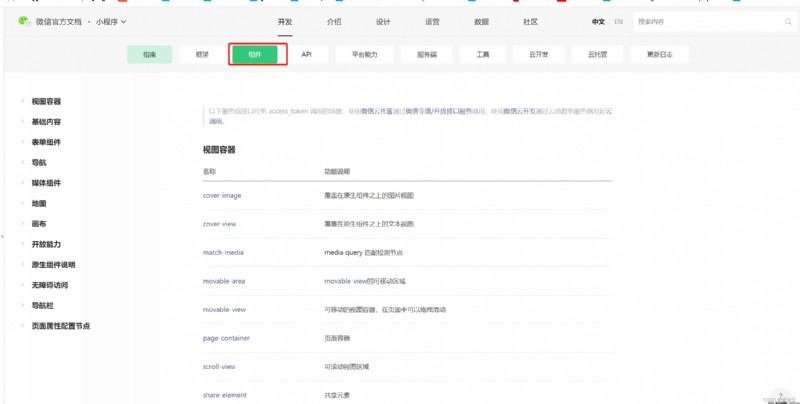
In the applet , I won't put the front end html Labels are called labels , They are called components . in other words text Components and view Components . As shown in the figure below , We can open the development documentation , Select the component column to see the function descriptions of various components .
This section focuses on text and view also image Three common components , Basically, most small programs are made up of these three components . In fact, it can be used with html About the same .
# (2)flex Layout .
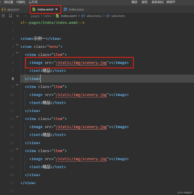
1) The first is to know image Components , In fact, it's just like html Inside img The label is similar . As shown in the figure below , It's easy to see image Use of components .
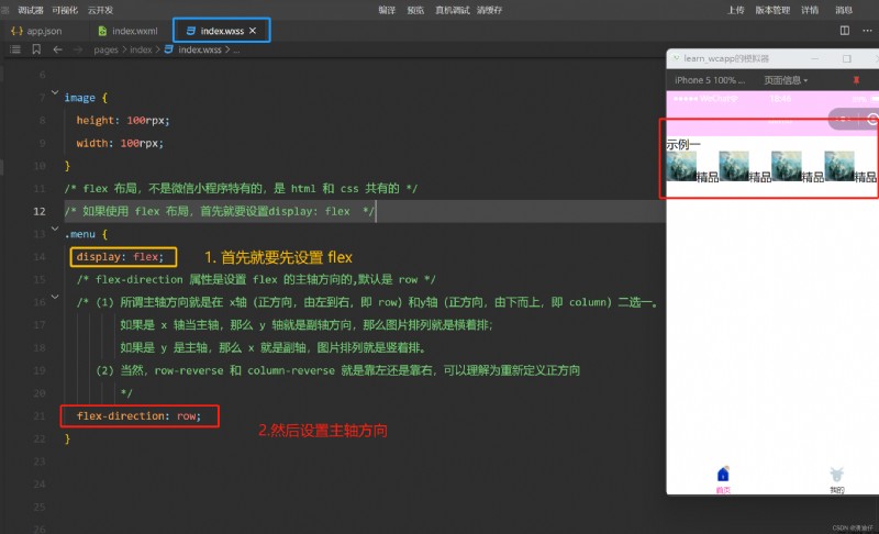
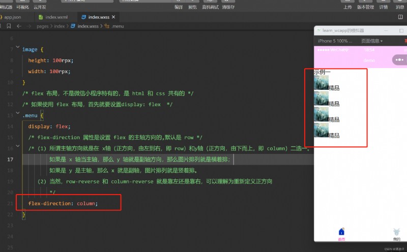
2) flex Preliminary layout _ 1. From the above wxml In the code , We know .menu Property corresponds to view Components are the outermost components ( This is the parent container ); It's wrapped inside .item Attribute view Components ( Sub container ); Then under each sub container , It's just image and text Components . With this premise , So if we are going to x The axis is set to the spindle direction , that wxss The code for is as follows , That is, set the parent container to flex Layout mode , Then flex-direction: row, You can see the effect as shown in the figure . Follow up explanation , So x The axis is the main axis .
If we were to y As a spindle , Then set it at flex-direction: column, You can see the picture below . You can see that the pictures are arranged vertically .
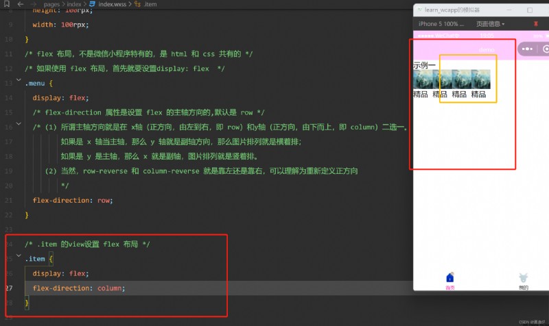
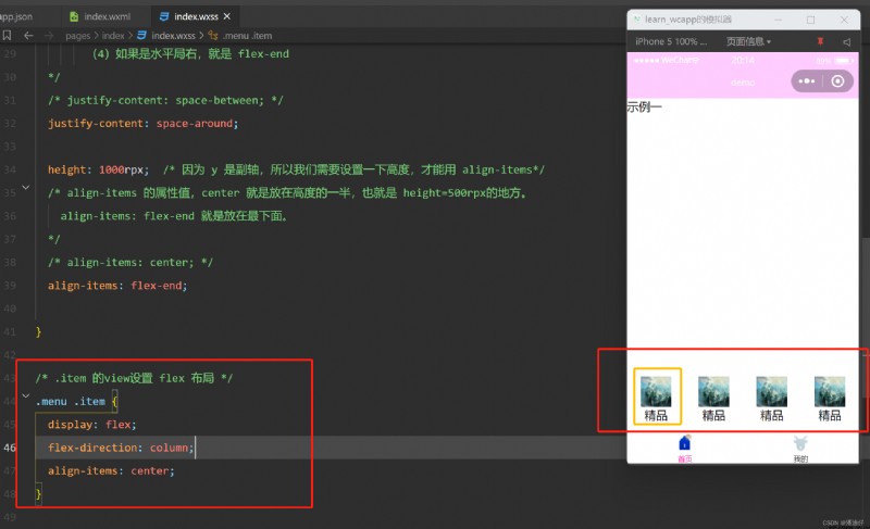
3) flex Preliminary layout _ 2. We can see , The above pictures and words are also arranged horizontally . We need to pay attention to .item Of view Is the parent container of the picture and text components ( It is not the same as the above !!!), If we want to make the pictures and words stand upright , We can also set... For this parent container flex Layout , Set up y Is the spindle direction . Then you can see the effect of the following figure
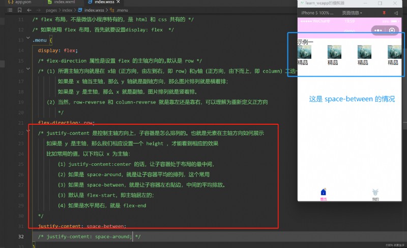
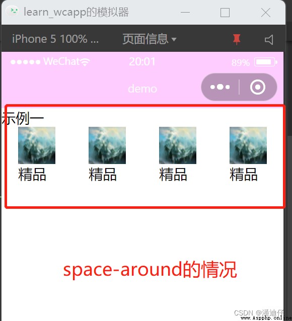
4) We are 3) In the rendering in , You can see that each group of pictures is very close , That is, the parent container of the picture and the text are very close . Here's another one justify-content Property can be used to set how it is arranged horizontally . See the notes in the figure below for details
If justify-content: space-around , Then the effect is as shown in the following figure :
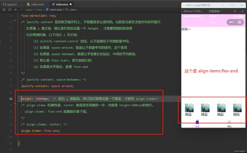
5) The style setting of the secondary axis uses align-items, See Notes in the figure below .
6) Then let's look at the alignment of the picture and the text , It's obviously aligned to the left . If we want them to be centered , You can also align parent containers for operations . See figure below . In fact, the core is flex Layout , Container based layout .
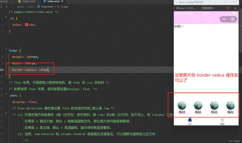
7) If we want the pictures to be round , Not the square above .
# summary , Directly above .
# (1) Applet specific styles
1)rpx and px.rpx Simply put, it is a pixel conversion relationship set by the applet for us , Because different devices have different pixel sizes , If traditional px Pixels to write , Then there will be problems during adaptation . To solve this problem , We just need to define , The width of the applet interface must be 750 rpx, How many pixels are filled , By the pixel size of each device , Calculate for yourself . All in all , Small program , Use rpx As a unit of width and height .
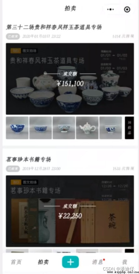
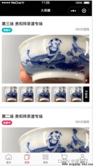
2) example , We want to achieve what the following figure looks like .
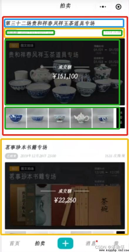
A brief analysis of , That is, each auction is a box , Then the title under the box is a box .
# (2) Start implementing code .
1) After the above analysis , We write the corresponding code directly . Here are wxml Code for .
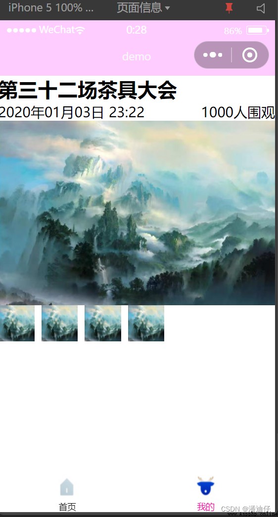
<!-- The outermost parent container , It covers every special auction -->
<view class="outer">
<!-- This is a special auction of tea sets -->
<view class="items">
<!-- title -->
<view class="title">
The 32nd tea set conference
</view>
<!-- Events and onlookers -->
<view class="customer">
<view>2020 year 01 month 03 Japan 23:22</view>
<view>1000 People gathered around </view>
</view>
<!-- Special scene map -->
<view class="pic">
<image class="big" src="/static/img/scenery.jpg"></image>
</view>
<!-- detailed -->
<view class="detail">
<image src="/static/img/scenery.jpg"></image>
<image src="/static/img/scenery.jpg"></image>
<image src="/static/img/scenery.jpg"></image>
<image src="/static/img/scenery.jpg"></image>
</view>
</view>
</view>
2) Here are wxss Code for .
/* css */
.outer .items .title{
font-size: 56rpx;
font-weight: 600;
}
.outer .items .customer{
display: flex;
flex-direction: row;
justify-content: space-between;
}
.outer .items .pic {
height: 500rpx; /* Define this outside view The height of , Width is 750rpx */
overflow: hidden; /* Big picture ,view Small , Then hide the extra pictures */
}
/* Set pictures , according to view Size , Scale proportionally */
.outer .items .pic .big {
height: 100%;
width: 100%;
}
/* Definition detail Of flex Layout */
.outer .items .detail {
display: flex;
flex-direction: row;
}
/* Set a width and height for each picture */
.outer .items .detail image {
width: 100rpx;
height: 100rpx;
padding-right: 20rpx;
}
3) Effect display .
# summary
In fact, the above attributes are used flexibly . Just write more and practice more .
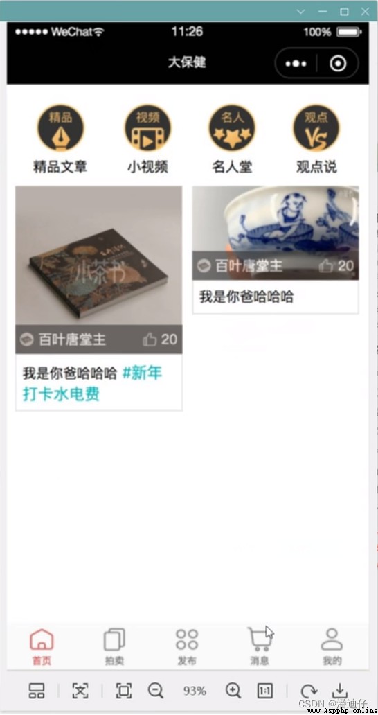
# (1) home page
1) Front-end UI picture .
# (2) The auction page has been written ~~
1) front end UI page .
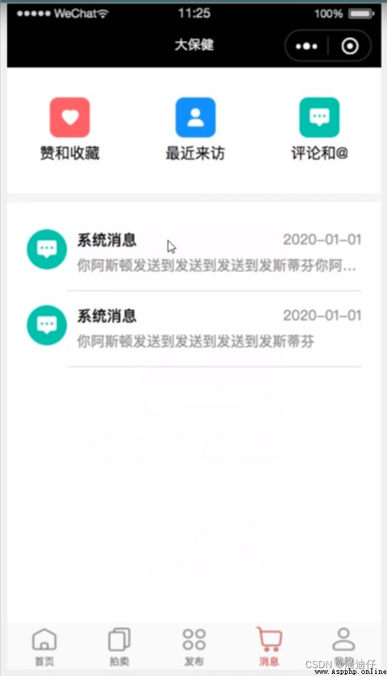
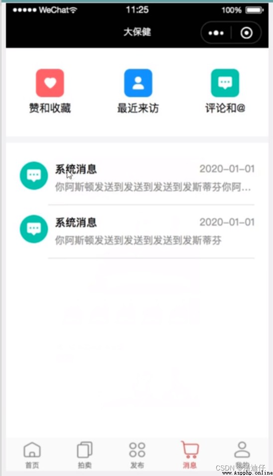
# (3) Message page
1) front end UI page .
# (4) My page
1) front end UI page .
#