This article USES the Python Matplotlib、Pyecharts、Seaborn、Plotl, And the interface of drawing visual map provided by Baidu BMap Tools such as , To Wuhan 14 Visual analysis of housing price data in districts , Draw a thermal map of house price distribution 、 Many charts such as the rising sun chart of house price distribution , Data source is use Python Scrapy and Selenium From the chain home 、 The house price and related data crawled by shell online , common 5056 Data .
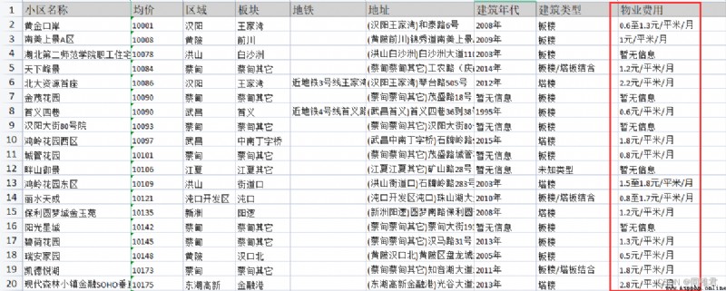
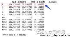
Data preview :
Data address :
Wuhan housing price distribution data set - Data mining document resources -CSDN download This data set is for use PythonScrapy、Selenium From the chain home 、 More download resources of Wuhan housing prices and related data crawled by shell net 、 For learning materials, please visit CSDN Download channel . https://download.csdn.net/download/qq_52181283/85863824 Data field :
author :A WHU SIMer
Catalog
introduction
One 、 Introduction to the visualization tools used
1.1 Matplotlib
1.2 Pyecharts
1.3 Seaborn
1.4 Plotly
1.5 BMap
Two 、 Data preprocessing
2.1 Import related packages 、 Read the data and check the basic situation of the data
2.2 Metro field processing
2.3 Construction year field processing
2.4 Building type field processing
2.5 Property expense field processing
2.6 Field processing of total number of buildings and total number of houses
2.7 Save the processed data and view its information
3、 ... and 、 Data Analysis Visualization
3.1 The overall distribution map of housing prices in the city
3.2 Histogram of the overall distribution of housing prices in the city
3.3 Box chart of housing price distribution in each district
3.4 Column chart of median house price in each district
3.5 The distance from the housing source to the city center 、 The type of building 、 Scatter diagram of the relationship between property costs and house prices
3.6 The rising sun chart of the distribution of house prices in various districts and plates
3.7 Heat map of housing price distribution in the city
Four 、 Monthly income 1 About 10000 suggestions for buying a house
Matplotlib It's a Python 2D Drawing library , At the same time, it also provides some 3D Drawing interface . Matplotlib yes Python One of the most popular data visualization packages in , Usually with NumPy、 Pandas Use it together , Just a few lines of code can generate a chart 、 Histogram 、 Power spectrum 、 Bar chart 、 Error chart 、 Scatter plot, etc. , It is one of the indispensable tools in data analysis . This article USES the matplotlib Participate in drawing the histogram of house prices 、 Box figure 、 Bar chart 、 Scatter plot .
Matplotlib — Visualization with Python https://matplotlib.org/
Pyecharts ( https://pyecharts.org ) It's a Python Echarts Drawing library ,Python It's an expressive language , Very suitable for data processing ,Echarts It is an open source application for Fast build based on Web Visual declarative framework , With its good interactivity , Delicate diagram Table design , Has been recognized by many developers , When data analysis meets data visualization ,pyecharts then The birth of .Pyecharts Include 30 A variety of common charts , It can be said that there is everything , Through highly flexible Configuration item , Can be easily matched with a beautiful chart . This article USES the Pyecharts The overall distribution map of housing prices in the city has been drawn .
pyecharts - A Python Echarts Plotting Library built with love.Description https://pyecharts.org/#/zh-cn/intro
Seaborn Is based on matplotlib Graphic visualization of python package . It provides a highly interactive interface , It is convenient for users to make all kinds of attractive statistical charts .Seaborn Is in Matplotlib On the basis of a more advanced API encapsulation , So it's easier to draw , Use... In most cases seaborn Can make a very attractive picture . And it's highly compatible numpy And pandas Data structure and scipy And statsmodels And so on . This article USES the Seaborn The overall distribution histogram of house prices in the city is drawn 、 Box chart of housing price distribution in each district 、 Column chart of median house price in each district 、 Scatter diagram of the relationship between the distance between the building and the city center and the price .
seaborn: statistical data visualization — seaborn 0.11.2 documentation https://seaborn.pydata.org/
Plotly It is an interactive that is rapidly improving and rising 、 Open source drawing library ,Python plotly Library is an important branch of it . It now supports more than 40 A unique chart type , Covering a wide range of Statistics 、 Finance 、 Geography 、 Science and 3D use cases .Plotly adopt JavaScript structure , Can be based on Web Display to achieve interactive visualization , So its graphics can be easily displayed in Jupyter notebook And independent html in . This article USES the plotly The rising sun map of the distribution of house prices in all districts and plates is drawn .
Plotly: The front end for ML and data science modelsDash apps go where traditional BI cannot: NLP, object detection, predictive analytics, and more. With 1M+ downloads/month, Dash is the new standard for AI & data science apps. https://plotly.com/
BMap It is the interface of drawing map and visual chart provided by Baidu map , You need to register the application in Baidu map and obtain the key before calling Baidu map API To map the heat map . Use BMap There are two ways : First, use. python.pyecharts.charts in BMap library , Second, in html Page usage JavaScript establish BMap object . This paper uses method 2 to draw the thermal map of the city's housing price distribution .
jspopularGL | Baidu Maps API SDK https://lbsyun.baidu.com/index.php?title=jspopularGL
<script type="text/javascript" src="http://api.map.baidu.com/library/Heatmap/2.0/src/Heatmap_min.js"></script>Data preprocessing part , Just use pandas, You can complete the processing of each field data , If missing value 、 Change the data format .
import pandas as pd
# Reading data
data = pd.read_excel(" Wuhan housing price data .xlsx")
# View the basic information of the data
print(data)
print(data.info())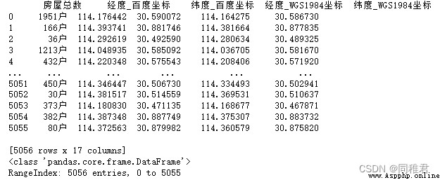
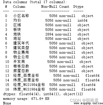
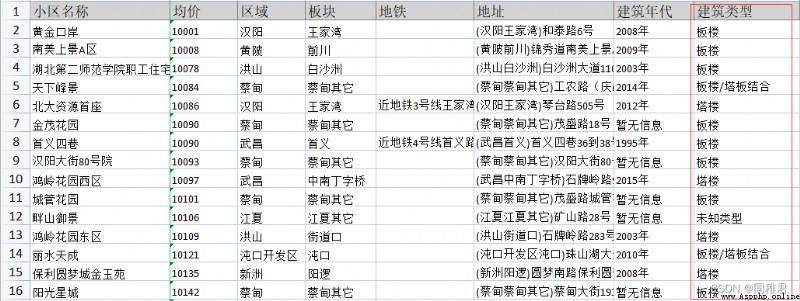
You can see that there are 5056 Building sample information , share 17 A field , The average price of residential buildings is used to represent the residential property price level . There are many missing values in the subway field ,“ The total number of buildings ”、“ The total number of houses ” The data type of the field should be numeric , But from the above figure, the data types of both are objects , It shows that there are some problems , Other fields need to be modified more or less before they are used for visualization , The specific modification measures are described below .
# Metro field processing , Extract subway line numbers :
metro = []
for i in range(len(data[" metro "])):
metroStation = data[" metro "][i]
if pd.isnull(metroStation): # When there is no subway
metro.append(0) # 0 It means there is no subway station nearby
else: # When there is a subway , Extract the subway number
lineNum = metroStation[metroStation.index(" iron ") + 1: metroStation.index(" Number ")]
metro.append(int(lineNum))
data["metro"] = metro
data.drop(' metro ',axis=1,inplace=True) # Delete the original “ Metro field ”
print(data[0:10])
print(data.info())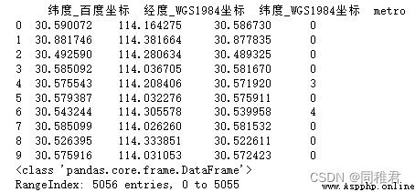
Because there are many missing values in the subway field , If the missing value is deleted , It will greatly reduce the amount of sample data , Therefore, the supplementary method was adopted , use 0 Replace missing values . And extract the subway number from the cell with subway , Such as “ Near the subway 3 Wangjiawan station of line ” The extracted Metro number is 3, Save in new field metro in .
year = []
for i in range(len(data[" The age of Architecture "])):
yearNum = data[" The age of Architecture "][i]
if yearNum == " No information ":
year.append(0) # 0 Representing unknown
else:
year.append(int(yearNum[0:-1]))
data["year"] = year
data.drop(' The age of Architecture ',axis=1,inplace=True)
print(data[[" Community name ","year"]][0:10])
print(data.info())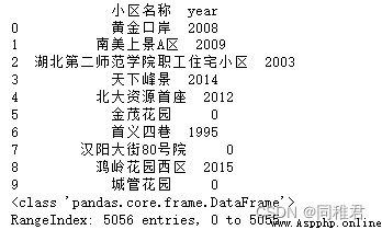
The original format of the building year field is “*** year ”, And there are missing values in the indirect sense “ No information ”, So use 0 Express “ No information ”, Extract the year to represent “*** year ”, This is convenient for visualization calculation .
You can see that there are many values in the building type field :“ Banlou ”、“ tower ”、“ Banlou / Tray combination ”、“ Unknown type ”、“ Tray combination ”、“ tower / Banlou ”······ But in the final analysis, there are only four values , Unknown type 、 Banlou 、 tower 、 Plate tower combination . So use them separately 0,1,2,3 Represent these four values respectively .
buildingType = []
for i in range(len(data[" The type of building "])):
type = data[" The type of building "][i]
if type == " Unknown type ":
buildingType.append(0)
# print(0)
elif type == " Banlou ":
buildingType.append(1)
# print(1)
elif type == " tower ":
buildingType.append(2)
# print(2)
else:
buildingType.append(3)
# print(3)
data["buildingType"] = buildingType
data.drop(' The type of building ',axis=1,inplace=True)
print(data[[" Community name ","buildingType"]][0:10])
print(data.info())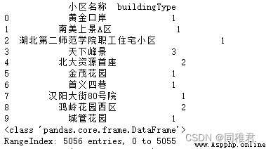
You can see “ Property costs ” There is a certain regularity in the value of the field , That is to “ element / Square meters / month ” ending , There are two forms of fixed cost and interval cost . So for fixed costs , Extract fixed fee value , For interval costs , Use the intermediate value to represent , about “ No information ” Then use -1 representative ( no need 0 Express , Because considering the property fee is 0 The situation of , and 0 It is not suitable to indicate missing values here ).
propertyExpense = []
for i in range(len(data[" Property costs "])):
expense = data[" Property costs "][i]
if expense == " No information ":
propertyExpense.append(-1)
# print(-1)
elif " to " in expense:
minPrice = float(expense[0 : expense.index(" to ")])
maxPrice = float(expense[expense.index(" to ")+1 : expense.index(" element ")])
price = round((minPrice+maxPrice)/2, 2)
propertyExpense.append(price)
# print(price)
else:
price = float(expense[0 : expense.index(" element ")])
propertyExpense.append(price)
# print(price)
data["propertyExpense"] = propertyExpense
data.drop(' Property costs ',axis=1,inplace=True)
print(data[[" Community name ","propertyExpense"]][0:10])
print(data.info())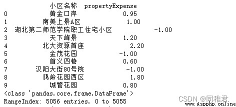
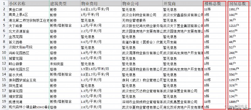
You can see “ The total number of buildings ” And “ The total number of houses ” The data of the field is represented by “ building ” and “ Household ” At the end of the word , For ease of calculation , Then delete these two words , And change the data to numerical .
# Building total field processing , Get rid of ” building “ word , Change the type of field value to numeric
data[" The total number of buildings "] = data[" The total number of buildings "].apply(lambda x: int(x[0:-1]))
# Total number of houses field processing , Get rid of ” Household “ word , Change the type of field value to numeric
data[" The total number of houses "] = data[" The total number of houses "].apply(lambda x: int(x[0:-1]))
print(data.info())
print(data[[" Community name "," The total number of buildings ", " The total number of houses "]])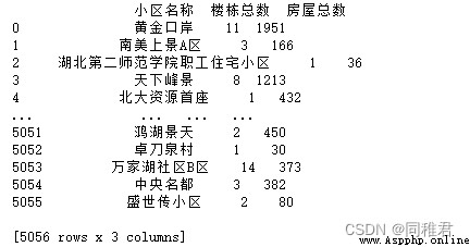
The purpose of saving the preprocessed data is to read the new data file directly during visualization , Instead of having to do another data preprocessing process every time you use it .
data.to_csv("WuHan.csv", encoding="utf8",index=False)
newData = pd.read_csv("WuHan.csv")
print(newData.info())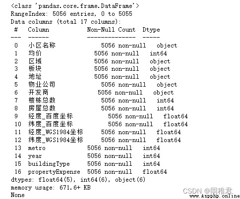
【 Be careful 】: The house price is hereinafter referred to as x, The specific meaning is :x element / Square meters , Such as 1 ten thousand , Express 1 Ten thousand yuan / Square meters .
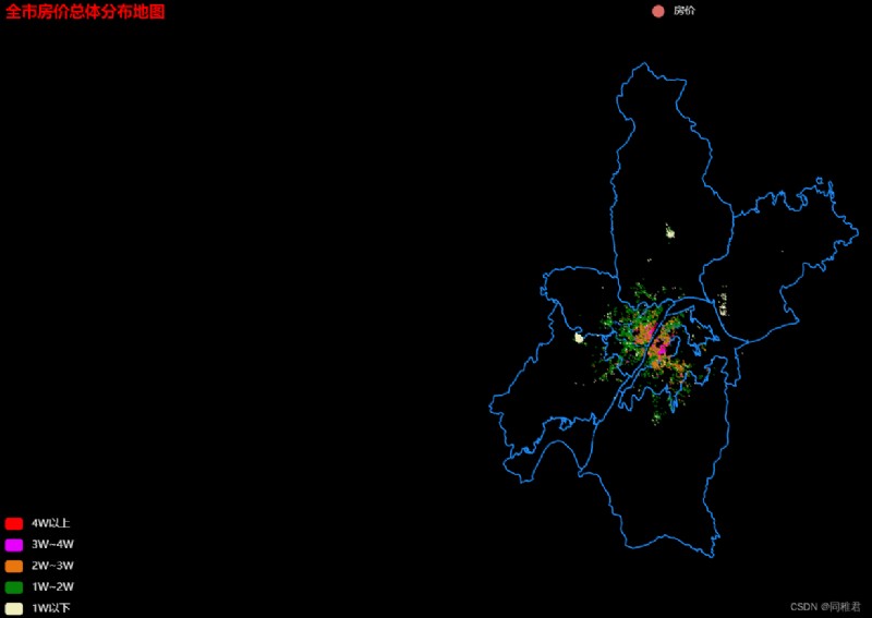
draw pyecharts.charts.Geo For maps , The coordinates used are “ longitude _ Baidu coordinates ” and “ latitude _ Baidu coordinates ”, The chart is as follows :
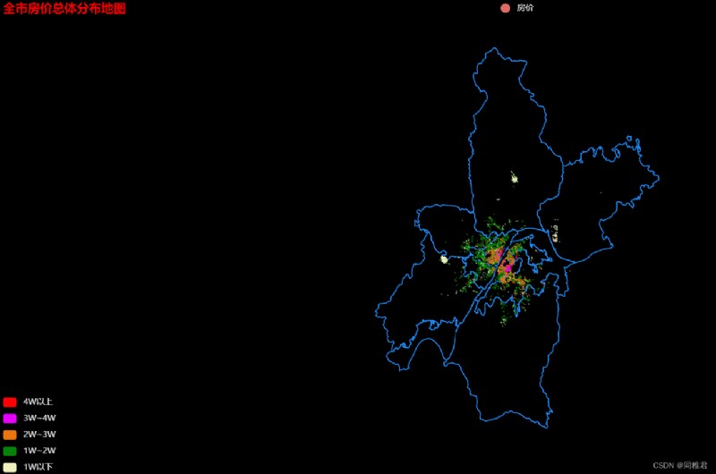
From above , It can be seen that the housing supply is concentrated in Wuchang district near the Yangtze River 、 Hanyang District 、 Qiaokou District 、 Jianghan District 、 Riverside area 、 Hongshan district . The house prices on both sides of the Yangtze River in the middle of Wuhan are relatively high , stay 3、4 All the above .1 Wan to 2 Ten thousand houses are the most , And closely surrounding the central high-priced housing area .1 Houses below 10000 are mainly distributed in Caidian District 、 Huangpi District 、 Xinzhou District and Jiangxia District , It is far away from the center of Wuhan , And in these four districts , The house price in Jiangxia District is relatively high , This also shows that the economic strength of Jiangxia District is higher than the other three .
Code :
import pyecharts
import pandas as pd
from pyecharts.charts import Geo
from pyecharts import options as opts
from pyecharts.datasets import register_url
from pyecharts.globals import ThemeType
from pyecharts.globals import GeoType
data = pd.read_csv("WuHan.csv", encoding="utf8")
dataList = data.to_dict(orient='records')
try:
register_url("https://echarts-maps.github.io/echarts-china-counties-js/")
except Exception:
import ssl
ssl._create_default_https_context = ssl._create_unverified_context
register_url("https://echarts-maps.github.io/echarts-china-counties-js/")
geo=Geo(init_opts=opts.InitOpts(theme=ThemeType.DARK,
width="100%",
height="700px",
page_title=" Wuhan City 2018 Visualization of annual house price data ",
bg_color="black"))
geo.add_schema(maptype=' wuhan ',
label_opts=opts.LabelOpts(is_show=True),
itemstyle_opts=opts.ItemStyleOpts(color="black", border_color="#1E90FF", border_width=1.5))
data_pair = []
for item in dataList:
name = item[" Community name "]
value = item[" Average price "]
longitude = item[" longitude _ Baidu coordinates "]
latitude = item[" latitude _ Baidu coordinates "]
# Add building coordinates to the map
geo.add_coordinate(name, longitude, latitude)
data_pair.append((name, value))
# Add data items , That is, assign a value to the building location in the map
geo.add(" housing price ",
data_pair=data_pair,
type_="scatter",
symbol_size=1.5,
is_large=True,
)
# Configure grouping colors
pricePieces = [
{"max": 10000, "label":"1W following ", "color": "#F0F0BF"},
{"min": 10000, "max": 20000, "label": "1W~2W", "color": "#08830A"},
{"min": 20000, "max": 30000, "label": "2W~3W", "color": "#EA760F"},
{"min": 30000, "max": 40000, "label": "3W~4W", "color": "#E800FF"},
{"min": 40000, "label": "4W above ", "color": "#FF0005"},
]
geo.js_dependencies.add("echarts-gl")
geo.set_series_opts(label_opts=opts.LabelOpts(is_show=False))
geo.set_global_opts(title_opts=opts.TitleOpts(title=" Wuhan City 2018 Visualization of annual house price data ", pos_left="left", title_textstyle_opts=opts.TextStyleOpts(color="red")),
visualmap_opts=opts.VisualMapOpts(is_piecewise=True, pieces=pricePieces))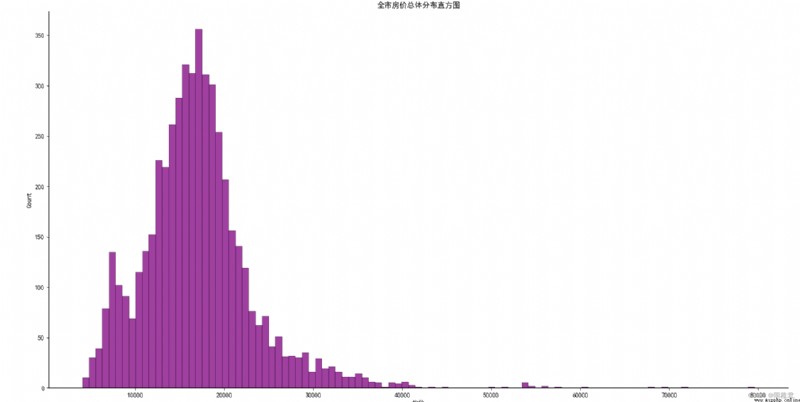
geo.render(" wuhan Geo.html")Use seaborn The histogram of house price distribution of all samples drawn is as follows . It can be estimated from the figure below that house prices in Wuhan are concentrated in 4 thousand ~4 In the range of 10000 , among 1 Wan to 2.5 Million houses account for the majority .4 There are few houses with more than 10000 , The highest approach 8 ten thousand , combination 3.1 chart 1 It can be seen that these high priced houses are located in Wuchang District 、 Hanyang District 、 Qiaokou District 、 Jianghan District 、 Riverside area .
Code :
print(data[" Average price "].max())
# Check the overall house price histogram ----------------------------
sns.displot(data[" Average price "],
kde_kws={"color": "r", "lw": 1, "label": "KDE"},
color="purple"
)
plt.title(" Histogram of the overall distribution of housing prices in the city ")
plt.show()Use seaborn The box diagram of housing price distribution in Wuhan is as follows . In the chart, the districts have been sorted in descending order according to the size of the median house price in each district , Therefore, it can be seen intuitively that the top three districts of median house prices are : Wuchang District 、 Hongshan district 、 Riverside area , Its median house price is close to 2 ten thousand .
From the perspective of outliers , It can be concluded that Hongshan District 、 Riverside area 、 There are great differences in house prices in Jianghan District , The price of high priced houses can even reach 7 Wanor 8 ten thousand , And the lowest price of houses is about 5 Thousand or so . From the figure below, it can also be determined that , The highest housing price is in Jianghan District .
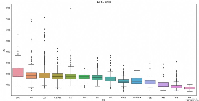
Code :
my_order = data.groupby(by=[" Area "])[" Average price "].median().sort_values(ascending=False).index
print(data.groupby(by=[" Area "])[" Average price "].median().sort_values(ascending=False))
print(my_order)
# sns.catplot(x=' Area ', y=' Average price ', data=data, order=my_order, kind="violin") # Draw a picture of the violin
sns.boxplot(x=' Area ', y=' Average price ', data=data, order=my_order)
plt.title(" Box chart of house price in each district ")
plt.show()Use seaborn The column chart of the median house price of each district in Wuhan is as follows . Because when a group of data has great differences , The median can better represent the medium level of this group of data than the average , So the median is used as the evaluation index . From the picture below , Not only can we intuitively see the ranking of the median house price in each district , It can also visually compare the gap between their median house prices . Besides , In Wuhan 14 In three districts , Only Caidian District and Xinzhou District have median house prices 1 All of the following , It shows that the overall housing price in Wuhan is on the high side .
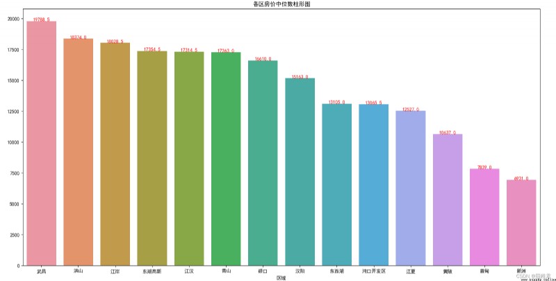
Code :
x = data.groupby(by=[" Area "])[" Average price "].median().sort_values(ascending=False).index
y = data.groupby(by=[" Area "])[" Average price "].median().sort_values(ascending=False).values
ax = sns.barplot(x,y)
print(data.groupby(by=[" Area "])[" Average price "].median().sort_values(ascending=False).reset_index())
for index,row in data.groupby(by=[" Area "])[" Average price "].median().sort_values(ascending=False).reset_index().iterrows():
ax.text(row.name, row[" Average price "], row[" Average price "],color="red", ha="center")
plt.title(" Column chart of median house price in each district ")
plt.show()Use seaborn The distance between the housing source in Wuhan and the downtown is drawn 、 The type of building 、 The scatter diagram of the relationship between property costs and house prices is as follows . This paper sets the location of Wuhan municipal government as the center of Wuhan , Its Baidu coordinate is :(114.311754, 30.598604). Use the baidu coordinates of the housing source and the location coordinates of Wuhan municipal government to calculate the actual distance between the housing source and Wuhan municipal government , Its calculation formula is as follows :
Let the coordinates of any two points on the earth be (X1,Y1)、(X2,Y2), among X1、X2 For longitude ,Y1、Y2 For latitude , And the equatorial radius of the earth is known R= 6371.0 km, Then the distance between these two points d The formula is :
d= R*arcos[cos(Y1)*cos(Y2)*cos(X1-X2)+sin(Y1)*sin(Y2)]
utilize “ Gold port ” Cell to verify the correctness of the calculation results , The calculation result is consistent with the ranging result .
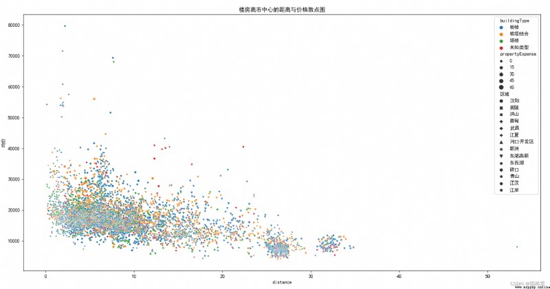
It can be seen from the above figure that the house price is negatively correlated with the distance from the housing source to the center of Wuhan , The distance from most houses to the center of Wuhan is 20km within . Besides , There are many houses with slab structure , The price in 4 The houses with more than 10000 yuan are almost all plank buildings or tower plate combined structures , It shows that Banlou is more favored by buyers . This is directly related to the characteristics of Banlou . Banlou is mostly in the north-south direction , The north and the south are transparent , Convenient for lighting and ventilation , And the house type is square , The plane layout is reasonable , The spatial scale of each function is appropriate , Compared with the tower, it has good lighting 、 Low density 、 Advantages of low management cost , This means that the price of Banlou is often higher than that of the tower , The above figure can also prove this .
Code :
centerPoint = (114.311754, 30.598604)
R = 6371
data["distance"] = data[[" longitude _ Baidu coordinates ", " latitude _ Baidu coordinates "]].apply(lambda x: math.fabs(R*math.acos(math.cos(x[" latitude _ Baidu coordinates "]*math.pi/180)*math.cos(centerPoint[1]*math.pi/180)*math.cos(x[" longitude _ Baidu coordinates "]*math.pi/180-centerPoint[0]*math.pi/180)+math.sin(x[" latitude _ Baidu coordinates "]*math.pi/180)*math.sin(centerPoint[1]*math.pi/180))),
axis=1)
print(data[[" longitude _ Baidu coordinates ", " latitude _ Baidu coordinates ", "distance"]])
data["buildingType"].loc[data["buildingType"] == 0] = " Unknown type "
data["buildingType"].loc[data["buildingType"] == 1] = " Banlou "
data["buildingType"].loc[data["buildingType"] == 2] = " tower "
data["buildingType"].loc[data["buildingType"] == 3] = " Plate tower combination "
sns.scatterplot(data=data,
x='distance',
y=' Average price ',
hue="buildingType", # Set the grouping color
style=' Area ', # Set grouping style
size='propertyExpense' # Set the group size
)
plt.title(" Scatter chart of the distance between the building and the city center and the price ")
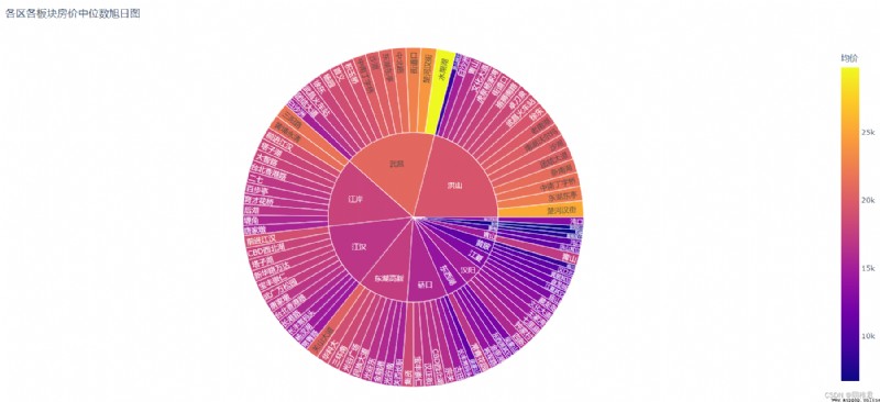
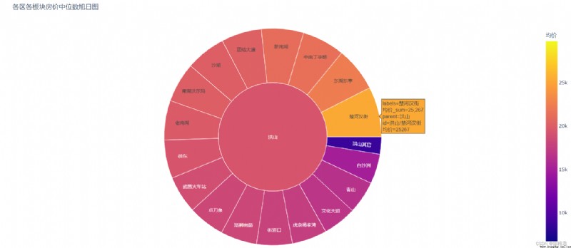
plt.show()Use plotly The sunrise map of the distribution of house prices in all districts and plates of Wuhan is as follows . From the picture 1 It can be seen at a glance that the median value of house prices in the fruit lake plate in Wuchang district is the largest , The second is the Chuhe Hanjie plate in Hongshan District and the Chuhe Hanjie plate in Wuchang District . Click on “ Hongshan ”, Check the proportion of the median house price of each plate in Hongshan District , Pictured 2, You can see , As the distance between the plate and the center of Wuhan increases , House prices in the sector are gradually declining .
Code :
newdata = data.groupby([" Area ", " plate "])[" Average price "].median().reset_index()
print(newdata)
chart = express.sunburst(newdata,path=[" Area ", " plate "], values=" Average price ", color=" Average price ", title=" Rising sun chart of the median house prices of all districts and sectors ")
chart.show()
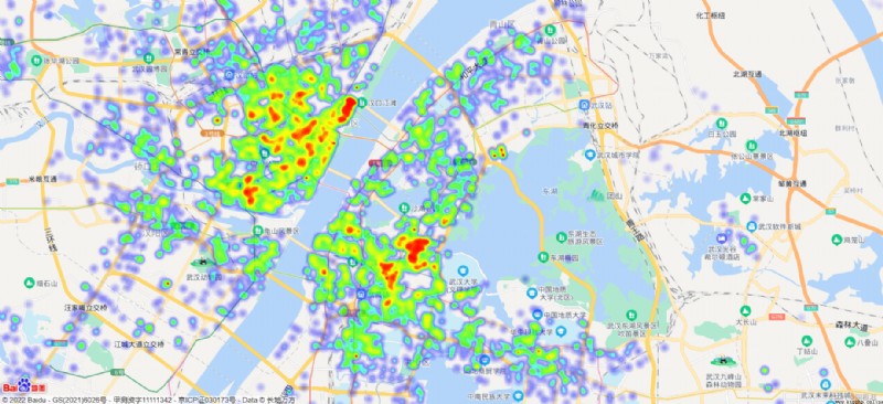
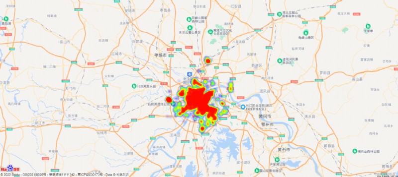
In order to more intuitively show the relationship between the geography and price of each housing source , This article calls Baidu JavaScript Development API, Come on html Draw a map of Wuhan on the page , And display the houses on the map according to the baidu coordinates of each house , And use the color depth to express the price , So as to form a heat map of the city's housing price distribution .
The results are as follows :
( chart 1)
( chart 2)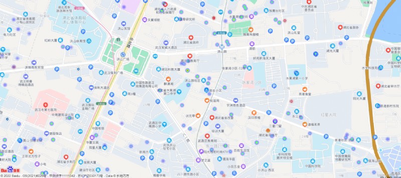
( chart 3)
From the picture 1 It can be seen that the housing supply is mainly distributed within the Fourth Ring Road of Wuhan , The peripheral housing source concentration area is distributed in Huangpi District 、 Caidian District 、 Jiangxia District and Xinzhou District , This is related to 3.1 chart 1 The display results of are consistent .
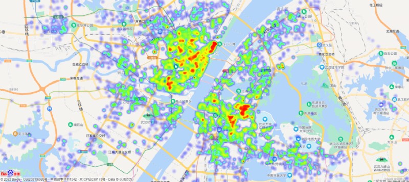
From the picture 2 It can be seen that , The high priced houses on the North Bank of the Yangtze River are more than those on the south bank . High priced houses on the North Bank of the Yangtze River are distributed in several business districts on the north bank , The high-grade houses on the south bank are distributed between colleges and commercial districts . Houses on the South Bank of the Yangtze River are obviously distributed on both sides of the subway line .
From the picture 3 It can be seen that , Close to government agencies 、 educational services 、 medical institution 、 The price of houses on main roads is higher than that of general houses .
Code :
HTML,(ak= Your key )
<!DOCTYPE html>
<html>
<head>
<meta http-equiv="Content-Type" content="text/html; charset=utf-8" />
<meta name="viewport" content="initial-scale=1.0, user-scalable=no" />
<script type="text/javascript" src="http://api.map.baidu.com/api?v=2.0&ak=*****************9C"></script>
<script type="text/javascript" src="http://api.map.baidu.com/library/Heatmap/2.0/src/Heatmap_min.js"></script>
<script src="https://code.jquery.com/jquery-3.1.1.min.js"></script>
<script src="jquery-csv.js"></script>
<script src="getData.js"></script>
<title> Heat map of housing price distribution in Wuhan </title>
<style type="text/css">
ul,
li {
list-style: none;
margin: 0;
padding: 0;
float: left;
}
html {
height: 100%
}
body {
height: 100%;
margin: 0px;
padding: 0px;
font-family: " Microsoft YaHei ";
}
#container {
height: 90%;
width: 100%;
}
#r-result {
width: 100%;
}
</style>
</head>
<body>
<div id="container"></div>
<div id="r-result">
<input type="button" onclick="openHeatmap();" value=" Display heat map " /><input type="button" onclick="closeHeatmap();"
value=" Close the heat map " />
</div>
</body>
</html>
<script type="text/javascript">
var map = new BMap.Map("container"); // Create a map instance
var point = new BMap.Point(114.311754, 30.598604);
map.centerAndZoom(point, 12); // Initialize map , Set center point coordinates and map level
map.enableScrollWheelZoom(); // Allows the scroll wheel to zoom
var data = getData()
console.log(data)
var points = data
if (!isSupportCanvas()) {
alert(' At present, the heat map only supports canvas Supported browsers , The browser you are using cannot use the heat map function ~')
}
heatmapOverlay = new BMapLib.HeatmapOverlay({ "radius": 10 });
map.addOverlay(heatmapOverlay);
heatmapOverlay.setDataSet({ data: points, max: 90000 });
// Whether to display the thermal diagram
function openHeatmap() {
heatmapOverlay.show();
}
function closeHeatmap() {
heatmapOverlay.hide();
}
closeHeatmap();
function setGradient() {
var gradient = {};
var colors = document.querySelectorAll("input[type='color']");
colors = [].slice.call(colors, 0);
colors.forEach(function (ele) {
gradient[ele.getAttribute("data-key")] = ele.value;
});
heatmapOverlay.setOptions({ "gradient": gradient });
}
// Determine whether the browsing area supports canvas
function isSupportCanvas() {
var elem = document.createElement('canvas');
return !!(elem.getContext && elem.getContext('2d'));
}
</script>
getData.js
function getData() {
var points = [
{'lat': 30.590072, 'lng': 114.176442, 'count': 10001} ,
{'lat': 30.590072, 'lng': 114.176442, 'count': 10001} ,
{'lat': 30.881746472273, 'lng': 114.39374109924, 'count': 10008} ,
{'lat': 30.881746472273, 'lng': 114.39374109924, 'count': 10008} ,
{'lat': 30.49259, 'lng': 114.292619, 'count': 10078} ,
{'lat': 30.49259, 'lng': 114.292619, 'count': 10078} ,
{'lat': 30.585092, 'lng': 114.048935, 'count': 10084} ,
.........
.........] // 5056 The longitude and latitude value of this housing source , And house prices :count
return points
}
Only Caidian District and Xinzhou District in Wuhan have median house prices 1 All of the following , If you want to buy a house within the Fourth Ring Road , The rate of house prices will probably be higher than 1 Ten thousand yuan , Combined with actual monthly income , You can consider buying houses with medium price , That is, the house price is 1 ten thousand ~2 Between ten thousand . The number of houses in this price range is the largest , You can choose more , And in 4 Within the loop , It's not too far from the city center . Further analysis , It can be found that the green houses on the North Bank of the Yangtze River are located outside the business district , And a few green houses on the south bank are even in the central business district , And there are many universities on the south bank , The cultural atmosphere is stronger . Therefore, it is suggested to be on the South Bank of the Yangtze River 、 Close to the University 、 The purchase price near the main road is 1 Wan to 2 All the houses . If the purchased area is 100 Square meters , Then the total cost is 100 Wan to 200 Between ten thousand , Do not eat or drink, work about 8 Year to 17 Annual payment .
 Two digit statistics without repeated figures in Python analysis of real questions of level 2 of Python programming level examination of the Electronic Society for youth programming June 2021
Catalog python Count the two d
 How Python can quickly save pictures in wechat official account articles
Python How to quickly save pic