This image is drawn to reflect the price range of the current price in the past period .
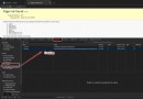
1. Data selection
# Read in fund documents
data=pd.read_csv("000005.csv")
# Select a list of prices
trans_data=data.iloc[:,4]
2. Solve the relevant parameters
# Corresponding to the mean value
a_mean = trans_data.mean()
# Corresponding standard deviation
a_std = trans_data.std()
3. Draw the corresponding curve
# Draw the corresponding curve
plt.plot(trans_data)
# mean value + Standard deviation
plt.axhline(a_mean + a_std, color='r')
# mean value
plt.axhline(a_mean, color='y')
# mean value - Standard deviation
plt.axhline(a_mean - a_std, color='g')
The result of the drawing 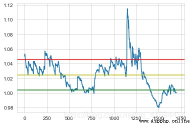
4. The image is perfect
Try adding a fill color block
plt.axhspan(a_mean -a_std,a_mean +a_std, facecolor='yellow', alpha=0.4)
The results are as follows 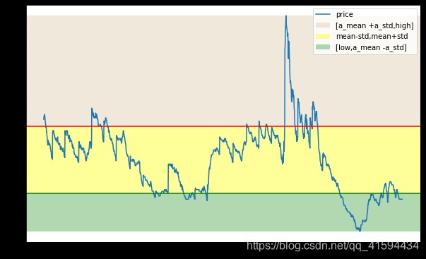
Perfect image , Add legend
Calculate the maximum and minimum , As the upper and lower boundaries of the fill
high=max(trans_data)
low=min(trans_data)
Change image size
plt.figure(figsize=(10, 6.18))
Add legend and modify corresponding range
plt.axhspan(a_mean +a_std,high , facecolor='tan', alpha=0.3,label='[a_mean +a_std,high]')
plt.axhspan(a_mean -a_std,a_mean +a_std, facecolor='yellow', alpha=0.4,label='mean-std,mean+std')
plt.axhspan(low,a_mean -a_std , facecolor='green', alpha=0.3,label='[low,a_mean -a_std]')
Perfect the image results