Catalog
(1) Data set background introduction
(2) Read the data and import the required third-party library
(3) The attribute and its type are estimated by judging the value range of each attribute
(4) Delete the space before the data value , Adjust data format
(5) Processing missing data
(6) Attribute visual analysis and data transformation
①"age" Age analysis
②"workclass" Job type analysis
③"education" Academic analysis
④"education_num" Analysis of education time
⑤"marital_status" Marital status analysis
⑥"occupation" Career analysis
⑦"relationship" Relationship analysis
⑧"race" Racial analysis
⑨"sex" Gender
⑩"capital_gain" Capital gains And "capital_loss" Analysis of the relationship between capital losses
⑪"capital_gain" Capital income analysis
⑫"capital_loss" Capital loss analysis
⑬"hours_per_week" Analysis of working hours per week
⑭"native_country" Origin analysis
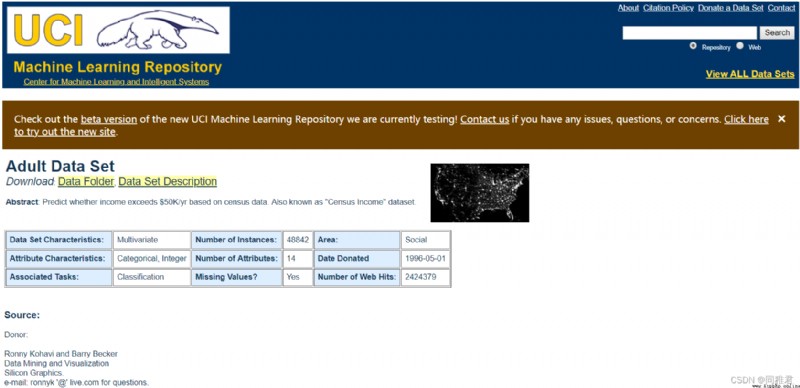
The data comes from 1994 U.S. Census database .( Download address https://archive.ics.uci.edu/ml/datasets/Adult)
The data set consists of 32560 Data ,15 A variable .
The data specifies the address :Index of /ml/machine-learning-databases/adult
The data analysis toolkits that need to be used are :numpy、pandas
The data visualization tools that need to be used include :pyecharts、matplotlib、missingno、seaborn
import csv
from pyecharts.charts import *
from pyecharts import options as opts
from pyecharts import options as opst
import matplotlib.pyplot as plt
import missingno as msno
import numpy as np
import pandas as pd
import seaborn as sns
iris_file = open("income dataset/adult.data", "r", encoding='utf-8')
reader = csv.reader(iris_file)
dataSet = []
for row in reader:
dataSet.append(row)
Suppose we don't know the details of each feature attribute of the data set at present ( Such as the name 、 data type 、 The amount of data, etc ), By extracting the value range of each attribute ( That is, non repeating value ) To estimate some cases of this attribute .
def AttributeTypeJudgment(dataSet):
attributeNum = len(dataSet[0]) # Calculate the number of attributes , Including the last category
uniqueAttributeDict = {}
for i in range(attributeNum): # Traverse each attribute
attributeValueList = []
for j in range(len(dataSet)):
attributeValueList.append(dataSet[j][i])
uniqueAttributeValue = list(set(attributeValueList)) # Remove duplicate attribute values , Get the first i The range of values of attributes
uniqueAttributeDict[i] = uniqueAttributeValue
print(i, ":", uniqueAttributeValue)
return uniqueAttributeDict
AttributeTypeJudgment(dataSet)
The first 0 All non repeating values of attributes :

The first 1 All non repeating values of attributes :

The first 2 Attribute partial non duplicate values :

The first 3 All non repeating values of attributes :

······
The first 13 Attribute partial non duplicate values :

All non repeating values of the category :

Through the observation and analysis of all non repeated values of each attribute , You can guess the possible names of some attributes , And determine the data type of the value of each attribute . Then by looking for introductory information about the data set , The attribute names and data types of the dataset are as follows :
attribute
name
Attribute types
data format
age
Age
Discrete properties
Int64
workclass
Type of work
Nominal properties
object
fnlwgt
Serial number
Continuous attributes
Int64
education
Education
Nominal properties
object
education_num
Education time
Continuous attributes
Int64
marital_status
Marital status
Nominal properties
object
occupation
occupation
Nominal properties
Object
relationship
Relationship
Nominal properties
Object
race
race
Nominal properties
Object
sex
Gender
Binary properties
object
capital_gain
Capital gains
Continuous attributes
Int64
capital_loss
Capital loss
Continuous attributes
Int64
hours_per_week
Working hours per week
Discrete properties
Int64
native_country
Origin
Nominal properties
object
Category
name
data format
wage_class
Income categories
Object
You can notice that the data type of each data in the dataset is string , also There is a space at the beginning , Therefore, you need to remove the space before each data , And put the data type in each characteristic data Convert from a string to its expected data type .
attributeLabels = ["age", # Age int64 Discrete properties
"workclass", # Type of work object Nominal properties There is a lack of
"fnlwgt", # Serial number int64 Continuous attributes
"education", # Education boject Nominal properties
"education_num", # Education time int64 Continuous attributes
"marital_status", # Marital status object Nominal properties
"occupation", # occupation object Nominal properties There is a lack of
"relationship", # Relationship object Nominal properties
"race", # race object Nominal properties
"sex", # Gender object Binary properties
"capital_gain", # Capital gains int64 Continuous attributes
"capital_loss", # Capital loss int64 Continuous attributes
"hours_per_week", # Working hours per week int64 Discrete properties
"native_country", # Origin object Nominal properties There is a lack of
"wage_class"] # Income categories object Binary properties
# Change the dataset format to pandas Of DataFrame Format
dataFrame = pd.DataFrame(dataSet, columns=attributeLabels)
# The missing value part “ ?” Set to empty , namely np.NaN, Easy to use pandas To deal with missing values
newDataFrame = dataFrame.replace(" ?", np.NaN)
# Delete the space before the data value
for label in attributeLabels:
newDataFrame[label] = newDataFrame[label].str.strip()
# Change the data format of the value of each number in the dataset , Currently, it is all string objects , For the next visual analysis
# take "age"、"fnlwgt"、“education_num”、"capital_gain"、“capital_loss”、“hours_per_week” Change it to int64 type
newDataFrame[['age', 'fnlwgt', 'education_num',
'capital_gain', 'capital_loss',
'hours_per_week']] = newDataFrame[['age', 'fnlwgt',
'education_num', 'capital_gain',
'capital_loss', 'hours_per_week']].apply(pd.to_numeric)
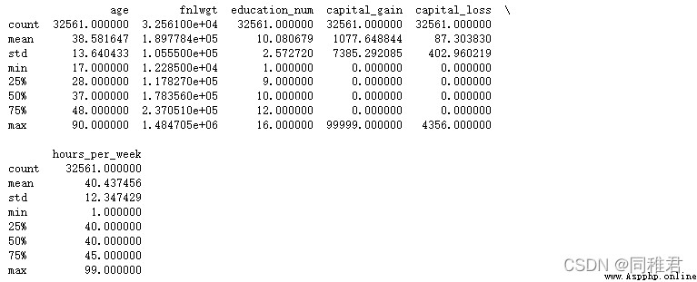
# View the description of the data distribution of the dataset
print(newDataFrame.describe())
The distribution of numerical attribute data in the data set is as follows :
First, check the attributes with missing data :
# Visually view the missing value of the characteristic attribute
msno.matrix(newDataFrame, labels=True, fontsize=9) # Matrix diagram
plt.show()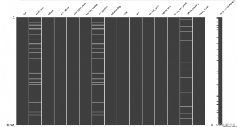
You can see the attributes intuitively “workclass”、“occupation”、“native_country” There are missing values , The total number of samples in the dataset is 32561 individual .
Then check the specific missing quantity :
print(newDataFrame.describe())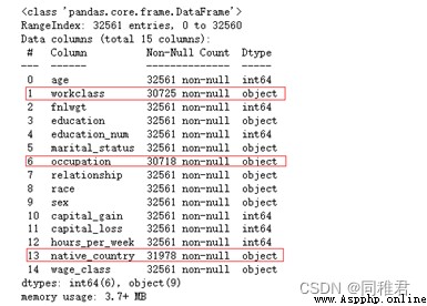
You can see , The number of missing values of the three attributes is small , Therefore, we can take the complementary method , Because these three attributes are nominal attributes , So you can use the value that appears the most times in the attribute to replace ( That is, use the most likely value to replace the missing value ). Among the three attributes, the values with the most occurrences are :“Private”、“Prof-specialty”、“United-States”.
# Fill in attributes workclass Missing value , Is the nominal property , And the number of missing is less , So use the value with the most occurrences instead ( That is, use the most likely value )
print(newDataFrame['workclass'].value_counts())
newDataFrame['workclass'].fillna("Private", inplace=True)
# Fill in attributes occupation Missing value , Is the nominal property , And the number of missing is less , So use the value with the most occurrences instead ( That is, use the most likely value )
print(newDataFrame['occupation'].value_counts())
newDataFrame['occupation'].fillna("Prof-specialty", inplace=True)
# Fill in attributes native_country Missing value , Is the nominal property , And the number of missing is less , So use the value with the most occurrences instead ( That is, use the most likely value )
print(newDataFrame['native_country'].value_counts())
newDataFrame['native_country'].fillna("United-States", inplace=True)# "age" Age analysis
page_age = Page()
print(newDataFrame['age'].describe())
# Look at the age distribution
# plt.hist(newDataFrame['age'], bins =20)
# plt.show()
# Divide the age according to the value , Age is [17,30) [30,65) [65,100), The segment label is :youth、middleAged、elderly
newDataFrame['age'] = pd.cut(newDataFrame['age'], bins=[16, 30, 65, 100], labels=['youth', 'middleAged', 'elderly'])
# Column chart of the number of people of all ages
# print(newDataFrame['age'].value_counts())
x_age = list(dict(newDataFrame['age'].value_counts()).keys()) # Get a list of age groups
y_age= list(newDataFrame['age'].value_counts()) # Get the number of people of all ages
bar_age = (
Bar(init_opts=opts.InitOpts(theme="romantic"))
.add_xaxis(x_age)
.add_yaxis(" The number of ", y_age, label_opts=opts.LabelOpts(is_show=True))
.set_global_opts(title_opts=opts.TitleOpts(title=" Column chart of age group ", pos_left="left"),
legend_opts=opts.LegendOpts(is_show=True))
)
y_age_wageclass1 = [
len(list(newDataFrame.loc[(newDataFrame['age']=='middleAged')&(newDataFrame['wage_class']=='<=50K'), 'wage_class'])),
len(list(newDataFrame.loc[(newDataFrame['age']=='youth')&(newDataFrame['wage_class']=='<=50K'), 'wage_class'])),
len(list(newDataFrame.loc[(newDataFrame['age']=='elderly')&(newDataFrame['wage_class']=='<=50K'), 'wage_class']))
]
y_age_wageclass2 = [
len(list(newDataFrame.loc[(newDataFrame['age'] == 'middleAged') & (newDataFrame['wage_class'] == '>50K'), 'wage_class'])),
len(list(newDataFrame.loc[(newDataFrame['age'] == 'youth') & (newDataFrame['wage_class'] == '>50K'), 'wage_class'])),
len(list(newDataFrame.loc[(newDataFrame['age'] == 'elderly') & (newDataFrame['wage_class'] == '>50K'), 'wage_class']))
]
# Stacked column chart of income categories by age
stackBar_age = (
Bar(init_opts=opts.InitOpts(theme="romantic"))
.add_xaxis(x_age)
.add_yaxis("<=50K", y_age_wageclass1, stack=True)
.add_yaxis(">50K", y_age_wageclass2, stack=True)
.set_global_opts(title_opts=opst.TitleOpts(title=" Stacked column chart of income categories by age ", pos_left="left"),
legend_opts=opst.LegendOpts(is_show=True, pos_left="center"))
)
page_age.add(bar_age, stackBar_age)
page_age.render("charts/age.html")because “age” The attribute value is in [16, 100] Between intervals , And age has a great correlation with income , Therefore, age can be divided into 3 Age groups [17,30)、[30,65)、[65,100), The age tag is :youth、middleAged、elderly, Replace specific values with age labels , Make datasets suitable for classification models .
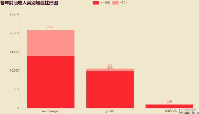
It can be seen intuitively from the figure that , The middle-aged and middle-aged income of the three age groups >50K The number of people accounts for the largest , The income of young and old people is mostly <=50K. And the number of middle-aged people accounts for the most in the data set .
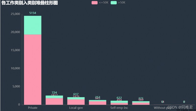
# "workclass" Job type analysis
page_workclass = Page()
# print(dict(newDataFrame['workclass'].value_counts()))
x_workclass = list(dict(newDataFrame['workclass'].value_counts()).keys())
print(x_workclass)
y_workclass = list(newDataFrame['workclass'].value_counts())
bar_workclass = (
Bar(init_opts=opts.InitOpts(theme="chalk"))
.add_xaxis(x_workclass)
.add_yaxis(" The number of ", y_workclass, label_opts=opts.LabelOpts(is_show=True))
.set_global_opts(title_opts=opts.TitleOpts(title=" Column chart of the number of people in each type of work ", pos_left="left"),
legend_opts=opts.LegendOpts(is_show=True))
)
y_workclass_wageclass1 = [
len(list(newDataFrame.loc[(newDataFrame['workclass']=='Private')&(newDataFrame['wage_class']=='<=50K'), 'wage_class'])),
len(list(newDataFrame.loc[(newDataFrame['workclass']=='Self-emp-not-inc')&(newDataFrame['wage_class']=='<=50K'), 'wage_class'])),
len(list(newDataFrame.loc[(newDataFrame['workclass']=='Local-gov')&(newDataFrame['wage_class']=='<=50K'), 'wage_class'])),
len(list(newDataFrame.loc[(newDataFrame['workclass']=='State-gov')&(newDataFrame['wage_class']=='<=50K'), 'wage_class'])),
len(list(newDataFrame.loc[(newDataFrame['workclass']=='Self-emp-inc')&(newDataFrame['wage_class']=='<=50K'), 'wage_class'])),
len(list(newDataFrame.loc[(newDataFrame['workclass']=='Federal-gov')&(newDataFrame['wage_class']=='<=50K'), 'wage_class'])),
len(list(newDataFrame.loc[(newDataFrame['workclass']=='Without-pay')&(newDataFrame['wage_class']=='<=50K'), 'wage_class'])),
len(list(newDataFrame.loc[(newDataFrame['workclass']=='Never-worked')&(newDataFrame['wage_class']=='<=50K'), 'wage_class'])),
]
y_workclass_wageclass2 = [
len(list(newDataFrame.loc[(newDataFrame['workclass']=='Private')&(newDataFrame['wage_class']=='>50K'), 'wage_class'])),
len(list(newDataFrame.loc[(newDataFrame['workclass']=='Self-emp-not-inc')&(newDataFrame['wage_class']=='>50K'), 'wage_class'])),
len(list(newDataFrame.loc[(newDataFrame['workclass']=='Local-gov')&(newDataFrame['wage_class']=='>50K'), 'wage_class'])),
len(list(newDataFrame.loc[(newDataFrame['workclass']=='State-gov')&(newDataFrame['wage_class']=='>50K'), 'wage_class'])),
len(list(newDataFrame.loc[(newDataFrame['workclass']=='Self-emp-inc')&(newDataFrame['wage_class']=='>50K'), 'wage_class'])),
len(list(newDataFrame.loc[(newDataFrame['workclass']=='Federal-gov')&(newDataFrame['wage_class']=='>50K'), 'wage_class'])),
len(list(newDataFrame.loc[(newDataFrame['workclass']=='Without-pay')&(newDataFrame['wage_class']=='>50K'), 'wage_class'])),
len(list(newDataFrame.loc[(newDataFrame['workclass']=='Never-worked')&(newDataFrame['wage_class']=='>50K'), 'wage_class'])),
]
# Stacked column chart of each work category and income category
stackBar_workclass = (
Bar(init_opts=opts.InitOpts(theme="chalk"))
.add_xaxis(x_workclass)
.add_yaxis("<=50K", y_workclass_wageclass1, stack=True)
.add_yaxis(">50K", y_workclass_wageclass2, stack=True)
.set_global_opts(title_opts=opst.TitleOpts(title=" Stacked column chart of each work category ", pos_left="left"),
legend_opts=opst.LegendOpts(is_show=True, pos_left="center"))
)
page_workclass.add(bar_workclass, stackBar_workclass)
page_workclass.render("charts/workclass.html")
“workclass” Itself is a nominal property , Therefore, in addition to filling in the missing value, there is no need to change too much . As you can see from the picture below “Private” The private sector has the largest number of workers , income >50K The largest proportion is “Self-emp-inc” Freelancers .
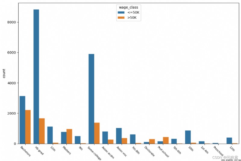
# "education" Academic analysis
print(list(dict(newDataFrame['education'].value_counts()).keys()))
sns.countplot('education', hue='wage_class', data=newDataFrame)
plt.xticks(fontsize=8, rotation=-45)
plt.show()
“education” Is the nominal property , Values are :
'HS-grad', 'Some-college', 'Bachelors', 'Masters', 'Assoc-voc', '11th', 'Assoc-acdm', '10th', '7th-8th', 'Prof-school', '9th', '12th', 'Doctorate', '5th-6th', '1st-4th', 'Preschool'. As can be seen from the figure below , The higher the education, the higher the income >50K The higher the proportion of , Most people have higher education .
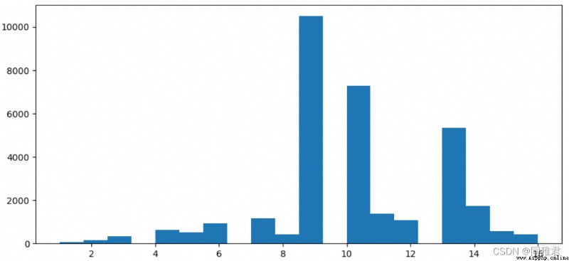
# "education_num" Analysis of education time
# Check the details of education time
print(newDataFrame['education_num'].describe())
# Check the distribution of education time
plt.hist(newDataFrame['education_num'], bins =20)
plt.show()
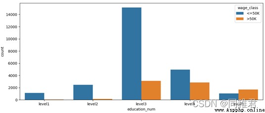
# Discretize education time , It is divided into 5 A hierarchical :level1、level2、...、level5,
newDataFrame['education_num'] = pd.cut(newDataFrame['education_num'], bins=5, labels=['level1', 'level2', 'level3', 'level4', 'level5'])
sns.countplot('education_num', hue='wage_class', data=newDataFrame)
plt.show()“education_num” Is a continuous property , Therefore, it can be discretized , From the distribution histogram of education time data below , Education time can be divided into 5 class , Therefore, the equidistant method is used to divide the data , Divided into 'level1', 'level2', 'level3', 'level4', 'level5' Five ranges . After the division, it can be seen intuitively that the number of people who have been educated at the middle level is the most , The more future income >50K The higher the proportion .
secondly “education” And “education_num” Attribute meaning has a high degree of repetition , When modeling, you can consider removing one of the genera sex , To reduce data redundancy .
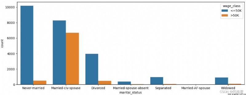
# "marital_status" Marital status analysis
print(list(dict(newDataFrame['marital_status'].value_counts()).keys()))
sns.countplot('marital_status', hue='wage_class', data=newDataFrame)
plt.show()
The figure below shows that the income of single people is generally less than or equal to 50K.
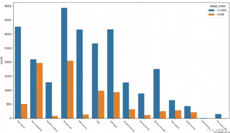
# "occupation" Career analysis
print(list(dict(newDataFrame['occupation'].value_counts()).keys()))
sns.countplot('occupation', hue='wage_class', data=newDataFrame)
plt.xticks(fontsize=6, rotation=-45) # adjustment x Axis label font size
plt.show()
It can be seen from the figure below that the higher proportion of high income is Exec-managerial、Prof-specialty, The lower one is Handlers-cleaners、Farming-fishing.
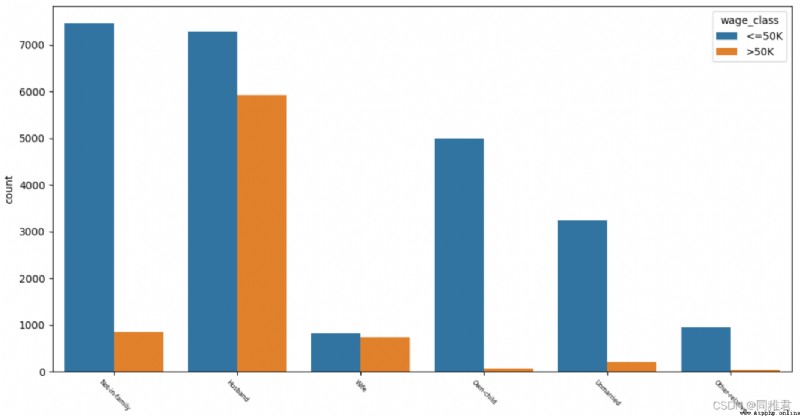
# "relationship" Relationship analysis
print(list(dict(newDataFrame['relationship'].value_counts()).keys()))
sns.countplot('relationship', hue='wage_class', data=newDataFrame)
plt.xticks(fontsize=6, rotation=-45) # adjustment x Axis label font size
plt.show()
It can be seen from the figure below that people with families generally have higher incomes , among “ Wife ” The number of role workers is small , It means that in the family “ Her husband, ” at work . The income of people who are not married or have children is generally less than or equal to 50K.
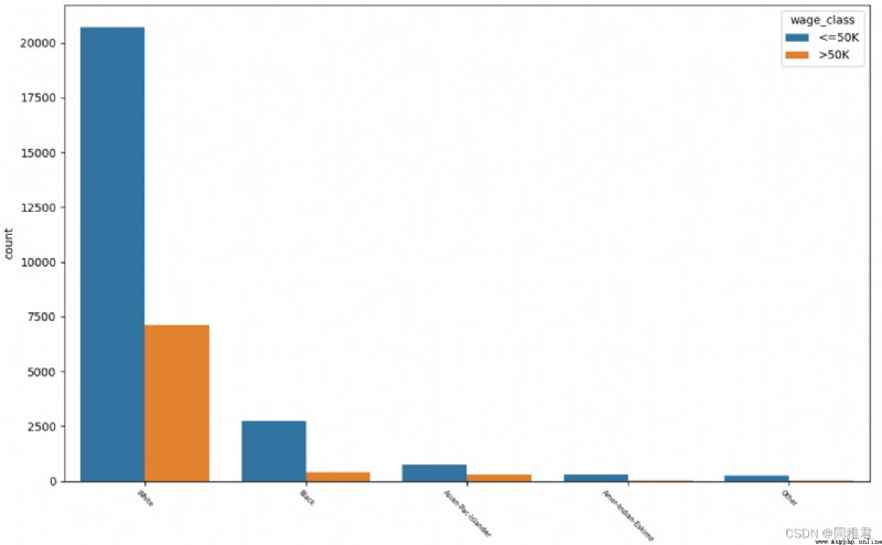
# "race" Racial analysis
print(list(dict(newDataFrame['race'].value_counts()).keys()))
sns.countplot('race', hue='wage_class', data=newDataFrame)
plt.xticks(fontsize=6, rotation=-45) # adjustment x Axis label font size
plt.show()
As can be seen from the figure below, whites account for the highest proportion of the total number , White and Asian Pacific Islander income >50K It's high , The proportion of high-income groups in blacks is relatively low .
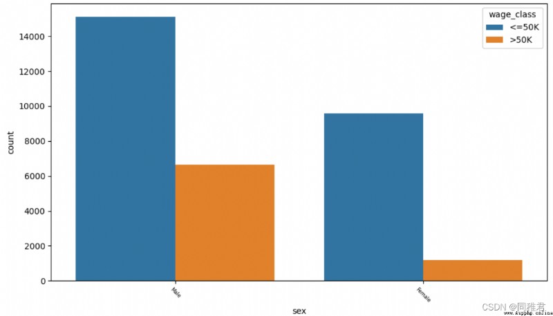
# "sex" Gender
print(list(dict(newDataFrame['sex'].value_counts()).keys()))
sns.countplot('sex', hue='wage_class', data=newDataFrame)
plt.xticks(fontsize=6, rotation=-45) # adjustment x Axis label font size
plt.show()
It can be seen from the figure below that men are higher than women in number and high-income proportion .
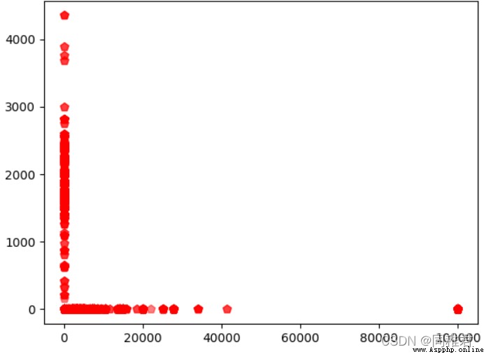
#"capital_gain" Capital gains And "capital_loss" Analysis of the relationship between capital losses , Scatter plot
x = list(newDataFrame['capital_gain'])
y = list(newDataFrame['capital_loss'])
print(len(x) == len(y))
plt.scatter(x, y, s=50, c="r", marker="p", alpha=0.5)
plt.show()
It can be seen that there is no quantitative relationship between capital gains and capital losses , Instead, it's the bipolar relationship , There are three situations : There is loss but no gain 、 Gain without loss 、 There is neither gain nor loss .
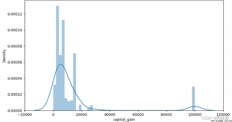
# "capital_gain" Capital income analysis
# View details of capital gains
print(newDataFrame['capital_gain'].describe())
# View the distribution of capital gains
# plt.hist(newDataFrame['capital_gain'], bins =10)
plt.subplots(figsize=(7,5))
sns.distplot(newDataFrame['capital_gain'][newDataFrame['capital_gain']!=0])
plt.show()
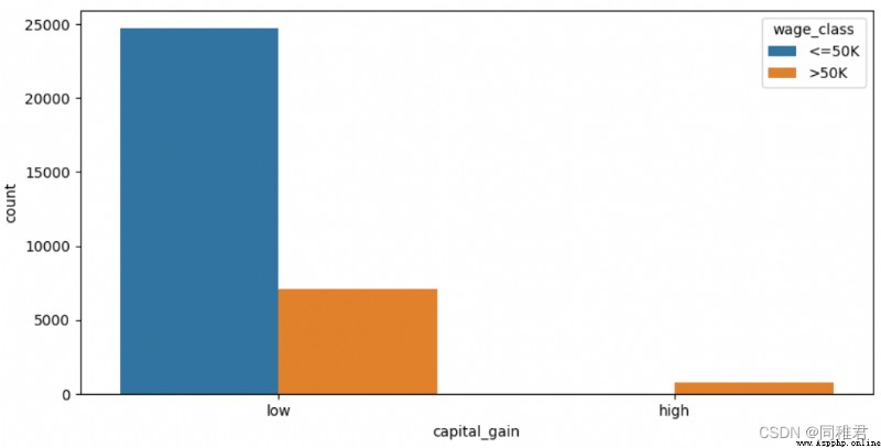
# Discretize capital gains , It is divided into 2 A hierarchical :low [0,10000),high[10000, 100000)
newDataFrame['capital_gain'] = pd.cut(newDataFrame['capital_gain'], bins=[-1, 10000, 100000], labels=['low', 'high'])
sns.countplot('capital_gain', hue='wage_class', data=newDataFrame)
plt.show()“capital_gain” The attribute is continuous , Therefore, it can be discretized , First, check the distribution of capital income data , It can be seen that most people earn less than 10000$. According to the data distribution, capital gains can be divided into low and high Two levels . After discretization, it can be seen that people with low capital gains account for the majority , People with high capital gains also have a high proportion of high income .
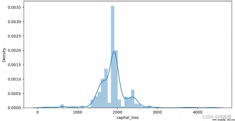
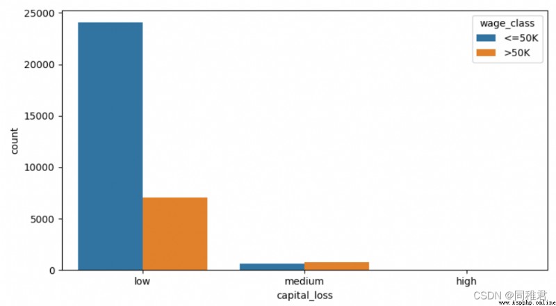
# "capital_loss" Capital loss analysis
# View details of capital losses
print(newDataFrame['capital_loss'].describe())
# View capital loss distribution
plt.subplots(figsize=(7,5))
sns.distplot(newDataFrame['capital_loss'][newDataFrame['capital_loss']!=0])
plt.show()
# Discretize capital losses , It is divided into 2 A hierarchical :low [0,1000),high[1000, 5000)
newDataFrame['capital_loss'] = pd.cut(newDataFrame['capital_loss'], bins=3, labels=['low', 'medium', 'high'])
sns.countplot('capital_loss', hue='wage_class', data=newDataFrame)
plt.show()
alike , From the distribution of capital loss data , Capital losses can be discretized , Equidistant is divided into “low”、“medium”、“high” Three levels . From the chart after discretization, it can be seen that the proportion of high-income group with high capital loss is higher than that of the second capital loss group .
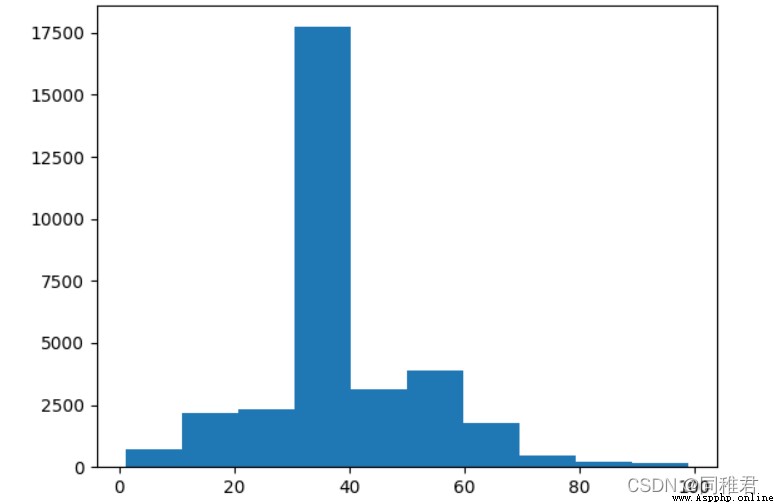
# "hours_per_week" Analysis of working hours per week
# Check the details of working hours per week
print(newDataFrame['hours_per_week'].describe())
# View the distribution of working hours per week
plt.hist(newDataFrame['hours_per_week'], bins =10)
plt.show()
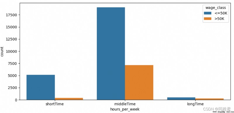
# Discretize the number of working hours per week , It is divided into 3 A hierarchical : short-term 、 In the middle of the day 、 For a long time
newDataFrame['hours_per_week'] = pd.cut(newDataFrame['hours_per_week'], bins=3, labels=['shortTime', 'middleTime', 'longTime'])
sns.countplot('hours_per_week', hue='wage_class', data=newDataFrame)
plt.show()“hours_per_week” Is a continuous property , Therefore, it also needs discretization . From the data distribution histogram of working hours per week , The number of working hours per week can be divided into 3 A hierarchical :'shortTime', 'middleTime', 'longTime'. From the divided chart , As the number of working hours per week increases , The proportion of high income is also increasing .
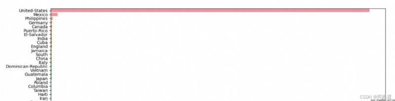
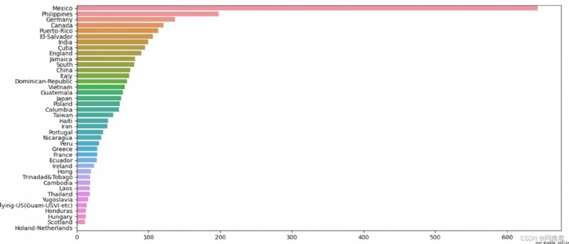
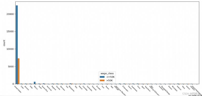
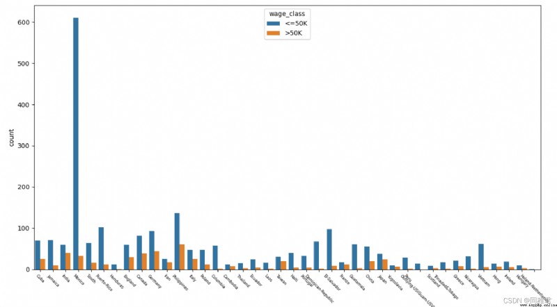
# "native_country" Origin analysis , Can be divided into Developed countries and developing countries
print(list(dict(newDataFrame['native_country'].value_counts()).keys()))
# sns.countplot('native_country', hue='wage_class', data=newDataFrame[newDataFrame['native_country'] != 'United-States'])
sns.countplot('native_country', hue='wage_class', data=newDataFrame)
plt.xticks(fontsize=6, rotation=-45) # adjustment x Axis label font size
plt.subplots(figsize=(5, 7))
s=newDataFrame['native_country'].value_counts()
sns.barplot(y=s.index,x=s.values)
plt.show()
As can be seen from the figure below, the American sample accounts for the vast majority ,Mexico,Philippines,Germany Cadastre sample , Due to the excessive number of American samples , It affects the display of other international sample data in the chart , Therefore, the bar graph of the number of samples in the country of origin and the column graph of the income in the country of origin are drawn respectively, including the country of origin 'United-States' The charts and do not contain 'United-States' The chart .
This paper demonstrates the data mining and exploration process of the original data through the annual income data set of the U.S. Census , Including data preprocessing 、 Feature Engineering 、 Data conversion 、 Data visualization analysis process ,《 Introduction to data mining 》 And 《 data mining - Practical machine learning tools and techniques 》 Provide theoretical guidance . I hope this article will help you learn data mining , Data mining is for better data modeling .
 【Anaconda】輕松解決Spyder 因 pandas numexpr 版本不匹配導致的kernel報錯Python代碼無法運行的問題
問題描述An error ocurred while sta
 The Chinese Valentines Day is here - the romance that belongs to Python, lets take it~ I wish a successful confession
Chinese Valentines Day!Its tim