Reading guide : No problem is Python It can't be solved .
author : Huang Weini
source : The beauty of data analysis and statistics (ID:huang_superme)
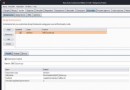
A friend asked a question in the group . The general meaning is shown in the figure :

It is proposed to use vba, But I have to say , I haven't learned vba Friend, , Will feel vba It's hard to use . It's not easy , Go straight up Python, No problem is Python It can't be solved .
ha-ha , That's a bit of an exaggeration . But the above problem , use Python The solution is absolutely no problem .
01 Their thinking
Let's take a look at this data first , What does it look like ?
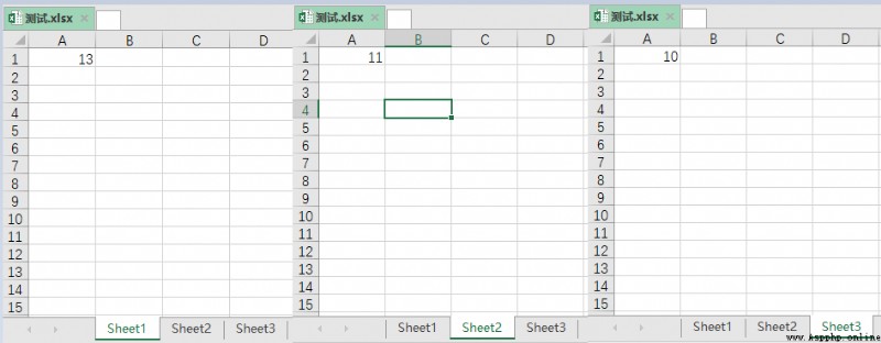
One Excel Yes 3 individual sheet surface , Every sheet There is a data in the table . We want to take advantage of this 3 Data , Draw a line chart .
My idea is roughly like this , The whole process is as follows :
Create a new Excel form ;
Read the Test data , And read each sheet The values in the table ;
Read the above data , Write new Excel In the table ;
Draw graphics ;
02 Complete code
With the above ideas , Let's go straight to the code , The code gives you detailed comments .
# Import related libraries
from openpyxl import load_workbook,Workbook
from openpyxl.chart import LineChart, Reference
# newly build Excel form
wb = Workbook()
ws = wb.active
ws.cell(row=1,column=1).value = " sales "
# Read the data in the test table , And write to the new Excel In the table
wb1 = load_workbook(" test .xlsx")
for index,value in enumerate(wb1.sheetnames):
ws1 = wb1[value]
ws.cell(row=index+2,column=1).value = ws1.cell(row=1,column=1).value
# Draw graphics
chart = LineChart()
data = Reference(ws,min_row=1,max_row=4,min_col=1, max_col=1)
chart.add_data(data,titles_from_data=True)
chart.title = " Sales in different months "
chart.y_axis.scaling.min = 9
chart.y_axis.scaling.max = 14
ws.add_chart(chart,"D1")
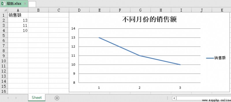
wb.save(" newest .xlsx")The final effect is as shown in the figure :

Extended reading

Extended reading 《 utilize Python Data analysis 》
Dry goods go straight to
AI Landing Manufacturing : Intelligent robots should have this 4 Kind of ability
Finally, someone explained the federal learning clearly
Explain big data in detail 、 The application of data storage and edge computing technology in the metauniverse
Internet companies that use users as leeks , It's over
More exciting
Enter the following dialog box in the official account dialog box key word
See more quality content !
read | book | dried food | Make it clear | God operation | handy
big data | Cloud computing | database | Python | Reptiles | visualization
AI | Artificial intelligence | machine learning | Deep learning | NLP
5G | Zhongtai | User portrait | mathematics | Algorithm | Number twin
According to statistics ,99% The big coffee is concerned about the official account