Loading and storage
One 、 Broken line diagram
Two 、 Scatter plot
3、 ... and 、 Bar chart
Four 、 Histogram
5、 ... and 、 The pie chart
6、 ... and 、 Histogram
7、 ... and 、 boxplot
last but not list、 How to give x、y Label axis coordinates
END、 How to overlay and draw images
summary
Loading and storageTo draw a table, we need to use python In the library matplotlib library
import matplotlib.pyplot as plt One 、 Broken line diagram # Drawing a line is ,x The axis can be omitted , The default with y Replace the data axis of the index plt.plot([0, 2, 4, 6, 8]) # Default Y Axis coordinates ,x Axis press 12345…… count plt.show()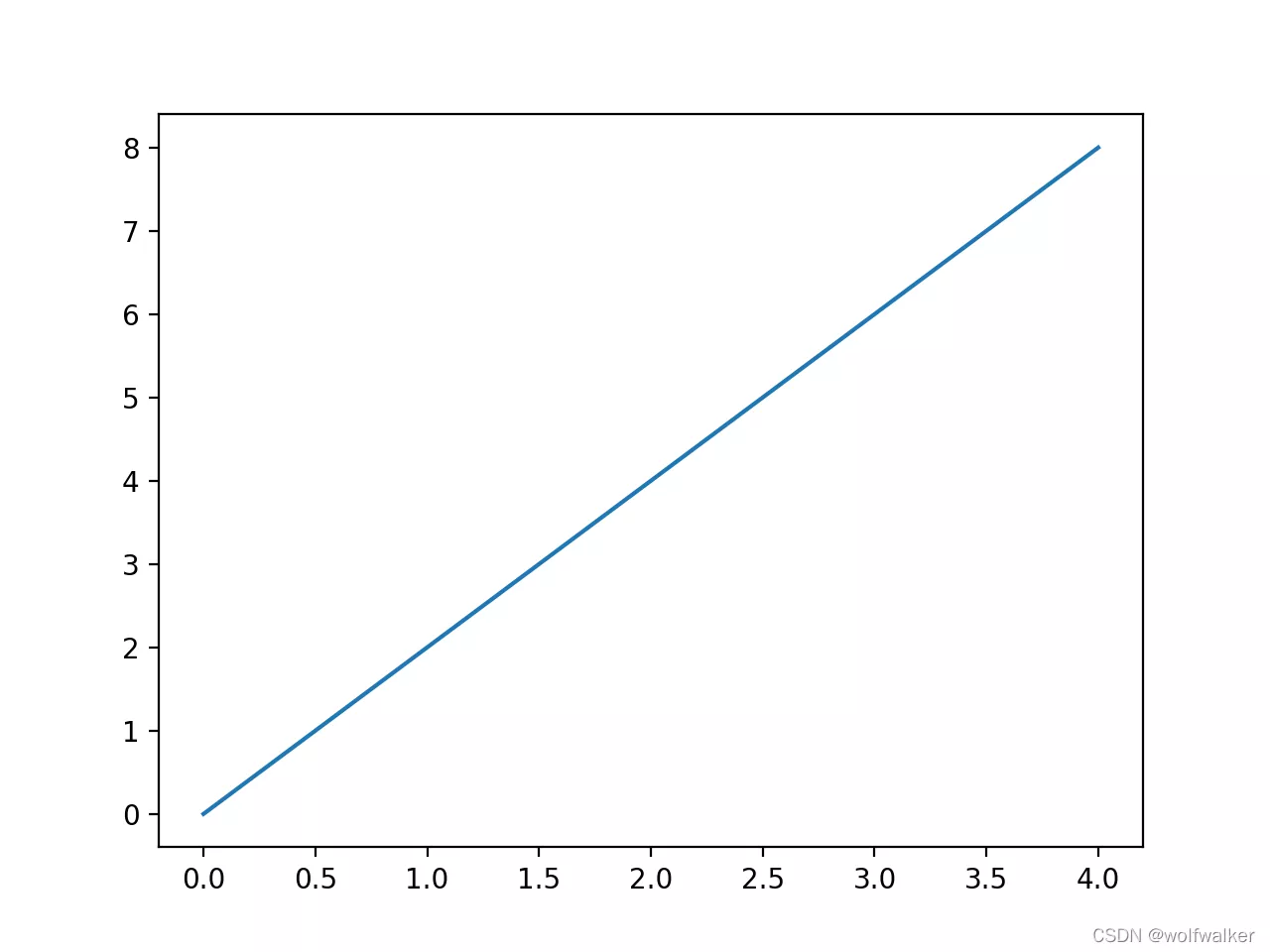
plt.plot([0, 2, 4, 6, 8], [1, 5, 3, 9, 7]) # x Axis coordinate value ,Y Axis coordinate value plt.show()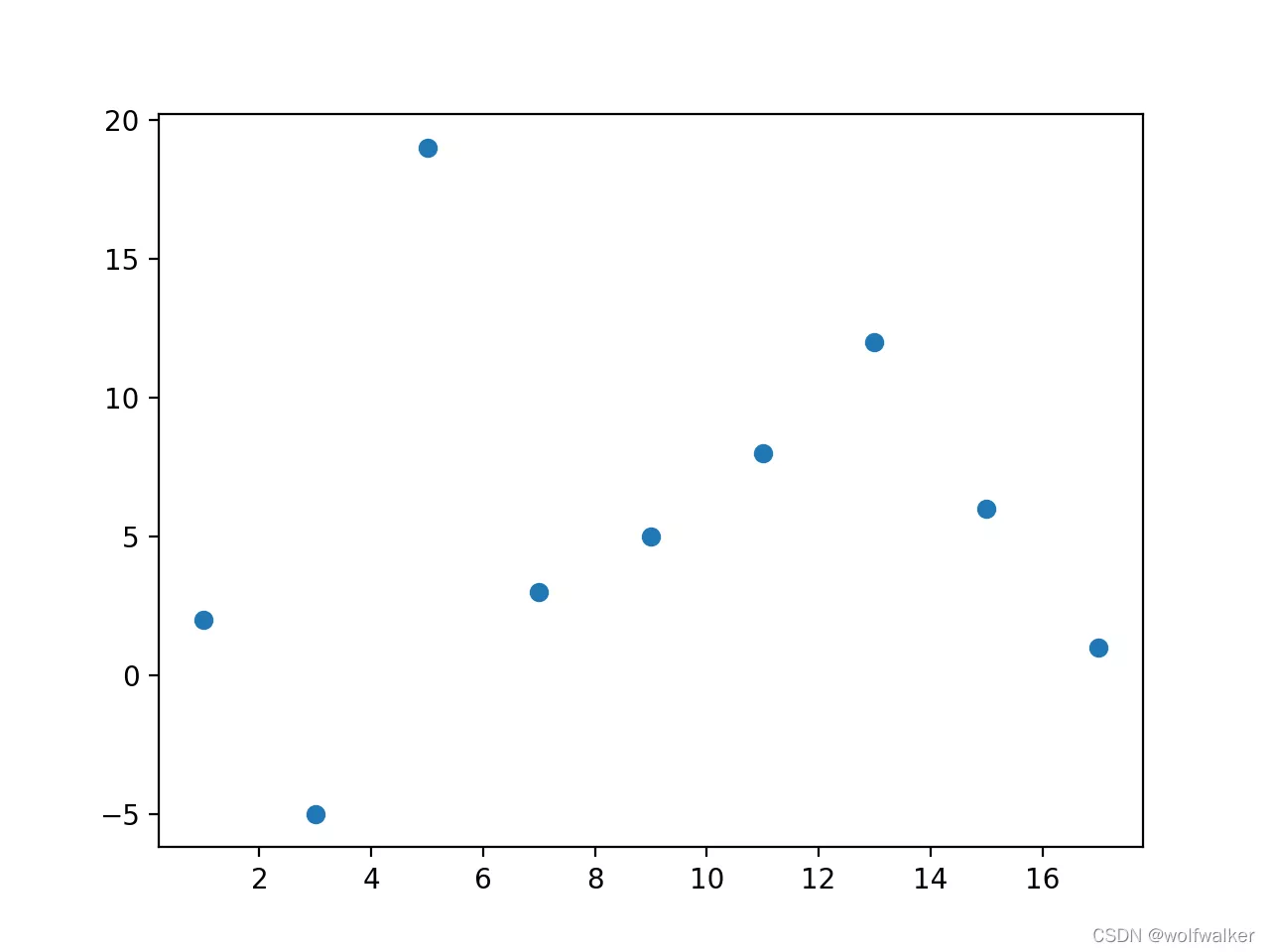
Next, let's see how we can draw a more cool line chart
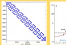
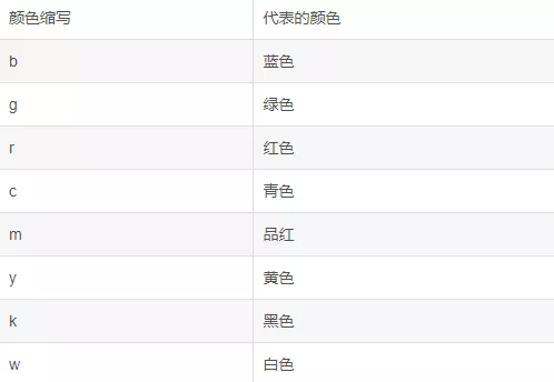
date = [3, 4, 5, 6, 7, 8, 9, 10, 12, 13, 14, 15, 16, 17, 18, 19, 20, 21]eurcny=[9, 3, 5, 7, 0, 10, 6, 1, 1, 42, 12, 3, 42, 4, 37, 45, 18, 481]plt.plot( date, # x Axis data , date eurcny, # y Axis data , Closing price color='r', # line color linestyle='--', # Line style linewidth=1.0,# Line thickness marker='o', # Tagging style markerfacecolor='#ffff00', # Mark the color markersize=10, # Tag size alpha=0.5, # transparency )plt.show()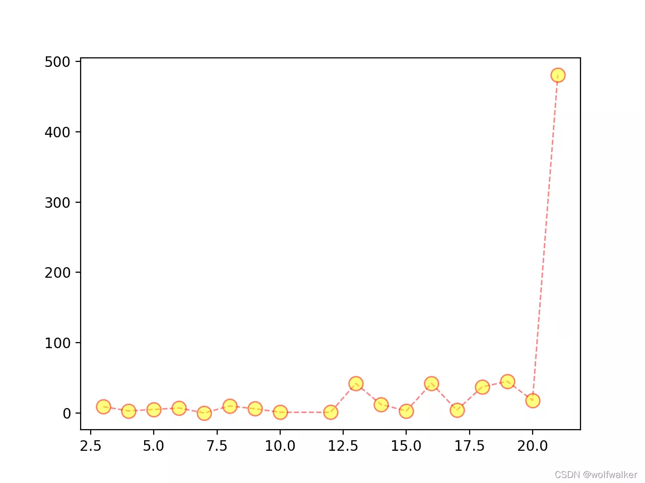
x = [1, 3, 5, 7, 9, 11, 13, 15, 17]y = [2, -5, 19, 3, 5, 8, 12, 6, 1]# mapping plt.scatter(x, y)plt.show()
Next, let's see how to draw a more cool scatter chart
x = [1, 3, 5, 7, 9, 11, 13, 15, 17]y = [2, -5, 19, 3, 5, 8, 12, 6, 1]plt.scatter( x, # x Axis y, # y Axis color='r', # Color marker='o', # style linewidth=20, # Line width alpha=0.3, # transparency # Scatter size , Used to draw bubble charts , On the basis of scatter diagram, another dimension is added s=[100, 300, 500, 700, 200, 400, 600, 800, 1000], # size )plt.show()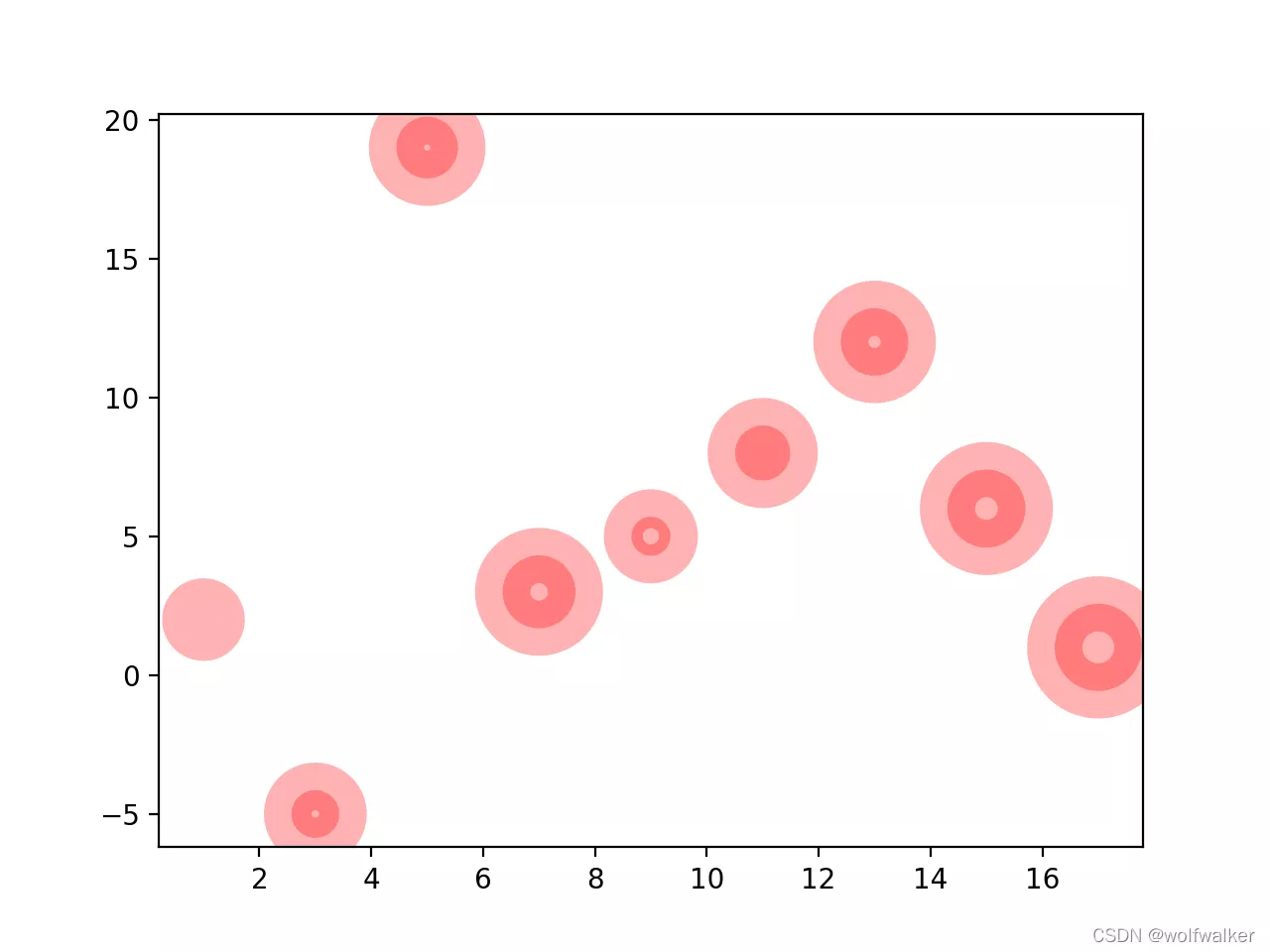
x=[1,2,3,4,5]y=[1,2,3,4,5]plt.barh(x,# The bar leaves x Distance of axis y,# The length of the horizontal bar height=0.5,# The thickness of the horizontal bar color='g',)plt.show()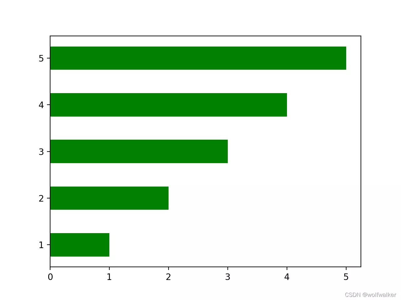
x=[1,2,3,4,5]y=[3,6,1,8,2]# Histogram ,x The shaft is a single shaft ,y The axis is the height of the column , Optional parameters width Used for column thickness plt.bar(x,y)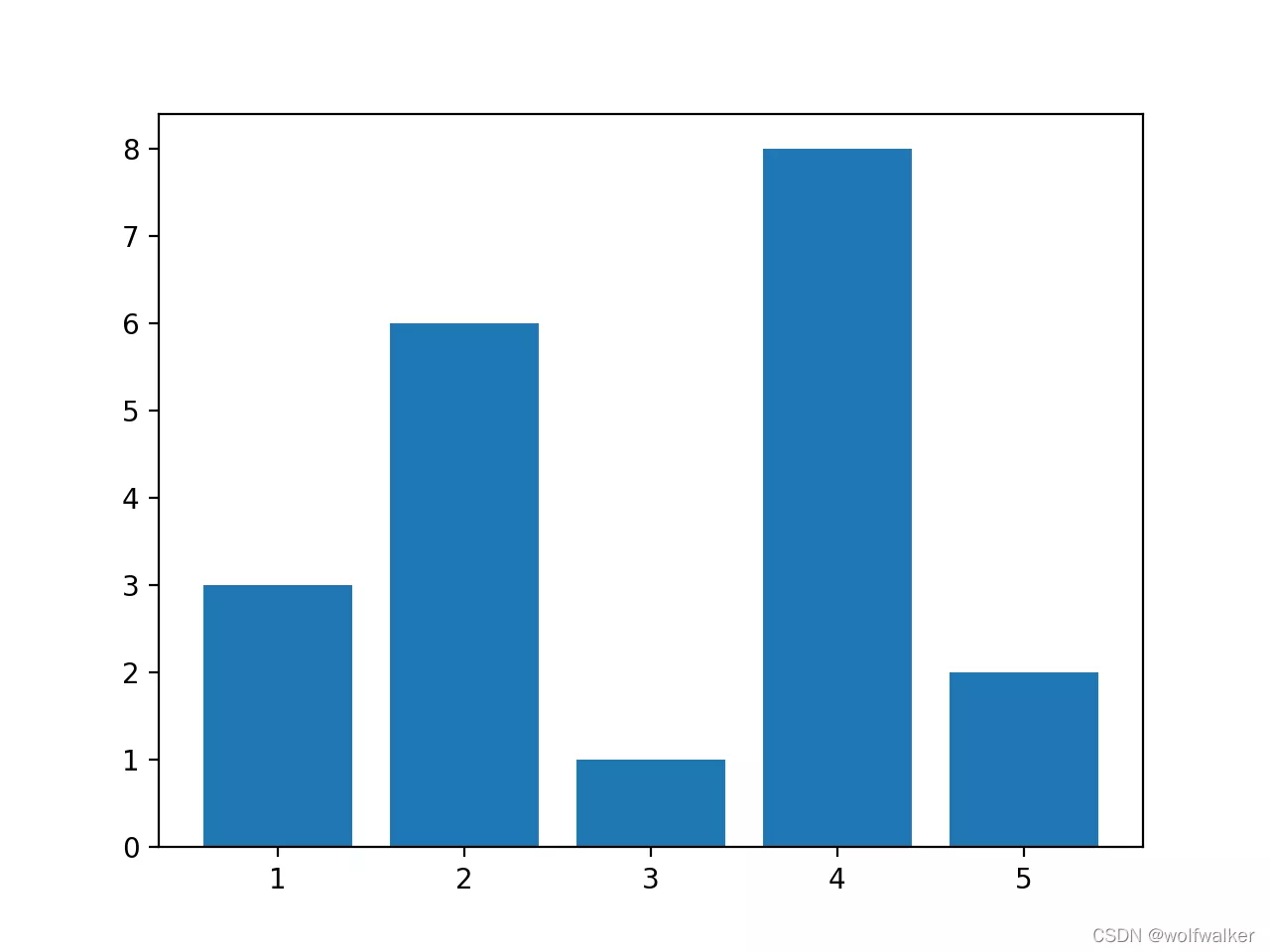
How to draw a more cool histogram
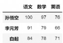
# Boys' average score , Chinese language and literature / mathematics / English / Physics / chemical boy=[85.5,91,72,59,66]# Girls' average score girl=[94,82,89.5,62,49]# Account coordinates course=[1,2,3,4,5]# mapping , schoolboy plt.bar(course,#x Axis , subject boy,#y Axis , Boys' grades color='g',# Color width=0.3,alpha=0.3,)# mapping , girl student # Account coordinates course2=[1.3,2.3,3.3,4.3,5.3]plt.bar(course2,#x Axis , subject girl,#y Axis , Girls' grades color='r',# Color width=0.3,)plt.show()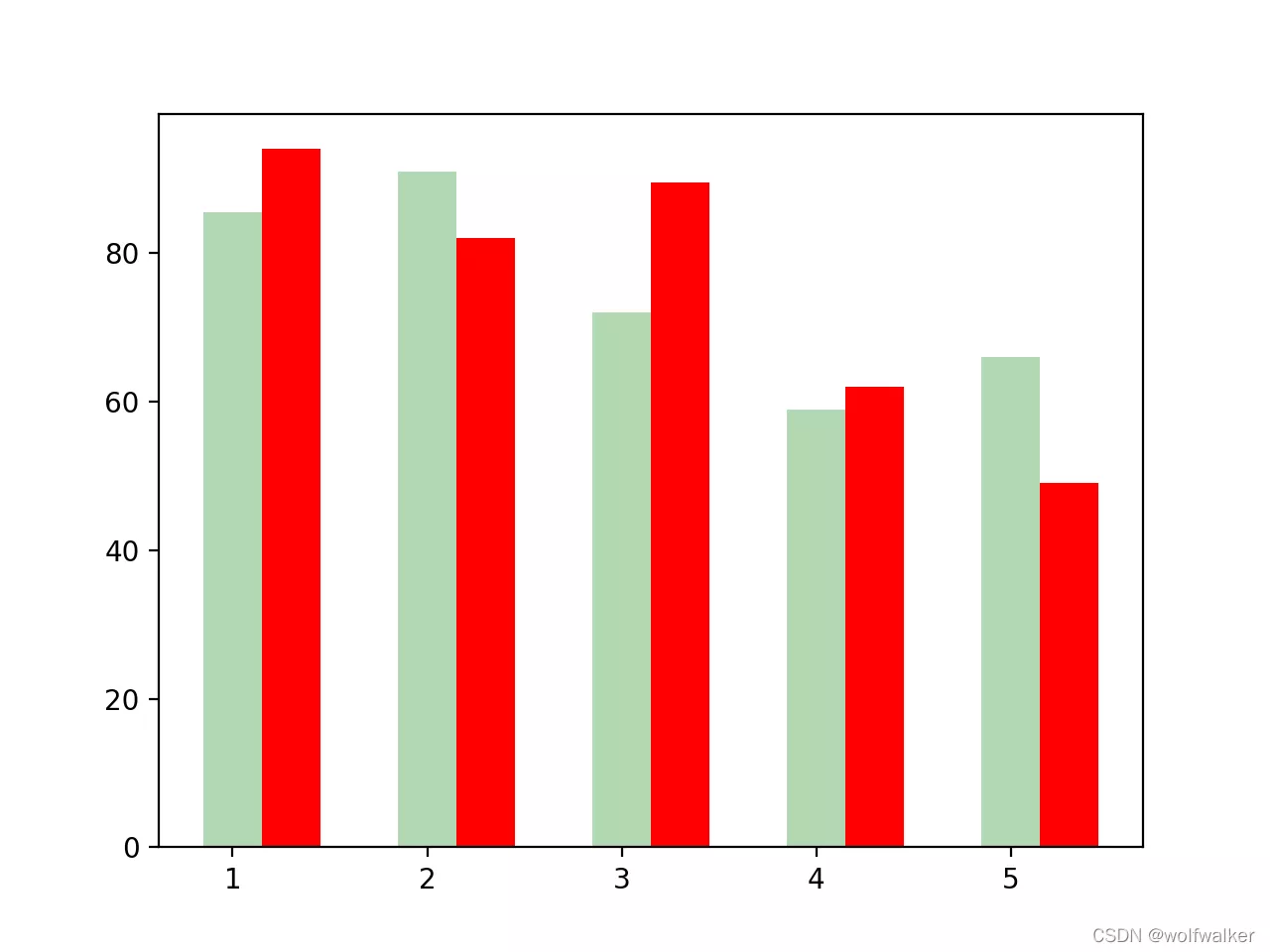
p=[15,30,45,10,20]plt.pie(p)plt.pie(p,labels=['china','russia','india','amarica','japan'],autopct='%1.1f%%')plt.show()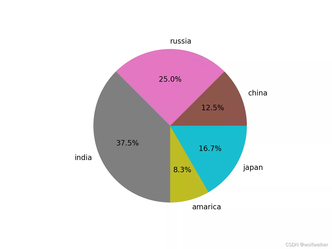
How to draw a more cool pie chart
# The name of the country mark=['china','russia','india','amarica','japan']# Countries fight 9 The proportion of total military expenditure percent=[0.55,0.144,0.321,0.312,0.312]plt.pie(percent,# percentage autopct='%1.1f%%',# Display percentage method labels=mark,# name explode=(0.0,0.1,0.0,0.0,0.0)# Protruding block , Prominent proportion )plt.show()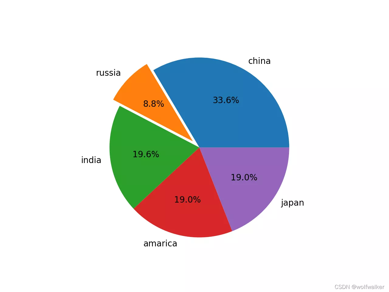
#1 Class grade histogram h1=[88.2,83.4,84.5,83.4,43,43,7,43,32,3,83.4,84.5,83.4,42,43,43,5,32,88.2,3,84.5,83.4,45,43,9,43,32,7,81,84.5,83.4,4,8,43,43,32,88.2,83,84.5,83.4,45,7,43,43,32,88.2,3,84.5,83.4]plt.hist(h1)plt.show()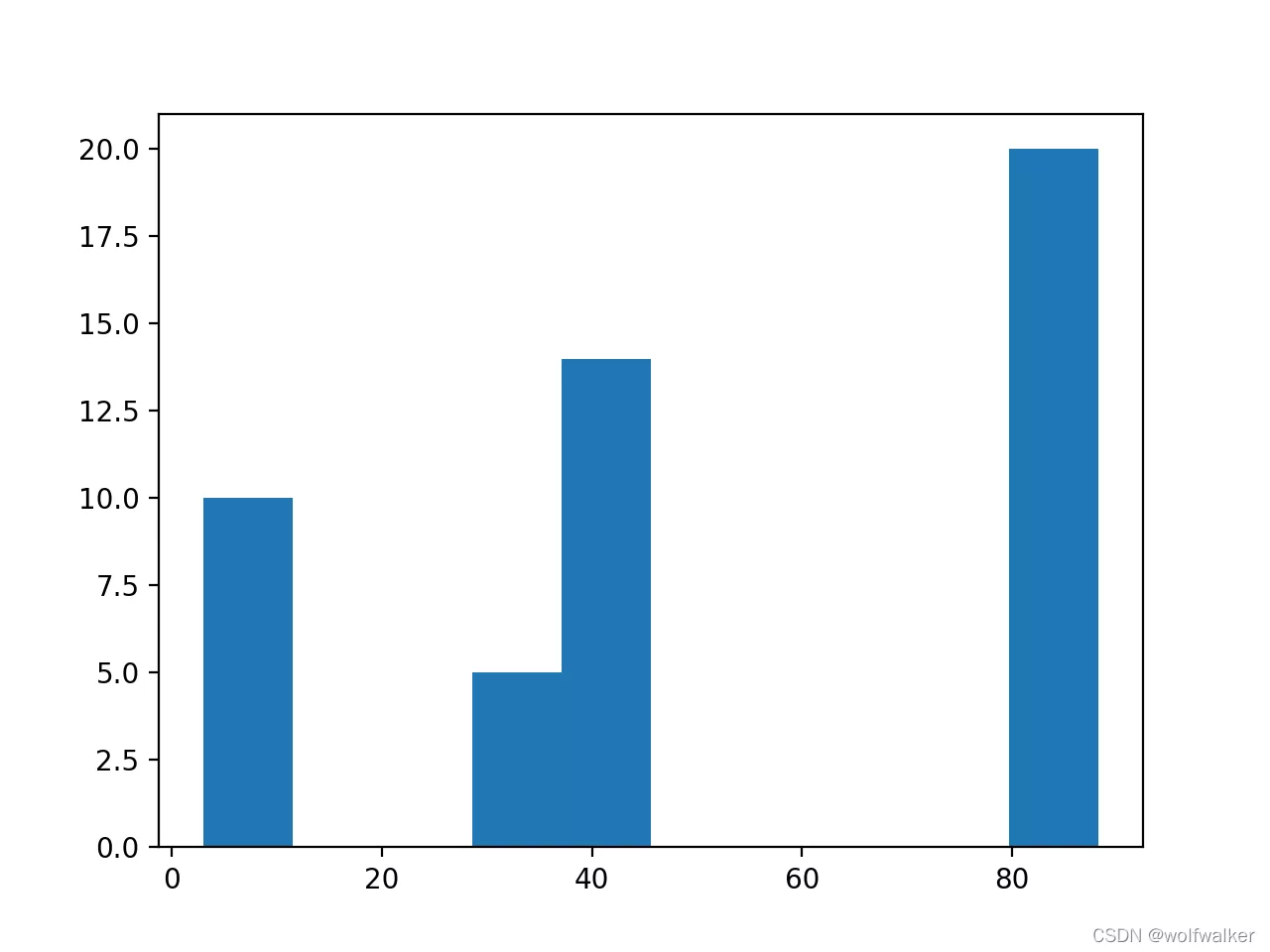
More cool histogram
#1 Class grade histogram h1=[88.2,83.4,84.5,83.4,43,43,7,43,32,3,83.4,84.5,83.4,42,43,43,5,32,88.2,3,84.5,83.4,45,43,9,43,32,7,81,84.5,83.4,4,8,43,43,32,88.2,83,84.5,83.4,45,7,43,43,32,88.2,3,84.5,83.4]# Add function :plt.hist(h1,# Histogram data 10,# Number of straight squares density=1,# Default 0 Number of data occurrences ,1 The number of occurrences is normalized to the frequency of occurrence histtype='bar',# Histogram style : Default bar,stepfilled Fill color ,step No filling, only lines facecolor='b',# Histogram color edgecolor='g',# Histogram border color alpha=0.3,)plt.show()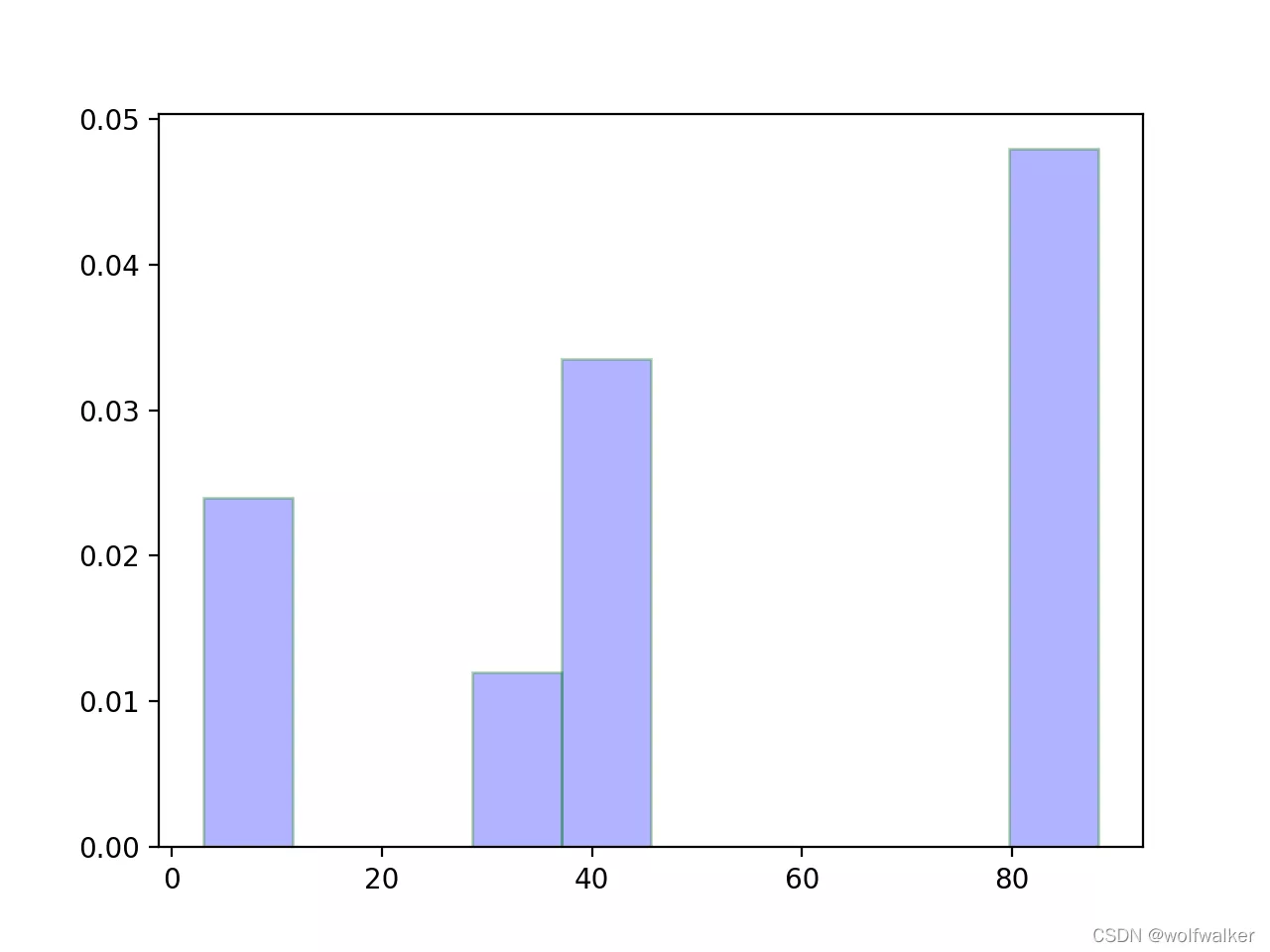
a=[15,5,9,22,4,-5,45,-22]plt.boxplot(a)plt.show()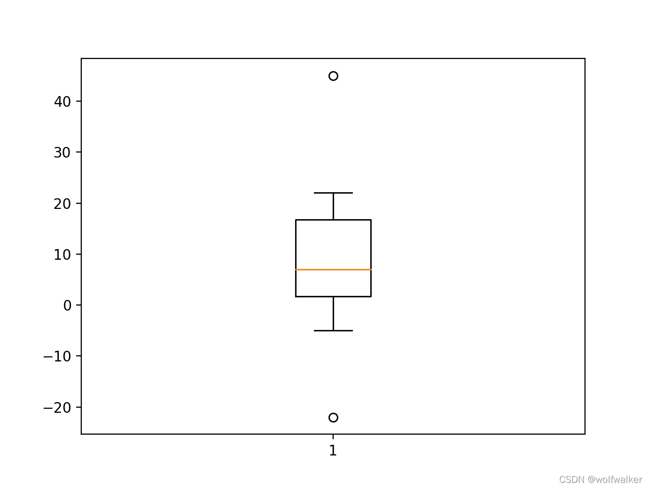
More cool box diagram
a = [42, 33, 33, 3, 2, 44]b = [4, 3, 3, 23, 32, 44]c = [52, 23, 93, 13, 22, 44]plt.boxplot( (a, c, b), # data labels=('a', 'c', 'b'), # label showfliers=True, # Whether the outliers are displayed , Default display whis=1.5, # Specify the outlier parameter , Default 1.5 Times the quartile difference meanline=True, # Whether to use a line to represent the average , The default point is widths=0.5, # Column width vert=False, # Default TRUE The longitudinal ,FALSE The transverse patch_artist=True, # Is it filled with color )plt.grid(linewidth=0.2)plt.show()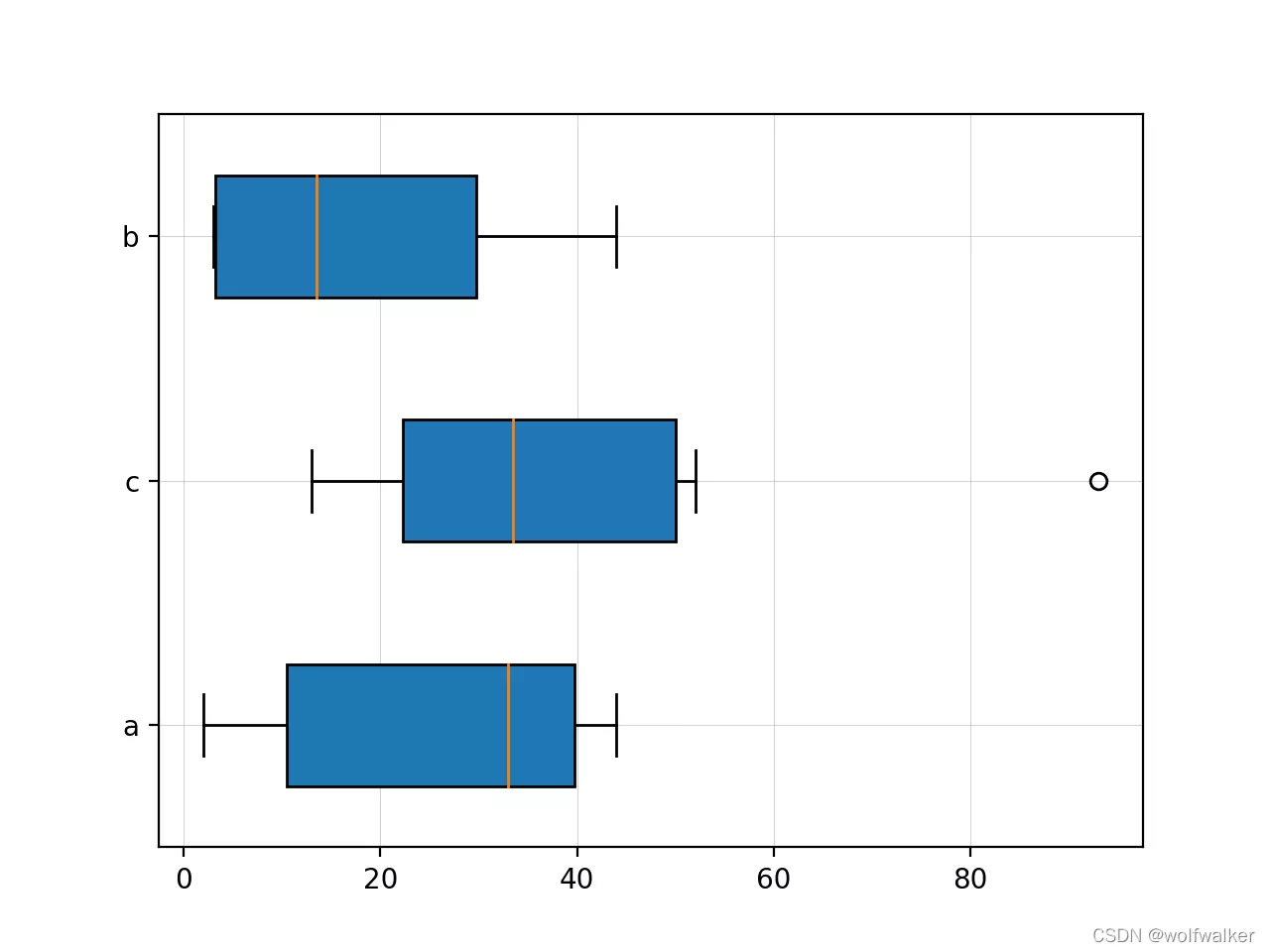
Here we use histogram as an example
# Boys' average score , Chinese language and literature / mathematics / English / Physics / chemical boy=[85.5,91,72,59,66]# Girls' average score girl=[94,82,89.5,62,49]# Account coordinates course=[1,2,3,4,5]# mapping , schoolboy plt.bar(course,#x Axis , subject boy,#y Axis , Boys' grades color='g',# Color width=0.3,alpha=0.3,)# mapping , girl student # Account coordinates course2=[1.3,2.3,3.3,4.3,5.3]plt.bar(course2,#x Axis , subject girl,#y Axis , Girls' grades color='r',# Color width=0.3,)# Mark the data on the column for i,j in zip(course,boy):plt.text(i,#x Axis ,course Subject position j,#y Axis ,boy fraction s=j,ha='center',# Horizontal alignment va='bottom',# The vertical alignment alpha=0.5,)for i,j in zip(course2,girl):plt.text(i,j,s=j,ha='center',va='bottom',alpha=0.5,)# Account coordinate value replacement character course3=[1.15,2.15,3.15,4.15,5.15]plt.xticks(course3,['Chi','Math','Eng','Phy','Che'])plt.show()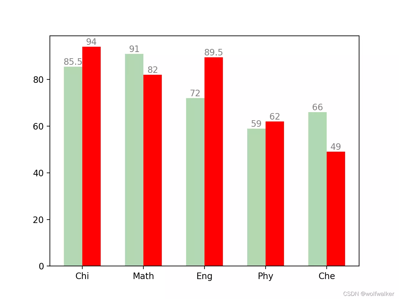
Here we use a scatter chart and a line chart as examples . Here we will compile the scatter chart and line chart respectively , In the use of plt.show, You can find that our two icons are superimposed together
x = [1, 3, 5, 7, 9, 11, 13, 15, 17]y = [2, -5, 19, 3, 5, 8, 12, 6, 1]plt.scatter( x, # x Axis y, # y Axis color='r', # Color marker='o', # style linewidth=20, # Line width alpha=0.3, # transparency # Scatter size , Used to draw bubble charts , On the basis of scatter diagram, another dimension is added s=[100, 300, 500, 700, 200, 400, 600, 800, 1000], # size )date = [3, 4, 5, 6, 7, 8, 9, 10, 12, 13, 14, 15, 16, 17, 18, 19, 20, 21]eurcny=[9, 3, 5, 7, 0, 10, 6, 1, 1, 42, 12, 3, 42, 4, 37, 45, 18, 481]plt.plot( date, # x Axis data , date eurcny, # y Axis data , Closing price color='r', # line color linestyle='--', # Line style linewidth=1.0,# Line thickness marker='o', # Tagging style markerfacecolor='#ffff00', # Mark the color markersize=10, # Tag size alpha=0.5, # transparency )plt.show()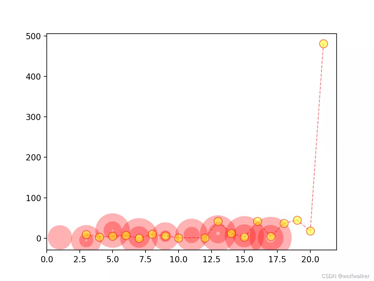
This is about Python matplotlib This is how to draw different types of tables , More about matplotlib To draw the contents of the table, please search the previous articles of SDN or continue to browse the relevant articles below. I hope you will support SDN more in the future !